Managing a helpdesk becomes challenging when ticket volume rises, response times slow down, and support teams get overloaded. Without proper visibility, managers face delays, escalations increase, customers get frustrated, and overall service quality drops. The Helpdesk Efficiency KPI Dashboard in Power BI solves these challenges by offering a clean, interactive, and real-time view of all helpdesk KPIs 📊⚡.
This dashboard brings all service-related data into one simple, visual, and easy-to-understand platform. Support managers can track performance daily, compare results with targets, review previous year trends, and make faster decisions. The dashboard updates automatically using Excel data, making it a powerful reporting tool for any support team.
Whether you manage IT support, customer service, field support, or internal helpdesk operations, this dashboard helps your team work smarter—not harder.
🔥 Key Features of the Helpdesk Efficiency KPI Dashboard in Power BI
-
📊 Summary Page – Full view of MTD & YTD helpdesk performance
-
📈 Trend Page – MTD and YTD trend charts with target comparison
-
📘 Drill-Through KPI Definition Page – Complete KPI logic & formulas
-
🔄 Excel Data Input – Easy monthly updates
-
🎯 Target vs Actual Indicators – Automated green/red status icons
-
📅 Month & KPI Group Slicers – Analyze performance quickly
-
📥 Structured KPI Table – In-depth view of every metric
-
⚡ Automatic Dashboard Refresh – Updated visuals with a single click
📂 Dashboard Structure Explained
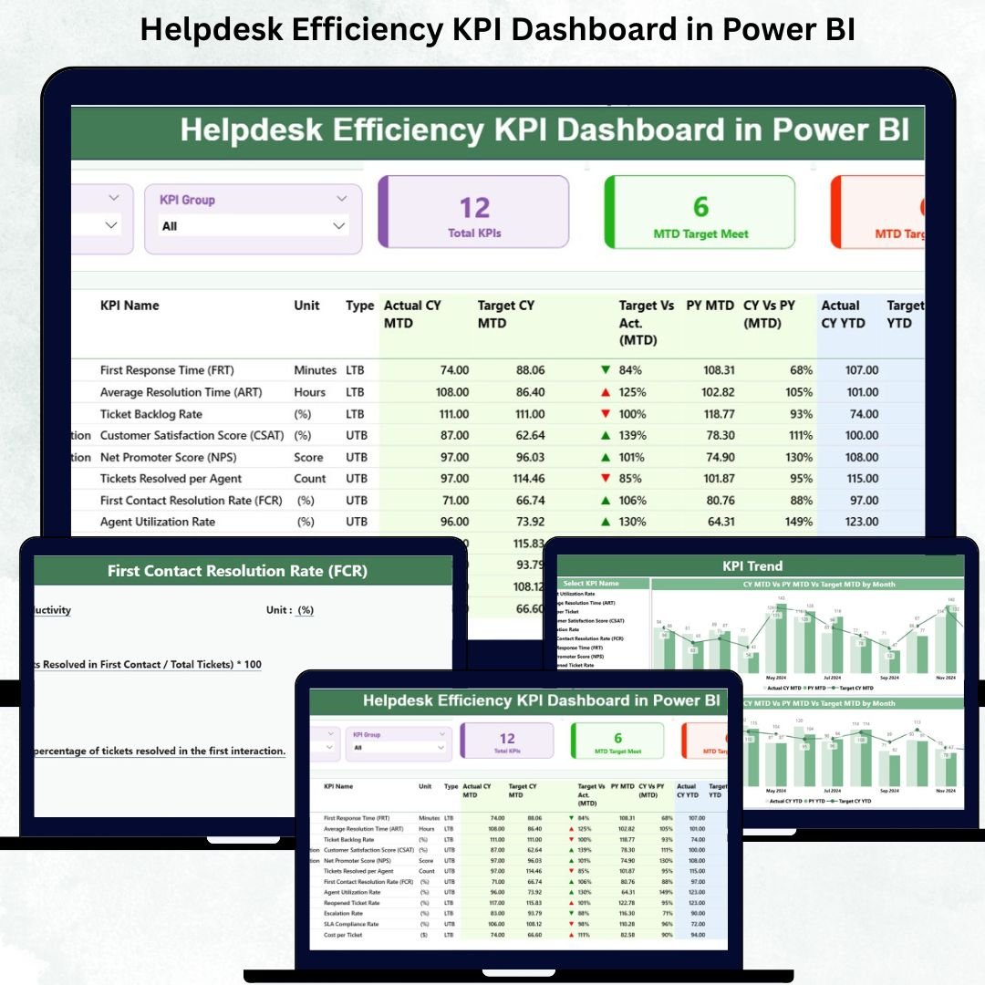
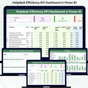
1️⃣ Summary Page – High-Level Helpdesk Performance
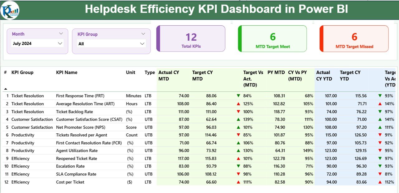
This is the central page of the dashboard. Managers use it daily to understand helpdesk performance at a glance.
✔️ Top Filters
-
Month Slicer
-
KPI Group Slicer
These slicers update the entire dashboard instantly, making analysis smooth and flexible.
✔️ KPI Cards
-
Total KPIs Count
-
MTD Target Met Count
-
MTD Target Missed Count
These cards provide a quick health check of the helpdesk.
✔️ Detailed KPI Table
The powerful KPI table includes:
-
KPI Number
-
KPI Group
-
KPI Name
-
Unit (%, hours, count, etc.)
-
KPI Type (LTB/UTB)
-
Actual CY MTD
-
Target CY MTD
-
MTD Icon (▲/▼)
-
Target vs Actual (MTD)
-
PY MTD
-
CY vs PY (MTD)
-
Actual CY YTD
-
Target CY YTD
-
YTD Icon
-
Target vs Actual (YTD)
-
PY YTD
-
CY vs PY (YTD)
This table gives complete visibility for every helpdesk KPI in one place.
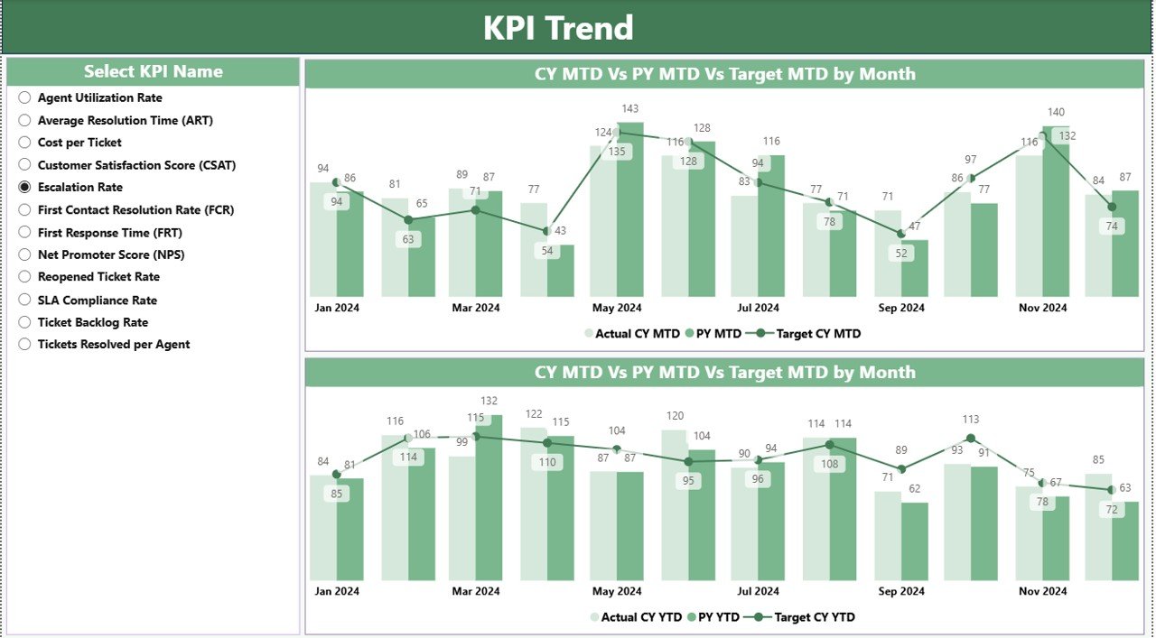
2️⃣ KPI Trend Page – Track Improvements Over Time
This page helps managers and team leaders understand:
-
Seasonal changes
-
Performance improvements
-
Bottlenecks
-
Long-term trends
It includes:
-
📈 MTD Combo Chart – Actual vs Target vs Previous Year
-
📉 YTD Combo Chart – Cumulative performance trends
-
🎛️ KPI Name Slicer – Choose any KPI to display its trends
This page makes trend analysis simple and insightful.
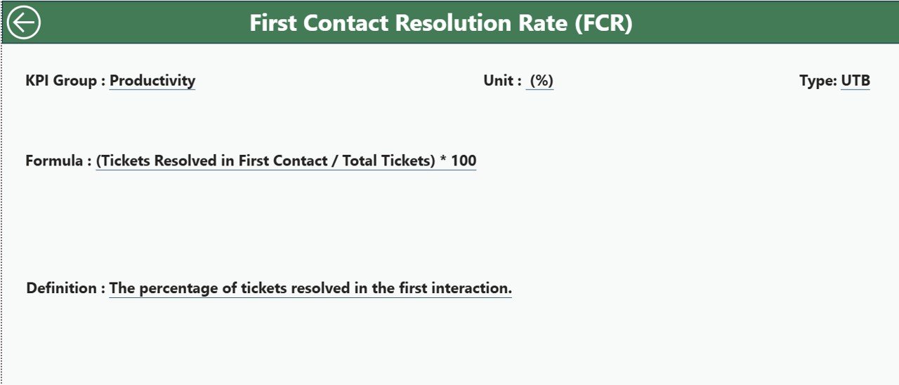
3️⃣ KPI Definition Page – Understand Every Metric
This drill-through page displays:
-
KPI Number
-
KPI Group
-
KPI Name
-
Unit
-
Formula
-
Definition
-
Type (LTB/UTB)
It ensures clarity, transparency, and consistency in reporting. A Back button takes you back to the Summary Page quickly.
🧾 Excel Data Input Structure
The dashboard reads data from three Excel sheets:
✔ 1. Input_Actual
-
KPI Name
-
Month
-
MTD Actual
-
YTD Actual
✔ 2. Input_Target
-
KPI Name
-
Month
-
MTD Target
-
YTD Target
✔ 3. KPI Definition
-
KPI Number
-
KPI Group
-
KPI Name
-
Unit
-
Formula
-
Definition
-
Type (LTB/UTB)
Updating these sheets keeps your entire dashboard accurate.
⭐ Advantages of the Helpdesk Efficiency KPI Dashboard
-
📊 Real-time KPI visibility
-
🎯 Automatic Target vs Actual comparison
-
📉 Trend analysis for better planning
-
📞 Improved SLA compliance
-
🕒 Time-saving automated reporting
-
📁 Simple Excel integration
-
⚡ Accurate decision-making
-
🧩 Supports unlimited KPIs
This dashboard helps teams reduce delays, improve response rates, and boost customer satisfaction.
✔ Best Practices for Maximum Value
-
Update Excel sheets every month
-
Keep KPI names consistent
-
Set correct KPI types (LTB/UTB)
-
Use both MTD and YTD views
-
Analyze trend charts before making decisions
-
Share dashboard views with your entire team
-
Set realistic monthly & yearly targets
🔚 Conclusion
The Helpdesk Efficiency KPI Dashboard in Power BI helps support teams improve performance with clarity and confidence. It provides real-time insights, simplifies monthly reporting, automates comparisons, and helps managers make smarter decisions. With its Summary Page, Trend Page, and KPI Definition Page, this dashboard becomes a complete performance monitoring tool for any helpdesk.
🔗 Click here to read the Detailed blog post
Visit our YouTube channel to learn step-by-step video tutorials


Reviews
There are no reviews yet.