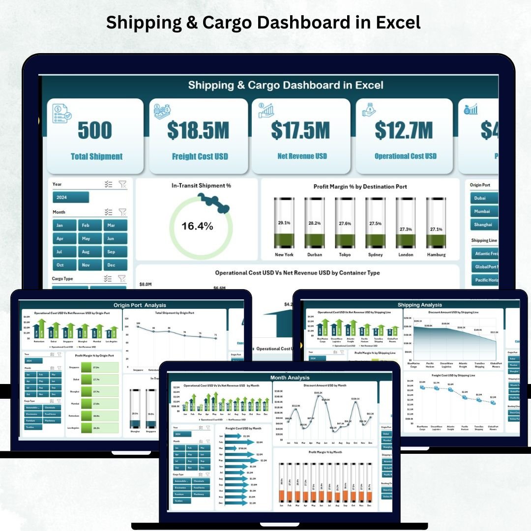
Shipping companies manage thousands of containers, multiple shipping lines, dynamic freight costs, and fast-changing operational expenses. But when all this information stays scattered in spreadsheets and manual reports, logistics teams lose visibility and struggle to make quick decisions. The Shipping & Cargo Dashboard in Excel solves this problem instantly. It converts your raw logistics data into interactive visuals, helping managers understand cost patterns, shipment movement, port performance, and cargo profitability in just a few seconds.
This ready-to-use Excel dashboard gives logistics teams a complete 360° view of shipping operations. You can monitor in-transit shipment percentage, compare freight cost vs revenue, analyze cargo types, evaluate port efficiency, and track monthly performance using dynamic slicers. Whether you work in a shipping company, freight forwarding business, warehouse unit, or supply chain department, this dashboard provides real-time insights that improve accuracy and drive faster decision-making.
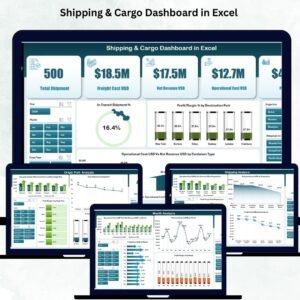
Built with clean visuals, smart KPI cards, and a left-side page navigator, the dashboard makes analysis simple and intuitive—even for users with basic Excel knowledge. Just update the Data Sheet and all pages refresh instantly. No formulas. No manual formatting.
⭐ Key Features of Shipping & Cargo Dashboard in Excel
✨ 5 Insightful Analysis Pages – Overview, Cargo Analysis, Shipping Analysis, Origin Port Analysis & Month Analysis.
📊 Smart KPI Cards – Track shipment performance, profit margin %, cost behavior & in-transit shipment %.
📍 Dynamic Right-Side Slicers – Filter by month, port, cargo type, container type, shipping line, or destination.
💰 Freight vs Revenue Comparison – Evaluate profitability instantly.
🚢 Cargo Type Analysis – Compare cost, shipment count & margin across cargo categories.
⚓ Port Performance Insights – Identify the best and weakest origin ports.
📈 Monthly Trends – Analyze cost, revenue, profit margin & freight patterns month-by-month.
🧮 Automated Excel Calculations – Update data once; dashboard updates on all pages.
🧠 Easy-to-Use Interface – Clear visuals for operations, finance, logistics & warehouse teams.
This dashboard brings complete transparency to your shipping operations.
📦 What’s Inside the Shipping & Cargo Dashboard in Excel
🟦 1. Overview Page – Quick Snapshot of Shipping Performance
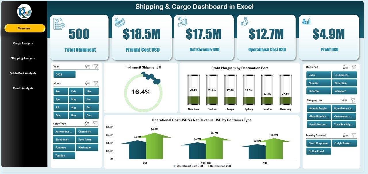
This page gives an instant summary of operations.
You get:
-
Five KPI Cards showing shipment movement, cost, revenue, margin %, and in-transit performance
-
Four Core Charts:
✔ In-Transit Shipment %
✔ Profit Margin % by Destination Port
✔ Operation Cost USD vs Net Revenue USD by Container Type
✔ Freight or cost behavior insights
This page helps managers make quick and informed decisions with a single glance.
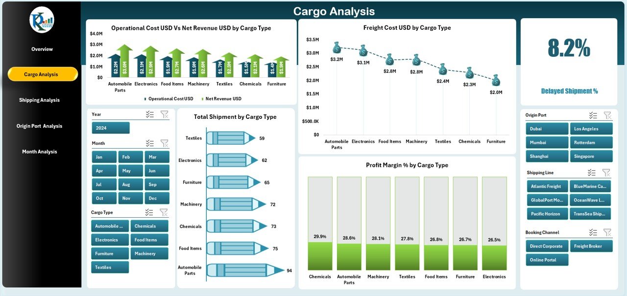
🟧 2. Cargo Analysis Page – Compare Cargo-Type Performance
This page highlights which cargo types drive revenue and which create cost pressures.
Charts include:
-
Operation Cost USD vs Net Revenue USD by Cargo Type
-
Freight Cost USD by Cargo Type
-
Total Shipment by Cargo Type
-
Profit Margin % by Cargo Type
These insights help companies plan cargo mix, pricing, and space utilization better.
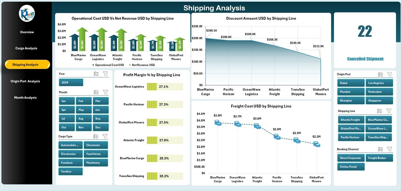
🟩 3. Shipping Analysis Page – Evaluate Shipping Line Efficiency
If you work with multiple carriers, this page gives clarity on:
-
Operation Cost USD vs Net Revenue USD by Shipping Line
-
Freight Cost USD by Shipping Line
-
Profit Margin % by Shipping Line
-
Discount Amount USD by Shipping Line
Identify profitable shipping partners, compare cost efficiency, and analyze discount patterns.
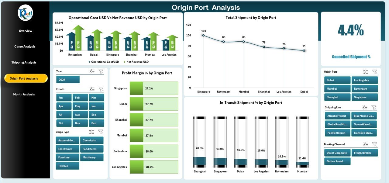
🟪 4. Origin Port Analysis Page – Analyze Port-Level Performance
Port performance directly impacts shipping timelines and cost.
This page includes:
-
Operation Cost USD vs Net Revenue USD by Origin Port
-
Profit Margin % by Origin Port
-
Total Shipment by Origin Port
-
In-Transit Shipment % by Origin Port
Teams can use this to choose the best ports, avoid delays, and optimize routes.
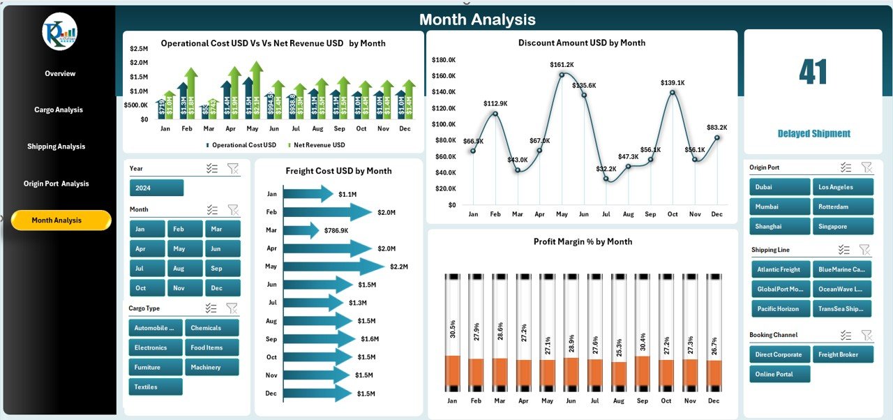
🟨 5. Month Analysis Page – Track Monthly Cost & Revenue Patterns
Shipping performance changes month by month.
Charts include:
-
Operation Cost USD vs Net Revenue USD by Month
-
Profit Margin % by Month
-
Discount Amount USD by Month
-
Freight Cost USD by Month
This helps with seasonal forecasting, budgeting, and cost management.
🧠 How to Use the Shipping & Cargo Dashboard in Excel
1️⃣ Open the Excel template.
2️⃣ Go to the Data Sheet and paste updated cargo, port, shipment & financial data.
3️⃣ The dashboard automatically recalculates all charts and KPIs.
4️⃣ Use slicers to filter by cargo type, port, shipping line, or month.
5️⃣ Navigate between pages using the left-side Page Navigator.
In minutes, raw data becomes powerful logistics insights.
👥 Who Can Benefit from This Shipping & Cargo Dashboard?
🚢 Shipping Companies – Track operations, revenue & cost.
🏭 Logistics Teams – Monitor container movement & cargo behavior.
📦 Warehouse Managers – Plan loading, unloading & storage effectively.
💼 Freight Forwarders – Compare shipping lines & cost structures.
📊 Finance Teams – Evaluate profit margin & operational cost.
🏗 Supply Chain Leaders – Improve forecasting & route planning.
This dashboard works for small logistics units as well as large shipping enterprises.


Reviews
There are no reviews yet.