Managing a hospital requires fast decisions, accurate insights, and complete visibility across departments, branches, financial activities, and patient care. But many healthcare organizations still rely on scattered spreadsheets, manual reports, and outdated systems. This leads to delays, errors, and poor visibility—making it difficult for leaders to understand performance in real time. The Hospitals Dashboard in Power BI solves these challenges by bringing all clinical, financial, operational, and satisfaction metrics together on one powerful, interactive platform.
This ready-to-use dashboard gives doctors, administrators, finance teams, and hospital leadership a complete 360° view of performance. You instantly track patient satisfaction, billing, recovery rates, treatment costs, insurance coverage, department performance, and long-term monthly trends. With dynamic visuals and powerful slicers, the entire hospital ecosystem becomes data-driven—helping teams improve decision-making, enhance patient care, and run operations more efficiently.
Built 100% in Power BI, this dashboard works seamlessly with Excel, databases, and cloud data sources. Just refresh your data and all visuals update automatically. No technical skills required. No complicated setup.
⭐ Key Features of Hospitals Dashboard in Power BI
✨ 5 Comprehensive Dashboard Pages – Overview, Department Analysis, Hospital Analysis, Branch Location Analysis, and Monthly Trends.
📊 Smart KPI Cards – Track satisfaction scores, recovery rates, total billing, and insurance coverage instantly.
📍 Dynamic Slicers – Filter by department, hospital name, branch, payment method, month, and more.
🏥 Department-Level Insights – Compare cost, satisfaction, and profit across specialties.
📈 Monthly Trends Tracking – Understand seasonality and long-term performance.
💰 Financial & Operational Analysis – Analyze billing, treatment cost, and insurance claims.
🚦 Branch-Level Comparison – Check which locations perform best.
⚡ Fully Automated Visuals – One-click refresh updates all charts instantly.
🧠 Beginner-Friendly Design – Clear visuals make it easy for every team member to understand insights.
This dashboard gives hospitals the clarity they need to improve care, boost profitability, and manage operations effectively.
📦 What’s Inside the Hospitals Dashboard in Power BI
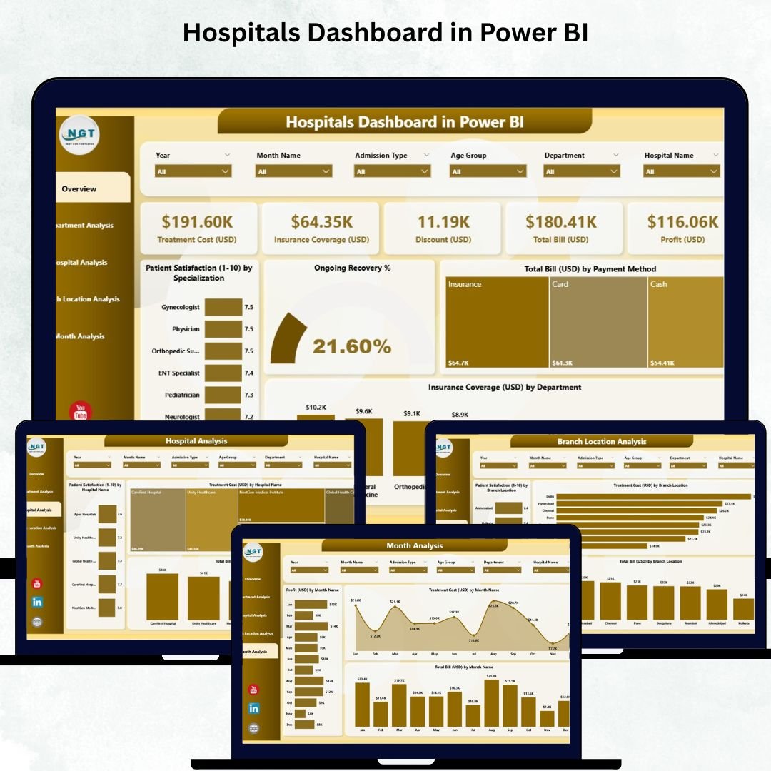
🟦 1. Overview Page – Complete Hospital Performance Snapshot
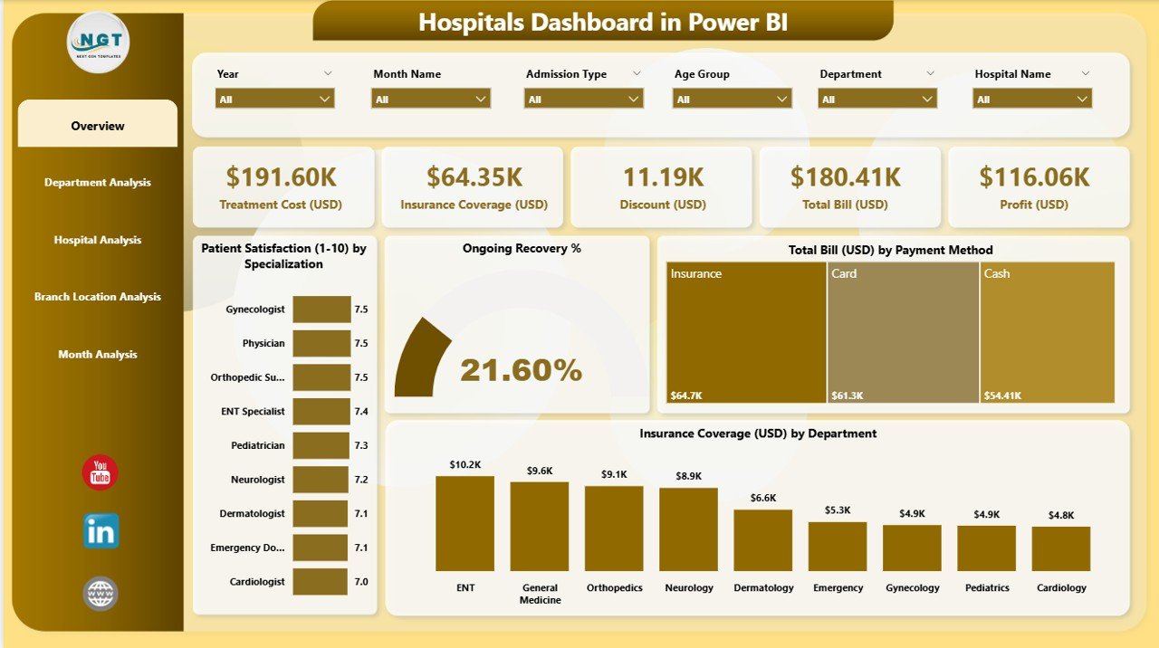
The Overview Page shows all major KPIs and insights in one place.
You get:
-
4 KPI Cards: Overall Satisfaction, Total Recovery Rate, Total Billing (USD), Insurance Coverage
-
4 Powerful Charts:
✔ Patient Satisfaction by Specialization
✔ Ongoing Recovery %
✔ Total Bill (USD) by Payment Method
✔ Insurance Coverage (USD) by Department
This page gives leadership a quick, accurate snapshot of hospital-wide performance.
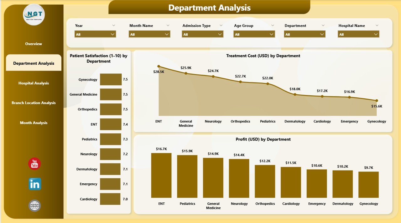
🟧 2. Department Analysis Page – Deep Insights for Every Department
This page helps hospital managers assess:
-
Patient Satisfaction by Department
-
Treatment Cost (USD) by Department
-
Profit (USD) by Department
You see which departments perform well, which need improvement, and how resources should be allocated. It’s ideal for department heads and medical directors.
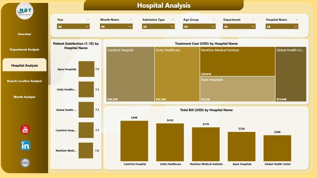
🟩 3. Hospital Analysis Page – Compare All Hospitals in Your Network
Perfect for multi-location healthcare groups.
The page includes:
-
Patient Satisfaction by Hospital Name
-
Treatment Cost (USD) by Hospital Name
-
Total Bill (USD) by Hospital Name
You instantly identify strong-performing hospitals and those needing operational or service improvements.
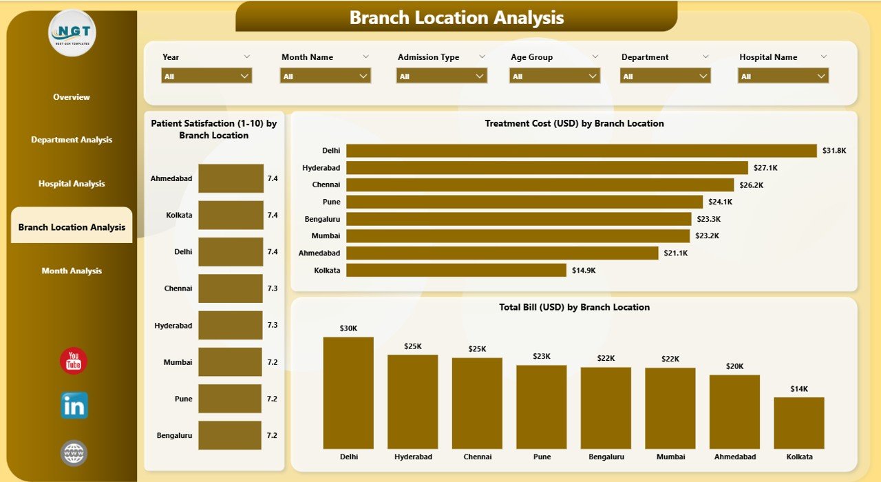
🟪 4. Branch Location Analysis Page – Performance by Every Branch
This page displays:
-
Patient Satisfaction by Branch Location
-
Treatment Cost (USD) by Branch Location
-
Total Bill (USD) by Branch Location
Great for senior management to compare branch efficiency, monitor service quality, and improve resource planning.
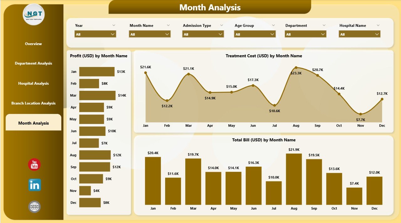
🟨 5. Monthly Trends Page – Track Month-by-Month Behavior
This page highlights long-term trends using:
-
Profit (USD) by Month
-
Treatment Cost (USD) by Month
-
Total Bill (USD) by Month
You easily identify seasonal patterns, plan budgets, forecast accurately, and measure progress throughout the year.
🧠 How to Use the Hospitals Dashboard in Power BI
1️⃣ Open the PBIX file in Power BI Desktop.
2️⃣ Connect your Excel or database source.
3️⃣ Refresh the dashboard to update all numbers instantly.
4️⃣ Use slicers to filter by department, hospital, branch, month, or payment method.
5️⃣ Explore each page for deep analysis of satisfaction, billing, cost, recovery, and performance.
6️⃣ Export insights for management meetings or financial reviews.
It takes only minutes to turn raw data into clear insights.
👥 Who Can Benefit from This Hospitals Dashboard in Power BI?
🏥 Hospital Administrators – Monitor operations and branch performance.
💉 Doctors & Medical Staff – Track recovery and satisfaction trends.
💰 Finance Teams – Monitor billing, revenue, cost, and insurance.
📈 Healthcare Leadership – Make strategic decisions with accurate insights.
📊 Data Analysts & BI Teams – Present performance in a clean, professional way.
🏨 Multi-Hospital Networks – Compare hospitals and branch locations.
This dashboard works for clinics, hospitals, medical groups, and multi-specialty centers.


Reviews
There are no reviews yet.