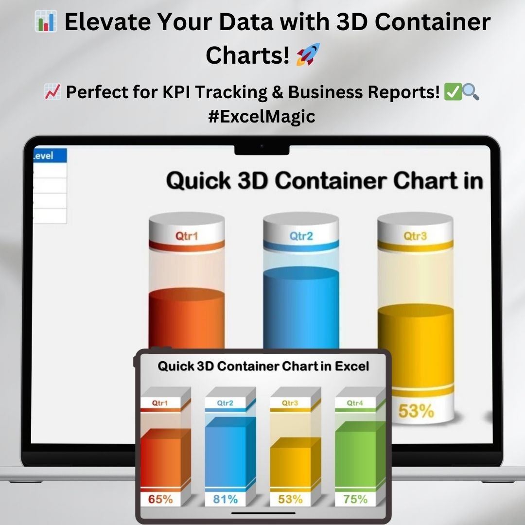
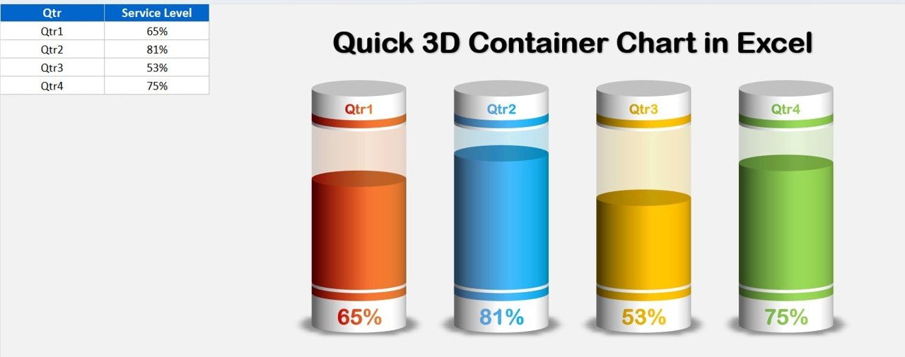
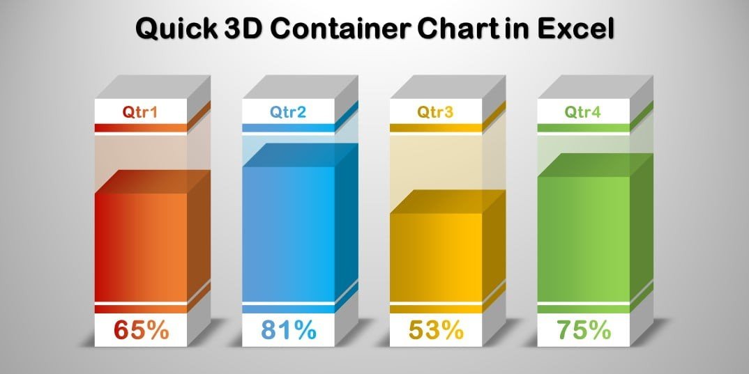
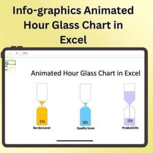
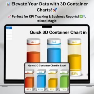
Are you looking for an innovative way to present your KPI metrics and business performance data? The Quick 3D Container Chart in Excel is the perfect solution for transforming raw numbers into engaging, visually appealing reports. This template features two stunning 3D chart styles—Cylinder and Box—designed to help you showcase essential business metrics such as Service Level, Quality Score, Gross Margin, and more. Whether you’re presenting quarterly results or tracking progress over time, this Excel-based chart will add a professional touch to your reports.
📌 Key Features of the 3D Container Chart
🔹 Two Unique 3D Chart Styles
- Choose between Cylinder or Box container-style charts for a dynamic data presentation.
- Offers a sleek, modern look that makes your data stand out in executive reports and presentations.
🔹 Ideal for Business Performance Metrics
- Perfect for tracking Service Level, Quality Score, Gross Margin, Revenue Growth, Customer Satisfaction, and other KPIs.
- Helps decision-makers quickly interpret key performance indicators with intuitive visuals.
🔹 Easy Data Integration in Microsoft Excel
- No complex coding or VBA required! Simply input your data, and the chart updates automatically.
- Works with all versions of Microsoft Excel, ensuring compatibility across different platforms.
🔹 Fully Customizable
- Modify colors, fonts, and labels to match your brand or report theme.
- Adjust chart elements to display percentage values, absolute figures, or comparative data.
🔹 Interactive and Dynamic Presentation
- The 3D effect adds depth and clarity, making data comparison more intuitive and visually appealing.
- Engages stakeholders and simplifies complex datasets for better decision-making.
🔹 Compatible with Business Dashboards
- Seamlessly integrate into your existing Excel dashboards, PowerPoint presentations, and business reports.
- Enhances your financial, operational, and marketing reporting workflows.
🎯 Why Choose This 3D Container Chart?
1️⃣ Professional Look & Feel: Unlike standard Excel charts, these 3D container visuals offer high-impact presentations.
2️⃣ Saves Time & Effort: No need to build charts from scratch—simply plug in your data and watch the visuals update.
3️⃣ Enhances Business Insights: Provides a clear snapshot of business performance for stakeholders and management.
4️⃣ Ideal for Reporting: Use in monthly reports, executive summaries, and data-driven decision-making sessions.
5️⃣ No Technical Skills Required: Even users with basic Excel knowledge can effectively use and modify this template.
📂 What’s Included in the Download?
- Excel File with both Cylinder and Box 3D Container Charts
- Pre-set formatting & formulas for quick data updates
- Step-by-step instructions for customization
- Fully editable template to match your reporting needs
Click here to read the detailed blog post
Visit our YouTube channel to learn step-by-step video tutorials
Watch the step-by-step video tutorial:
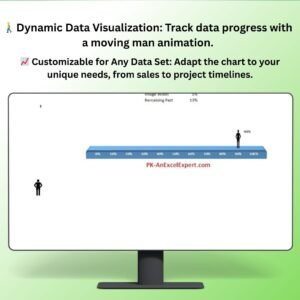
Also check our Pro Gantt Chart in Excel with data entry form


Reviews
There are no reviews yet.