In the insurance and finance industries, precision, risk assessment, and predictive analysis are everything. Actuaries handle massive volumes of data — from premiums and claims to satisfaction scores and reserves — to ensure organizations stay profitable and compliant.
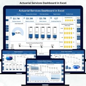
The Actuarial Services Dashboard in Excel is a ready-to-use analytical solution that transforms raw actuarial data into clear, actionable insights. Built for actuaries, insurance professionals, and risk managers, this Excel-based dashboard helps track, visualize, and interpret key performance indicators (KPIs) across multiple dimensions — including claims management, policy analysis, and risk exposure.
By combining Excel’s flexibility with automated analytics, this tool enables professionals to make faster, more data-driven decisions without relying on expensive BI software.
⚙️ Key Features of the Actuarial Services Dashboard in Excel
📊 5 Analytical Pages – Overview, Company Name, Policy Type, Region, and Monthly Trends.
🧭 Page Navigator – Switch between dashboards effortlessly via left-side navigation.
📈 Dynamic KPIs – Total Claims, Premium Amount, Combined Ratio %, and Customer Satisfaction.
💡 Interactive Charts – Drill down into risk categories, claim approvals, and performance ratios.
🎯 Actual vs Target Visualization – Compare results against business benchmarks.
🌍 Regional Risk Mapping – Identify high-risk or high-profit geographies.
📅 Monthly Trend Tracking – Detect seasonal variations in claims and premiums.
📘 Support & Data Sheets – Maintain reference data and raw inputs cleanly.
📤 Customizable Format – Add KPIs, adjust formulas, or integrate with databases easily.
🧭 Dashboard Structure Overview
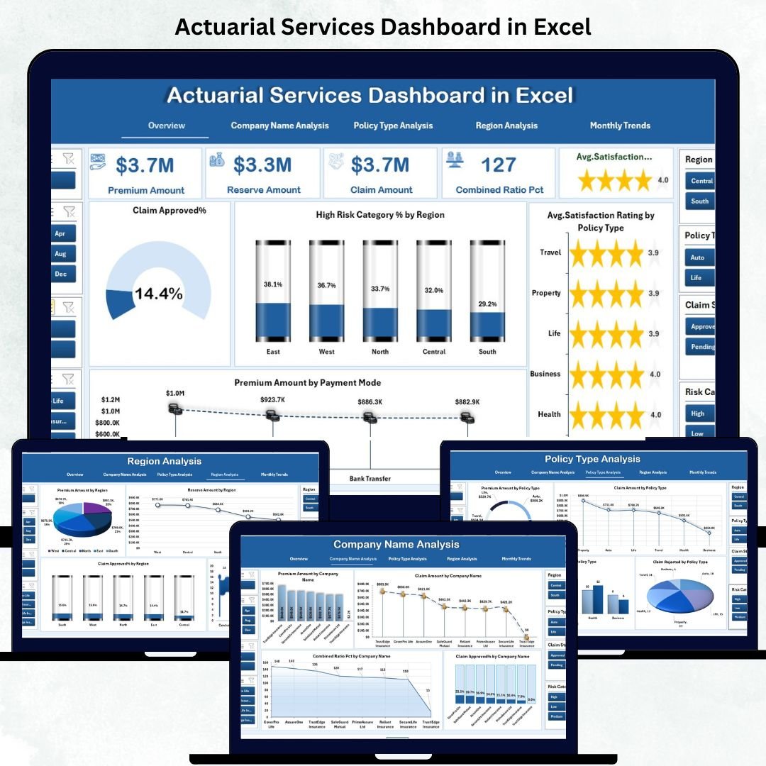
🏠 1️⃣ Overview Page — Central Insight Hub
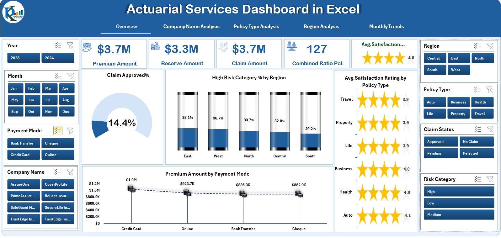
The main page features five key KPI cards (Total Claims, Premiums, Customer Satisfaction, etc.) and four interactive charts:
-
Claim Approved %
-
High-Risk Category % by Region
-
Premium Amount by Payment Mode
-
Average Satisfaction by Policy Type
💡 Purpose: Get a one-glance, 360° performance summary of actuarial operations.
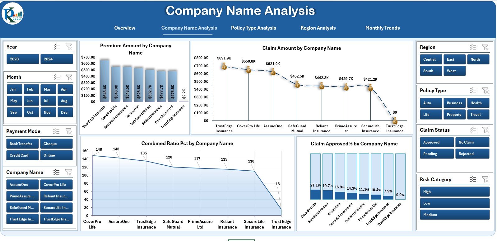
🏢 2️⃣ Company Name Analysis — Compare Insurer Performance
Analyze multiple insurers with four comparative visuals:
-
Premium Amount by Company
-
Claim Amount by Company
-
Combined Ratio (%) by Company
-
Claim Approved % by Company
🎯 Purpose: Benchmark insurer efficiency and identify improvement areas.
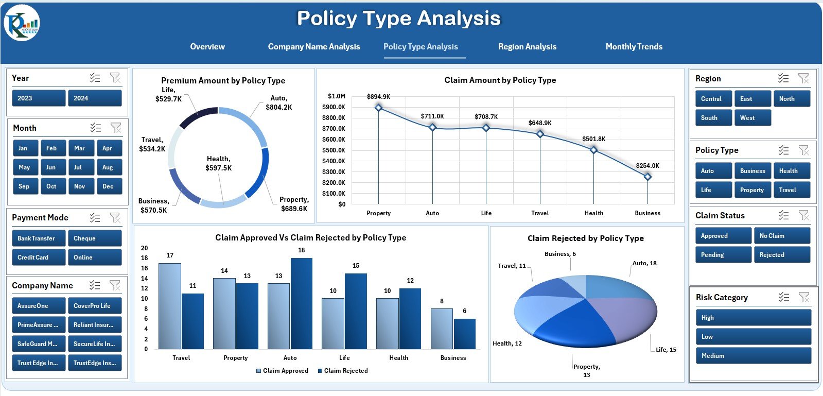
🧾 3️⃣ Policy Type Analysis — Evaluate Policy Effectiveness
Understand how each policy type performs:
-
Premiums and Claims by Policy Type
-
Claim Approved vs Rejected %
-
Rejected Claims by Category
💡 Purpose: Reveal which products are most profitable or risky.
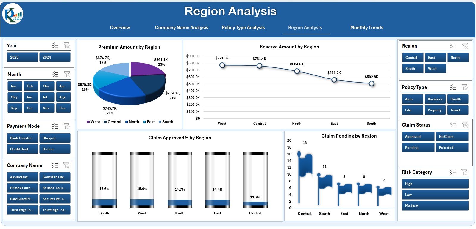
🌍 4️⃣ Region Analysis — Identify Geographical Risk
Gain a location-based view of business performance:
-
Premiums by Region
-
Reserve Amount by Region
-
Claim Approved % by Region
-
Pending Claims Count by Region
📊 Purpose: Detect risk hotspots and optimize regional pricing.
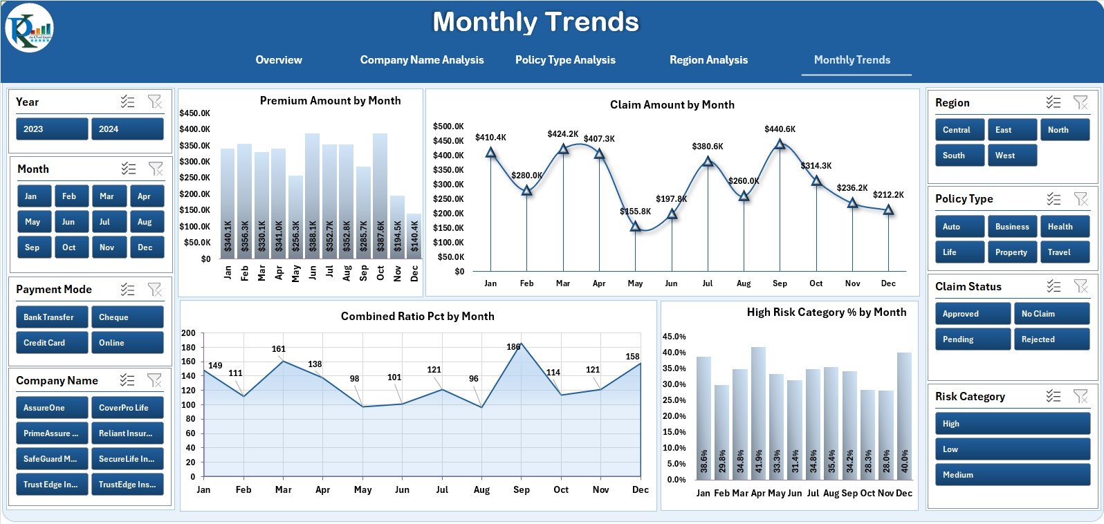
📅 5️⃣ Monthly Trends — Time-Series Performance
Monitor operational KPIs month-by-month:
-
Premium Amount by Month
-
Claim Amount by Month
-
Combined Ratio % by Month
-
High-Risk Category % by Month
🎯 Purpose: Identify seasonal cycles, forecast trends, and plan budgets.
🧩 Supporting Sheets
-
Data Sheet: Core transactional data for premiums, claims, and reserves.
-
Support Sheet: Stores reference data like policy types and regions.
Together, these power the entire dashboard dynamically.
🌟 Advantages of the Actuarial Services Dashboard
✅ Centralized Performance Tracking – View all actuarial KPIs in one structured file.
✅ Automated Analysis – Dynamic charts update instantly when data changes.
✅ Data-Driven Risk Management – Identify high-risk segments with visual cues.
✅ Enhanced Transparency – All departments share consistent performance views.
✅ Cost-Efficient – Provides analytical power without expensive software.
✅ Easy Customization – Modify KPIs, add formulas, or integrate Power Query.
🧠 Best Practices for Maximum Accuracy
📌 Validate all claim and premium entries before analysis.
📌 Define KPI targets clearly (e.g., Combined Ratio ≤ 95 %).
📌 Review Monthly Trends regularly for early warnings.
📌 Share insights with Finance, Risk, and Operations teams.
📌 Use slicers to filter by region, company, or policy.
📌 Back up data to cloud storage for version control.
👥 Who Can Benefit
👩💼 Actuarial Analysts & Consultants – Perform detailed risk and premium analysis.
🏢 Insurance Companies & Brokers – Monitor performance across portfolios.
📊 Risk & Finance Teams – Align claims data with business targets.
🎓 Academic Institutions – Teach actuarial modeling and reporting techniques.
💡 Why Excel Works Best for Actuarial Analysis
-
Familiar and flexible for quick modeling.
-
Supports complex formulas, pivot tables, and charts.
-
Easy to share, modify, and audit.
-
Integrates seamlessly with Power BI or databases when scaling up.


Reviews
There are no reviews yet.