💡 Healthcare Services Dashboard in Power BI – Empower Smarter, Data-Driven Healthcare Decisions
In today’s fast-paced healthcare environment, data is the backbone of better patient outcomes and efficient operations. Hospitals, clinics, and healthcare service providers deal with enormous data every day — from treatment details and costs to patient feedback and performance metrics. Without the right analytical tools, this valuable information often remains underutilized.
That’s where the Healthcare Services Dashboard in Power BI comes in — an advanced, ready-to-use data visualization solution designed to simplify healthcare analytics. This dashboard consolidates treatment, cost, and satisfaction data into one interactive platform, allowing medical leaders and analysts to make faster, more informed decisions.
Built entirely in Microsoft Power BI, it delivers real-time insights on patient outcomes, resource efficiency, and operational costs — all through automated charts, KPIs, and visuals. Whether you’re managing a single hospital or an entire healthcare network, this dashboard is your all-in-one performance tracking solution.
⚙️ Key Features of the Healthcare Services Dashboard in Power BI
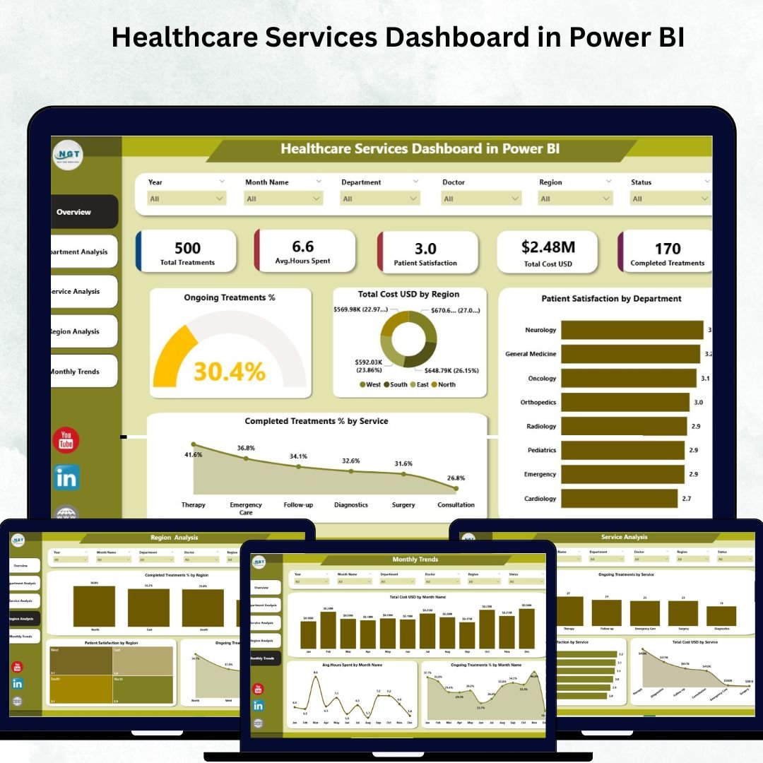
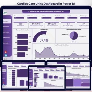
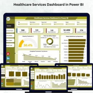
🩺 1. Overview Page – A Snapshot of Organizational Health
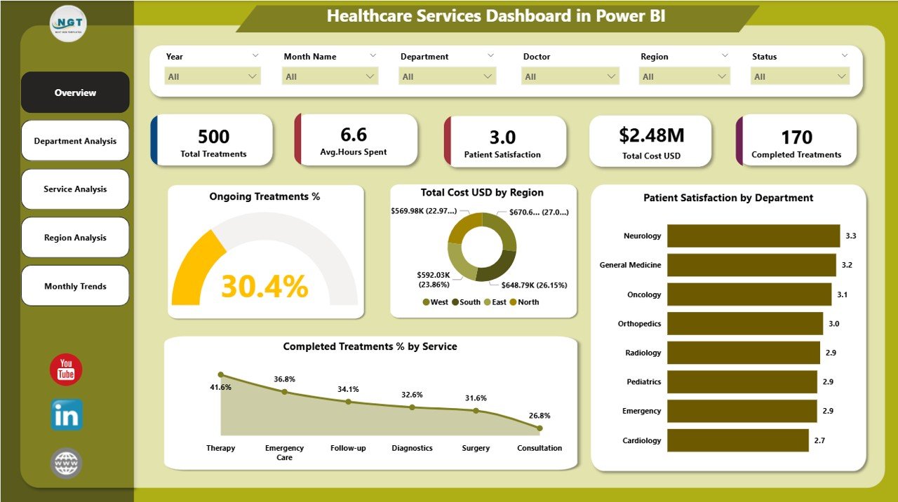
Get a quick, high-level view of overall healthcare performance with interactive visuals.
Highlights:
-
Five KPI Cards: Track ongoing treatment %, completed treatment %, total cost (USD), and patient satisfaction.
-
Interactive Slicers: Filter by month, region, or department to drill into detailed analysis.
-
Visuals like Completed Treatment % by Service and Total Cost (USD) by Department simplify complex performance tracking.
📊 Instantly identify trends in treatment completion, cost efficiency, and satisfaction levels — all in one place.
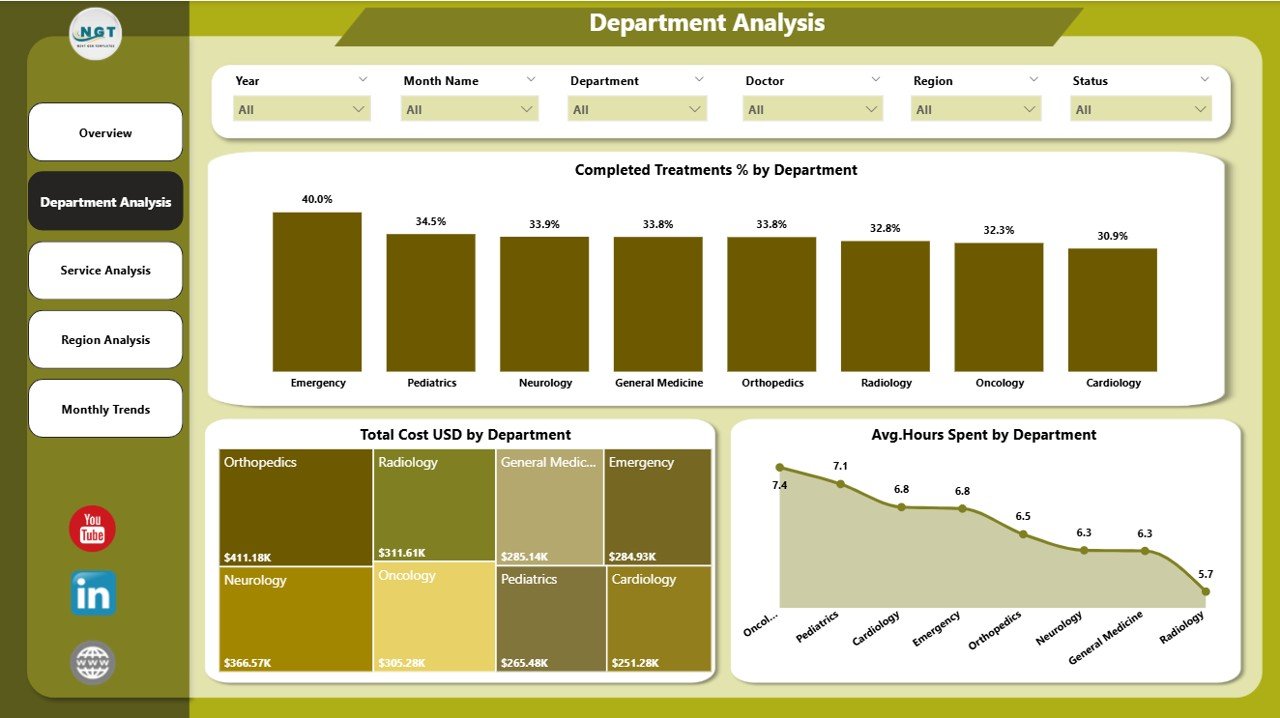
🏢 2. Department Analysis Page – Evaluate Efficiency Across Departments
Analyze how each department performs in terms of cost, productivity, and patient care.
Key Charts:
-
Completed Treatment % by Department
-
Total Cost (USD) by Department
-
Average Hours Spent by Department
💼 Identify high-performing departments, optimize workforce allocation, and control expenses effectively.
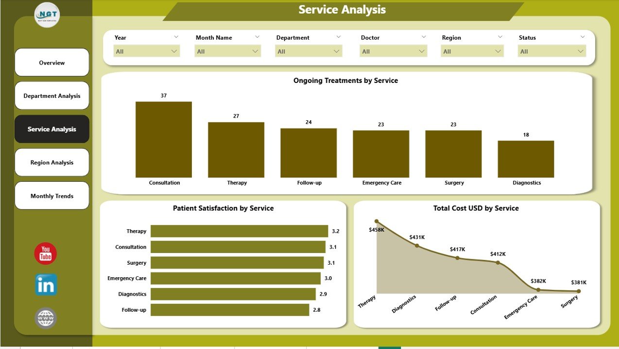
🧬 3. Service Analysis Page – Compare Healthcare Services
Understand how different medical services — like diagnostics, surgery, or physiotherapy — are performing.
Visual Insights:
-
Ongoing Treatment % by Service
-
Patient Satisfaction by Service
-
Total Cost (USD) by Service
🎯 These visuals help decision-makers allocate resources wisely, improve service quality, and maximize efficiency.
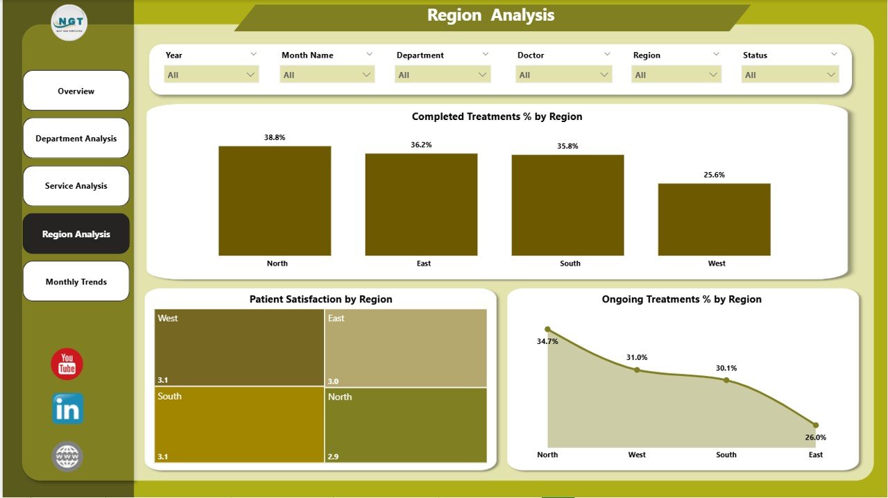
🌍 4. Region Analysis Page – Monitor Regional Performance
Ideal for multi-location healthcare providers, this page compares service quality and performance across regions.
Charts Include:
-
Completed Treatment % by Region
-
Patient Satisfaction by Region
-
Ongoing Treatment % by Region
📈 Perfect for ensuring consistent standards of care and identifying regional improvement opportunities.
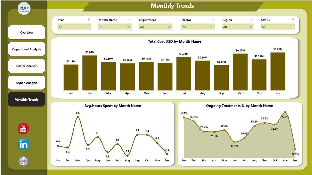
📅 5. Monthly Trends Page – Track Progress Over Time
Evaluate how your key KPIs evolve monthly.
Charts:
-
Total Cost (USD) by Month
-
Average Hours Spent by Month
-
Ongoing Treatment % by Month
📆 Identify seasonal trends, monitor performance growth, and plan future staffing needs with data-backed insights.
📊 What’s Inside the Dashboard
✅ Dynamic Power BI Pages: Overview, Department, Service, Region, and Monthly Trends
✅ Excel Data Integration: Simple connection for easy updates
✅ Interactive Filters & Slicers: Drill down by time, location, or service type
✅ Auto-Refreshing Visuals: Instantly updated charts and KPIs
✅ Customizable KPIs: Adapt to your organization’s unique needs
🚀 Why Use Power BI for Healthcare Analytics?
Power BI makes healthcare analytics simple, visual, and powerful.
-
Real-Time Insights: Monitor ongoing treatments and costs instantly.
-
No Coding Required: Fully drag-and-drop interface.
-
Scalable: Suitable for small clinics or multi-hospital networks.
-
Secure: Built-in role-based access and encryption ensure data protection.
-
Flexible Integration: Connects with Excel, SQL, EHR, and other sources.
👨⚕️ Who Can Benefit from This Dashboard
👩⚕️ Hospital Administrators – Track operations and efficiency.
💰 Finance Teams – Monitor and optimize cost per treatment.
📋 Quality Control Teams – Analyze satisfaction and compliance data.
🌍 Regional Directors – Compare branch performance.
👨🔬 Medical Operations Teams – Plan staff and resources effectively.
Whether it’s a clinic, diagnostic center, or healthcare group, this dashboard provides clear visibility into performance and helps enhance both patient care and operational efficiency.
🌟 Advantages of the Healthcare Services Dashboard in Power BI
✅ Centralized healthcare data management
✅ Improved patient satisfaction monitoring
✅ Real-time performance and cost tracking
✅ Enhanced operational transparency
✅ Easy-to-understand visuals for non-technical users
✅ Fully customizable and scalable
💡 This dashboard transforms complex healthcare data into actionable intelligence — empowering data-driven, patient-focused decision-making.
🔗 Click here to read the Detailed blog post
📺 Visit our YouTube channel for step-by-step tutorials
👉 YouTube.com/@PKAnExcelExpert


Reviews
There are no reviews yet.