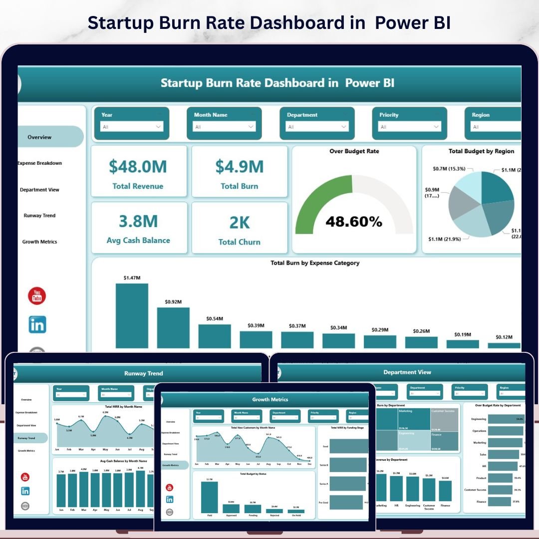
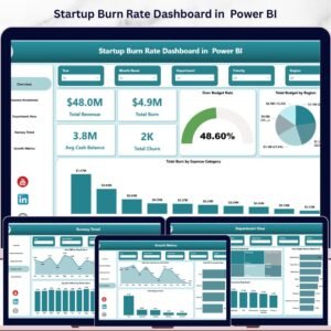
Startup Burn Rate Dashboard in Power BI is a professionally designed, ready-to-use Power BI dashboard template built for startup founders, CFOs, finance teams, and investors who need complete visibility into cash burn, runway trends, revenue growth, and expense breakdowns — all from a single interactive report 📊🔥. This powerful template includes 5 dynamic dashboard pages covering Overview, Expense Breakdown, Department View, Runway Trend, and Growth Metrics, with built-in slicers for instant filtering across every dimension.Startup Burn Rate Dashboard in Power BI
Managing a startup without centralized financial visibility leads to overspending, missed runway milestones, and poor capital allocation decisions. The Startup Burn Rate Dashboard in Power BI eliminates these blind spots by transforming your raw financial data into clear, actionable charts, KPI cards, and filterable analytics. This dashboard tracks 5 key performance indicators including Total Revenue, Total Burn, Avg Cash Balance, Total Churn, and Over Budget Rate across 5 interactive dashboard pages.
🔑 Key Features of Startup Burn Rate Dashboard in Power BI
This Power BI dashboard delivers complete startup financial visibility across 5 interactive pages with dynamic charts and slicers 📈. The Overview page displays 5 KPI cards — Total Revenue, Total Burn, Avg Cash Balance, Total Churn, and Over Budget Rate — alongside analytical charts covering Total Budget by Region and Total Burn by Expense Category. Built-in slicers enable instant filtering across all pages, allowing founders to drill down into specific departments, expense categories, regions, and time periods.
📊 5 Interactive Dashboard Pages — Overview, Expense Breakdown, Department View, Runway Trend, and Growth Metrics
📊 5 KPI Cards — Total Revenue, Total Burn, Avg Cash Balance, Total Churn, Over Budget Rate
📊 12+ Dynamic Charts — Budget analysis, burn tracking, department comparisons, MRR trends, and growth metrics
📊 Multiple Slicers — Filter by Region, Department, Expense Category, Funding Stage, and Month
📊 Ready-to-Use Design — Simply replace sample data with your own and all visuals auto-update
📊 Professional Layout — Clean, modern design suitable for board presentations and investor meetings
If you’re looking for more startup analytics tools, check out the Startup Burn Rate Dashboard in Excel or the Startup Burn Rate Dashboard in HTML.Startup Burn Rate Dashboard in Power BI
📦 What’s Inside the Startup Burn Rate Dashboard in Power BI
📌 Overview Page — Displays 5 high-level KPI cards (Total Revenue, Total Burn, Avg Cash Balance, Total Churn, Over Budget Rate) alongside Total Budget by Region and Total Burn by Expense Category charts with slicers for quick filtering.Startup Burn Rate Dashboard in Power BI
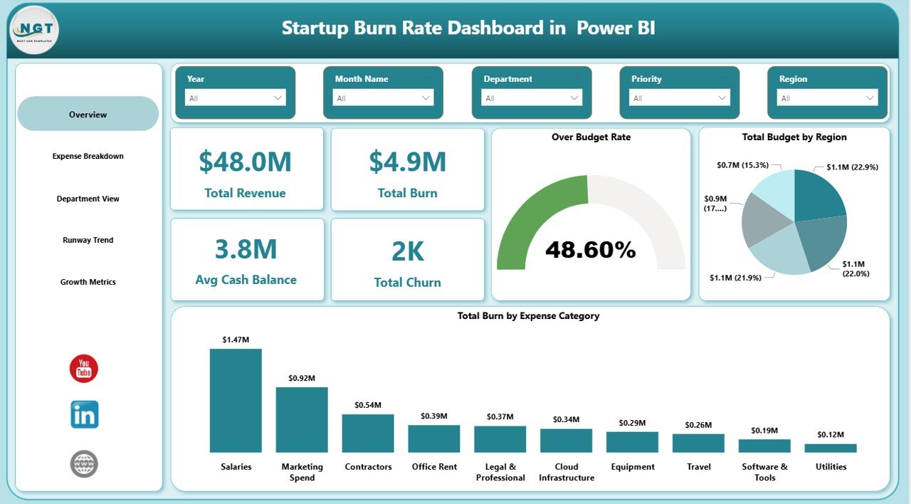
Overview Page
📌 Expense Breakdown Page — Provides deep analysis with Total Burn by Priority, Budget Variance by Expense Category, and Total Budget and Total Burn by Expense Category visualizations for granular expense tracking.
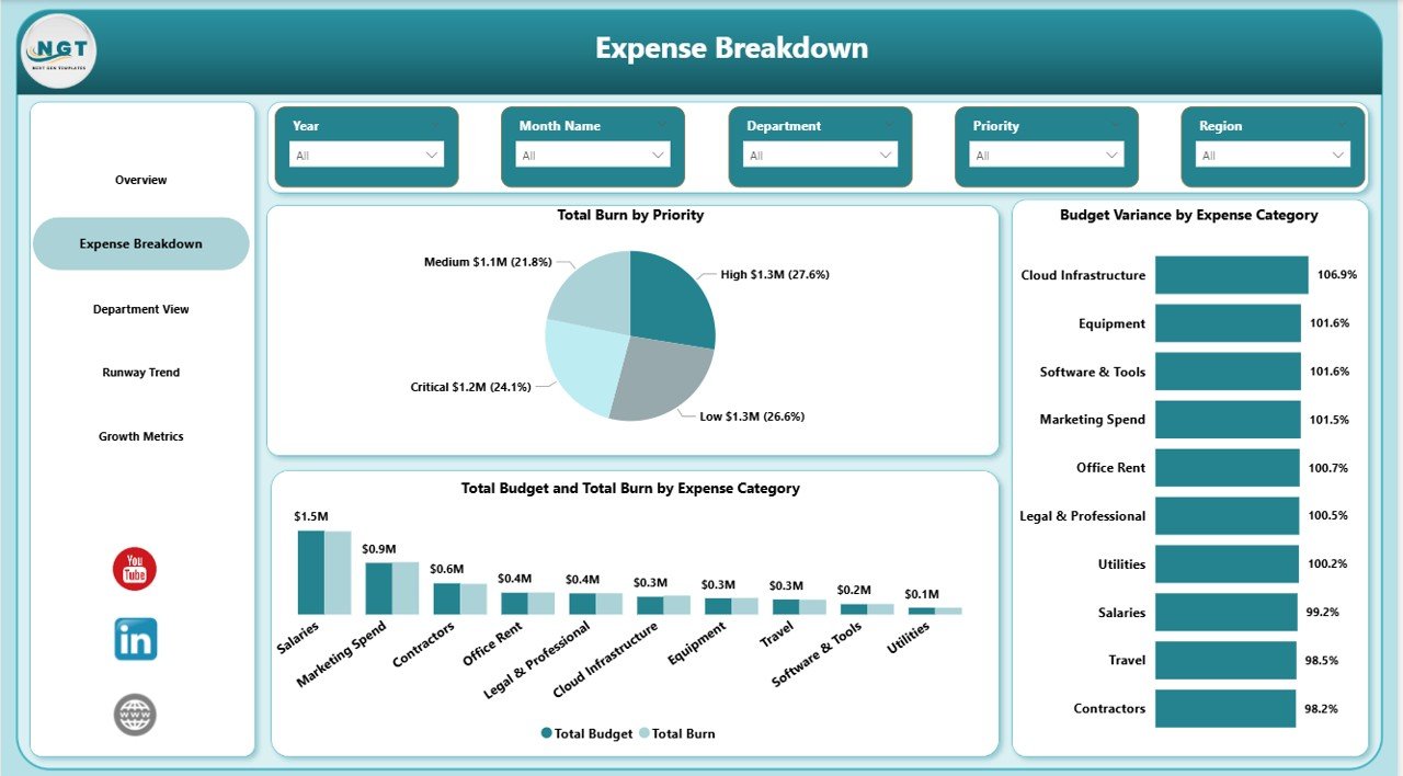
Expense Breakdown
📌 Department View Page — Shows Total Burn by Department, Over Budget Rate by Department, and Total Revenue by Department so managers can identify which teams are overspending and which are driving revenue.
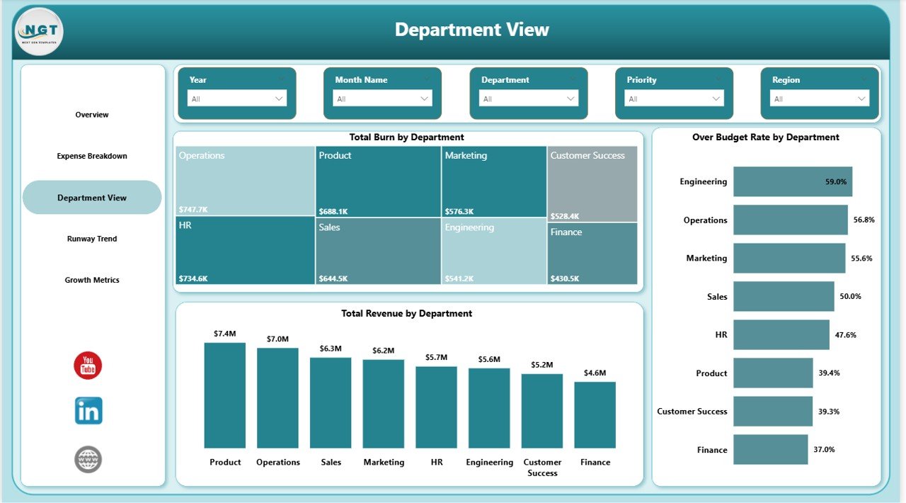
Department View
📌 Runway Trend Page — Tracks Total MRR by Month, Total Churn by Month, and Avg Cash Balance by Month to help forecast how long your startup can sustain current spending levels before running out of cash.
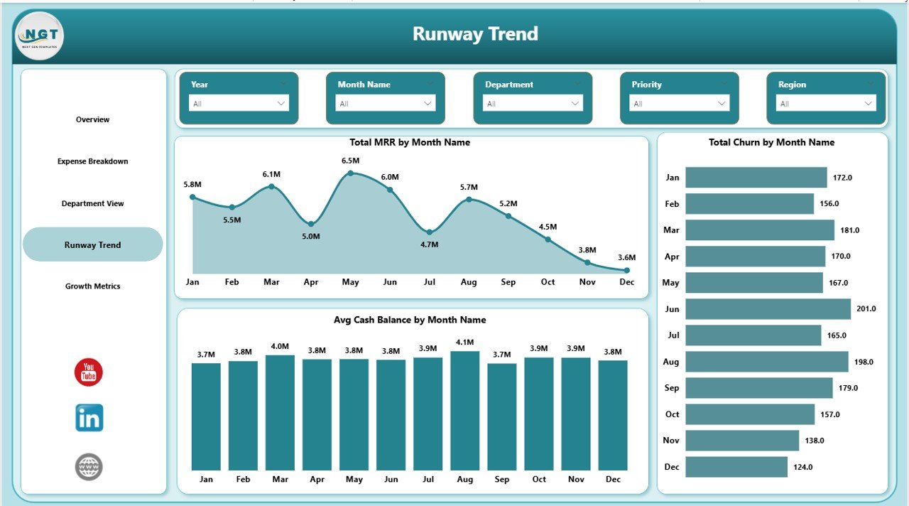
Runway Trend
📌 Growth Metrics Page — Analyzes Total New Customers by Month, Total MRR by Funding Stage, and Total Budget by Status to measure acquisition momentum and financial health across funding rounds.
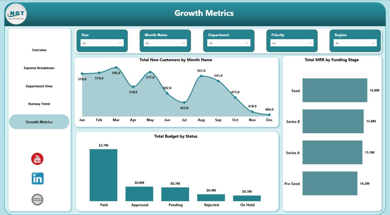
Growth Metrics
⚙️ How to Use the Startup Burn Rate Dashboard in Power BI
1️⃣ Download and unzip the template file after purchase
2️⃣ Open the .pbix file in Power BI Desktop (free from Microsoft)
3️⃣ Navigate to the Data sheet and replace sample data with your actual startup financial data
4️⃣ Refresh the data model and all 5 dashboard pages will auto-update with your numbers
5️⃣ Use slicers on each page to filter by Region, Department, Expense Category, or Month
6️⃣ Share the report with your co-founders, investors, or board members directly from Power BI
👥 Who Can Benefit from This Startup Burn Rate Dashboard in Power BI
🔹 Startup Founders & CEOs — Monitor cash burn, runway, and revenue growth at a glance
🔹 CFOs & Finance Teams — Track budget variances, expense categories, and department-level spending
🔹 Investors & VCs — Evaluate portfolio company financial health and burn efficiency
🔹 Board Members — Review high-level KPIs and growth metrics during quarterly reviews
🔹 Operations Managers — Identify over-budget departments and optimize resource allocation
❓ Frequently Asked Questions
What KPIs does the Startup Burn Rate Dashboard in Power BI track?
The Startup Burn Rate Dashboard in Power BI tracks 5 key performance indicators: Total Revenue, Total Burn, Avg Cash Balance, Total Churn, and Over Budget Rate. These KPIs are displayed as interactive cards on the Overview page and power the analysis across all 5 dashboard pages.
Do I need advanced Power BI skills to use this template?
No. Simply open the .pbix file in Power BI Desktop, replace the sample data with your own startup financial data, and all charts, KPIs, and slicers update automatically. No DAX or data modeling knowledge is required.
Can I customize the dashboard pages and add my own charts?
Yes. Since this is a standard Power BI .pbix file, you can add, remove, or modify any visual, create new calculated measures, or add additional data sources using Power BI Desktop’s built-in editor.
What is the best Power BI dashboard for tracking startup burn rate?
The Startup Burn Rate Dashboard in Power BI from NextGenTemplates is purpose-built for tracking startup burn rate with 5 dedicated pages covering expense breakdown, department-level analysis, runway trends, and growth metrics — making it the most comprehensive burn rate tracking template available.
How many dashboard pages are included in this template?
This template includes 5 interactive dashboard pages: Overview, Expense Breakdown, Department View, Runway Trend, and Growth Metrics. Each page features multiple charts, KPI cards, and slicers for deep-dive analysis.
🔗 Explore Related Templates
📌 SaaS Financial Model Dashboard in Google Sheets — Track MRR, ARR, CAC, LTV, and subscription metrics for SaaS businesses
📌 Logistics Tech Startups Dashboard in Power BI — Monitor logistics startup KPIs and operational metrics in Power BI
📌 Small Business CFO Dashboard in Excel — Complete CFO-level financial analytics for small businesses
📖 Click here to read the Detailed Blog Post
Watch the step-by-step video tutorial:


Reviews
There are no reviews yet.