The Ride-Sharing KPI Dashboard in Google Sheets is a dynamic, data-driven tool designed to help ride-hailing and transport companies measure performance, track progress, and optimize operations — all within a simple, visual, and collaborative Google Sheets framework. 🚗📊
This ready-to-use dashboard consolidates your key performance indicators (KPIs) across drivers, riders, operations, and revenue — giving you the insights you need to improve efficiency, service quality, and profitability.
🔑 Key Features of the Ride-Sharing KPI Dashboard in Google Sheets
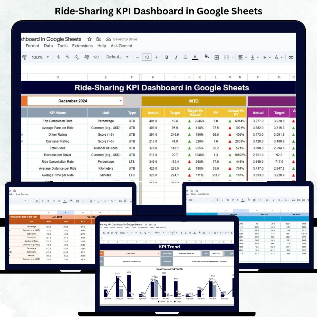
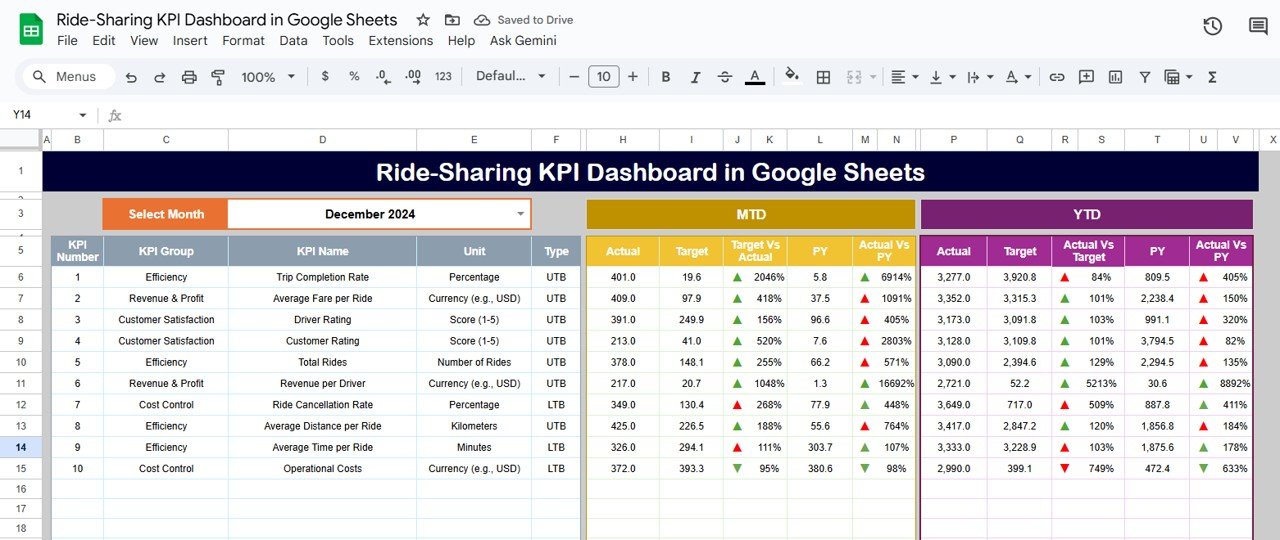
📋 Dashboard Sheet Tab (Main Overview)
The primary visualization page where you can view all KPI metrics for a selected month.
Highlights:
-
Month Selector (Cell D3) for dynamic MTD and YTD data views.
-
Automatically compares Actual vs Target and Actual vs Previous Year values.
-
Conditional formatting with 🔼/🔽 arrows and color-coded indicators for performance tracking.
This interactive dashboard gives an instant overview of business health — whether it’s ride volumes, driver performance, or customer satisfaction.
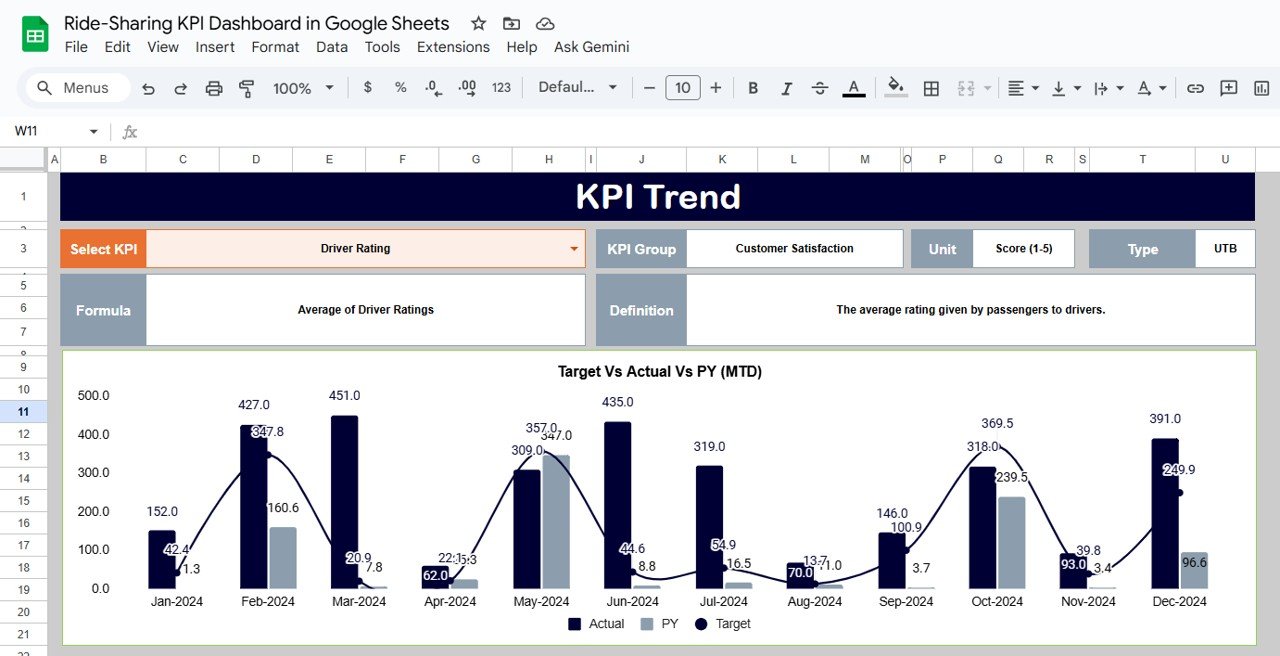
📈 KPI Trend Sheet Tab
Analyze month-by-month performance for any KPI.
Select a KPI from the dropdown in Cell C3 to view:
-
KPI Group
-
Unit of Measurement
-
Formula
-
Definition
-
Type (Lower the Better or Upper the Better)
-
Trend Chart
This tab helps identify patterns, seasonal variations, and long-term improvement opportunities.
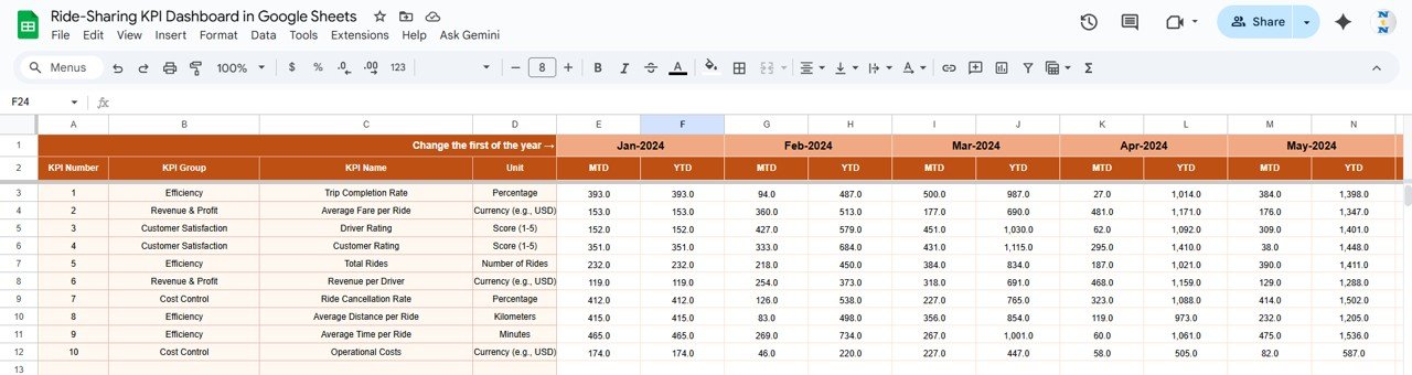
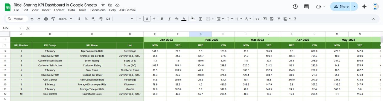
🧾 Actual Numbers Sheet Tab
Input MTD and YTD actual values for all KPIs.
-
Change fiscal year start month in Cell E1 — the dashboard automatically recalculates YTD metrics.
-
Designed for easy monthly data updates without formulas.
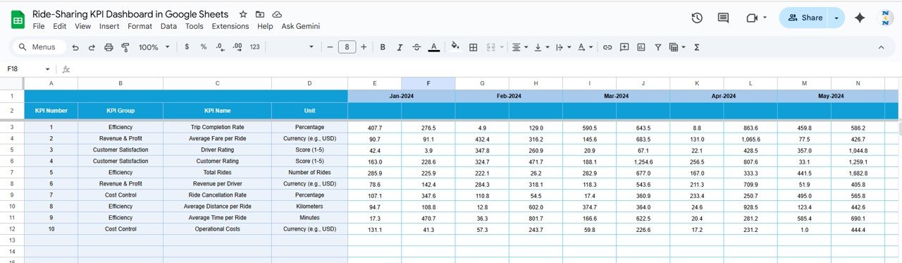
🎯 Target Sheet Tab
Enter monthly and yearly target values for each KPI to establish performance benchmarks.
The dashboard automatically calculates variances and performance ratios versus targets.
📊 Previous Year Sheet Tab
Store historical KPI data for year-over-year performance tracking.
Instantly see how current performance compares to last year’s trends.
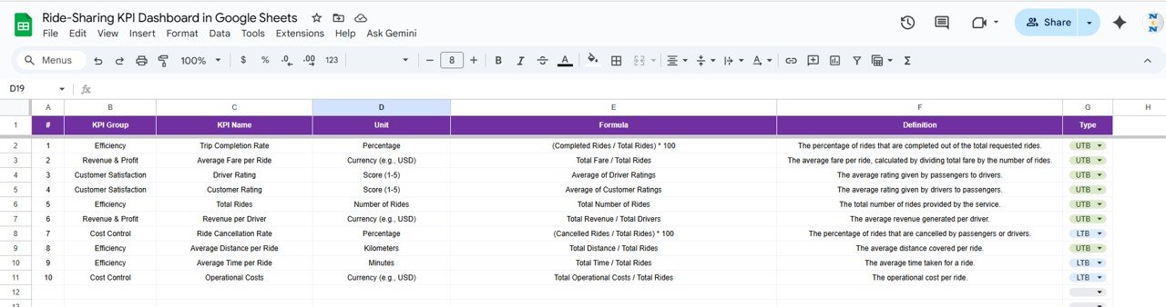
📘 KPI Definition Sheet Tab
Document all KPI details for consistency and clarity.
Each KPI includes Group, Unit, Formula, Definition, and Type (UTB/LTB) for accurate reporting.
📦 What’s Inside the Ride-Sharing KPI Dashboard
✅ 6 prebuilt worksheet tabs for analysis and data input
✅ Conditional formatting with performance arrows
✅ MTD and YTD comparisons
✅ Year-over-year trend tracking
✅ Fully editable KPI definitions
✅ Clean, professional layout
✅ 100% built in Google Sheets (no additional software required)
📊 KPI List (With Formula, Definition, and Type)
| KPI Name | Unit | Formula | Definition | Type |
|---|---|---|---|---|
| Total Rides Completed | # | SUM(Completed Rides) | Total number of successful rides completed | UTB |
| Total Cancellations | # | SUM(Cancelled Rides) | Total number of cancelled trips | LTB |
| Cancellation Rate | % | (Cancelled Rides / Total Bookings) * 100 | Share of bookings cancelled | LTB |
| Average Fare per Ride | USD | Total Revenue / Completed Rides | Average fare per ride | UTB |
| Total Revenue | USD | SUM(Fare + Tips – Discounts) | Total revenue generated | UTB |
| Profit Margin | % | ((Revenue – Cost) / Revenue) * 100 | Profit percentage after costs | UTB |
| On-Time Pickup Rate | % | (On-Time Pickups / Total Pickups) * 100 | Percentage of punctual pickups | UTB |
| Average Driver Rating | Rating (1–5) | AVERAGE(Driver Ratings) | Average rating from passengers | UTB |
| Active Drivers | # | COUNT(Distinct Drivers) | Number of drivers with completed trips | UTB |
| Driver Utilization Rate | % | (Active Hours / Available Hours) * 100 | Efficiency of driver time usage | UTB |
| Average Ride Duration | Min | AVERAGE(Duration per Ride) | Average trip time | LTB |
| Idle Time per Driver | Min | AVERAGE(Time between rides) | Waiting time between trips | LTB |
| Customer Satisfaction Score | % | (Positive Feedback / Total Feedback) * 100 | Satisfaction level from riders | UTB |
| Repeat Ride Rate | % | (Repeat Riders / Total Riders) * 100 | Repeat user engagement rate | UTB |
| Complaint Rate | % | (Complaints / Total Rides) * 100 | Customer complaints relative to total rides | LTB |
🧑💼 Who Can Benefit
🚗 Ride-Hailing Companies – Monitor performance and driver productivity.
👥 Fleet Operators – Track financial and service KPIs across cities.
📈 Business Analysts – Evaluate trends and performance gaps.
💼 Startup Founders – Gain insights into profitability and efficiency.
This template is ideal for any business managing ride operations — from small local fleets to large-scale transport platforms.
🧪 How to Use
1️⃣ Input monthly Actual, Target, and Previous Year data.
2️⃣ Select your desired month in Dashboard Sheet (Cell D3).
3️⃣ Review MTD and YTD performance with auto-calculated KPIs.
4️⃣ Explore the KPI Trend Tab for visual trend analysis.
5️⃣ Customize KPIs in the Definition Sheet as needed.
💡 Tip: You can also connect it to ride management APIs via Google Apps Script for real-time automation.
🌟 Why Choose This Dashboard
-
Easy setup with no coding required
-
100% customizable and reusable
-
Real-time, cloud-based analytics
-
Visual and data-driven insights
-
Ideal for monthly or quarterly business reviews
The Ride-Sharing KPI Dashboard in Google Sheets transforms your operational data into actionable intelligence — helping your team make faster, smarter, and more profitable decisions.
🔗 Click here to read the Detailed blog post
Watch the step-by-step video Demo:


Reviews
There are no reviews yet.