
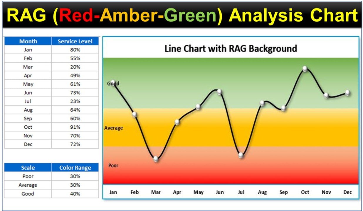
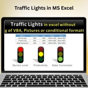
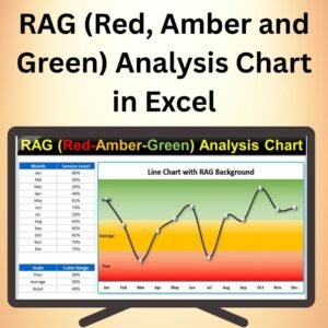
The RAG (Red, Amber, Green) Analysis Chart in Excel is a powerful tool designed to provide a visual overview of project status, performance metrics, or any data that can be categorized into different risk or performance levels. Using color coding—Red, Amber, and Green—this chart helps you quickly assess the status of your data, with Red indicating critical issues, Amber showing caution, and Green representing a positive outcome or progress.
Ideal for project managers, business analysts, and anyone needing to track key performance indicators (KPIs), this RAG Analysis Chart allows for easy, at-a-glance status updates. It can be applied to various use cases such as project management, financial analysis, sales performance, and more. This Excel template is customizable, allowing you to adjust the thresholds, categories, and colors to fit your specific needs.
Key Features of the RAG (Red, Amber, Green) Analysis Chart in Excel
📌 Color-Coded Visual Indicators
The RAG Analysis Chart uses Red, Amber, and Green to represent data points across different categories. Red indicates areas that need immediate attention, Amber signifies caution, and Green highlights areas where goals are being met. This color-coded system makes it easy to assess the status of key metrics at a glance.
🛠 Customizable Thresholds and Categories
You can easily customize the thresholds and categories to fit your specific needs. Whether you are tracking project progress, sales performance, or financial health, you have full control over how data is categorized and displayed.
💡 Quick and Easy Analysis
This chart simplifies data interpretation by grouping values into clear visual categories. With the RAG Analysis Chart, you can quickly identify issues or areas for improvement without having to dive into complex reports.
🔢 Real-Time Data Updates
As your data changes, the RAG Analysis Chart automatically updates to reflect new values. This real-time update ensures that you always have the most up-to-date information at your fingertips.
🚀 Simple Setup and Easy Customization
Setting up the RAG Analysis Chart in Excel is simple, even for beginners. With an easy-to-follow guide, you can quickly integrate this chart into your workflow and customize it to match your data tracking needs.
📊 Versatile Applications
This chart is ideal for project management, KPI tracking, budget monitoring, sales performance, and any other area where you need to visually track progress and make decisions based on performance metrics.
⚙ User-Friendly Interface
The RAG Analysis Chart is designed to be intuitive and easy to use. It allows you to enter data, set thresholds, and analyze results without the need for advanced Excel skills.
🚀 Why You’ll Love the RAG Analysis Chart in Excel
✅ Color-Coded Indicators – Red, Amber, and Green help visualize status at a glance. ✅ Customizable Design – Tailor the chart’s categories and thresholds to your needs. ✅ Real-Time Data Updates – Automatically reflects changes in data for up-to-date analysis. ✅ Versatile for Multiple Use Cases – Ideal for project management, sales tracking, and KPI monitoring. ✅ Simple Setup and Customization – Quick to set up with easy-to-follow instructions.
📂 What’s Inside the RAG (Red, Amber, Green) Analysis Chart in Excel?
- Color-Coded Chart: Red, Amber, and Green visual indicators for easy data analysis.
- Customizable Thresholds: Adjust thresholds to categorize data as Red, Amber, or Green.
- Real-Time Data Updates: The chart automatically updates as you modify your data.
- Clear Setup Instructions: Simple, step-by-step guide for creating and customizing the chart.
🔍 How to Use the RAG (Red, Amber, Green) Analysis Chart in Excel
1️⃣ Download the Template – Instant access to the Excel file upon purchase. 2️⃣ Input Your Data – Enter your performance data into the Excel sheet. 3️⃣ Customize the Categories – Adjust the thresholds for Red, Amber, and Green based on your data. 4️⃣ Track Performance – Monitor your data and use the color-coded chart to identify key issues. 5️⃣ Share and Present – Use the chart in presentations, reports, or dashboards for better decision-making.
🎯 Who Can Benefit from the RAG (Red, Amber, Green) Analysis Chart in Excel? 🔹 Project Managers
🔹 Business Analysts
🔹 Sales Teams
🔹 Operations Managers
🔹 Financial Analysts
🔹 Anyone who needs to quickly assess data performance or status
Keep your data organized and easy to interpret with the RAG (Red, Amber, Green) Analysis Chart in Excel. This customizable tool helps you monitor performance and make informed decisions at a glance.
Click here to read the Detailed blog post
https://www.pk-anexcelexpert.com/rag-red-amber-and-green-analysis-chart-in-excel/
Visit our YouTube channel to learn step-by-step video tutorials
Watch the step-by-step video tutorial:


Reviews
There are no reviews yet.