


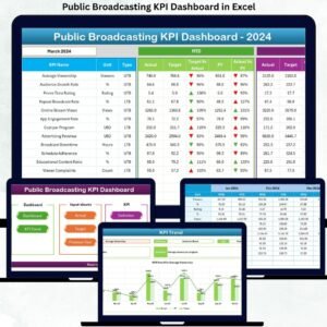
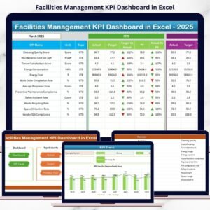
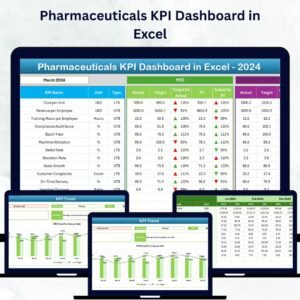
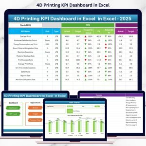
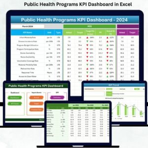
Public Health Programs KPI Dashboard in Excel Monitoring public health programs effectively is crucial for improving population health, reducing disease burden, and ensuring access to quality healthcare services 🏥. Public Health Programs KPI Dashboard in Excel With multiple initiatives running simultaneously, data coming from hospitals, clinics, and field surveys, and seasonal variations in health outcomes, it’s challenging to track performance accurately. The Public Health Programs KPI Dashboard in Excel offers a ready-to-use solution that helps health administrators, program managers, and policymakers monitor, analyze, and improve public health initiatives with ease.
Public Health Programs KPI Dashboard in Excel This dashboard collects key performance indicators (KPIs) in one place, allowing users to track Month-To-Date (MTD) and Year-To-Date (YTD) performance, compare actual values with targets, visualize trends, and make data-driven decisions. Built entirely in Excel, it’s accessible without specialized software skills and designed to streamline reporting and improve program efficiency.
Key Features of Public Health Programs KPI Dashboard in Excel 💡

-
Home Sheet – Easy Navigation 🏠: Six buttons allow quick access to all dashboard sheets, making navigation simple even for large programs.
-
Dashboard Sheet – Main Performance View 📊: Get a complete snapshot of MTD and YTD KPIs. Visual indicators like up/down arrows highlight areas performing above or below targets.
-
KPI Trend Sheet – Visualize Performance Over Time 📈: Track improvements, seasonal patterns, or recurring issues by visualizing MTD and YTD performance for each KPI.
-
Actual Numbers Input Sheet – Real-Time Data Entry ✍️: Enter actual performance numbers for all KPIs to ensure accurate dashboard visuals.
-
Target Sheet – Set Goals for KPIs 🎯: Input monthly and yearly target numbers for each KPI to measure progress effectively.
-
Previous Year Numbers Sheet – Historical Comparison 📅: Compare current performance with the previous year for informed decision-making.
-
KPI Definition Sheet – Clear Understanding 🔍: Includes KPI name, group, unit, formula, and definition, ensuring consistency and clarity in reporting.
What’s Inside the Public Health Programs KPI Dashboard 📦
-
Excel-Based Dashboard: Fully built in Excel with pre-configured formulas and charts.
-
Seven Interactive Worksheets: Home, Dashboard, KPI Trend, Actual Numbers Input, Target, Previous Year Numbers, and KPI Definition.
-
MTD & YTD Metrics: Track monthly and cumulative performance with visual cues for easy interpretation.
-
Trend Analysis: Identify seasonal or program-specific performance trends quickly.
-
User-Friendly Navigation: Buttons and drop-down menus make switching between sheets effortless.
How to Use the Public Health Programs KPI Dashboard 🖥️
-
Input actual and target KPI values in the Excel sheets regularly.
-
Use the Dashboard Sheet to monitor overall program performance and identify areas needing improvement.
-
Check the KPI Trend Sheet to analyze historical patterns and seasonal effects.
-
Reference the KPI Definition Sheet for precise explanations of each metric.
-
Compare MTD and YTD performance to ensure programs meet their targets.
-
Use insights to allocate resources effectively and improve overall program efficiency.
Who Can Benefit from This Dashboard 👥
-
Health Administrators: Gain clear visibility of all ongoing programs.
-
Program Managers: Monitor KPIs to ensure program goals are met.
-
Monitoring & Evaluation Teams: Track progress and identify gaps in real time.
-
Donors & Policymakers: Access standardized, easy-to-understand reports for accountability.
-
Field Staff: Understand performance trends and focus on critical areas.
This dashboard is perfect for any public health program looking to improve efficiency, accountability, and measurable impact while saving time on reporting and analysis.


Reviews
There are no reviews yet.