Ports and harbors are the heart of global commerce. Every day, thousands of vessels unload cargo, transfer containers, refill fuel, and navigate tight schedules. With so many moving parts—berth allocation, turnaround time, cargo handling, labor performance, vessel traffic, and equipment usage—manual reporting becomes slow, error-prone, and risky. Leaders need clarity, speed, and real-time visibility.
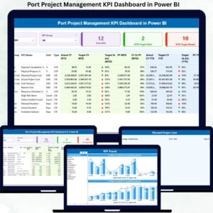
This is why the Ports and Harbors KPI Dashboard in Power BI is a powerful transformation tool. Ports and Harbors KPI Dashboard in Power BI It turns raw operational data into clean, visual insights that help port authorities monitor performance, detect delays instantly, and make smarter decisions. With dynamic slicers, KPI cards, monthly trends, and drill-through explanations, this dashboard becomes the control center for every maritime team.
Since it connects to a simple Excel file, updating the dashboard requires zero technical expertise. Just input monthly figures → refresh Power BI → start analyzing. Whether you manage cargo operations, port scheduling, fuel usage, or harbor administration, this dashboard gives you complete visibility in seconds.
Let’s explore everything inside this powerful maritime analytics tool 👇
✨ Key Features of the Ports and Harbors KPI Dashboard in Power BI
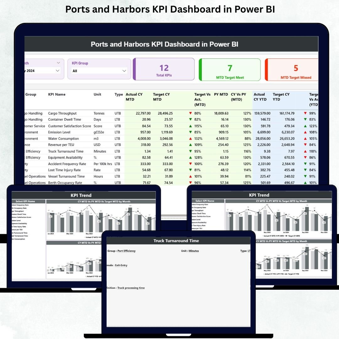
🚢 Monitor All Port Operations in One Dashboard
Track vessel traffic, cargo movement, turnaround time, berth utilization, equipment performance, and resource usage—all in one smart interface.
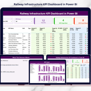
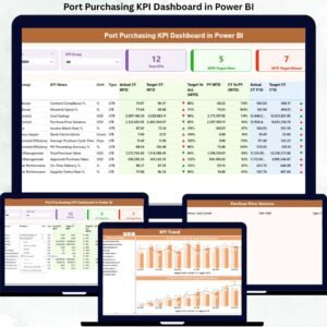
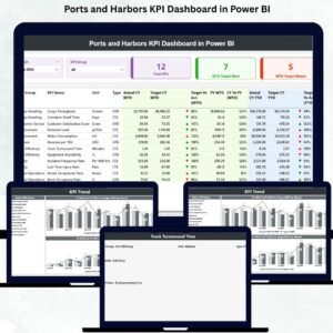
🎯 KPI Cards for Instant Performance Clarity
The Summary Page displays:
-
Total KPIs Count
-
MTD Target Met Count
-
MTD Target Missed Count
With green and red arrows, leaders know exactly where performance meets expectations and where action is needed.
🧭 Dynamic Slicers for Quick Filtering
Filter by Month and KPI Group to refresh all visuals instantly. Perfect for quick reviews, meetings, and operational discussions.
📈 MTD & YTD Insights in One View
Compare Actual vs Target vs Previous Year for both monthly and yearly performance. This side-by-side clarity helps detect operational bottlenecks immediately.
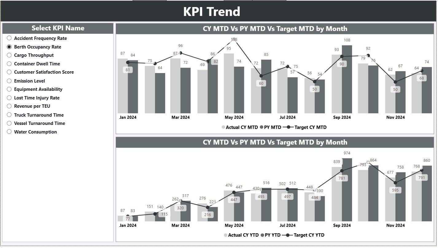
📊 Trend Analytics for Smarter Maritime Planning
The KPI Trend Page includes combo charts that show:
-
Current Year MTD
-
Previous Year MTD
-
MTD Targets
-
Current Year YTD
-
Previous Year YTD
-
YTD Targets
These trends reveal seasonal patterns, operational fluctuations, delays, and opportunities for improvement.
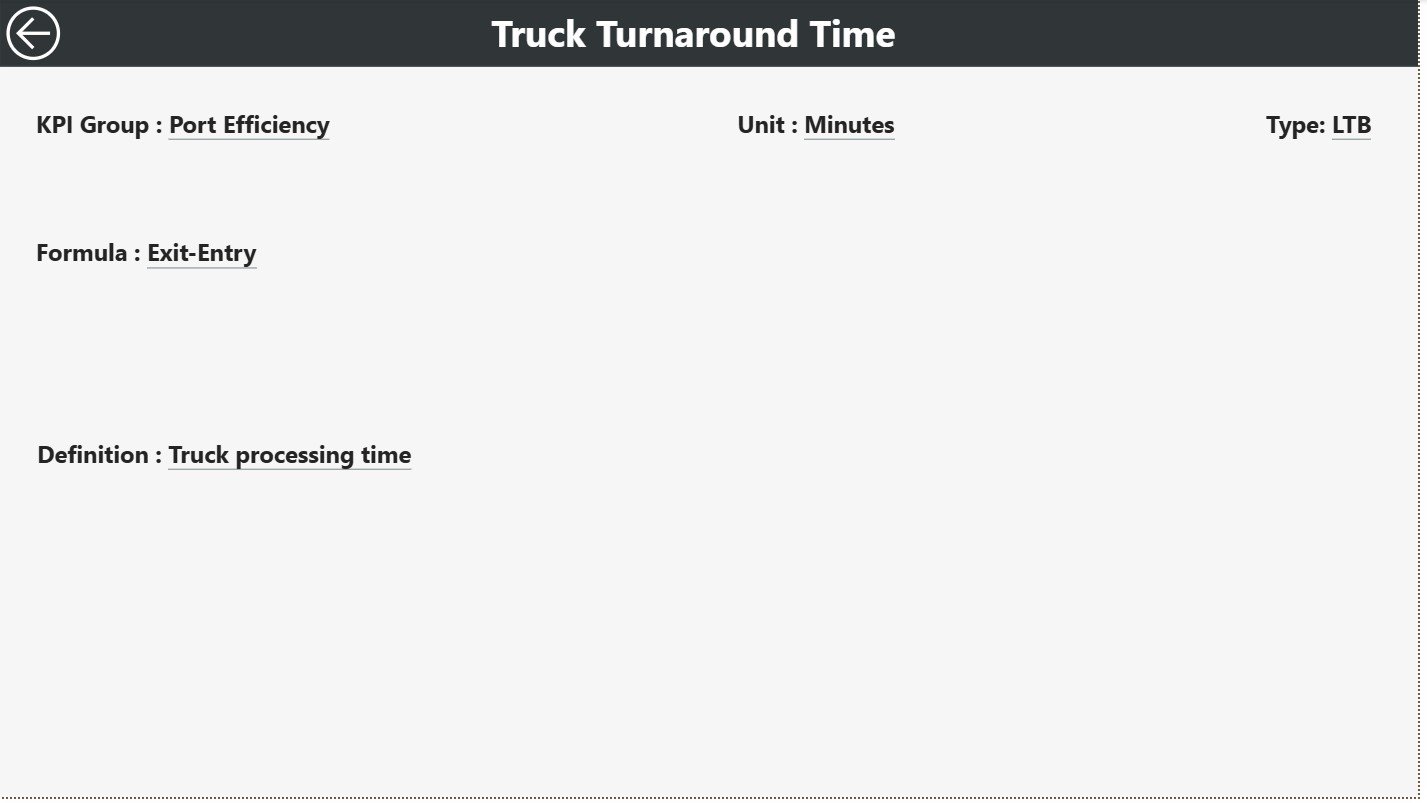
🔍 Drill-Through KPI Definitions for Transparency
Right-click any KPI → drill through to see:
-
KPI Number
-
Group
-
Formula
-
Unit
-
Definition
-
Type (UTB/LTB)
This eliminates confusion and helps standardize KPIs across departments.
📥 Excel-Driven Data Updates
All input comes from three simple sheets—Actual, Target, and Definition. Anyone can update the data without technical skills.
📦 What’s Inside the Ports and Harbors KPI Dashboard in Power BI
Your dashboard includes three structured pages, each designed to improve maritime decision-making.
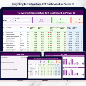
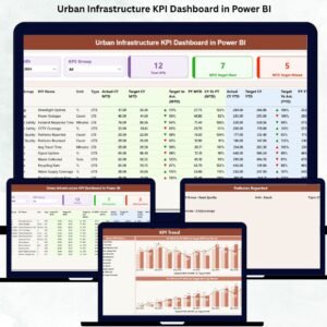
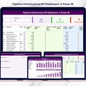
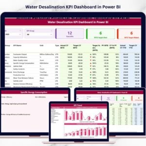
✔ Summary Page – Your Operational Command Center
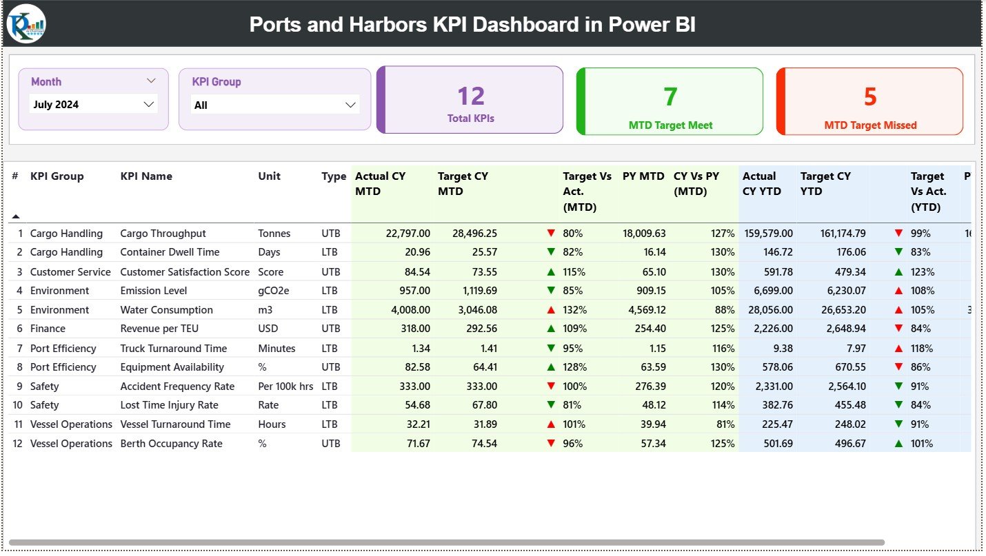
The Summary Page provides a quick overview of everything happening inside the port.
It includes:
-
Month & KPI Group slicers
-
KPI status cards
-
A detailed performance table with:
-
MTD Actual
-
MTD Target
-
Target vs Actual %
-
Previous Year MTD
-
CY vs PY (MTD)
-
YTD Actual
-
YTD Target
-
Target vs Actual % (YTD)
-
Performance icons
-
This page offers a complete picture of port efficiency in real time.
✔ KPI Trend Page – Understand Monthly & Yearly Patterns
This page uses combo charts to compare present vs past performance.
It helps maritime teams analyze:
-
Turnaround time patterns
-
Utility consumption
-
Cargo throughput variations
-
Equipment productivity
-
Berth occupancy changes
-
Seasonal fluctuations
Trend analysis empowers leaders to take proactive action.
✔ KPI Definition Page – Documentation with Clarity
This drill-through page shows detailed KPI definitions, formulas, and units.
It builds transparency and ensures everyone interprets KPIs in the same way.
✔ Excel Data Source (Backend)
The dashboard connects to three sheets:
-
Input_Actual
-
Input_Target
-
KPI Definition
This makes the dashboard simple, lightweight, and easy to maintain.
🛠 How to Use the Ports and Harbors KPI Dashboard in Power BI
Using the dashboard is simple:
➤ Step 1: Update Actual & Target Data
Fill the Input_Actual and Input_Target sheets with monthly MTD and YTD numbers.
➤ Step 2: Update KPI Definitions
Enter KPI names, formulas, units, groups, and types.
➤ Step 3: Refresh Power BI
Your entire dashboard updates instantly.
➤ Step 4: Use Slicers to Explore Insights
Filter by month or KPI group for deeper analysis.
➤ Step 5: Review Trends & Take Action
Use combo charts to detect unusual shifts or performance gaps.
👥 Who Can Benefit from This Dashboard
This tool is perfect for:
⚓ Port managers
🚢 Harbor authorities
📦 Cargo operation teams
🛠 Equipment & maintenance teams
📊 Maritime planners and analysts
🛳 Vessel scheduling teams
⛽ Fuel and utility departments
If you manage port operations, this dashboard will transform the way you monitor performance.


Reviews
There are no reviews yet.