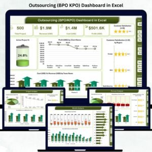
The Outsourcing (BPO KPO) Dashboard in Excel is a comprehensive performance-tracking solution designed to simplify data management for outsourcing companies. Whether you manage customer support, finance BPO, research KPO, or analytics services, this dashboard turns raw operational data into clear, actionable insights — all inside Microsoft Excel.
In today’s outsourcing world, success depends on efficiency, client satisfaction, and profitability. This ready-to-use Excel dashboard empowers managers and executives to track costs, monitor project delays, measure satisfaction, and optimize resources — without any coding or complex BI tools.
Built using Excel’s power of pivot tables, slicers, and dynamic charts, it’s the perfect choice for small-to-mid-sized outsourcing firms aiming to achieve enterprise-level analytics with minimal setup.
✨ Key Features of the Outsourcing (BPO KPO) Dashboard in Excel
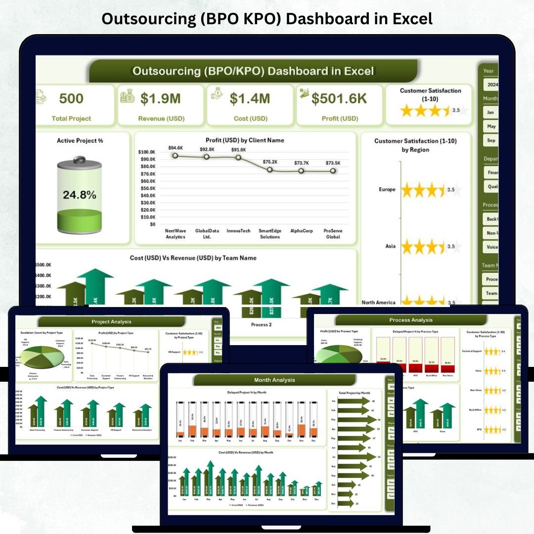
✅ 📊 Overview Page – The Executive Summary
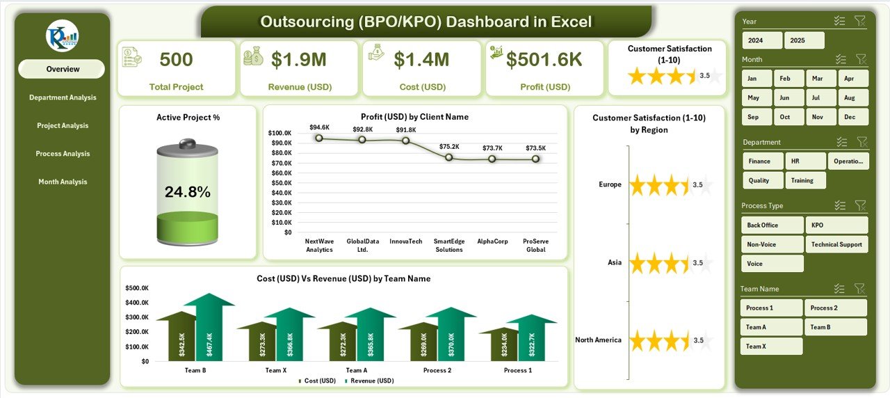
Your command center for all major KPIs.
-
Performance Cards: Active Project %, Total Profit (USD), Cost vs Revenue, Customer Satisfaction (1–10).
-
Visual Charts: Active Project %, Profit by Client, Satisfaction by Region, Cost vs Revenue by Team.
🎯 Quickly identify top clients, regional performance, and profit trends at a glance.
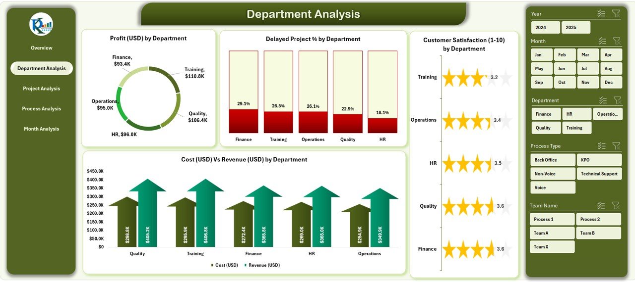
✅ 🏢 Department Analysis – Team Productivity & Profitability
Compare performance across departments such as Finance BPO, HR Services, or Tech Support.
-
Profit (USD) by Department
-
Delayed Project % by Department
-
Customer Satisfaction (1–10) by Department
-
Cost vs Revenue by Department
💡 Spot underperforming units, optimize workloads, and increase operational efficiency.
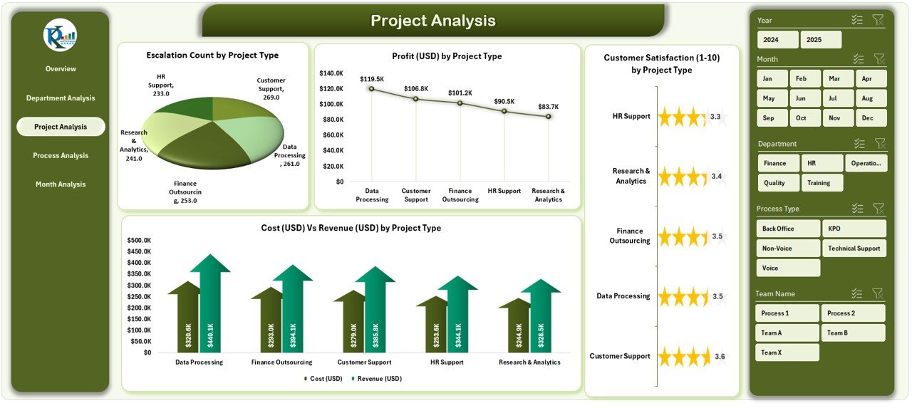
✅ 📁 Project Analysis – Profitability by Project Type
Dive into project-level insights:
-
Profit (USD) by Project Type
-
Delayed Project % by Project Type
-
Satisfaction Score by Project Type
-
Cost vs Revenue by Project Type
📈 Understand which project types deliver maximum ROI and which require improvement.
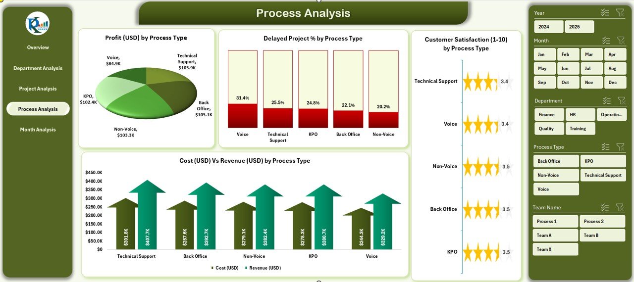
✅ ⚙️ Process Analysis – Workflow Efficiency Insights
Evaluate the performance of each process — from data entry to research analytics.
-
Profit (USD) by Process Type
-
Delayed Project % by Process Type
-
Satisfaction (1–10) by Process Type
-
Cost vs Revenue by Process Type
🧠 Identify process bottlenecks and reduce cost leaks efficiently.
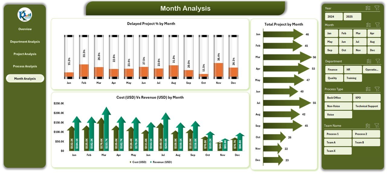
✅ 📅 Month Analysis – Time-Based Performance Trends
Track how results evolve month-to-month.
-
Delayed Project % by Month
-
Cost vs Revenue by Month
-
Total Projects by Month
📊 Forecast demand, analyze seasonality, and align resources proactively.
📦 What’s Inside the Dashboard
📁 Five Interactive Pages: Overview | Department | Project | Process | Month Analysis
📂 Support Sheet: Data Sheet for all records (Client, Department, Process, Cost, Revenue, Satisfaction, Duration).
🎯 Core KPIs Tracked:
-
Active Project %
-
Profit (USD)
-
Cost vs Revenue (USD)
-
Delayed Project %
-
Satisfaction Score (1–10)
💡 All pages use slicers and charts for interactive exploration — no macros required.
⚙️ How to Use the Dashboard
1️⃣ Enter monthly data (cost, revenue, client name, etc.) in the Data Sheet.
2️⃣ Click Refresh All to update pivots and charts instantly.
3️⃣ Use slicers to filter by department, process, client, or month.
4️⃣ Navigate via page buttons to view specific insights.
5️⃣ Export summaries as PDF for management reviews.
💡 No VBA required — everything works through Excel’s built-in features.
👥 Who Can Benefit from This Dashboard
📞 BPO Managers – Track active projects and client profitability.
🧮 Finance Teams – Compare cost vs revenue for each department.
📊 Operations Heads – Analyze delays and department performance.
🧠 KPO Analysts – Measure research accuracy and client satisfaction.
💼 Executives & Owners – Monitor business health from a single file.
This Excel dashboard is your ready-to-use command center for measuring outsourcing success.
💡 Why Excel Is Perfect for Outsourcing Analytics
✔️ No Software Cost — Works 100 % inside Microsoft Excel.
✔️ Offline Access — Use anywhere, anytime.
✔️ Customizable — Add KPIs, departments, or clients as needed.
✔️ Easy Sharing — Send files via email or cloud.
✔️ No Coding — All visuals auto-update through formulas and pivots.
💡 A simple yet powerful alternative to expensive BI tools.
🧭 Best Practices for Using the Dashboard
🟢 Maintain consistent naming in data entries.
🟢 Update data monthly for accurate trend analysis.
🟢 Use conditional formatting to highlight low scores.
🟢 Back up the file periodically to preserve historical data.
🟢 Train team members to interpret dashboard insights effectively.


Reviews
There are no reviews yet.