The media and journalism industry moves fast—stories change every second, platforms evolve, and reader engagement shifts rapidly. Editors, reporters, digital teams, and newsroom managers need clear, real-time insights to stay ahead. But when data spreads across multiple sheets, tools, or platforms, decision-making becomes slow and confusing.
This is exactly why the News & Journalism Dashboard in Power BI becomes an essential reporting solution for modern newsrooms.
This ready-to-use Power BI dashboard brings every important journalism metric into one clean, visual, and interactive system. Whether you manage articles, reporters, categories, promotions, or monthly content trends—this dashboard shows everything instantly. It removes manual work, improves clarity, and empowers teams to take data-driven decisions faster.
Perfect for media houses, digital publishers, editors, corporate communication teams, and content strategists—this dashboard ensures your newsroom operates with full efficiency and accuracy.
📰 Key Features of the News & Journalism Dashboard in Power BI
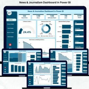
This dashboard includes 5 professionally designed pages, each offering deep insights into article performance, categories, reporters, reach, and publishing trends. Below is a complete breakdown of each page.
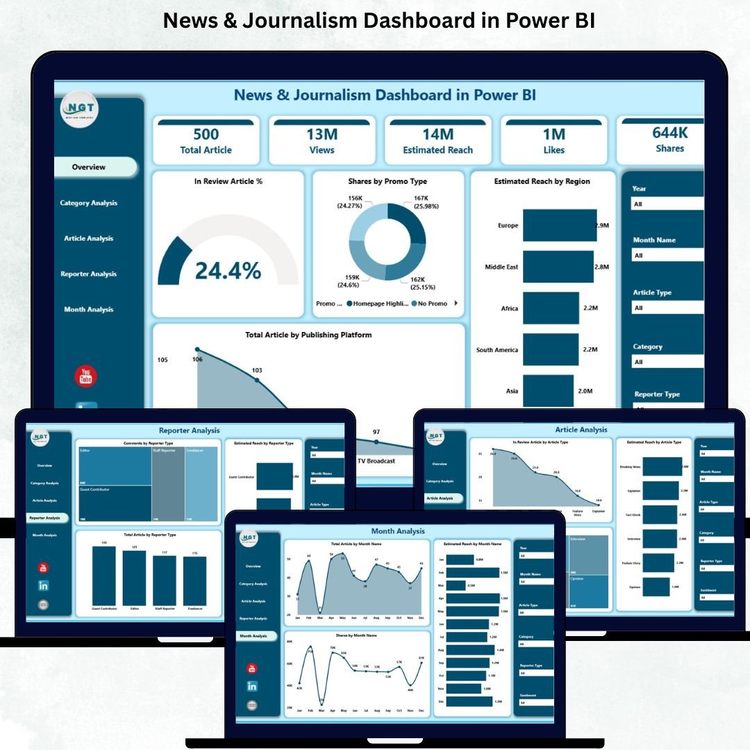
⭐ 1. Overview Page – The Main Control Center
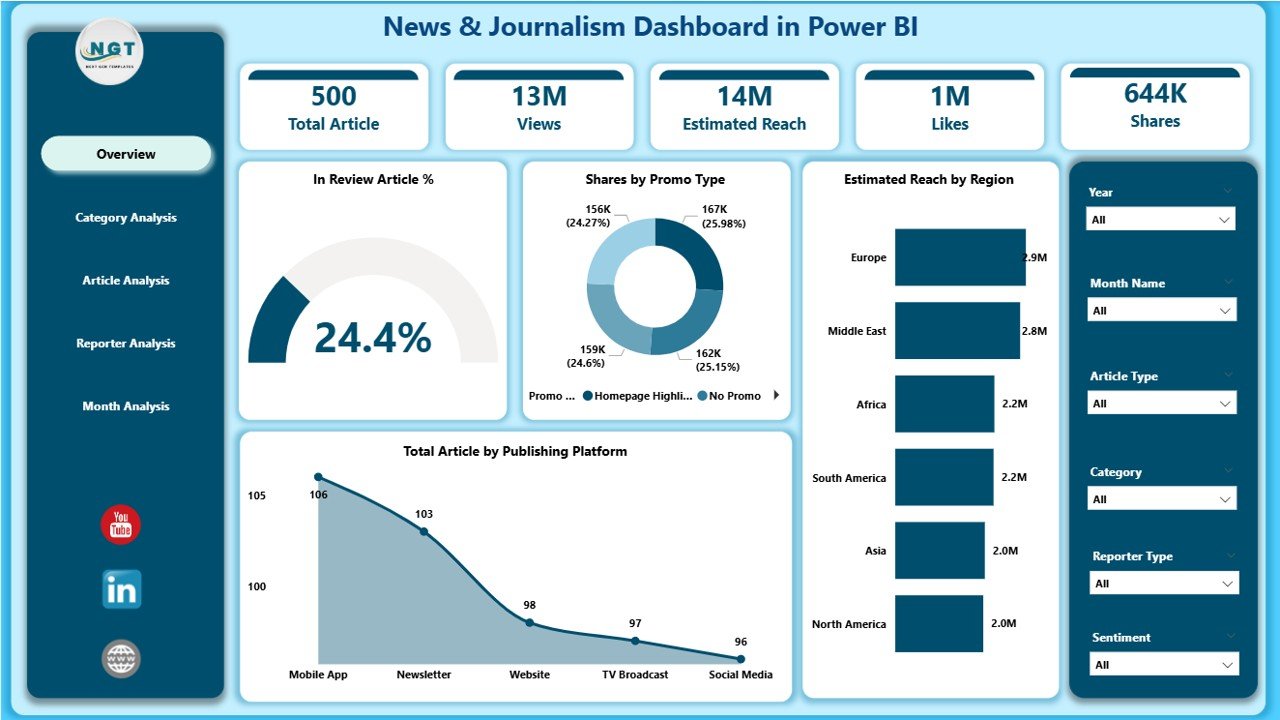
The Overview Page gives a clean snapshot of newsroom performance. It includes:
🔹 Four Essential KPI Cards
These help you monitor daily and monthly content health:
-
In Review Article %
-
Share by Promo Type
-
Estimated Reach by Region
-
Total Articles by Publishing Platform
Each card updates dynamically based on slicers.
🔹 Interactive Charts
The page includes four powerful visual charts:
-
📊 In Review Article %
-
🌍 Estimated Reach by Region
-
📰 Total Articles by Publishing Platform
-
🎯 Share by Promo Type
These visuals make it easy to understand where your content stands and how your audience interacts with it.
This page works as the newsroom’s real-time performance dashboard.
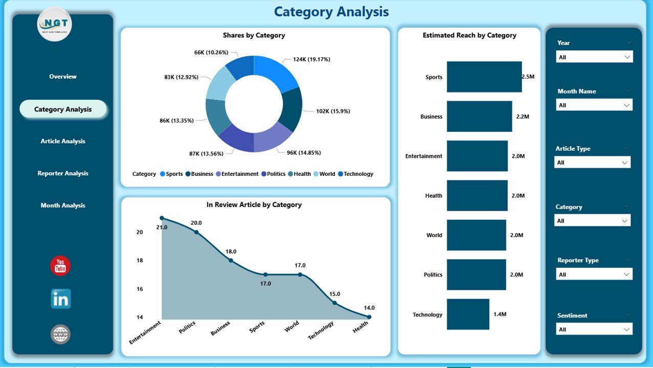
⭐ 2. Category Analysis Page – Deep Category-Level Insights
The Category Analysis Page helps you measure performance across different article categories such as politics, entertainment, sports, finance, lifestyle, and more.
Charts Included:
-
🗂 In Review Article by Category
-
🎯 Share by Category
-
🌐 Estimated Reach by Category
These insights help editors and content strategists understand which categories perform well, need improvement, or require more focus.
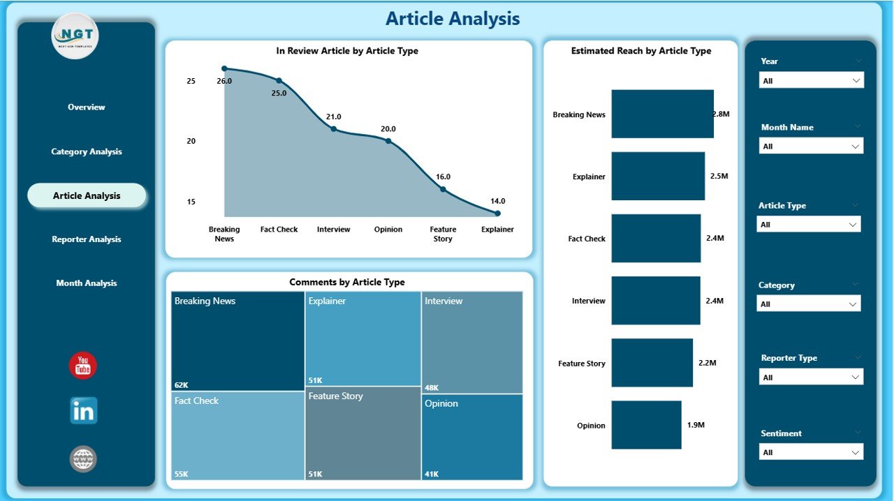
⭐ 3. Article Analysis Page – Understand Article Type Performance
Different article types perform differently—breaking news, editorials, interviews, explainers, and more.
This page helps you identify what content formats your audience prefers.
Charts Included:
-
📝 In Review Article by Article Type
-
💬 Comments by Article Type
-
📡 Estimated Reach by Article Type
These visuals allow content teams to plan better formats, improve engagement, and optimize content strategy.
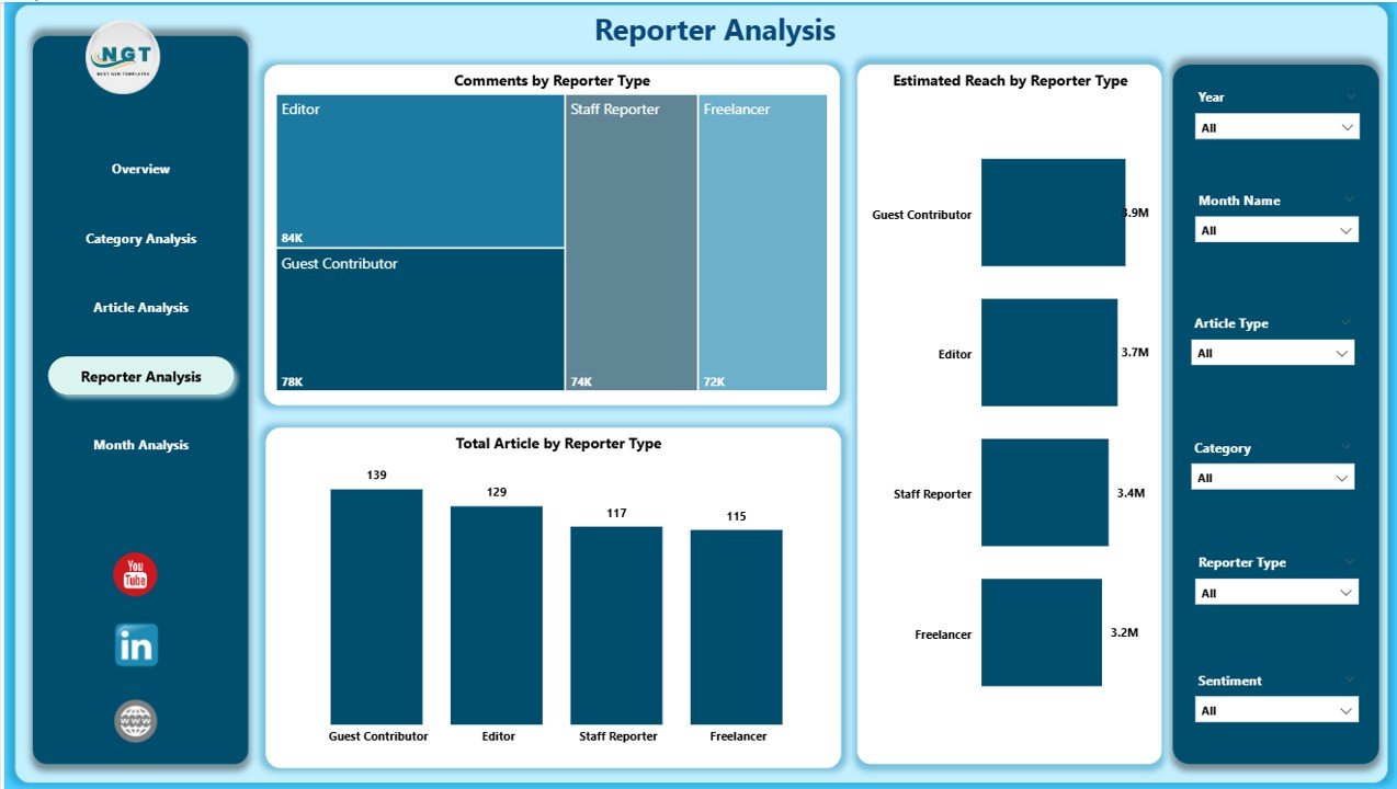
⭐ 4. Reporter Analysis Page – Track Reporter Productivity & Impact
A modern newsroom needs visibility into reporter performance.
The Reporter Analysis Page highlights:
-
📰 Total Articles by Reporter Type
-
💬 Comments by Reporter Type
-
🌍 Estimated Reach by Reporter Type
These insights help identify top-performing reporters, high-engagement contributors, and improvement areas.
This is extremely valuable for editorial planning and performance reviews.
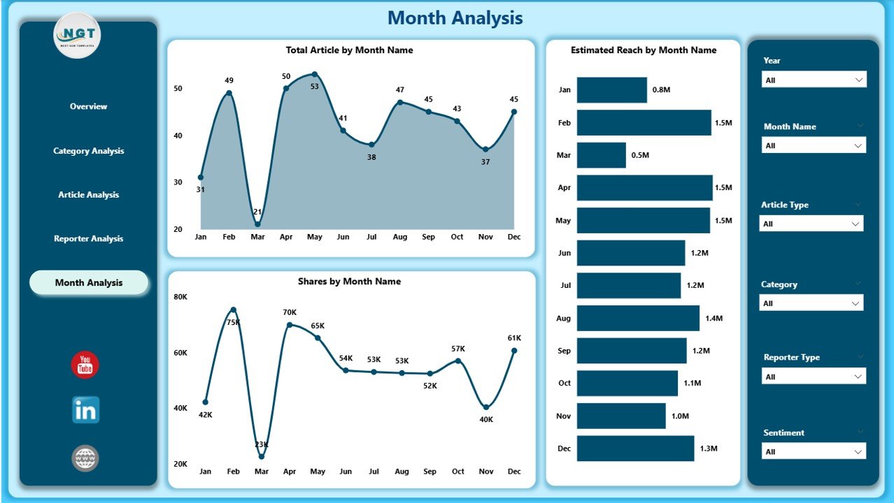
⭐ 5. Monthly Trends Page – Track the Pulse of Publishing Activity
The final page, Monthly Trends, gives a month-by-month breakdown of newsroom performance.
Charts Included:
-
📅 Total Articles by Month
-
🌍 Estimated Reach by Month
-
📈 Share by Month
These visuals help teams understand seasonal trends, special event impact, publishing cycles, and growth opportunities.
🎯 What’s Inside the News & Journalism Dashboard?
-
✔ 5 fully interactive Power BI pages
-
✔ Real-time slicers for platform, region, promo type & category
-
✔ KPI cards for instant content health monitoring
-
✔ Deep analysis on reporters, categories & article types
-
✔ Monthly visual trends for planning
-
✔ Clean layout with attractive visuals
-
✔ Excel-driven data source for easy updates
-
✔ Zero coding required—just refresh and use
👥 Who Can Benefit from This Dashboard?
-
Newsrooms & Media Houses
-
Digital Publishing Teams
-
Editors & Content Managers
-
Corporate Communication Teams
-
PR & Media Strategy Departments
-
Online News Portals
-
Journalism Schools & Researchers
-
Freelance Editorial Agencies
Anyone who manages content, audience engagement, or newsroom analytics will benefit from this dashboard.
🛠 How to Use the Dashboard
-
Update article, reach, category & reporter data in Excel
-
Refresh the Power BI file
-
Use slicers to filter by month, category, region, promo type, or platform
-
Review each page for detailed insights
-
Track content performance, engagement & reach
-
Use trend charts for planning future content
-
Optimize categories, reporters & publishing platforms based on insights
### Click here to read the Detailed Blog Post
📺 Visit our YouTube channel to learn step-by-step video tutorials
👉Visit our YouTube channel to learn step-by-step video tutorials


Reviews
There are no reviews yet.