


The Hospitals Dashboard in Excel is an all-in-one healthcare analytics solution built for modern hospital administrators, finance teams, and quality managers. 💉
In today’s fast-moving medical world, managing hospital performance, patient satisfaction, and costs can be overwhelming — especially when data is scattered across multiple spreadsheets. This ready-to-use Excel dashboard centralizes everything, transforming raw data into meaningful visuals that drive smarter, faster decisions.
From treatment cost trends to patient satisfaction scores and insurance coverage breakdowns, this dashboard provides a complete picture of hospital performance — instantly and without needing any additional software.
✨ Key Features of the Hospitals Dashboard in Excel
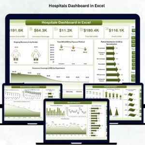
✅ 📊 Overview Page – Complete Hospital Snapshot

See your entire hospital’s performance at a glance.
Includes:
-
Page Navigator for quick movement between analytical pages.
-
Five KPI Cards:
-
Total Treatment Cost
-
Total Profit
-
Average Patient Satisfaction
-
Ongoing Recovery %
-
Total Insurance Coverage
-
-
Four Charts:
-
Ongoing Recovery % by Gender
-
Total Bill (USD) by Payment Method
-
Patient Satisfaction (1–10) by Specialization
-
Insurance Coverage (USD) by Department
💡 Perfect for leadership meetings or quick hospital overviews.
-
✅ 🏥 Department Analysis Page – Evaluate Departmental Performance
Dive deep into every department’s performance metrics.
Charts include:
-
Treatment Cost (USD) by Department
-
Discount (USD) by Department
-
Patient Satisfaction (1–10) by Department
-
Profit (USD) by Department
📈 Identify departments that are thriving and those that need cost optimization.
✅ 🏨 Hospital Analysis Page – Multi-Hospital Comparison
For healthcare groups with multiple hospitals.
Visuals:
-
Treatment Cost (USD) by Hospital Name
-
Patient Satisfaction (1–10) by Hospital Name
-
Insurance Coverage (USD) by Hospital Name
-
Total Bill (USD) by Hospital Name
🌍 Ideal for organizations managing multiple hospitals or clinics.
✅ 📍 Branch Location Analysis Page – Regional Performance
Track how each branch performs across key metrics:
-
Treatment Cost, Patient Satisfaction, Insurance Coverage, and Total Bill (USD) by Branch Location.
🌆 Spot performance differences between regions and make informed resource allocation decisions.
✅ 📅 Month Analysis Page – Time-Based Trend Insights
Understand how your hospital’s performance evolves month over month.
Charts:
-
Treatment Cost (USD) by Month
-
Insurance Coverage (USD) by Month
-
Discount (USD) by Month
-
Profit (USD) by Month
📆 Great for identifying seasonal trends and cost fluctuations.
📦 What’s Inside the Dashboard
💾 Included Worksheets:
1️⃣ Overview Page – Summary of key KPIs and charts.
2️⃣ Department Analysis Page – Department-wise analytics.
3️⃣ Hospital Analysis Page – Multi-unit comparison.
4️⃣ Branch Location Page – Regional performance breakdown.
5️⃣ Month Analysis Page – Trend analysis over time.
6️⃣ Data Sheet – Backend for inputting hospital data.
7️⃣ Support Sheet – Contains formulas, dropdowns, and data validations.
⚙️ Update your Data Sheet — all visuals refresh automatically!
👥 Who Can Benefit from This Dashboard
🏥 Hospital Administrators – Track KPIs, patient data, and department performance.
💰 Finance Teams – Analyze costs, discounts, and profitability trends.
🧑⚕️ Quality Teams – Evaluate patient satisfaction and recovery rates.
🏢 Department Heads – Manage budgets and monitor efficiency.
📊 Consultants & Analysts – Assess hospital performance for reports.
💡 Advantages of the Hospitals Dashboard in Excel
✅ All-in-One Analytics: View patient, operational, and financial KPIs in one file.
✅ Instant Visual Insights: No coding, no setup — just open and analyze.
✅ Cost-Effective: Built entirely in Excel — no extra software needed.
✅ Accurate & Automated: Formulas and data validation minimize errors.
✅ User-Friendly Interface: Easy for anyone with basic Excel skills.
✅ Customizable: Modify KPIs, visuals, or slicers to fit your hospital’s needs.
✅ Scalable: Works for single hospitals or entire healthcare networks.
⚡ Turn your hospital data into actionable insights — without spending on complex BI tools.
🧠 Best Practices for Using the Dashboard
✔️ Update data regularly (weekly or monthly).
✔️ Use consistent formatting for departments and branches.
✔️ Apply slicers to filter data by month, department, or hospital.
✔️ Protect formula cells to prevent accidental edits.
✔️ Backup your dashboard before updates.
✔️ Use color coding (🟢 = growth, 🔴 = decline) for quick visual cues.
Following these practices keeps your dashboard reliable and insightful.


Reviews
There are no reviews yet.