
In the highly competitive food and beverage (F&B) industry, every decision — from pricing to production — can impact profitability. The Food and Beverage Dashboard in Power BI offers a smart, visual, and data-driven solution for managing all aspects of business performance.
This ready-to-use dashboard consolidates key data from sales, production, finance, and supply chain departments into a single, interactive Power BI workspace. It empowers decision-makers to monitor performance metrics, identify trends, and take corrective actions quickly — all without needing advanced analytics skills.
Built entirely in Microsoft Power BI, the dashboard connects seamlessly to your Excel data or ERP system, giving you real-time visibility into costs, margins, and sales trends. Whether you’re managing a restaurant chain, beverage plant, or food distributor, this tool helps you make faster, more informed business decisions.
⚙️ Key Features of the Food and Beverage Dashboard in Power BI
The dashboard includes five powerful analytical pages, each tailored to address critical business insights across the F&B value chain.
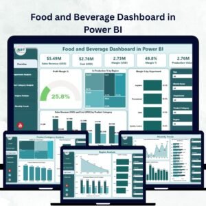
🍽️ 1️⃣ Overview Page – The Executive Summary
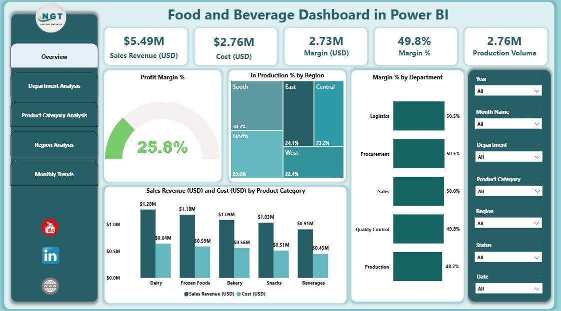
The Overview Page acts as the control center of your operations.
Key Components:
-
KPI Cards: Show Total Sales Revenue, Total Cost, and Profit Margin %.
-
Interactive Charts:
-
Profit Margin % Over Time
-
In Production % by Region
-
Margin % by Department
-
Sales Revenue (USD) vs Cost (USD) by Product Category
-
-
Dynamic Slicers: Filter data by region, time period, or department for precise analysis.
This page gives leaders an at-a-glance understanding of business performance, helping them identify top-performing areas and cost inefficiencies.
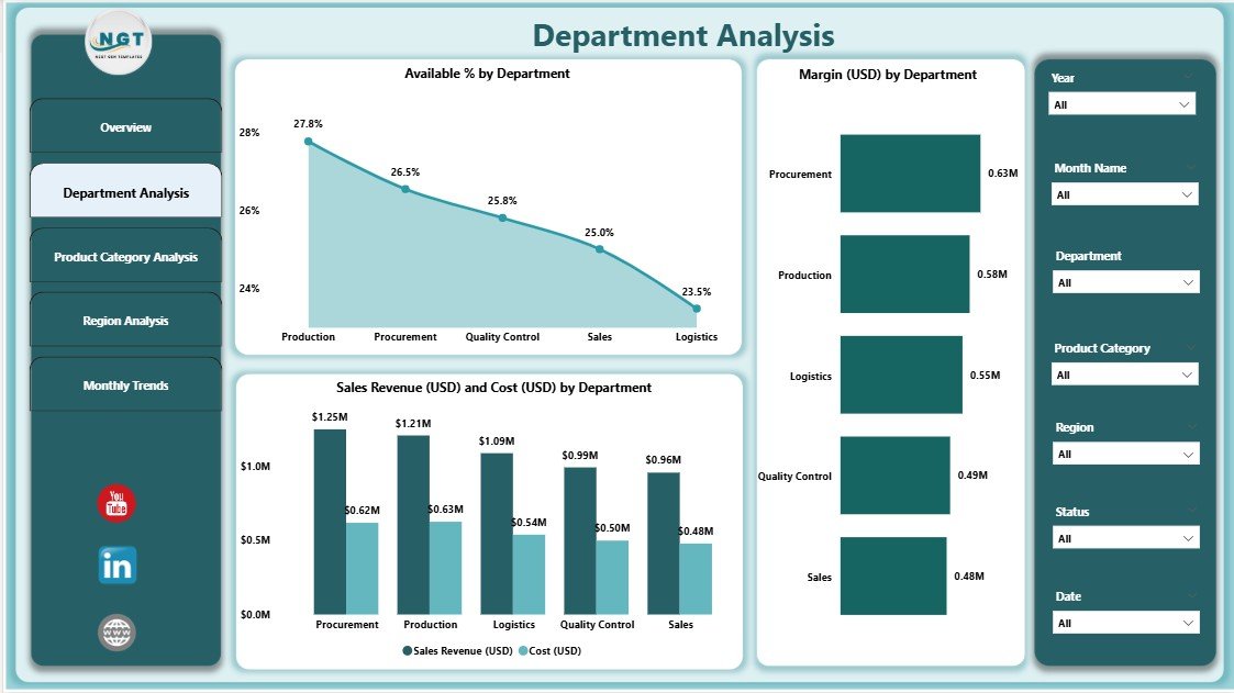
🏭 2️⃣ Department Analysis Page – Track Efficiency by Function
Each department plays a unique role in business success. The Department Analysis Page helps managers evaluate performance across departments like production, sales, logistics, or marketing.
Charts Featured:
-
Available % by Department
-
Margin (USD) by Department
-
Sales Revenue (USD) and Cost (USD) by Department
These insights help allocate budgets effectively and boost departmental accountability.
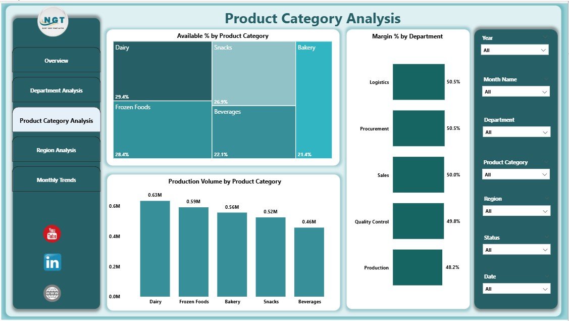
🥫 3️⃣ Product Category Analysis Page – Understand Product Profitability
Monitor product category performance — from snacks to beverages to packaged goods — and identify which categories drive the most profit.
Charts Displayed:
-
Available % by Product Category
-
Margin % by Product Category
-
Production Volume by Product Category
Category managers can use this data to plan inventory, optimize pricing, and develop targeted promotions.
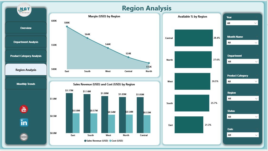
🌍 4️⃣ Region Analysis Page – Geographic Performance Insights
For multi-location F&B businesses, the Region Analysis Page offers powerful geographical analytics.
Visuals Include:
-
Margin (USD) by Region
-
Available % by Region
-
Sales Revenue and Cost (USD) by Region
These charts highlight the best-performing regions, helping teams focus marketing efforts and resources efficiently.
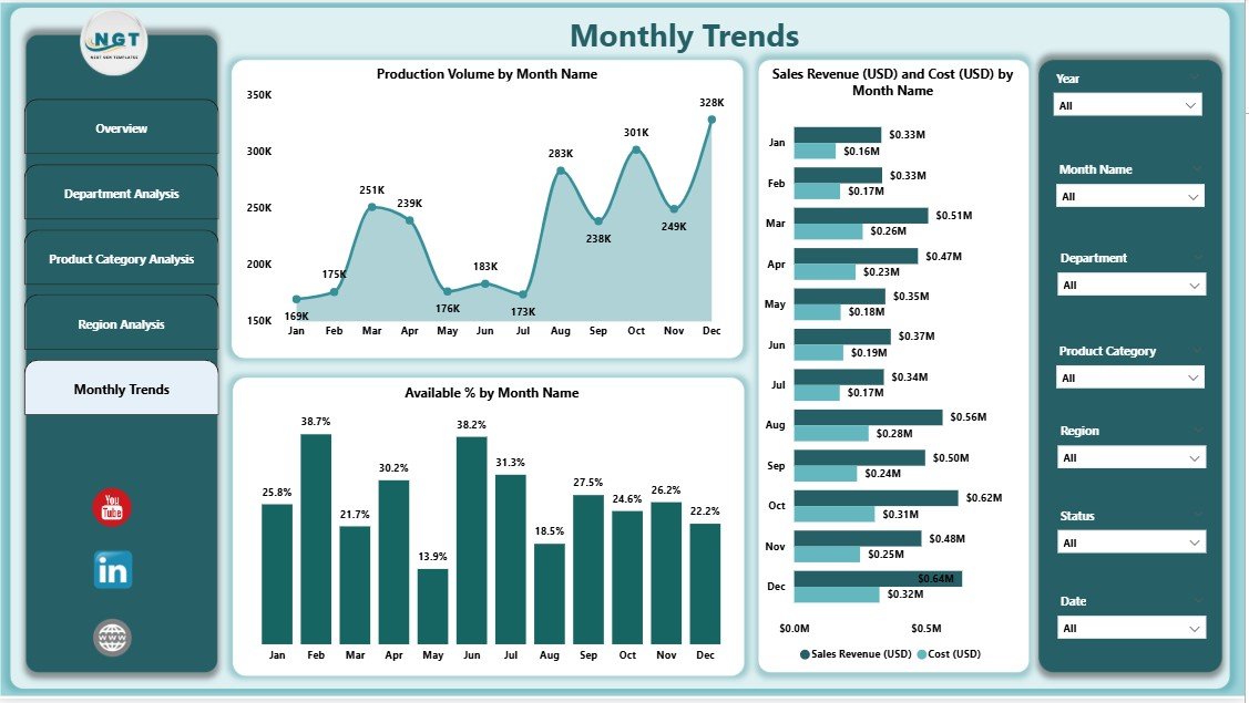
📅 5️⃣ Monthly Trends Page – Track Seasonality and Growth
The Monthly Trends Page visualizes how production, sales, and costs change over time.
Main Visuals:
-
Production Volume by Month
-
Sales Revenue and Cost (USD) by Month
-
Available % by Month
This helps management forecast demand, reduce waste, and plan operations based on seasonal cycles.
💡 Why Power BI Is Perfect for the F&B Industry
Power BI enables real-time data analysis that goes beyond traditional Excel reports.
Top Benefits:
-
Seamless Data Integration: Works with Excel, SQL, ERP, and cloud systems.
-
Real-Time Insights: Data auto-refreshes to keep performance metrics current.
-
Interactive Visuals: Users can drill down into specifics without coding.
-
Scalable Design: From small restaurants to global enterprises, it adapts easily.
-
Professional Reporting: Beautiful visuals make insights easy to understand and share.
With Power BI, businesses can transform raw numbers into actionable intelligence that drives profit and efficiency.
📊 Advantages of the Food and Beverage Dashboard in Power BI
1️⃣ Real-Time Performance Tracking – Monitor key metrics like margin %, costs, and production across all departments.
2️⃣ Better Decision-Making – Quickly identify profit leaks, bottlenecks, and opportunities.
3️⃣ Improved Forecasting – Monthly trend analysis enables accurate demand and production planning.
4️⃣ Departmental Accountability – Compare performance by team or business unit.
5️⃣ Regional Insights – Pinpoint the most profitable locations and address underperformance.
6️⃣ Customization Ready – Easily add KPIs or integrate more data sources as your operations expand.
🔧 How to Build and Use the Dashboard
1️⃣ Prepare Your Data: Organize sales, cost, and production data in Excel.
2️⃣ Import to Power BI: Connect the dataset and establish relationships.
3️⃣ Design Overview & Analysis Pages: Use charts, slicers, and KPI cards.
4️⃣ Apply Conditional Formatting: Highlight performance changes visually.
5️⃣ Publish & Share: Share the dashboard securely via Power BI Service or Teams.
This simple workflow turns manual reporting into automated, interactive analytics.
📈 Best Practices for Effective Dashboard Use
✔️ Define clear KPIs such as Profit Margin % and Sales Growth.
✔️ Keep visuals consistent with brand colors and layout.
✔️ Update data regularly for accurate analysis.
✔️ Limit visuals per page to avoid clutter.
✔️ Schedule data refreshes and monitor performance trends.
✔️ Use storytelling — start from the Overview and drill into deeper insights.
🧭 Who Can Benefit from This Dashboard
-
🍳 Restaurant Owners: Track menu performance and profitability.
-
🏭 F&B Manufacturers: Monitor production efficiency and cost control.
-
💼 Finance Teams: Analyze margin and cost trends.
-
🚚 Supply Chain Professionals: Manage logistics, inventory, and availability.
-
📊 Executives: Gain real-time, cross-functional insights.
🔗 Click here to read the Detailed Blog Post
🎥 Visit our YouTube channel for tutorials
🔗 YouTube.com/@PKAnExcelExpert


Reviews
There are no reviews yet.