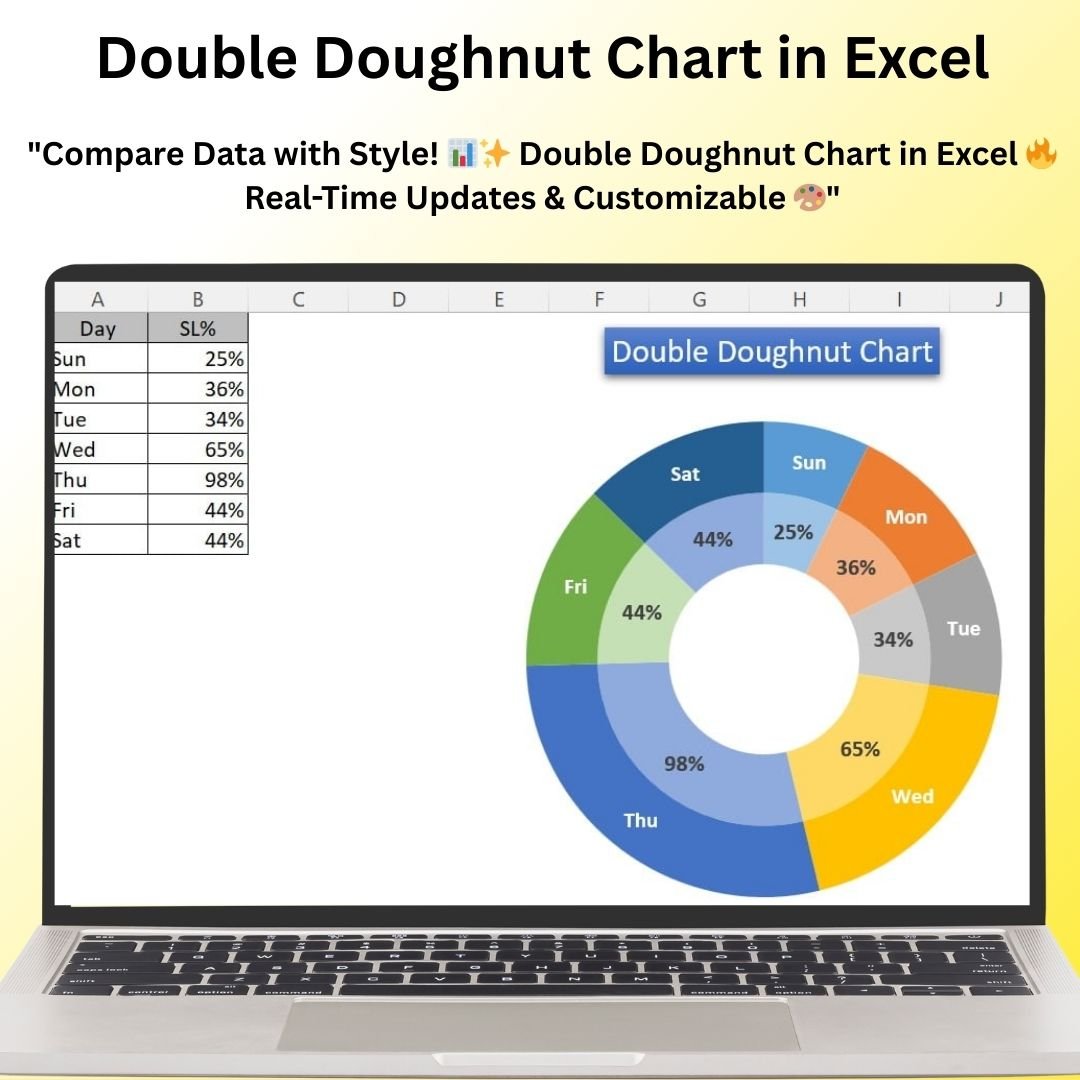
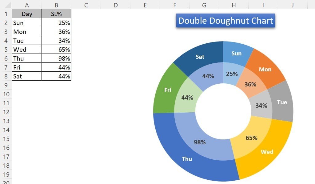
The Double Doughnut Chart in Excel is an advanced and visually captivating chart template that provides a clear and efficient way to display and compare two sets of data within a single visual. This powerful chart allows you to showcase part-to-whole relationships for two different categories, making it an ideal tool for performance tracking, project progress, or any scenario where you need to compare two data sets.
By using two concentric doughnut rings, this chart presents two related data series side-by-side, offering a dual perspective on your data. Whether you’re tracking the performance of two teams, comparing two different metrics, or showcasing sales goals versus actual results, the Double Doughnut Chart in Excel makes it easier to convey insights and comparisons clearly and effectively.
Key Features of the Double Doughnut Chart in Excel
📌 Dual Data Series Visualization
The Double Doughnut Chart allows you to compare two sets of data within a single chart. Each ring of the doughnut represents a different data series, making it easy to compare two related metrics at a glance.
🛠 Customizable Data and Labels
Easily adjust the chart to display the data that’s most relevant to your needs. Customize the colors, labels, percentages, and data points to match your specific project or reporting requirements.
💡 Visually Clear Comparison
The concentric doughnut rings allow for clear side-by-side comparison of two data series. Whether you’re tracking performance, progress, or other key metrics, the chart provides a clean and intuitive way to view your data.
🔢 Real-Time Data Updates
As you update your data, the chart automatically adjusts to reflect the new values. This feature ensures that your chart is always up-to-date and provides accurate insights in real time.
🚀 Multiple Use Cases
This chart is versatile and can be used for a wide variety of applications, including comparing budget vs. actual spending, sales goals vs. actual sales, or tracking project milestones versus targets.
📊 Dynamic Data Representation
The Double Doughnut Chart offers an interactive way to visualize your data. You can customize the chart’s radius, thickness, and segments to create a representation that suits your presentation style.
⚙ Easy Customization and Setup
The template is easy to set up and does not require advanced Excel skills. With clear instructions and straightforward customization options, you can quickly create a chart tailored to your specific needs.
🚀 Why You’ll Love the Double Doughnut Chart in Excel
✅ Dual Data Visualization – Display and compare two sets of data with ease. ✅ Customizable and Flexible – Adjust colors, labels, and data points to match your requirements. ✅ Real-Time Updates – Automatically adjust as new data is entered. ✅ Visually Engaging – Compare data in a clear and visually appealing way. ✅ Easy to Use – Quick setup with simple instructions and no advanced Excel skills required.
📂 What’s Inside the Double Doughnut Chart in Excel?
- Dual Doughnut Rings: Display two sets of data side-by-side for easy comparison.
- Customizable Labels and Data: Modify the chart to fit your specific data points and labels.
- Real-Time Updates: Automatically update the chart as data changes.
- Dynamic Visuals: Adjust the thickness, radius, and segments for optimal data representation.
- Simple Setup: Clear instructions to help you customize and implement the chart quickly.
🔍 How to Use the Double Doughnut Chart in Excel
1️⃣ Download the Template – Get instant access to the Excel file upon purchase. 2️⃣ Customize Your Data – Modify the data points, labels, and colors to fit your specific project or metrics. 3️⃣ Enter Your Data – Input your data, and the chart will automatically update. 4️⃣ Track Progress – Compare the two data series visually with the dual doughnut rings. 5️⃣ Present and Share – Use the chart in meetings, reports, or presentations for a professional, visual comparison of your data.
🎯 Who Can Benefit from the Double Doughnut Chart in Excel? 🔹 Business Analysts 🔹 Project Managers 🔹 Sales Teams 🔹 Marketing Professionals 🔹 Financial Analysts 🔹 Anyone needing to compare two related data sets visually
The Double Doughnut Chart in Excel is a powerful tool for comparing two sets of related data in a clean, visually engaging format. Ideal for performance tracking, project milestones, or sales goals, this chart makes data comparisons easier and more insightful.
Click here to read the Detailed blog post
https://www.pk-anexcelexpert.com/double-doughnut-chart-in-excel/


Reviews
There are no reviews yet.