Financial clarity is the Debt-to-Equity Ratio KPI Dashboard of strong business decisions. Whether you are a CFO, finance manager, investor, or startup founder, you must track leverage, capital structure, debt load, and equity growth continuously. One of the most important KPIs for this purpose is the Debt-to-Equity Ratio—a direct indicator of financial stability and long-term risk. But reviewing these insights manually in Excel becomes slow and prone to errors. That is why the Debt-to-Equity Ratio KPI Dashboard in Power BI becomes the perfect solution.
This ready-to-use Power BI dashboard transforms raw financial data into real-time insights through smart visuals, trends, slicers, performance icons, and interactive charts. With just one click, you can track MTD performance, YTD progress, previous-year comparisons, and target achievements. Everything becomes automated, visual, and easy to interpret.
Whether you want to analyze debt growth, evaluate equity strength, prepare board presentations, or identify financial risks, this dashboard gives you complete visibility—with zero coding and minimal setup. Just update your Excel sheets and refresh Power BI. The entire report updates instantly.
Let’s look deeper into what makes this dashboard powerful, practical, and essential for every finance leader.
📊 Key Features of the Debt-to-Equity Ratio KPI Dashboard in Power BI
This dashboard is built with a clean structure and three fully interactive pages. All data flows from three Excel sheets—Input_Actual, Input_Target, and KPI Definition—which ensures flexibility and simple maintenance.
Here’s what makes this dashboard incredibly effective:
-
🚀 Auto-refresh visuals driven by Excel data
-
🎯 KPI cards with instant MTD/YTD performance
-
📉 Icons showing target met/missed status
-
🔍 Drill-through capability to understand KPI formulas
-
📆 Powerful MTD and YTD trend charts
-
🧭 Smart slicers to explore KPIs by month and category
-
📚 Clean table structure for complete transparency
Now let’s explore each page in detail.
📌 What’s Inside the Debt-to-Equity Ratio KPI Dashboard in Power BI?
The dashboard contains three highly practical pages that cover financial performance from every angle.
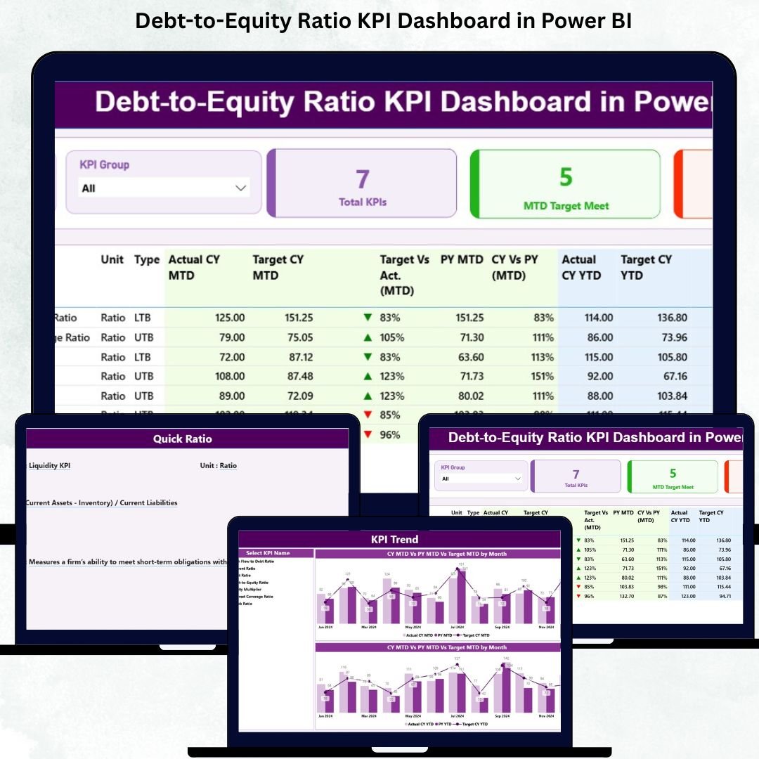
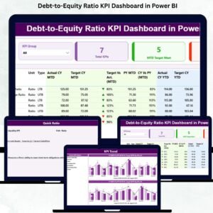
📈 1. Summary Page – Your Complete Financial Overview
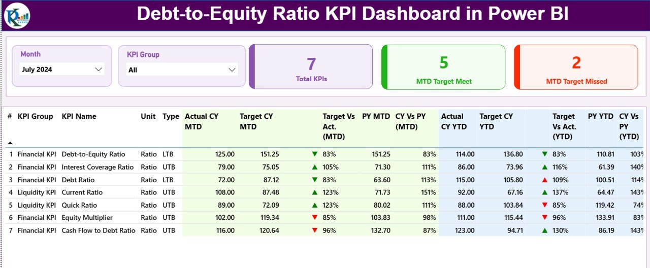
The Summary Page works as the main control panel. It offers a complete financial picture using slicers, cards, and a detailed KPI table.
🔹 Top Slicers
-
Month
-
KPI Group
This allows you to filter the entire dashboard instantly.
🔹 KPI Cards
-
Total KPIs Count
-
MTD Target Met Count
-
MTD Target Missed Count
These cards give you an immediate sense of how your finance KPIs are performing.
🔹 Detailed KPI Table
The heart of the dashboard is a comprehensive table showing:
-
KPI Number
-
KPI Group
-
KPI Name
-
Unit
-
Type (UTB / LTB)
-
Actual CY MTD
-
Target CY MTD
-
MTD Icon
-
Target vs Actual (MTD)
-
PY MTD
-
CY vs PY (MTD)
-
Actual CY YTD
-
Target CY YTD
-
YTD Icon
-
Target vs Actual (YTD)
-
PY YTD
-
CY vs PY (YTD)
This single table brings together all insights—making financial monitoring extremely simple.
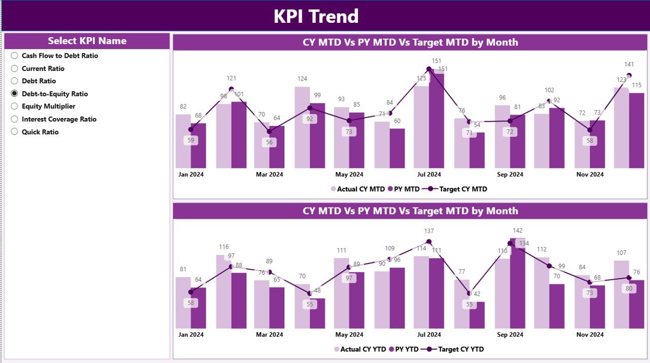
📊 2. KPI Trend Page – Visual MTD & YTD Financial Trends
The KPI Trend Page focuses on month-wise and year-wise performance. It uses two combo charts:
-
📉 MTD Chart – Current Year vs Previous Year vs Target
-
📈 YTD Chart – Cumulative performance for CY, PY, and target
A KPI Name slicer allows you to switch between Debt-to-Equity Ratio and other financial KPIs instantly.
These trend visuals help you identify:
-
Whether leverage is improving
-
Whether debt is rising faster than equity
-
Long-term financial risk
-
Monthly financial fluctuations
-
Target alignment
This page strengthens your financial strategy through clear visual storytelling.
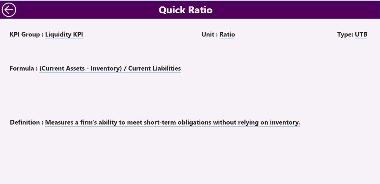
📘 3. KPI Definition Page – Clear Insight into Every Metric
Understanding formulas is important in financial reporting. The KPI Definition Page gives explanations in one clean view:
-
KPI Number
-
KPI Group
-
KPI Name
-
Unit
-
Formula
-
Definition
-
Type (LTB/UTB)
This drill-through page ensures consistency and transparency across your finance team.
🧠 How to Use the Debt-to-Equity Ratio Dashboard Effectively
Here’s a simple way to get the best insights:
-
Choose a month using the slicer
-
Review KPI cards for quick performance status
-
Analyze the Debt-to-Equity Ratio in the table
-
Check MTD/YTD icons to detect risks
-
Compare actual numbers with targets
-
See historical patterns in the Trend Page
-
Drill-through to understand KPI formulas
This streamlined workflow saves hours of manual work every month.
💼 Who Can Benefit from This Dashboard?
This dashboard is ideal for:
-
CFOs & Finance Directors
-
Business Analysts
-
Startup Founders
-
Investors & Stakeholders
-
Chartered Accountants
-
FP&A Teams
-
Audit & Compliance Teams
Anyone who tracks leverage, financial stability, borrowed capital, or equity growth will benefit from this dashboard.
### Click here to read the Detailed Blog Post
📺 Visit our YouTube channel to learn step-by-step video tutorials
👉 https://youtube.com/@PKAnExcelExpert


Reviews
There are no reviews yet.