Courier and logistics businesses operate in a fast-moving environment where every shipment, delivery day, and cost matters. Companies must track thousands of parcels, manage multiple courier partners, control shipping costs, reduce returns, and still meet customer delivery expectations. However, when operational data stays scattered across spreadsheets or manual reports, performance gaps remain hidden.
That is exactly where the Courier Services Dashboard in Excel becomes a powerful and practical solution 🚚📊.
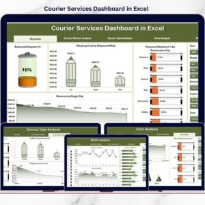
This ready-to-use Excel dashboard transforms courier and logistics data into clear, visual, and interactive insights. Instead of manually compiling shipment reports, courier managers and operations teams can instantly track shipments, returns, costs, revenue, and delivery performance using KPI cards, pivot charts, and slicers.
Built entirely in Excel, this dashboard offers flexibility, familiarity, and full control. It works without complex BI tools and allows teams to analyze performance month-wise, zone-wise, service-wise, and partner-wise. As a result, courier companies move from reactive problem-solving to data-driven operational excellence.
## Key Features of Courier Services Dashboard in Excel 🚀
This dashboard is designed specifically for courier and logistics operations.
📦 Centralized Courier Performance Tracking
Monitor shipments, returns, costs, revenue, and delivery speed in one place.
📊 Interactive Pivot-Based Charts
All visuals are powered by pivot tables and pivot charts.
🎛️ Dynamic Slicers for Instant Filtering
Filter data by Month, Zone, Courier Partner, Service Type, and City.
📈 Executive KPI Cards
View critical metrics instantly without manual calculations.
💰 Cost & Revenue Visibility
Track shipping costs and revenue trends clearly.
🔁 Returned Shipment Analysis
Identify high return rates by city, partner, or zone.
⏱️ Delivery Time Monitoring
Analyze average delivery days across services and regions.
🧭 Page Navigator for Easy Navigation
One-click movement between dashboard pages.
🛠️ Fully Customizable Excel Template
Easily add KPIs, charts, or dimensions.
## What’s Inside the Courier Services Dashboard in Excel 📂
This dashboard includes five structured analytical pages, supported by a Data Sheet and Support Sheet.
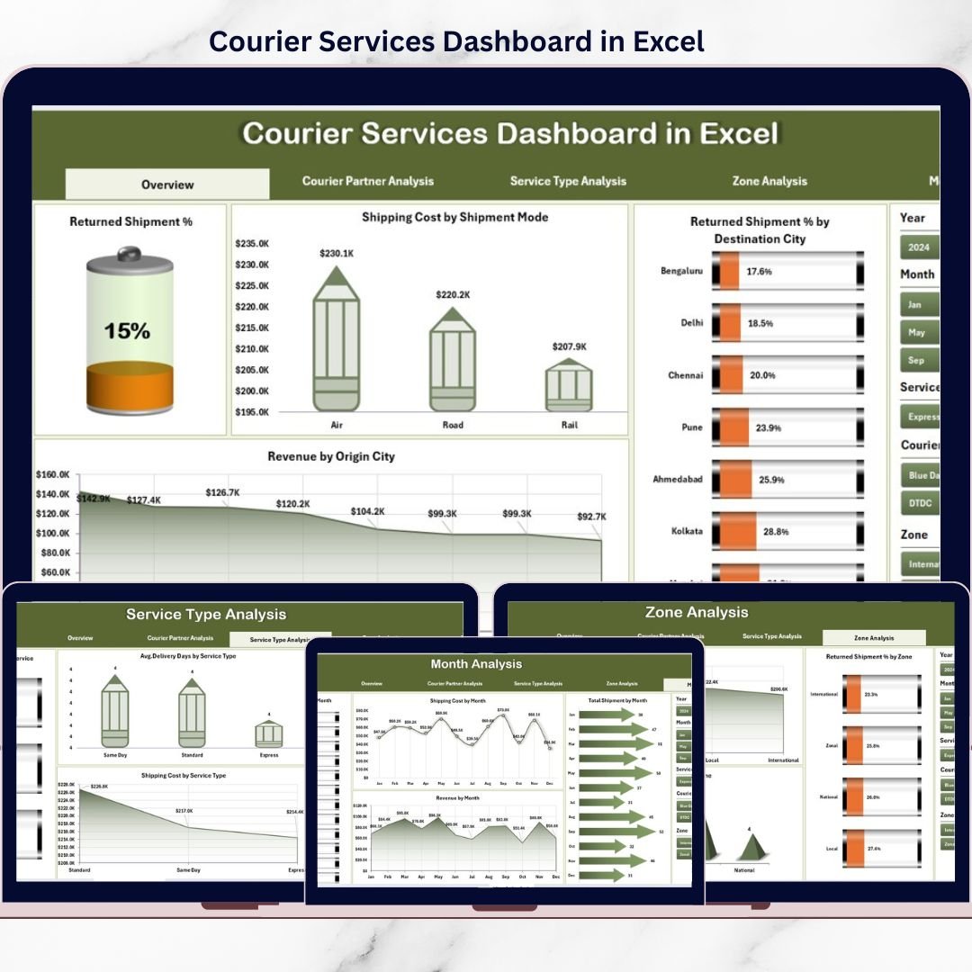
🟦 Overview Page
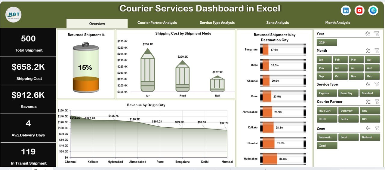
Acts as the control center with KPI cards and high-level charts showing:
-
Returned Shipment %
-
Shipping Cost by Shipment Mode
-
Returned Shipment % by Destination City
-
Revenue by Origin City
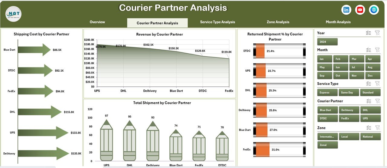
🟦 Courier Partner Analysis Page
Evaluates courier partners using:
-
Returned Shipment % by Partner
-
Shipping Cost by Partner
-
Total Shipment by Partner
-
Revenue by Partner
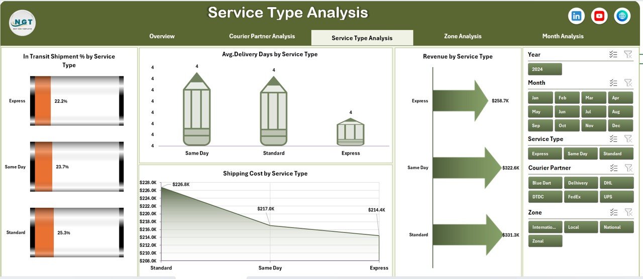
🟦 Service Type Analysis Page
Analyzes service performance using:
-
In-Transit Shipment % by Service Type
-
Average Delivery Days by Service Type
-
Revenue by Service Type
-
Shipping Cost by Service Type
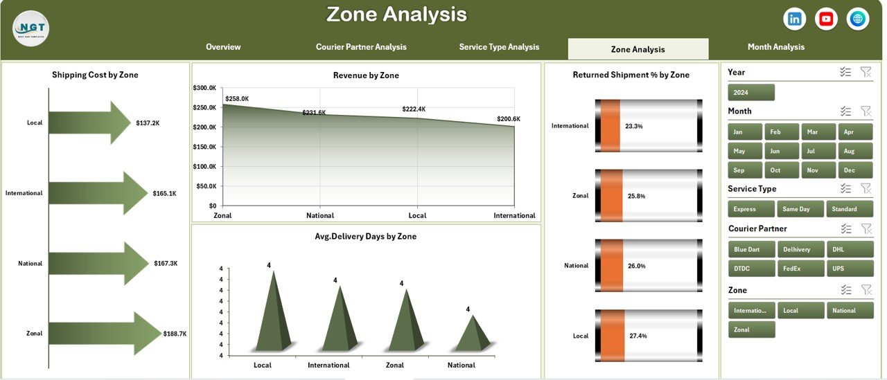
🟦 Zone Analysis Page
Provides region-wise insights with:
-
Shipping Cost by Zone
-
Revenue by Zone
-
Returned Shipment % by Zone
-
Average Delivery Days by Zone
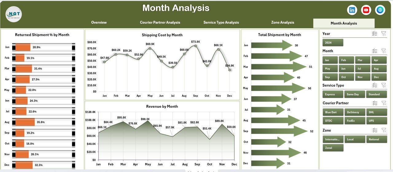
🟦 Month Analysis Page
Tracks trends over time using:
-
Shipping Cost by Month
-
Revenue by Month
-
Returned Shipment % by Month
-
Total Shipment by Month
🟦 Data Sheet
Stores all shipment-level transactional data.
🟦 Support Sheet
Manages helper tables and pivot-ready structures.
Together, these components form a complete courier operations analytics solution.
## How to Use the Courier Services Dashboard in Excel 🧩
Using this dashboard is simple:
1️⃣ Enter or update shipment data in the Data Sheet
2️⃣ Refresh pivot tables
3️⃣ Use slicers to filter by month, zone, partner, or service type
4️⃣ Review KPI cards and charts instantly
5️⃣ Identify cost leaks, return issues, and delays
6️⃣ Take corrective operational actions
Excel handles all calculations automatically—so teams focus on decisions, not reporting.
## Who Can Benefit from This Courier Services Dashboard in Excel 👥
This dashboard is ideal for:
✔️ Courier & Logistics Companies
✔️ E-commerce Businesses
✔️ Supply Chain & Operations Teams
✔️ Delivery Management Teams
✔️ Business Owners & Analysts
✔️ Operations & Finance Managers
Both technical and non-technical users can use it confidently.
### Click here to read the Detailed blog post
Visit our YouTube channel to learn step-by-step video tutorials
👉 https://youtube.com/@PKAnExcelExpert


Reviews
There are no reviews yet.