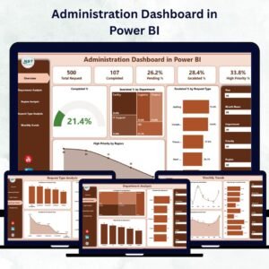
Running a modern organization requires more than routine management — it demands real-time visibility, accountability, and data-driven action. The Administration Dashboard in Power BI empowers you to achieve exactly that.
This ready-to-use, interactive dashboard consolidates all your administrative metrics into one visual platform. Built on Power BI and powered by an Excel data source, it helps leaders monitor performance, detect bottlenecks, and drive productivity — all at a glance.
Whether you manage a corporate office, government department, university, or manufacturing unit, this dashboard offers a centralized view of every request, escalation, and completion rate — helping teams stay aligned and efficient.
⚙️ Key Features of the Administration Dashboard in Power BI
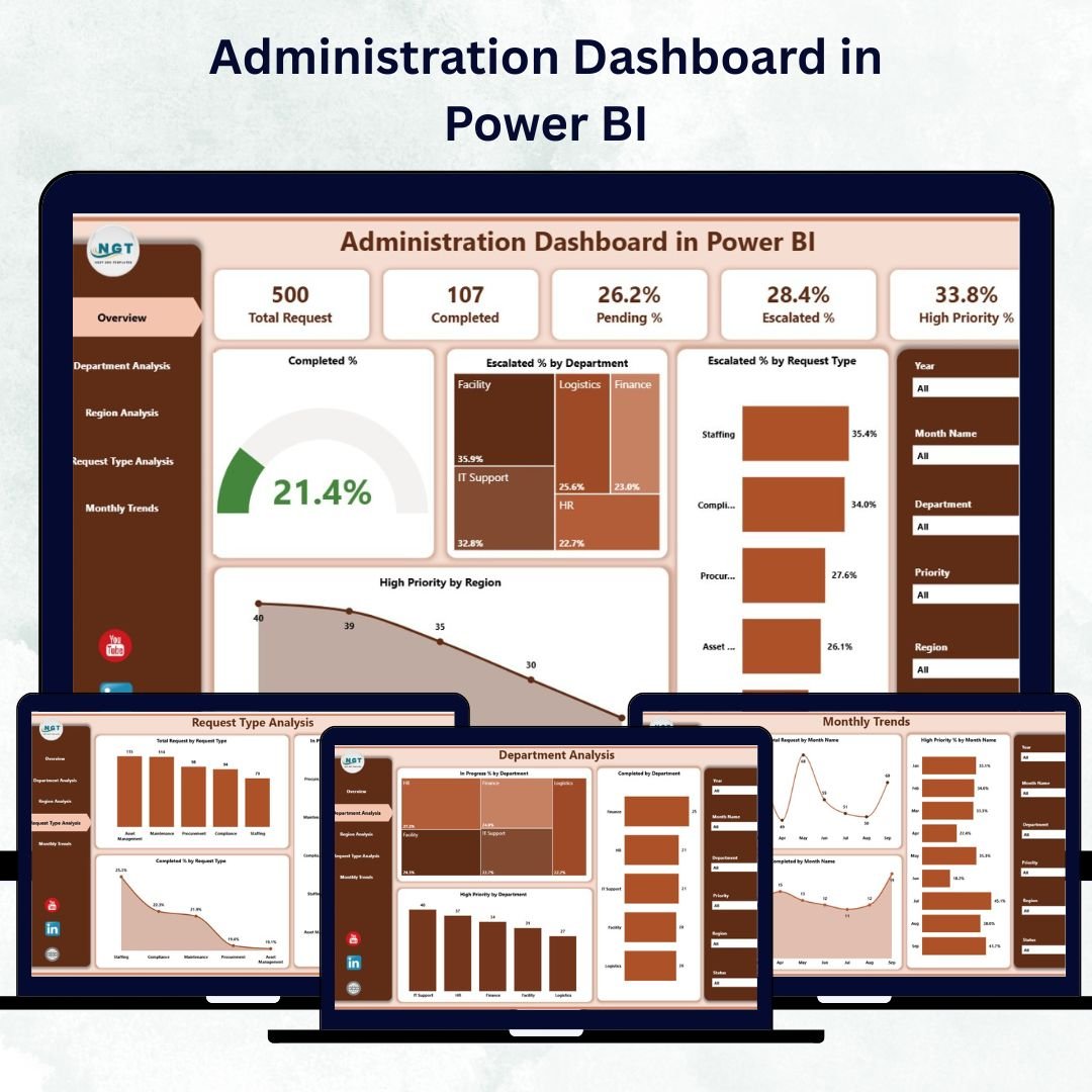
✅ 📊 Five Analytical Pages – Overview, Department Analysis, Region Analysis, Request Type Analysis, and Monthly Trends — each page providing unique insights into operations.
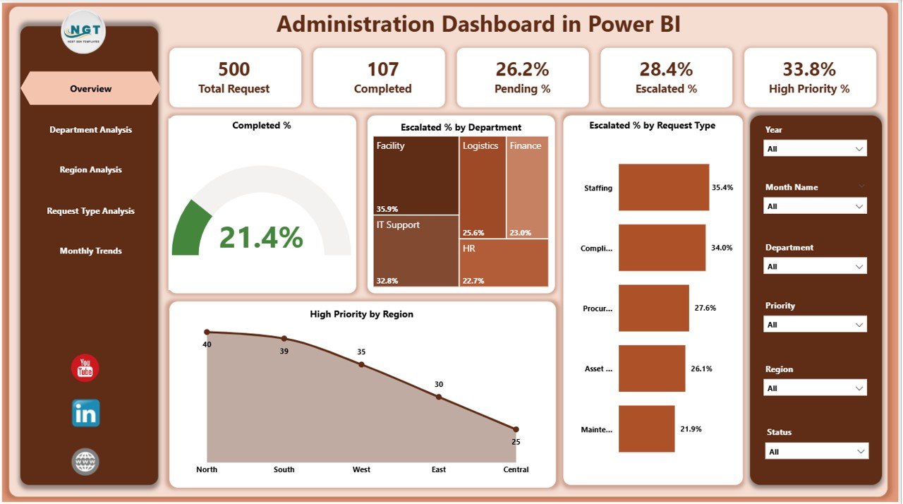
✅ 📋 Overview Page – Displays five KPI Cards: Total Requests, Completed %, Escalated %, In Progress %, and High Priority %. Includes slicers for Department, Region, Request Type, and Month.
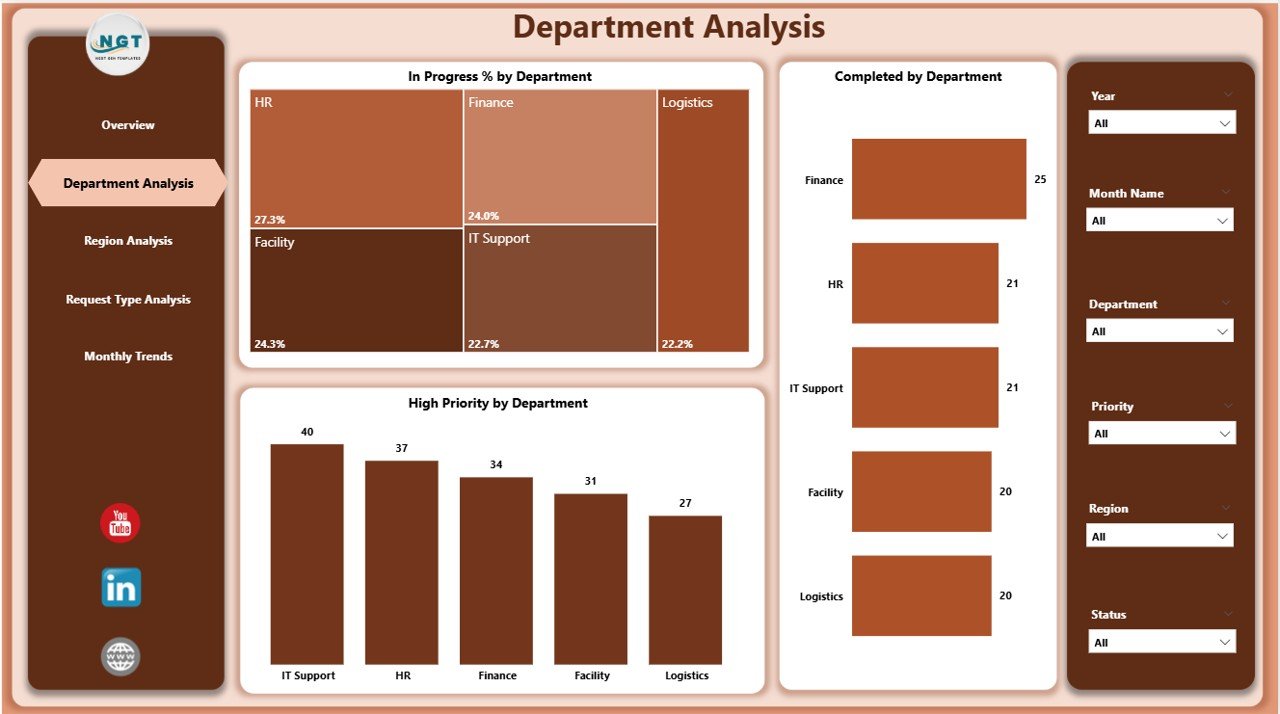
✅ 🏢 Department Analysis Page – Compare In Progress %, Completed %, and High Priority Tasks across departments to evaluate efficiency and resource allocation.
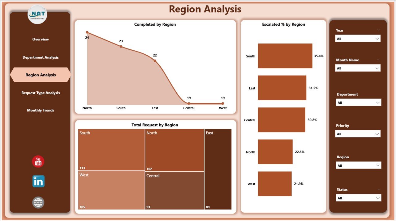
✅ 🌍 Region Analysis Page – Understand geographical performance with visuals for Completed %, Escalated % and Total Requests by Region. Identify top-performing locations and improvement zones.
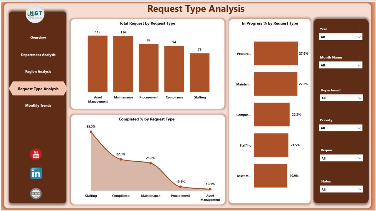
✅ 📂 Request Type Analysis Page – Drill down into task categories such as Maintenance, IT Support, or Facility Management to reveal workload distribution and performance differences.
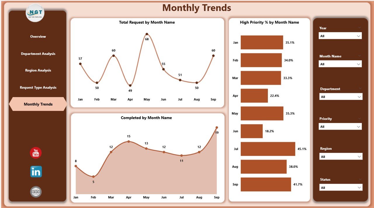
✅ 📅 Monthly Trends Page – Track Total Requests, Completed % and High Priority % by Month to uncover seasonality and recurring performance patterns.
✅ ⚡ Interactive Slicers & Drill-Throughs – Filter instantly and dig into deeper details with a single click.
✅ 💾 Excel-Connected Data Source – Seamless data refresh keeps your dashboard current with the latest numbers.
✅ 🎨 Customizable Design – Modify visuals, colors, or KPIs easily to match your organization’s needs and branding.
✅ 📈 Real-Time Monitoring – Stay informed with live metrics that update automatically — no manual reporting required.
🧩 What’s Inside the Administration Dashboard
📁 Overview Page – The command center for all administrative performance metrics.
📁 Department Analysis – Dive into team-wise results and productivity insights.
📁 Region Analysis – Benchmark performance by branch or region.
📁 Request Type Analysis – Explore workload patterns by category.
📁 Monthly Trends – Visualize progress and escalation trends across months.
All pages are interconnected, ensuring that every click leads to meaningful, data-backed insights.
💡 How to Use the Administration Dashboard
1️⃣ Import Your Data – Connect Power BI to your Excel-based administrative dataset.
2️⃣ Click Refresh – Update visuals automatically with the latest numbers.
3️⃣ Use Slicers & Filters – Explore data by Department, Region, Request Type, or Month.
4️⃣ Drill Through – Click any chart element to see deeper details.
5️⃣ Monitor KPIs Weekly – Review performance regularly to identify early risks or delays.
6️⃣ Share Securely – Publish to Power BI Service for team access via web or mobile.
With its intuitive layout and automation, you can start analyzing results within minutes — no coding required!
👥 Who Can Benefit from This Dashboard
🏢 Administrative Managers – Track operations, requests, and completion performance.
📊 Operations Heads – Identify bottlenecks and escalation trends early.
🏫 Educational Institutions – Manage maintenance and campus-wide service requests.
🏭 Manufacturing Firms – Oversee internal service workflows efficiently.
🏥 Healthcare Organizations – Streamline facility and IT support tasks.
🏛️ Government Agencies – Improve public service delivery visibility.
If your goal is to optimize administration through smart analytics, this dashboard delivers precision and clarity.
🚀 Why You’ll Love This Dashboard
-
📍 Centralized Monitoring – All metrics on one visual screen.
-
🕒 Real-Time Insights – Always up to date with live refresh.
-
⚖️ Compare Departments & Regions – Benchmark efficiency easily.
-
💬 Clear Communication – Visuals simplify complex reports.
-
🔍 Bottleneck Detection – Identify issues before they escalate.
-
⚙️ Scalable & Customizable – Add new visuals anytime.
-
🧠 Data-Driven Decisions – Turn information into strategic action.
🔗 Click here to read the Detailed blog post
📺 Visit our YouTube channel to learn step-by-step video tutorials
👉 YouTube.com/@PKAnExcelExpert


Reviews
There are no reviews yet.