Managing a Account Management KPI Dashboard when KPIs are scattered across multiple Excel sheets, outdated reports, or manual summaries 📄⏳. Account management teams deal with renewals, upselling, client communication, ticket handling, and service coordination every month—and without a smart reporting tool, decisions become slow and unclear. That’s why businesses rely on the Account Management KPI Dashboard in Power BI.
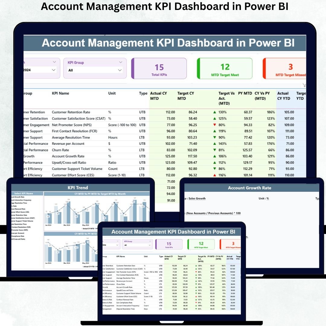
This dashboard gives you a complete, real-time view of all account KPIs. From monthly performance to yearly trends, from target comparisons to previous-year results—everything appears in one clean, interactive dashboard. Built with slicers, dynamic charts, detailed tables, and drill-through features, this Power BI dashboard simplifies reporting and gives managers the clarity they need to make confident decisions.
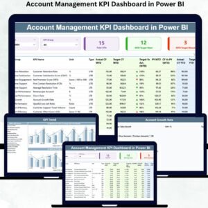
🔥 Key Features of the Account Management KPI Dashboard in Power BI
-
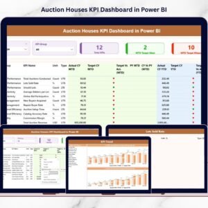
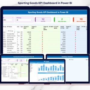
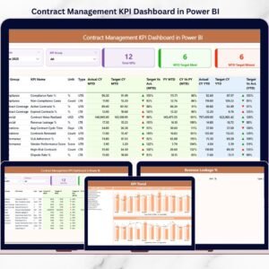
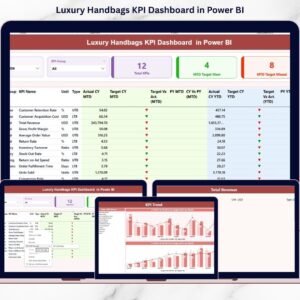
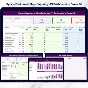
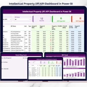
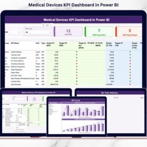
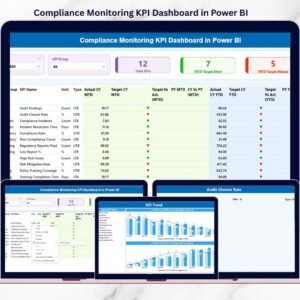
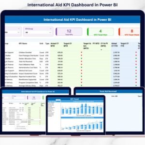
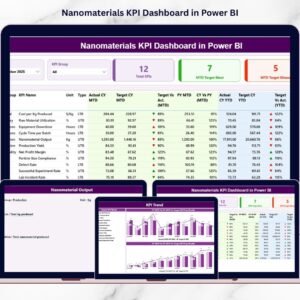
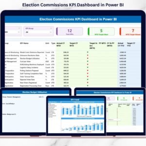
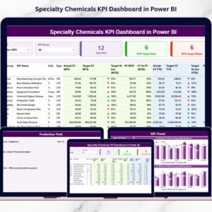
📊 Summary Page – Track MTD & YTD performance with KPI cards, slicers, and a powerful KPI table.
-
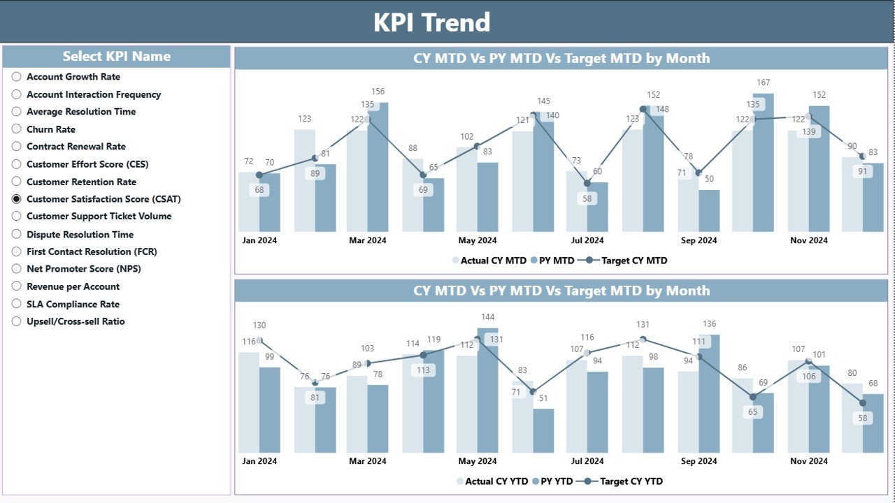
📈 Trend Analysis Page – Visual combo charts showing Actual vs Target vs Previous Year for all KPIs.
-
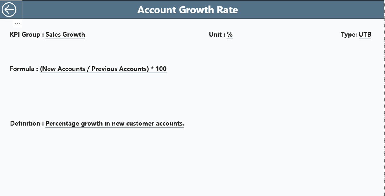
🔍 KPI Definition Page – Drill-through page showing formula, definition, unit, type, and KPI details.
-
📅 Month & KPI Filters – Filter KPIs by category or select any month to refresh the entire dashboard instantly.
-
💡 Real-Time Insights – Refresh the Excel data source and the dashboard updates automatically.
-
📥 Excel-Based Input – Three structured sheets (Actual, Target, Definition) make data management simple.
-
🟢 Instant Status Icons – Green ▲ means the KPI meets/exceeds target; red ▼ shows performance gaps.
-
👨💼 Perfect for Client Reviews – Clean visuals ideal for client presentations, strategy meetings, and leadership reporting.
📂 What’s Inside the Account Management KPI Dashboard
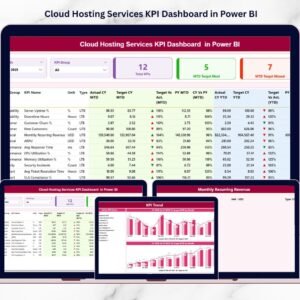
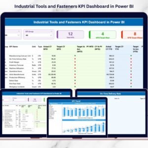
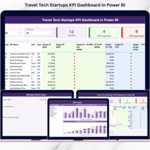
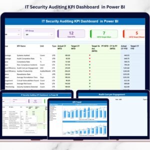
1. Summary Page – The Core Performance View
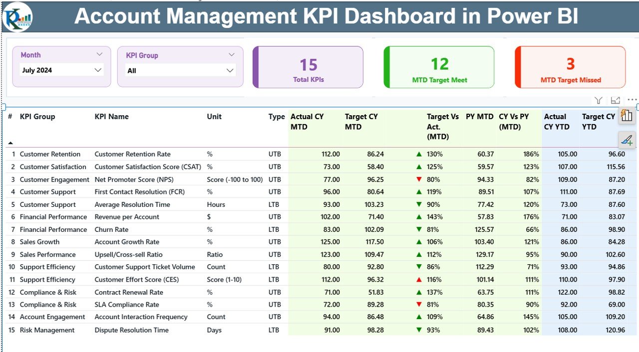
This page gives you everything you need at a glance:
-
Month & KPI Group slicers
-
Cards showing total KPIs, met KPIs, and missed KPIs
-
A full KPI table with MTD/YTD, Actual vs Target %, Previous Year comparisons, and color-coded icons
This page acts as the “control room” of account performance.
2. KPI Trend Page – Track KPI Movement Over Time
This page includes:
-
KPI selector to choose any KPI instantly
-
MTD combo chart (Current Year vs Previous Year vs Target)
-
YTD combo chart (Cumulative comparison with last year)
This helps identify monthly patterns, growth gaps, and seasonal behaviors.
3. KPI Definition Page – Clear KPI Logic and Formulas
This drill-through page shows:
-
KPI Number
-
KPI Group
-
KPI Name
-
Unit
-
Formula
-
Definition
-
KPI Type (UTB or LTB)
This ensures clarity for teams, managers, and clients during reporting.
🛠️ How the Dashboard Works With Excel Data
The dashboard reads all KPIs from a connected Excel file:
-
Input_Actual Sheet – Stores month-wise Actual MTD & YTD values
-
Input_Target Sheet – Stores Target MTD & YTD values
-
KPI Definition Sheet – Stores KPI names, formulas, units, and logic
Just update the Excel file → click refresh → the dashboard updates instantly.
👥 Who Can Benefit from This Dashboard
-
Account Managers
-
Customer Success Teams
-
Sales & Retention Teams
-
Business Analysts
-
Client Relationship Managers
-
Leadership & Strategy Teams
It’s perfect for tracking performance, improving retention, identifying upselling opportunities, and preparing business reviews.
### Click here to read the Detailed blog post
Visit our YouTube channel to learn step-by-step video tutorials


Reviews
There are no reviews yet.