The Info-graphics with Column chart (Part-2) builds upon the foundations of the first part, adding more advanced features and customization options to help you take your data presentations to the next level. This enhanced Excel tool allows you to create highly visual and interactive infographics with multiple data points, layered with design elements that not only represent your KPIs, sales data, or project progress but also make the information visually captivating and easy to understand.
This version of the Info Graphics with Column Chart introduces additional functionality, such as multiple data series and advanced formatting options, ensuring your reports and presentations are not only informative but also visually engaging. The dynamic charts update in real time, so you can keep track of your metrics and adapt to changes quickly.
Key Features of the Info Graphics with Column Chart (Part 2):
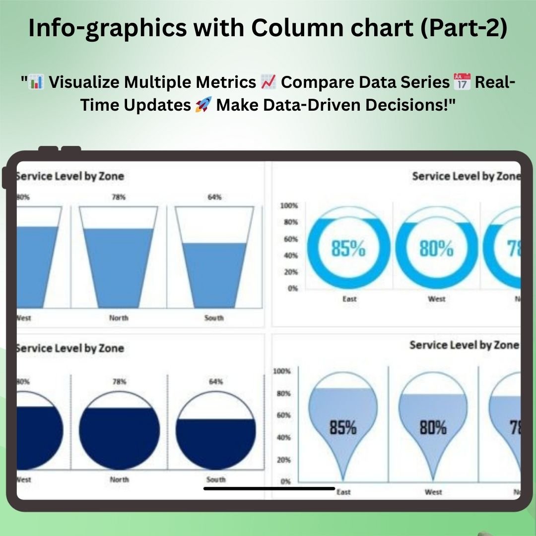
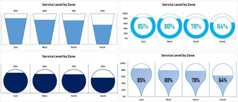
📊 Multiple Data Series
Track and visualize multiple data series in a single column chart. Compare various metrics, KPIs, or sales figures in one integrated infographic that makes data analysis clearer and more effective.
🎨 Advanced Customization Options
Customize every aspect of the chart, from colors to fonts to design elements, ensuring your infographic fits seamlessly into your presentation or report. Tailor the visual appearance to align with your branding or design preferences.
📈 Enhanced Data Visualization
With advanced visual elements such as segmented bar charts, icons, and color coding, this infographic design allows you to clearly highlight key performance trends, comparisons, and insights.
🔄 Real-Time Data Updates
As you update your data, the infographic automatically adjusts, ensuring that your charts reflect the most current performance metrics and provide you with up-to-date insights.
⚙️ User-Friendly Interface
Despite the added complexity of multiple data series, the chart remains user-friendly, offering a simple and intuitive interface that makes it easy to input and visualize your data.
Why You’ll Love the Info Graphics with Column Chart (Part 2):
✅ Visualize Multiple Metrics – Display several KPIs, sales targets, or project metrics in one column chart for a comprehensive view of your data. ✅ Instant Updates – The chart updates automatically when new data is entered, ensuring you have access to real-time insights. ✅ Fully Customizable – Modify the chart to fit your unique business needs, from the visual appearance to the data series included. ✅ Enhanced Data Storytelling – With added visuals and design elements, make your data more impactful and easier to interpret for your audience. ✅ Perfect for Reports and Presentations – Create professional-looking infographics that will captivate your audience and clearly communicate your message.
What’s Inside the Info Graphics with Column Chart (Part 2):
- Multiple Data Series – Visualize and compare several metrics in a single chart.
- Advanced Customization – Customize colors, fonts, and design elements for a unique look.
- Dynamic Chart Updates – Watch the chart adjust as you enter or update data in real time.
- Enhanced Data Visualization – Add visuals such as icons, segmented bars, and color coding to make the data easier to interpret.
- User-Friendly Interface – Despite the advanced features, the chart remains simple to use and navigate.
How to Use the Info Graphics with Column Chart (Part 2):
1️⃣ Download the Template – Get instant access to your Excel file after purchase. 2️⃣ Input Data – Add your data and customize your chart’s appearance. 3️⃣ Customize the Design – Adjust the color scheme, fonts, and layout to match your branding or presentation style. 4️⃣ Track and Visualize Performance – Use the chart to analyze multiple data points and get real-time updates on your performance metrics.
Who Can Benefit from the Info Graphics with Column Chart (Part 2):
- Business Owners
- Project Managers
- Data Analysts
- Marketing Teams
- Sales Teams
- Entrepreneurs
- Consultants
- Anyone looking to present complex data in an easy-to-understand and visually engaging format
With the Info Graphics with Column Chart (Part 2), you’ll be able to present data in a visually impactful way, making it easier for your team or clients to understand performance metrics, trends, and progress at a glance.
Click here to read the Detailed blog post
https://www.pk-anexcelexpert.com/info-graphics-with-column-chart-part-2/


Reviews
There are no reviews yet.