
In today’s data-driven workplace, HR professionals can’t afford to make employee benefits decisions based on guesswork. With rising benefit costs and evolving workforce expectations, organizations need clarity and control — fast.Employee Benefits Dashboard in Excel
That’s where the Employee Benefits Dashboard in Excel comes in — a dynamic, visual, and fully interactive tool that bridges raw HR data and powerful insights. Whether you’re an HR manager, finance leader, or business owner, this template unlocks actionable benefits analytics without complex BI tools.Employee Benefits Dashboard in Excel
In this article, we’ll break down why this dashboard is quickly becoming a go-to resource for smart HR teams who want to optimize benefits programs, improve engagement, and maximize ROI — all using Microsoft Excel.
📊 What Is the Employee Benefits Dashboard in Excel?
The Employee Benefits Dashboard in Excel is a ready-to-use Excel template designed to help businesses visualize and monitor all facets of their employee benefits programs — from coverage levels and contribution costs to participation trends and provider performance.
Unlike static spreadsheets, this dashboard is built for interactive analysis and decision-making, empowering HR teams with clear, actionable visual KPIs.
👉 Ready to level up your HR analytics? Grab your copy here: Employee Benefits Dashboard in Excel
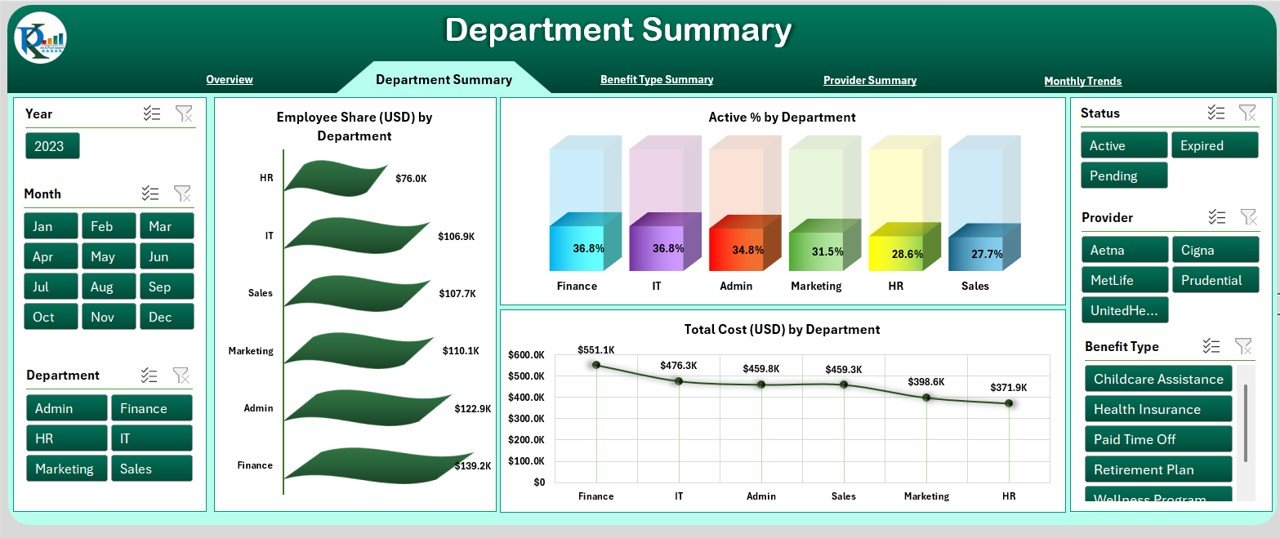
🔥 1. One View for All Your Benefits Data
Instead of juggling multiple sheets or manual reports, this dashboard brings everything into one consolidated workspace.
✔ Compare benefit enrollments across plans
✔ Visualize cost trends month-to-month
✔ Analyze participation by employee segments
This unified approach transforms complex data into simple visuals — saving hours of manual work while giving you an at-a-glance understanding of benefits performance.
🔍 2. Visual Analytics That Drive Decisions
Numbers alone rarely tell the full story. This dashboard’s interactive charts and graphs help you spot patterns quickly:
📈 Trend lines reveal rising benefit costs
🧠 Bar charts show participation levels by benefit type
🔁 Comparison visuals highlight changes over time
With visually compelling insights, you can confidently answer key questions like:
-
Which benefits are underutilized?
-
Are contributions aligned with actual usage?
-
How are benefit costs trending year over year?
These answers fuel smarter strategy — not guesswork.
🛠️ 3. Built for Excel — No Extra Software Needed
Unlike advanced analytics platforms that require separate licenses or IT support, this dashboard runs entirely in Microsoft Excel.
Benefits of an Excel-based tool:
✔ Familiar interface everyone understands
✔ Works offline and across different Excel versions
✔ No cloud subscriptions or integrations required
This makes it ideal for small businesses and HR teams that want powerful insights without a steep learning curve.
📊 4. Supports Strategic HR Goals
Too many benefits programs are reactive — reacting to trends after they’ve already cost time and money. Smart HR teams use data to be proactive. This dashboard lets you:
-
Forecast benefit costs with historical trends
-
Identify under- or over-utilization early
-
Make evidence-based recommendations to leadership
By aligning benefits data with organizational goals, you not only improve employee satisfaction — you also protect your bottom line.
💡 5. Perfect for HR, Finance & Leadership
This isn’t just an HR toy — it’s a cross-functional decision support tool.
Who benefits most?
👥 HR Managers – Improve program effectiveness
💰 Finance Teams – Analyze benefit spend and budget impact
📊 Leadership – Make data-backed decisions with confidence
By presenting data clearly and visually, the dashboard fosters collaboration across departments and reduces costly misinterpretations — a huge advantage for mid- to large-sized teams.
📈 6. Customizable to Your Organization
Every company’s benefits ecosystem is unique. That’s why this dashboard is designed to be flexible:
🔧 Add new benefit types
🔧 Modify KPIs based on organizational priorities
🔧 Tailor visuals for executive presentations
Rather than being locked into rigid templates, you get a solution that grows with your organization.
📌 7. Immediate ROI — Save Time & Reduce Errors
Too often, HR teams spend hours manually aggregating data from multiple sources — prone to mistakes and interpretation errors.
With this dashboard:
✔ Data updates automatically once inputs are changed
✔ Visual KPIs give instant feedback
✔ Excel formulas do the heavy lifting for you
The result? Less time wrestling spreadsheets, more time driving strategic programs that boost employee satisfaction and retention.
📦 Bonus Tip: Combine with Other HR Tools
Want deeper insights?
Consider pairing this benefits dashboard with other HR analytics tools from NextGenTemplates — like the Employee Benefits Utilization KPI Dashboard in Excel for utilization trends or the Employee Benefits Report in Excel for detailed benefit forecasting.
This integrated data ecosystem gives HR leaders comprehensive visibility over programs, costs, and outcomes — driving better decisions across the employee lifecycle.
📌 Final Thoughts: A Must-Have for Modern HR
The Employee Benefits Dashboard in Excel is more than a reporting tool — it’s a high-impact analytical engine that helps HR professionals transform raw benefits data into strategic insights.Employee Benefits Dashboard in Excel
Whether you want to:
-
Cut costs without losing value
-
Improve employee participation
-
Forecast benefit spend
-
Present insights to leadership
…this dashboard makes it easy, actionable, and insightful — all within Excel.
Visit our YouTube channel to learn step-by-step video tutorials