In today’s fast-paced logistics and supply chain landscape, every second and every dollar count. The Transportation Dashboard in Power BI is your ultimate analytics companion — built to help logistics professionals monitor, analyze, and optimize transportation performance in real time.
Whether you’re tracking on-time deliveries, managing fleet efficiency, or analyzing fuel costs across regions and routes, this dashboard delivers powerful, data-driven insights in one centralized Power BI workspace.
With its intuitive visuals, dynamic slicers, and interactive reports, the dashboard turns complex logistics data into actionable intelligence — helping organizations boost efficiency, reduce costs, and improve customer satisfaction.
⚙️ Key Features of the Transportation Dashboard in Power BI
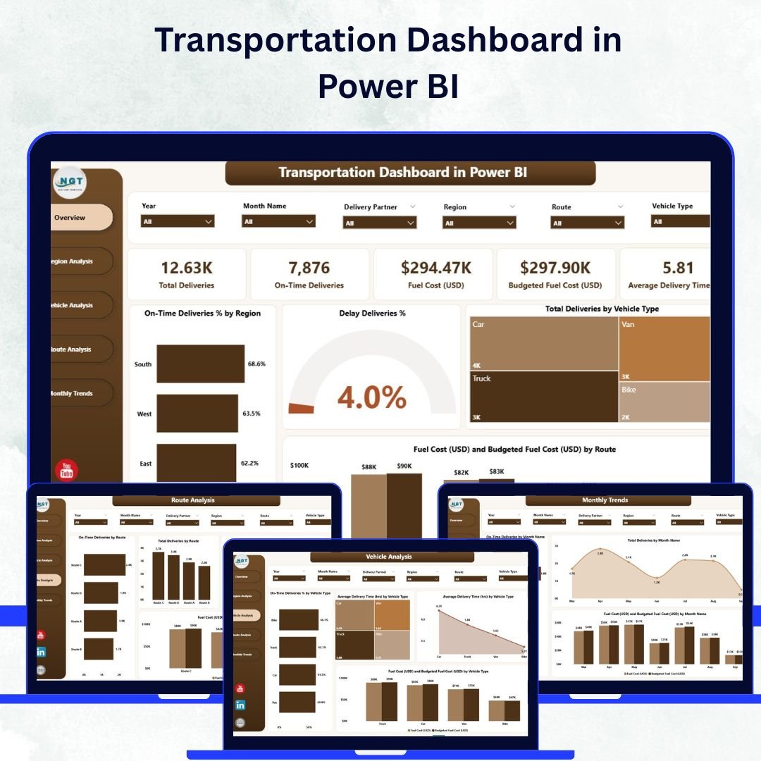
📊 Five Interactive Pages:
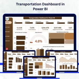
Explore five beautifully designed pages — Overview, Region Analysis, Vehicle Analysis, Route Analysis, and Monthly Trends — each focusing on a critical aspect of transportation performance.
🚦 Overview Page – The Command Center:
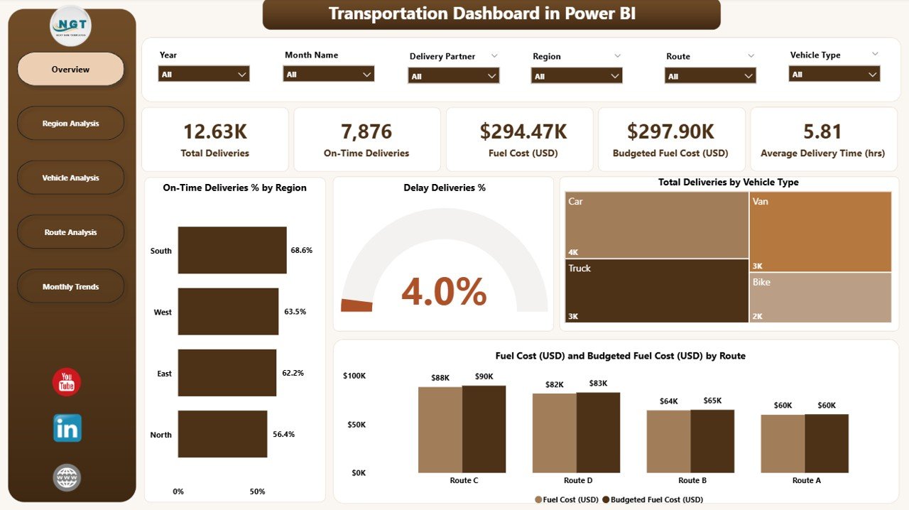
Get a snapshot of total deliveries, on-time delivery rate, delay %, and fuel cost vs. budget.
Includes:
-
5 KPI Cards for instant insights.
-
4 Charts: On-Time Deliveries %, Delay %, Total Deliveries by Vehicle Type, Fuel Cost vs. Budget by Route.
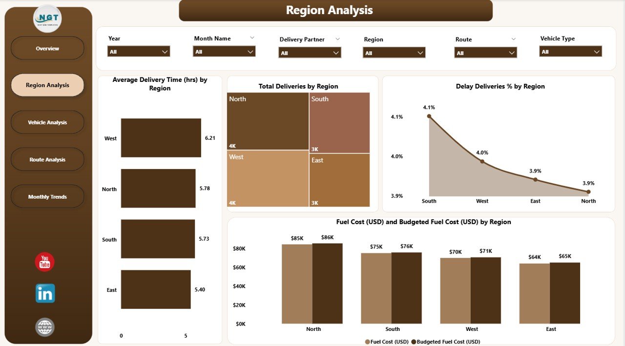
🌍 Region Analysis Page:
Dive into regional trends with visuals showing average delivery time, total deliveries, delay %, and fuel spending per region — perfect for identifying high-performing or underperforming territories.
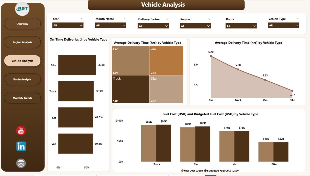
🚛 Vehicle Analysis Page:
Track fleet performance using visuals that compare delivery reliability, time efficiency, and fuel cost by vehicle type — helping optimize vehicle utilization and maintenance.
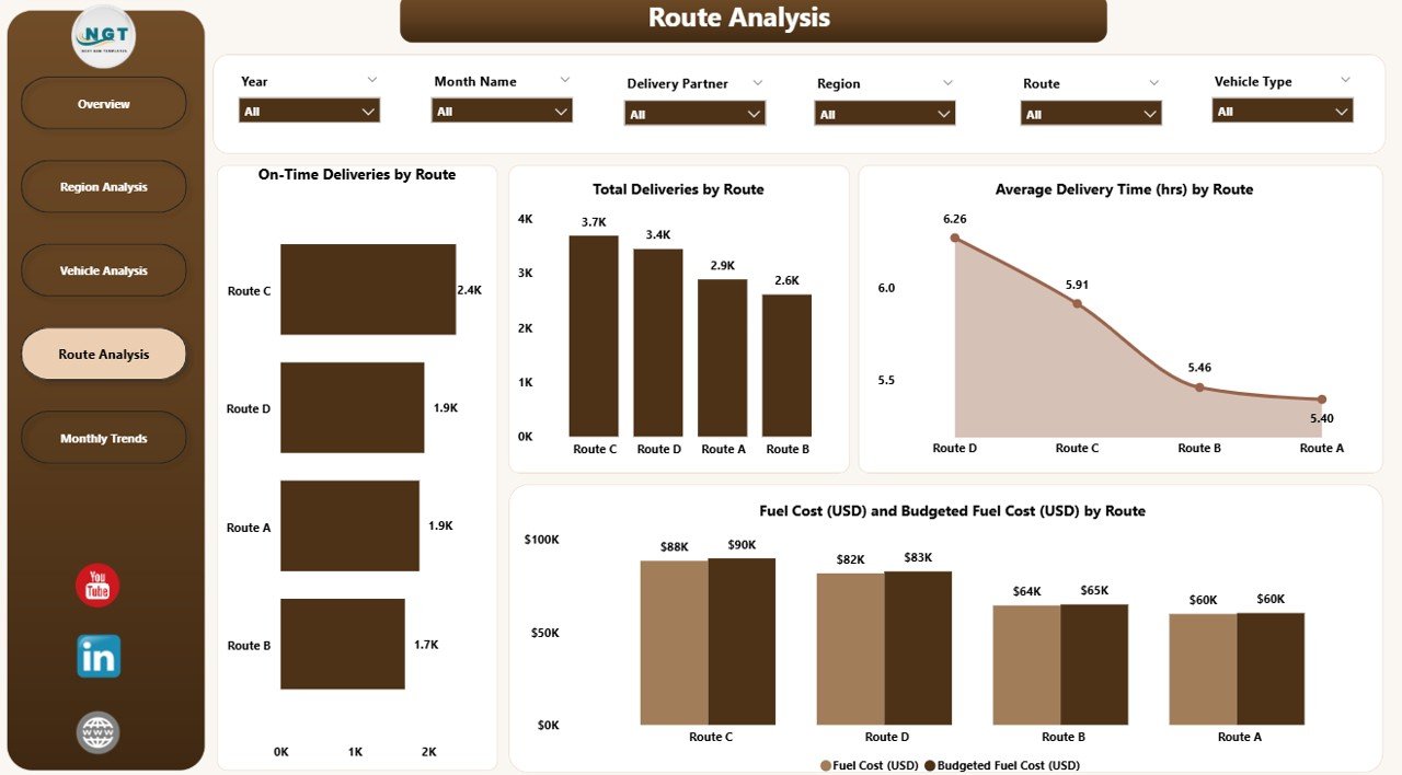
🗺️ Route Analysis Page:
Analyze the most and least efficient routes with metrics like on-time delivery %, average delivery time, total deliveries, and cost variance by route — essential for route optimization and budget planning.
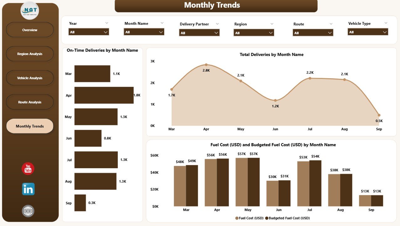
📅 Monthly Trends Page:
Monitor performance over time with charts for On-Time Deliveries %, Total Deliveries, and Fuel Cost vs. Budget — ideal for monthly reviews and executive reporting.
📈 Real-Time Analytics:
Dynamic visuals update automatically, ensuring your KPIs reflect the latest operational performance.
🔍 Customizable Filters & Slicers:
Filter data by Month, Region, Vehicle Type, or Route to zoom into specific insights instantly.
🔗 Excel Integration:
The dashboard is powered by Excel data sources — allowing users to easily update, refresh, and extend the analysis without technical expertise.
💡 Interactive & Drill-Through Capabilities:
Drill deeper into visuals to identify causes of delays, inefficiencies, or cost overruns within seconds.
🗂️ What’s Inside the Transportation Dashboard
1️⃣ Overview Page:
High-level summary of delivery performance and cost efficiency.
2️⃣ Region Analysis Page:
Compare regional performance to identify bottlenecks and improvement areas.
3️⃣ Vehicle Analysis Page:
Evaluate fleet efficiency across multiple vehicle types.
4️⃣ Route Analysis Page:
Pinpoint which routes are cost-effective and which require optimization.
5️⃣ Monthly Trends Page:
Track long-term trends, seasonality, and recurring performance patterns.
🧭 How to Use the Transportation Dashboard in Power BI
✅ Step 1: Import your Excel or database files (Region, Vehicle Type, Route, Fuel Cost, etc.) into Power BI.
✅ Step 2: Open the Power BI dashboard and refresh your data.
✅ Step 3: Use the slicers to analyze by Month, Region, or Vehicle Type.
✅ Step 4: Review charts and KPIs to assess delivery efficiency and cost control.
✅ Step 5: Share insights securely through Power BI Service with your team.
Within minutes, you’ll gain a 360° view of your logistics operations — enabling faster, smarter, and more accurate decisions.
👥 Who Can Benefit from This Dashboard
🚚 Logistics Managers: Monitor KPIs and improve delivery efficiency.
🏢 Supply Chain Analysts: Analyze cost, route, and performance trends.
🛣️ Fleet Supervisors: Optimize vehicle usage and maintenance schedules.
💰 Finance Teams: Track actual vs. budgeted fuel cost across departments.
📦 Executives: Gain top-level visibility into transportation performance and ROI.
🌟 Advantages of the Transportation Dashboard in Power BI
✅ Real-Time Insights: Monitor delivery KPIs and costs live.
✅ Centralized Data Integration: Combine data from Excel, ERP, or GPS systems.
✅ Dynamic Drilldowns: Analyze regions, routes, and vehicles interactively.
✅ Budget Optimization: Identify deviations between planned and actual fuel costs.
✅ Enhanced Collaboration: Share dashboards securely via Power BI Service.
✅ Customizable Layout: Adjust visuals, colors, and metrics as per your branding.
✅ Time-Saving Automation: Eliminate manual reporting with scheduled data refreshes.
🔗 Click here to read the Detailed Blog Post
🎥 Visit our YouTube channel for step-by-step tutorials
🔗 YouTube.com/@PKAnExcelExpert


Reviews
There are no reviews yet.