Teacher training institutes manage trainees, courses, satisfaction scores, funding partners, and costs every single day. They juggle multiple training programs, review assessments, monitor budgets, and evaluate outcomes. But without a structured reporting system, teams spend hours merging spreadsheets, validating numbers, and preparing monthly summaries. This slows down decision-making and hides the insights that matter most.
The Teacher Training Institutes Dashboard in Power BI solves these challenges instantly. It transforms raw training data into clean, interactive visuals. With slicers, charts, KPIs, and multiple analytical pages, this dashboard gives institutes complete performance clarity—without manual reporting.
From trainee counts to course outcomes, and from funding analysis to monthly trends, this dashboard helps training leaders understand what is working, what needs improvement, and where resources should be allocated.
This ready-to-use Power BI dashboard allows users to explore insights with ease, compare performance across courses and institutes, and make faster, data-backed decisions—all in one place.
✨ Key Features of Teacher Training Institutes Dashboard in Power BI
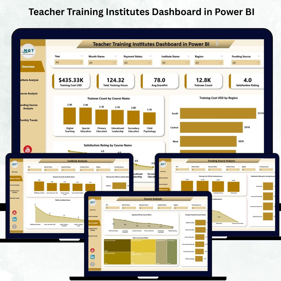
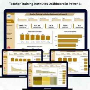
📊 1. Overview Page – High-Level Training Summary
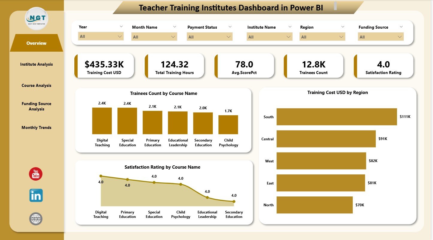
The Overview Page serves as the central performance hub.
You get six essential KPI cards, including:
✔ Total Trainees
✔ Total Courses
✔ Total Training Hours
✔ Total Training Cost
✔ Average Satisfaction Rating
✔ Total Institutes
Along with the KPIs, you also get three powerful charts:
📌 Trainees Count by Course Name
📌 Training Cost (USD) by region
📌 Satisfaction Rating by Course Name
These visuals help leaders quickly identify popular courses, cost-heavy regions, and training quality levels across programs.
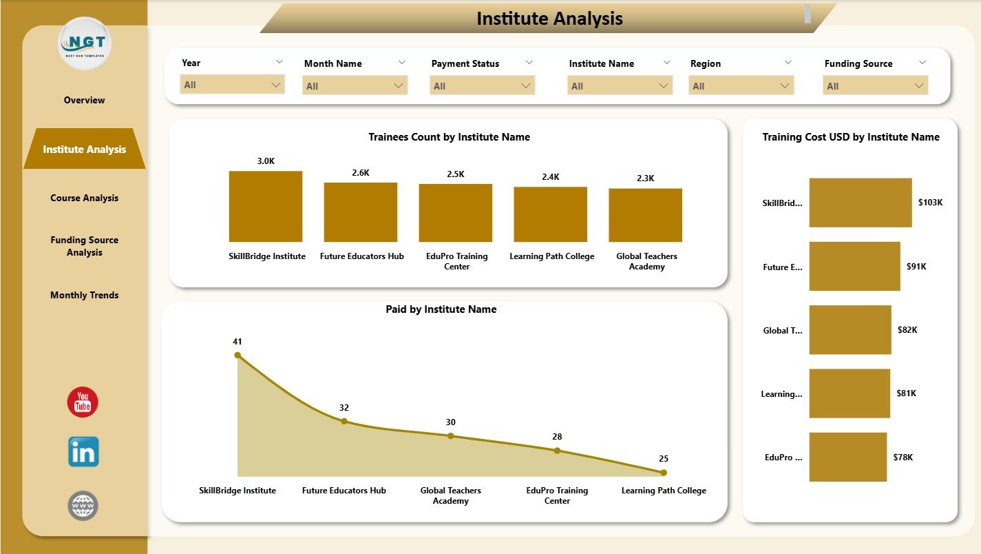
🏫 2. Institute Analysis – Compare Institutes Easily
This page helps you understand how each training institute performs.
It includes charts for:
✨ Trainees Count by Institute Name
✨ Training Cost (USD) by Institute Name
✨ Paid Amount by Institute Name
Decision makers use this section to compare training volumes, financial contributions, and cost behavior across multiple institutes.
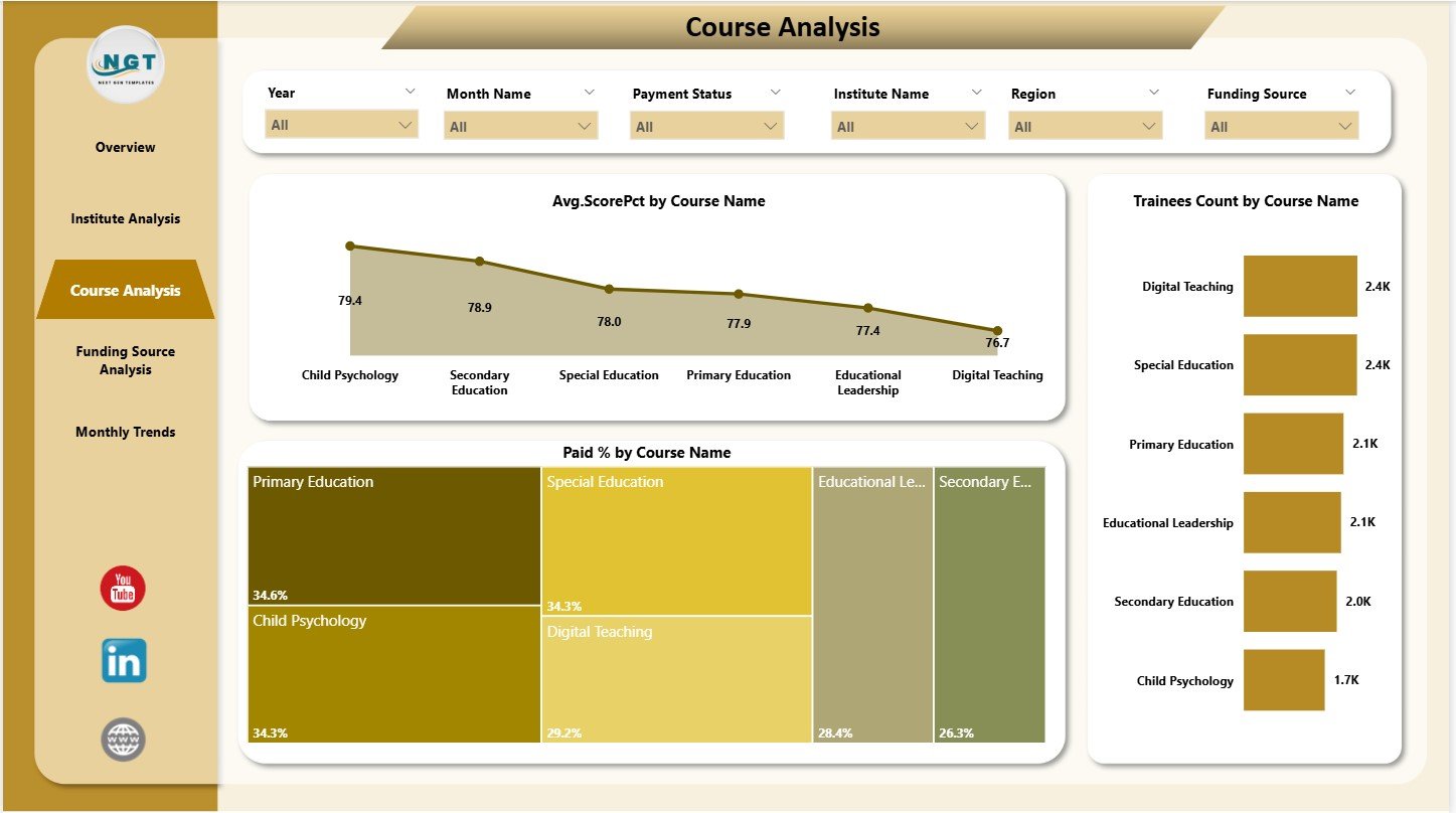
📘 3. Course Analysis – Evaluate Course Effectiveness
Training quality often varies course by course.
This page includes three course-specific charts:
✔ Average Score (%) by Course Name
✔ Trainees Count by Course Name
✔ Paid (%) by Course Name
Leaders use this section to identify top-performing courses, assess training outcomes, and monitor fee or payment completion rates.
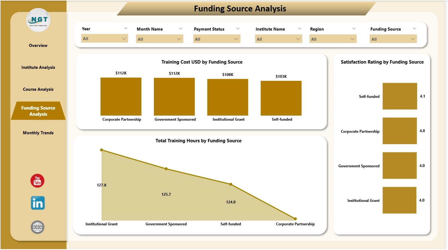
💰 4. Funding Source Analysis – Understand Partner Impact
Teacher training programs often rely on multiple funding streams.
This page shows:
📌 Training Cost (USD) by Funding Source
📌 Satisfaction Rating by Funding Source
📌 Total Training Hours by Funding Source
Institutes use this analysis to evaluate which sponsors support more training hours, which partners deliver the best satisfaction scores, and how funding correlates with training outcomes.
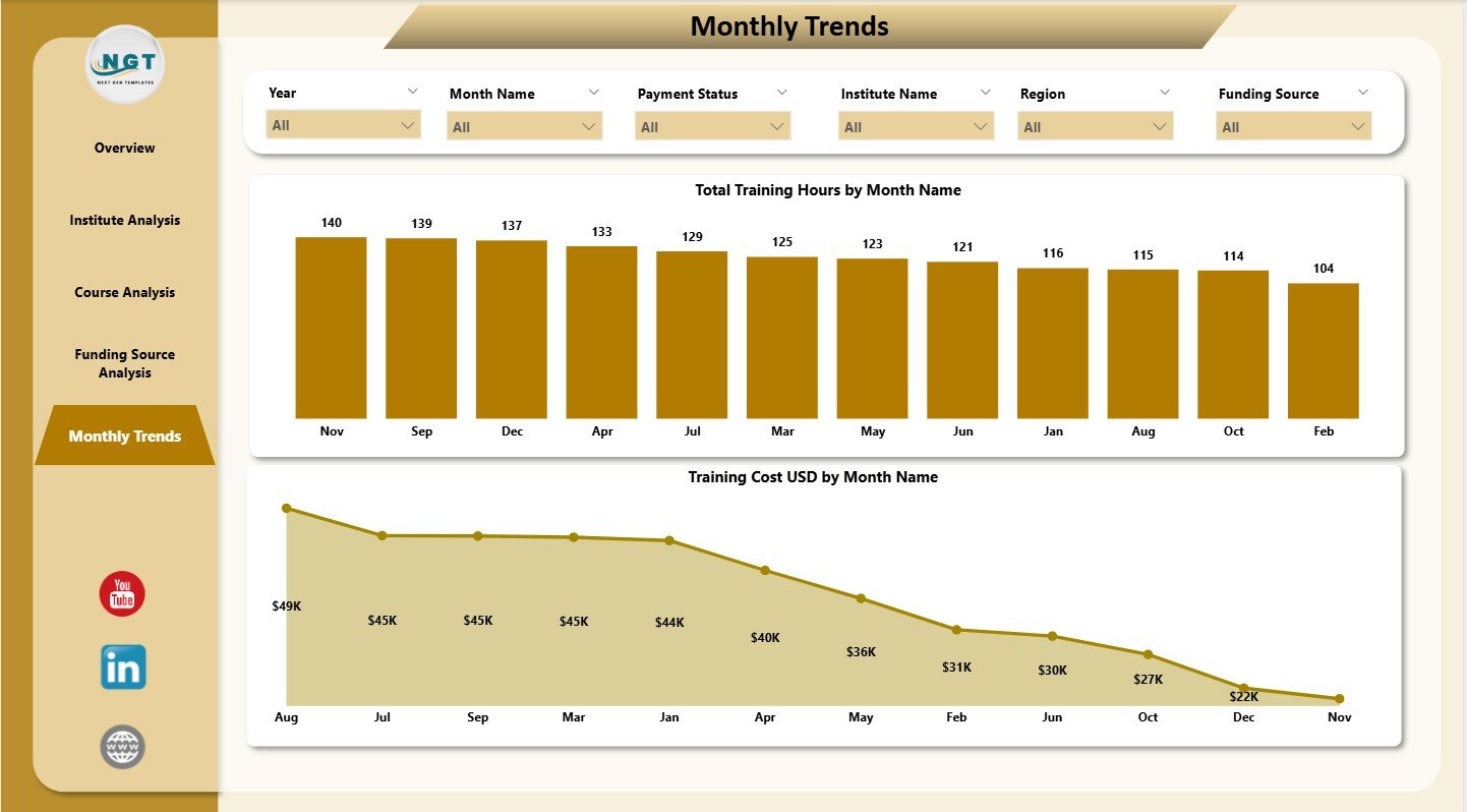
📅 5. Monthly Trends – Clear Month-by-Month Patterns
Training volumes change due to seasons, exam schedules, and budget cycles.
This page includes:
✔ Total Training Hours by Month Name
✔ Training Cost (USD) by Month Name
These patterns help institutes plan better, manage resources, forecast costs, and prepare monthly reports more efficiently.
📦 What’s Inside the Teacher Training Institutes Dashboard
When you download this Power BI dashboard, you get:
⭐ Fully designed Power BI (.pbix) file
⭐ Overview, Institute, Course, Funding, and Monthly Trend Pages
⭐ Interactive slicers and filters
⭐ Professional charts and KPIs
⭐ Clean and structured dataset mapping
⭐ Ready-to-use visuals and page layouts
Everything is fully interactive—you only need to update the data source.
🛠️ How to Use the Teacher Training Institutes Dashboard
1️⃣ Load or update your training dataset in Power BI.
2️⃣ Refresh the dashboard to update all visuals instantly.
3️⃣ Use slicers to filter by course, institute, funding source, or month.
4️⃣ Review KPIs on the Overview Page for quick insights.
5️⃣ Compare courses, institutes, and funding partners across pages.
6️⃣ Use monthly trends to plan budgets and forecast demand.
7️⃣ Share the dashboard with your team for collaborative decision-making.
No technical expertise is required—just Power BI basics.
👥 Who Can Benefit from This Dashboard?
This dashboard is ideal for:
🎓 Teacher training colleges
🏫 Government training institutes
🏢 Private training academies
🌍 NGO-backed training programs
📚 University training departments
💼 Education project monitoring teams
Any organization running regular training programs will benefit from these structured insights.


Reviews
There are no reviews yet.