Managing a sportswear retail chain is a constant balancing act. Inventory moves fast, seasonal demand changes quickly, customer preferences evolve, and return rates directly impact profitability. However, when performance data remains scattered across spreadsheets and static reports, decision-making becomes slow and reactive.
That is exactly why the Sportswear Chains Dashboard in Power BI is built — to convert raw retail data into clear, interactive, and action-ready insights.
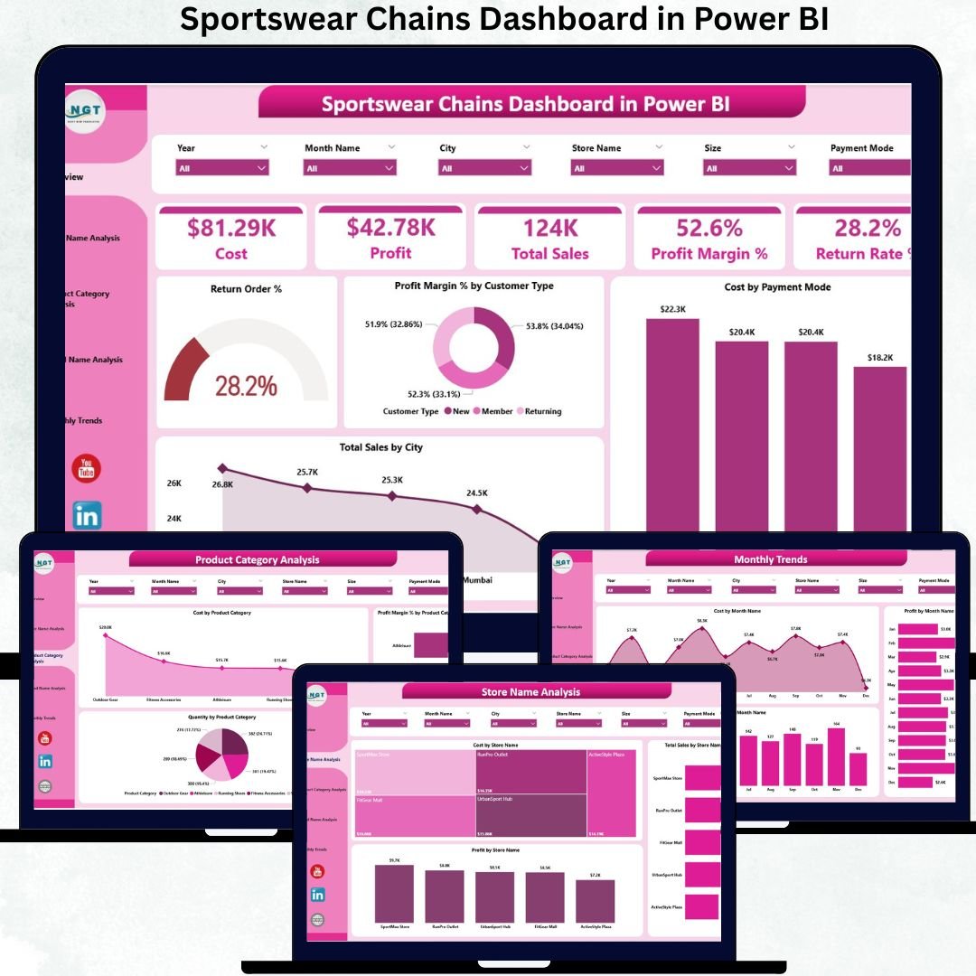
Sportswear Chains Dashboard in Power BI This ready-to-use Power BI dashboard helps retail leaders monitor sales, cost, profit, margins, returns, and trends across stores, brands, and product categories from a single, user-friendly analytics platform. Instead of guessing what is working and what is not, you see the full picture instantly.
Built using Power BI’s powerful visualization and filtering capabilities, this dashboard supports real-time performance tracking, deep-dive analysis, and smarter decision-making for growing sportswear businesses.
✅ Key Features of Sportswear Chains Dashboard in Power BI
📊 Complete Retail KPI Visibility
Track Total Sales, Cost, Profit, Profit Margin %, and Return Rate % across your entire sportswear chain without complex reports.
🏬 Store-Level Performance Analysis
Compare sales, cost, and profitability by store to quickly identify high-performing and underperforming locations.
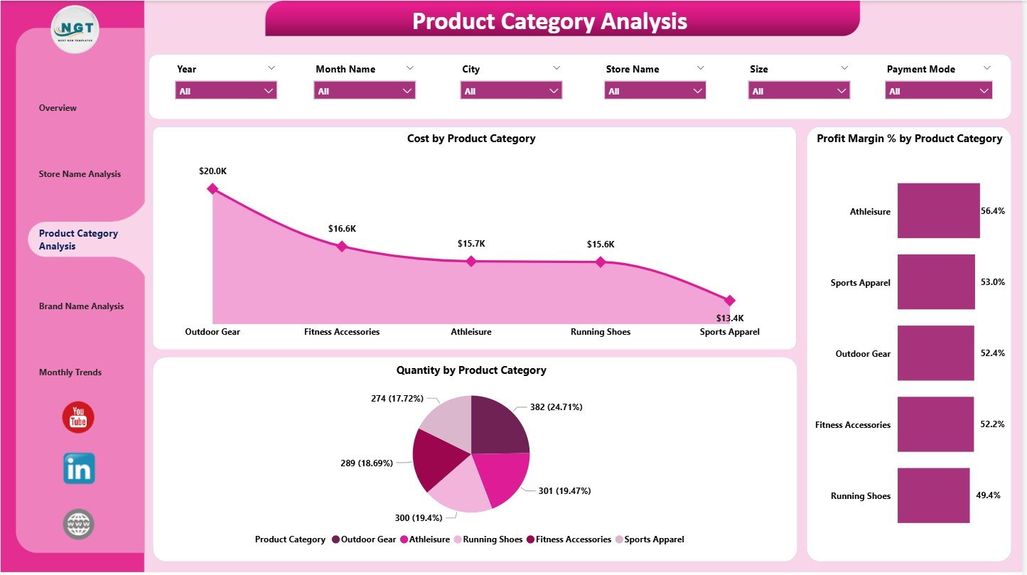
👟 Product Category Insights
Analyze footwear, apparel, accessories, and seasonal product performance to focus on high-margin categories.
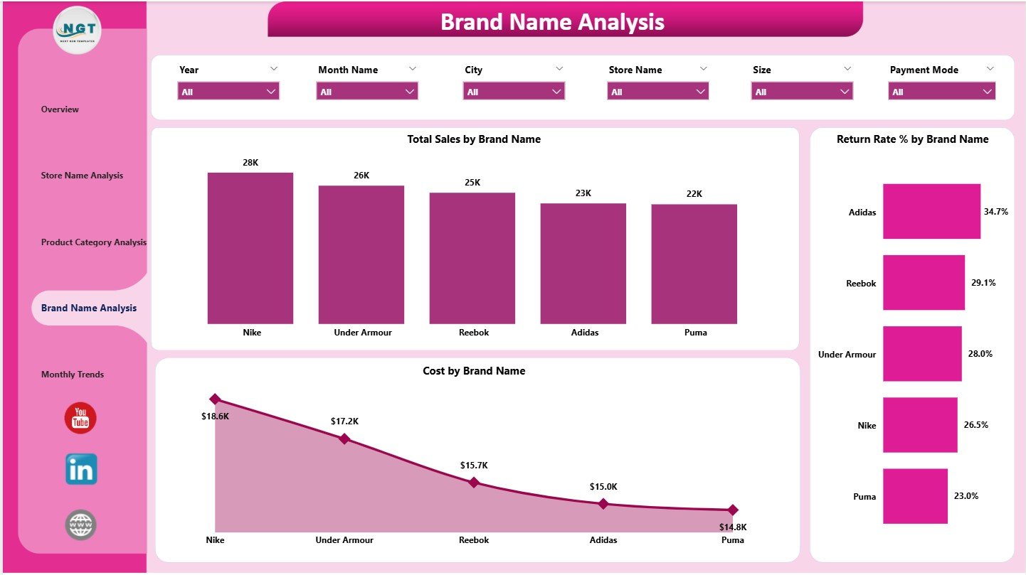
🏷️ Brand-Wise Performance Tracking
Monitor brand-level sales, cost efficiency, and return rates to optimize procurement and merchandising strategies.
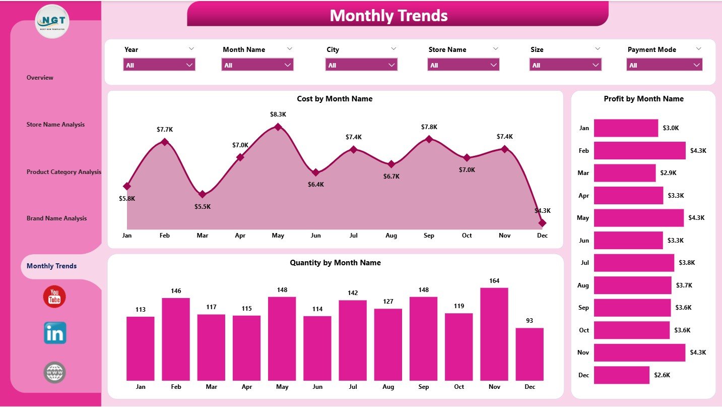
📈 Monthly Trend Analysis
Understand seasonal behavior by tracking monthly sales quantity, cost, and profit trends.
🎯 Interactive Filters & Slicers
Instantly filter insights by store, brand, category, customer type, or time period for focused analysis.
⚡ Real-Time Decision Support
All visuals update dynamically, helping you move from delayed reporting to proactive retail management.
📦 What’s Inside the Sportswear Chains Dashboard in Power BI
📄 Overview Page
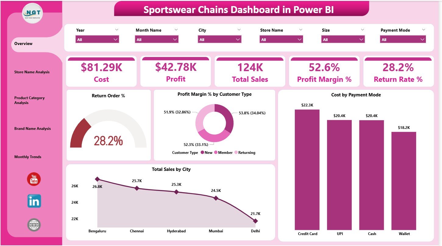
Shows Total Sales, Cost, Profit, Profit Margin %, and Return Rate % along with quick comparison charts by customer type, city, and payment mode.
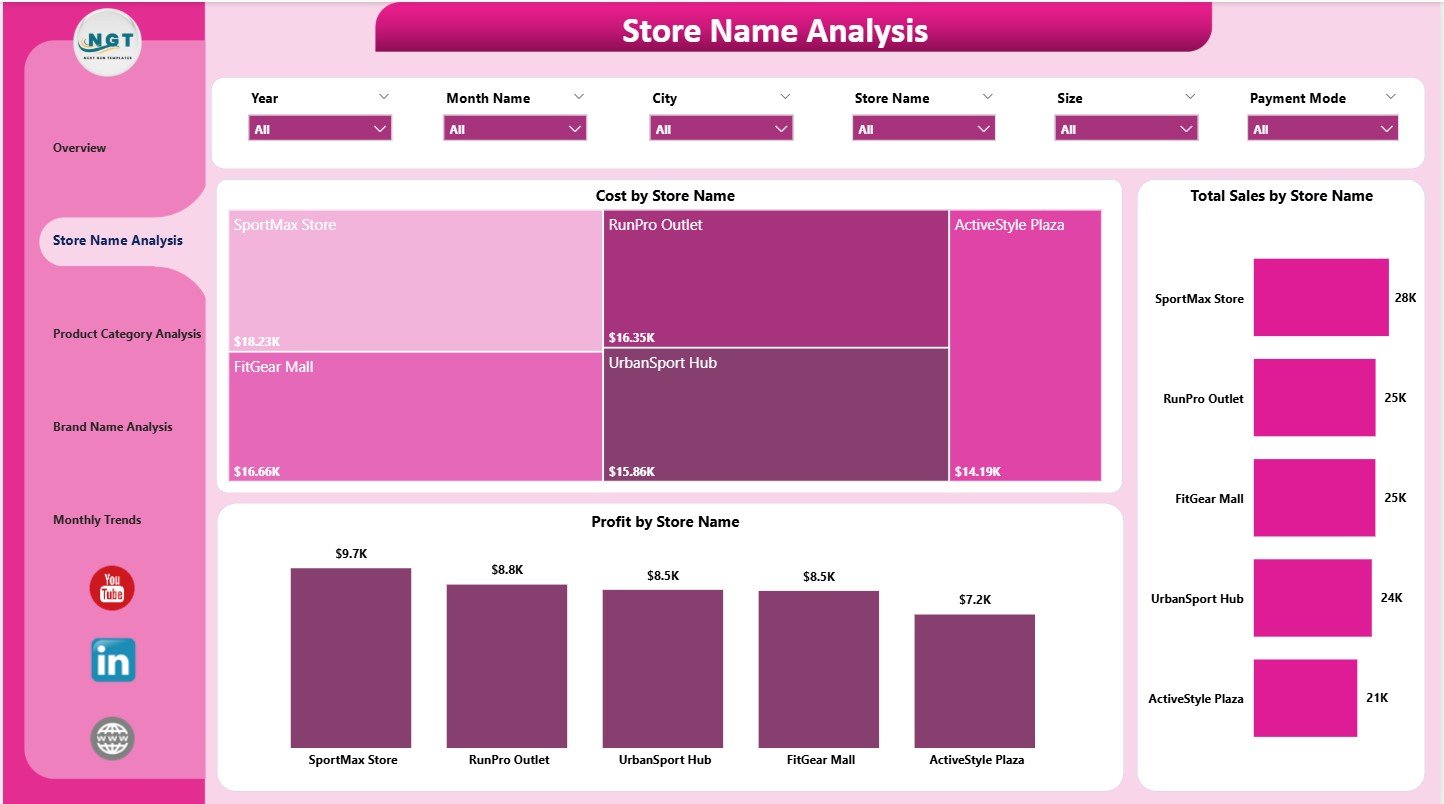
🏬 Store Name Analysis Page
Provides Cost, Sales, and Profit comparison by individual store locations.
👟 Product Category Analysis Page
Highlights category-wise Cost, Profit Margin %, and Quantity sold.
🏷️ Brand Name Analysis Page
Displays brand-wise Total Sales, Return Rate %, and Cost to evaluate brand contribution.
📅 Monthly Trends Page
Tracks Cost, Profit, and Quantity movement over time to support planning and forecasting.
🛠️ How to Use the Sportswear Chains Dashboard in Power BI
1️⃣ Load your structured retail data into Power BI
2️⃣ Refresh the dashboard with updated sales and return data
3️⃣ Use slicers to filter by Store, Brand, Category, Customer Type, or Month
4️⃣ Review KPI cards for business health
5️⃣ Drill into store, category, and brand pages for deeper insights
6️⃣ Track monthly trends to plan inventory and promotions
No advanced Power BI skills are required — the dashboard is designed for business users and decision-makers.
🎯 Who Can Benefit from This Dashboard?
🏪 Sportswear Chain Owners
📊 Retail Operations Managers
🧾 Finance & Profitability Teams
📦 Merchandising & Buying Teams
🏬 Store & Regional Managers
📈 Senior Leadership & Strategy Teams
Whether you manage a few outlets or a fast-growing sportswear chain, this dashboard scales with your business.


Reviews
There are no reviews yet.