The ride-hailing and mobility industry is evolving rapidly—and so is the amount of data companies must manage. Trip logs, fare details, promo usage, customer feedback, and vehicle performance data are stored across multiple systems. When this information is scattered, teams struggle to understand what’s really happening. This leads to slow decision-making, revenue leakage, long wait times, low customer satisfaction, and inefficient operations.
The Ride Hailing & Mobility Apps Dashboard in Power BI solves these challenges instantly. It brings together all key metrics into one clean, interactive dashboard. With just a click, businesses can analyze rides, fares, promotions, vehicles, cities, and monthly performance. This dashboard helps ride-hailing companies make smarter decisions, optimize fleet utilization, and improve profitability with real-time insights.
Built entirely in Power BI, the dashboard transforms raw data into live charts, slicers, KPIs, and dynamic visuals. Whether you run a taxi service, carpooling platform, bike rental, or full mobility app—this dashboard helps you monitor demand, understand customer behavior, and manage operations with clarity.
📊 Key Features of the Ride Hailing & Mobility Apps Dashboard in Power BI
The dashboard includes five powerful pages, each designed to give deep insights into different areas of mobility operations.
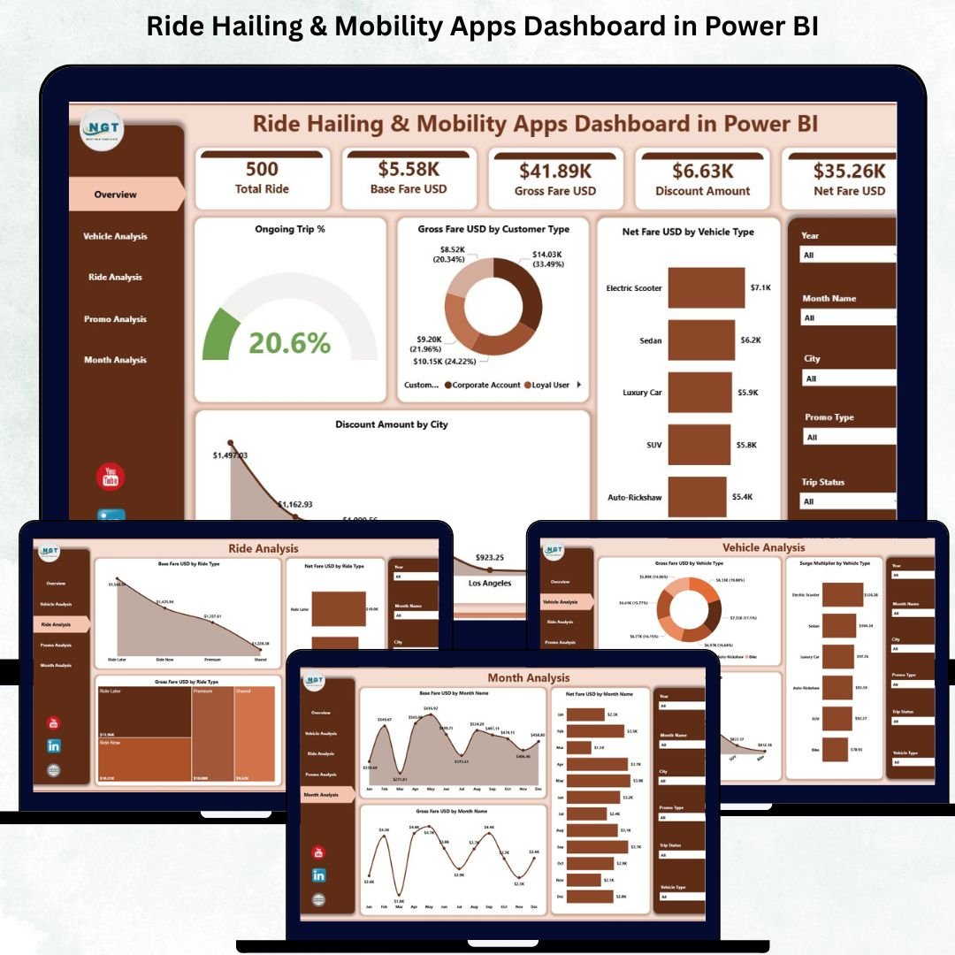
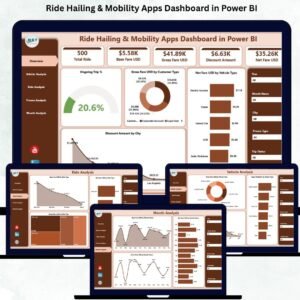
⭐ 1. Overview Page – Your Central Control Panel
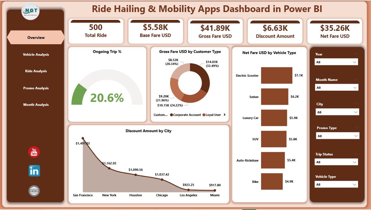
This is the main page of the dashboard, giving a quick snapshot of business health.
You can track:
-
✔ Ongoing Trip %
-
✔ Gross Fare (USD) by Customer Type
-
✔ Net Fare (USD) by Vehicle Type
-
✔ Discount Amount (USD) by City
Slicers allow instant filtering by:
-
Month
-
Vehicle type
-
Ride type
-
Promo type
-
City or customer segment
These filters give flexible, drill-down insights. For example, if you see a drop in Net Fare, you can immediately identify whether it comes from a specific city, vehicle type, or promo group.
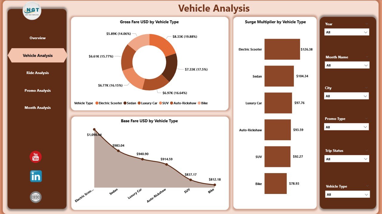
⭐ 2. Vehicle Analysis Page – Understand Fleet Performance
Vehicle categories influence fare, surge behavior, demand, and profitability.
This page includes charts for:
-
✔ Gross Fare USD by Vehicle Type
-
✔ Base Fare USD by Vehicle Type
-
✔ Surge Multiplier by Vehicle Type
You can identify top-performing vehicle types, optimize fleet distribution, refine surge pricing strategies, and enhance customer experience. For example, sedans may perform better in weekdays, while SUVs dominate during weekends.
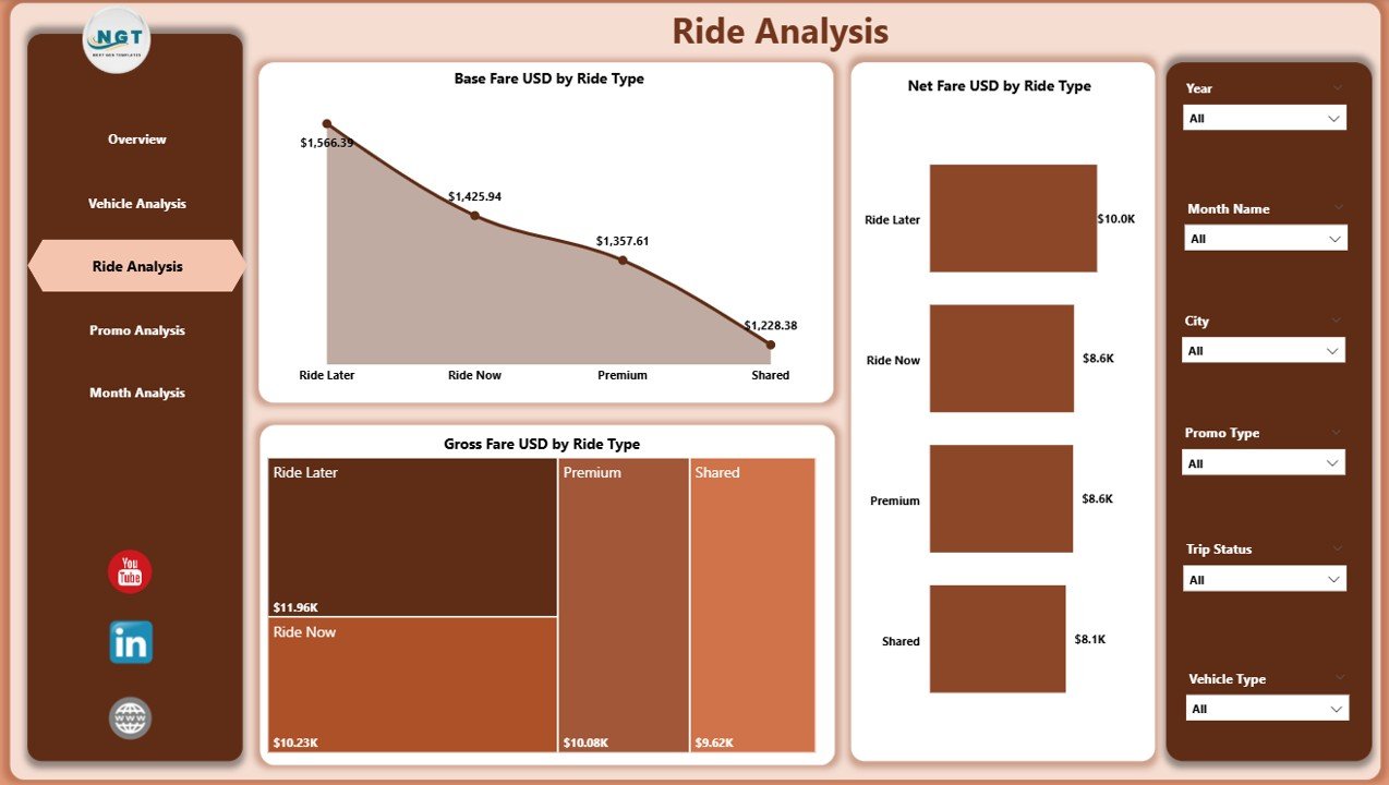
⭐ 3. Ride Analysis Page – Insights by Ride Category
Ride categories such as standard, premium, shared, airport rides, and shuttles each perform differently.
This page shows:
-
✔ Gross Fare USD by Ride Type
-
✔ Base Fare USD by Ride Type
-
✔ Net Fare USD by Ride Type
These insights help you track high-revenue categories, compare fare structures, understand customer preferences, and refine pricing models.
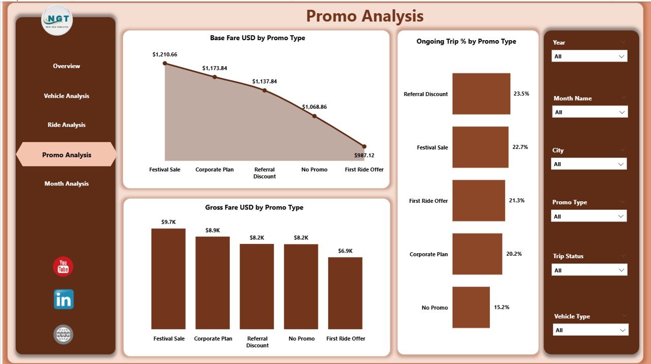
⭐ 4. Promo Analysis Page – Optimize Promotional Impact
Promotions attract users but reduce the net fare—so tracking them is essential.
This page includes:
-
✔ Gross Fare USD by Promo Type
-
✔ Base Fare USD by Promo Type
-
✔ Ongoing Trip % by Promo Type
You can identify which promos attract high demand, which ones affect revenue negatively, and which cities respond best. This helps you run smarter, cost-effective campaigns.
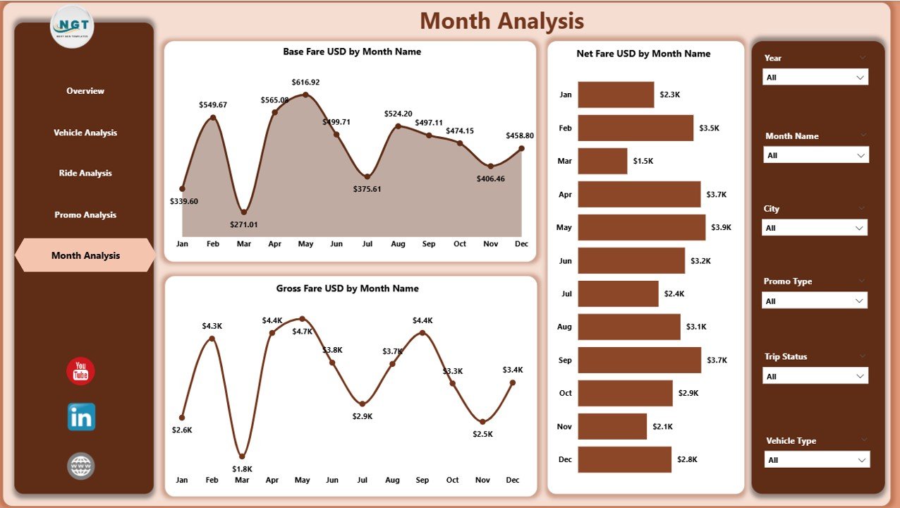
⭐ 5. Monthly Trends Page – Understand Seasonality and Demand Patterns
Mobility demand changes throughout the year due to weather, festivals, events, and holidays.
This page displays:
-
✔ Gross Fare USD by Month
-
✔ Base Fare USD by Month
-
✔ Net Fare USD by Month
These charts help you plan fleet availability, pricing, and promotional strategies more accurately.
📦 What’s Inside the Ride Hailing & Mobility Apps Dashboard
When you download the dashboard, you get:
-
A professionally built Power BI dashboard with 5 pages
-
Dynamic slicers to filter cities, vehicle types, ride types, promo types, and months
-
KPI cards for real-time performance tracking
-
Interactive charts for fares, discounts, and ongoing trips
-
Clean layouts designed for fast navigation
-
Fully customizable visuals and data connections
-
Easy refresh and ready-to-use structure
No coding or technical skills required—just connect your dataset and refresh.
🧩 How to Use the Ride Hailing Dashboard Effectively
Using the dashboard is simple:
-
Import your ride-hailing dataset
-
Refresh the visuals
-
Filter data by ride type, promo type, month, vehicle type, or city
-
Compare gross fare, base fare, and net fare
-
Track surge multiplier and ongoing trips
-
Analyze monthly trends
-
Improve pricing, fleet distribution, and promotions
All insights update automatically as your data grows.
👤 Who Can Benefit from This Dashboard
This dashboard is ideal for:
-
🚖 Ride-Hailing App Owners
-
🚕 Taxi Operators
-
🛵 Scooter & Bike Rental Companies
-
🚐 Shuttle Service Providers
-
🚙 Carpooling & Fleet Managers
-
📊 Mobility Analysts & CX Teams
-
🧭 Operations & Strategy Leaders
Any mobility business that wants real-time insights and better decision-making will benefit from this tool.
### Click hare to read the Detailed blog post
Visit our YouTube channel to learn step-by-step video tutorials
👉 Youtube.com/@PKAnExcelExpert


Reviews
There are no reviews yet.