Rail passenger transport systems move millions of people every day. Ticket sales, passenger volumes, trip schedules, delays, staffing, and revenue all change constantly. However, when this data remains scattered across reports or static spreadsheets, decision-makers lose visibility, speed, and control.
That is exactly why the Rail Passenger Transport Dashboard in Power BI is a game-changing analytics solution 🚀.
This ready-to-use Power BI dashboard transforms complex rail transport data into clear KPIs, interactive visuals, and actionable trends, enabling operators and authorities to manage performance, revenue, and passenger experience with confidence.
Designed for rail operators, transport authorities, planners, and leadership teams, this dashboard helps you monitor passenger behavior, track revenue efficiency, analyze service performance, and identify operational gaps—all from one centralized Power BI report.
Key Features of Rail Passenger Transport Dashboard in Power BI
📊 Centralized Rail Performance Monitoring
Track passenger, revenue, trip, and service KPIs in one interactive dashboard.
💰 Revenue & Efficiency Visibility
Monitor ticket revenue, revenue per passenger, and revenue per kilometer clearly.
🎟️ Passenger & Ticket Analysis
Understand passenger distribution by station, class, and ticket type.
📅 Time-Based Trend Analysis
Identify demand patterns and seasonality using monthly trend visuals.
🚦 Delay & Service Performance Tracking
Analyze delay minutes and service efficiency across line types.
⚡ Interactive Power BI Experience
Use slicers and filters to explore data instantly without technical skills.
📈 Scalable & Future-Ready Design
Easily extend the dashboard as routes, stations, and KPIs grow.
What’s Inside the Rail Passenger Transport Dashboard in Power BI
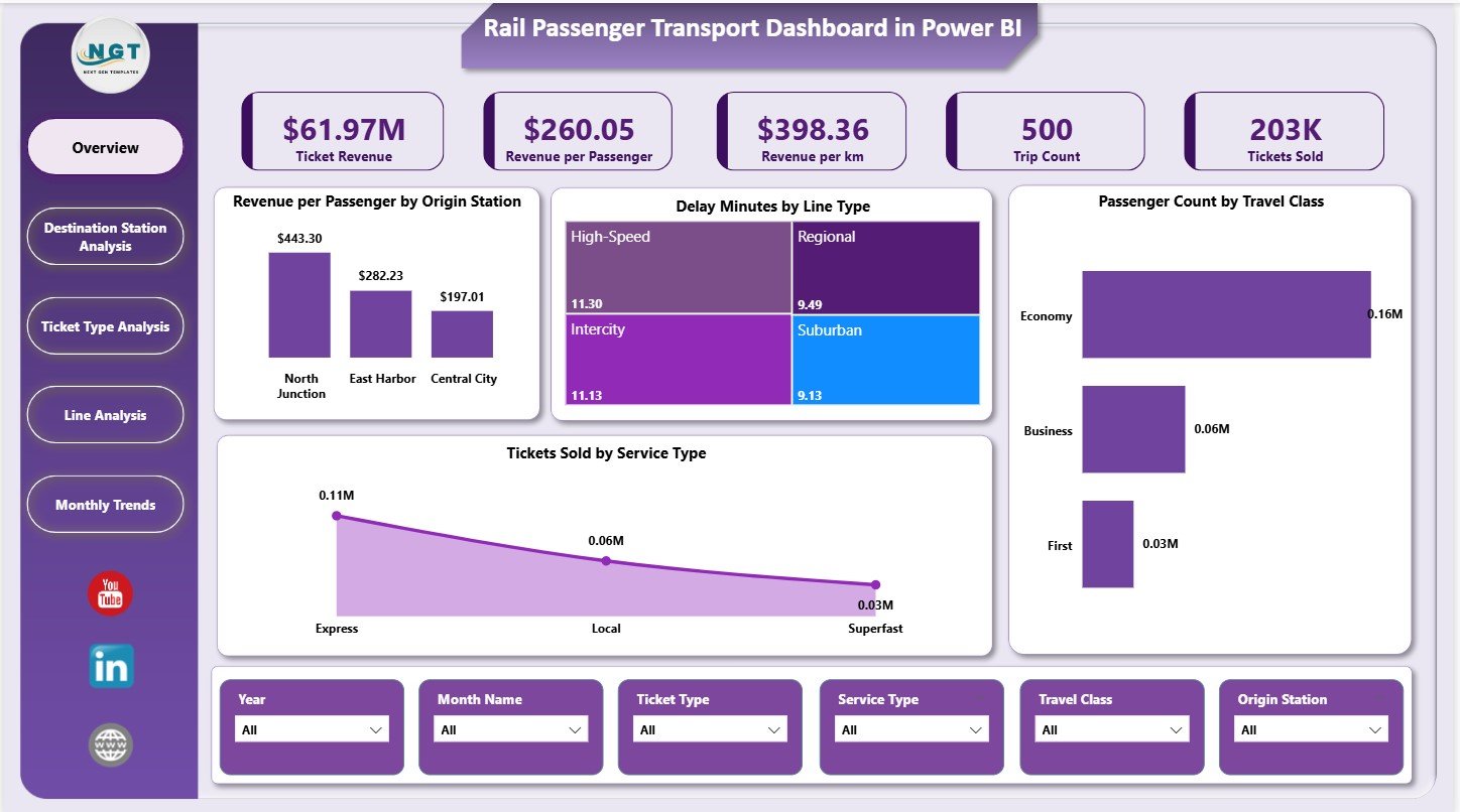
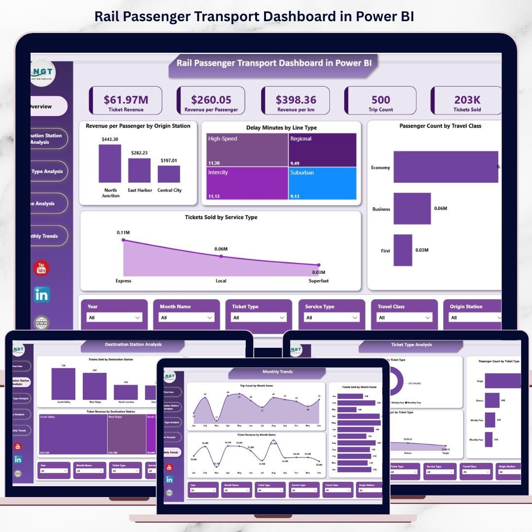
📌 Overview Page
The executive summary of rail performance with KPIs and high-level visuals.
KPI Cards Display:
-
Ticket Revenue
-
Revenue per Passenger
-
Revenue per Kilometer
-
Trip Count
-
Tickets Sold
Charts Included:
-
Revenue per Passenger by Origin Station
-
Delay Minutes by Line Type
-
Passenger Count by Travel Class
-
Tickets Sold by Service Type
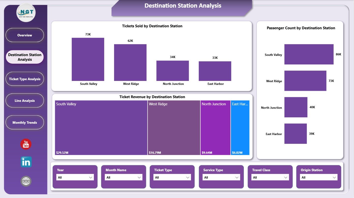
📍 Destination Station Analysis Page
Analyze passenger flow and revenue contribution by destination.
Charts Included:
-
Tickets Sold by Destination Station
-
Passenger Count by Destination Station
-
Ticket Revenue by Destination Station
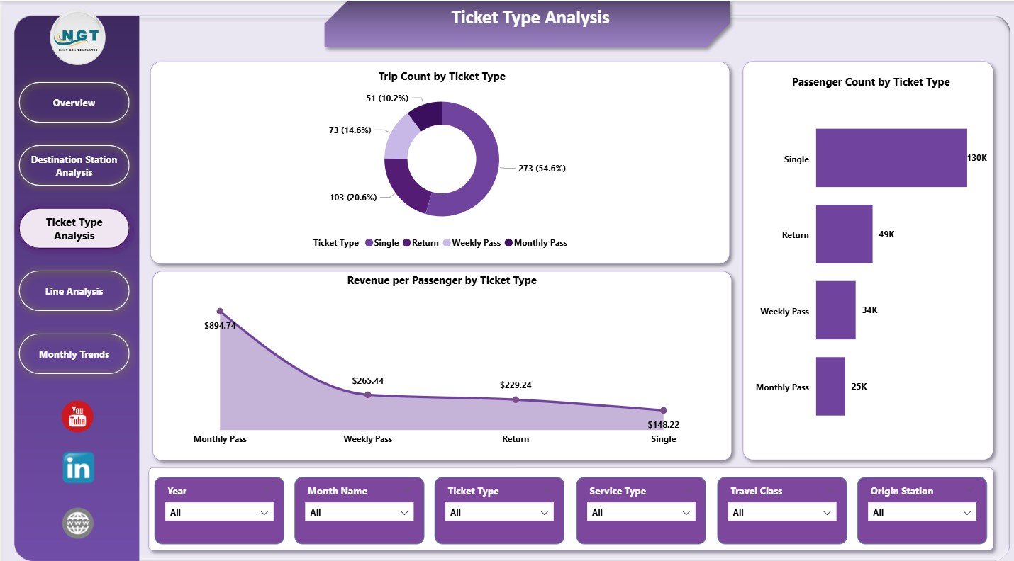
🎫 Ticket Type Analysis Page
Evaluate performance across different ticket categories.
Charts Included:
-
Trip Count by Ticket Type
-
Revenue per Passenger by Ticket Type
-
Passenger Count by Ticket Type
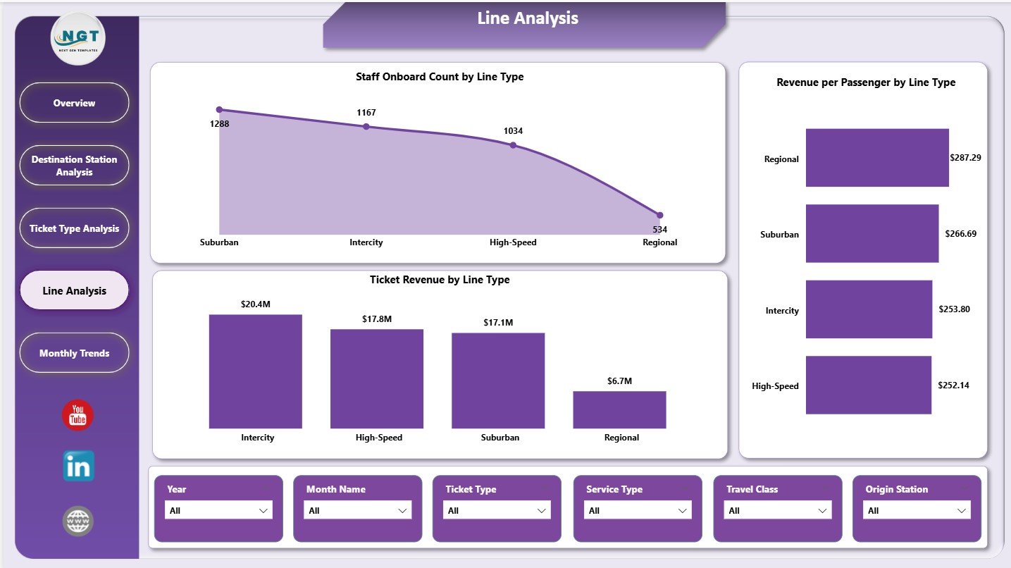
🚉 Line Analysis Page
Compare operational and revenue performance across rail line types.
Charts Included:
-
Staff Onboard Count by Line Type
-
Revenue per Passenger by Line Type
-
Ticket Revenue by Line Type
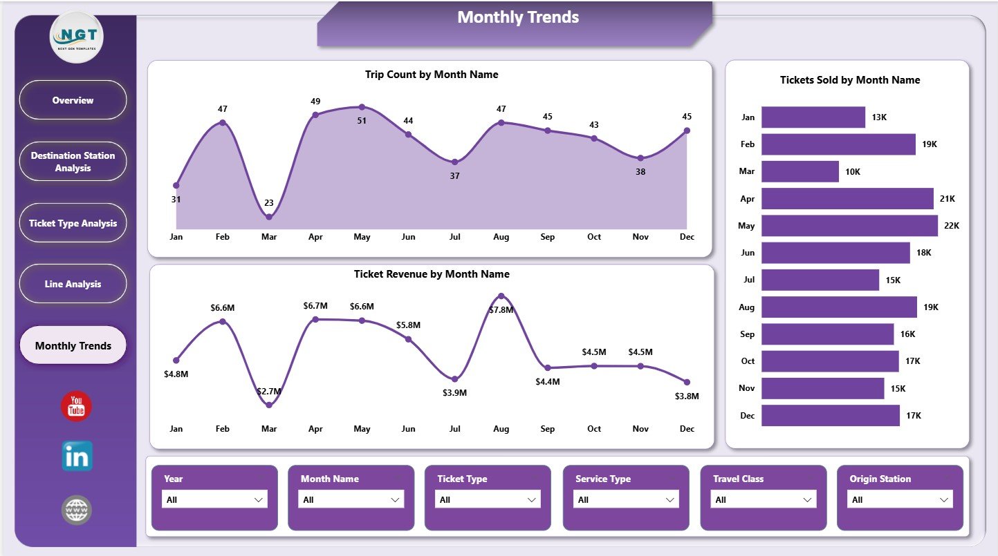
📅 Monthly Trends Page
Track time-based performance and demand fluctuations.
Charts Included:
-
Trip Count by Month
-
Tickets Sold by Month
-
Ticket Revenue by Month
How to Use the Rail Passenger Transport Dashboard in Power BI
📝 Step 1: Load Data
Import passenger, ticketing, and operational data into Power BI.
🔄 Step 2: Refresh the Model
Update datasets to reflect the latest rail performance data.
📊 Step 3: Explore KPIs
Use slicers to analyze by station, line type, ticket category, or time period.
📈 Step 4: Analyze Trends
Identify growth, congestion, or revenue changes over time.
🎯 Step 5: Take Action
Improve scheduling, pricing, staffing, and service quality using insights.
👥 Who Can Benefit from This Rail Passenger Transport Dashboard in Power BI
🚆 Rail Operations Managers – Monitor trips, delays, and service performance
💰 Revenue & Finance Teams – Analyze ticket sales and pricing effectiveness
📊 Transport Planners – Study passenger demand and capacity needs
🏙️ Public Transport Authorities – Improve network efficiency and transparency
🏢 Senior Leadership – Gain high-level visibility into rail system performance
🔍 Click here to read the Detailed blog post
📺 Visit our YouTube channel to learn step-by-step video tutorials
👉 Youtube.com/@PKAnExcelExpert


Reviews
There are no reviews yet.