
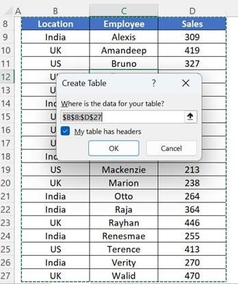


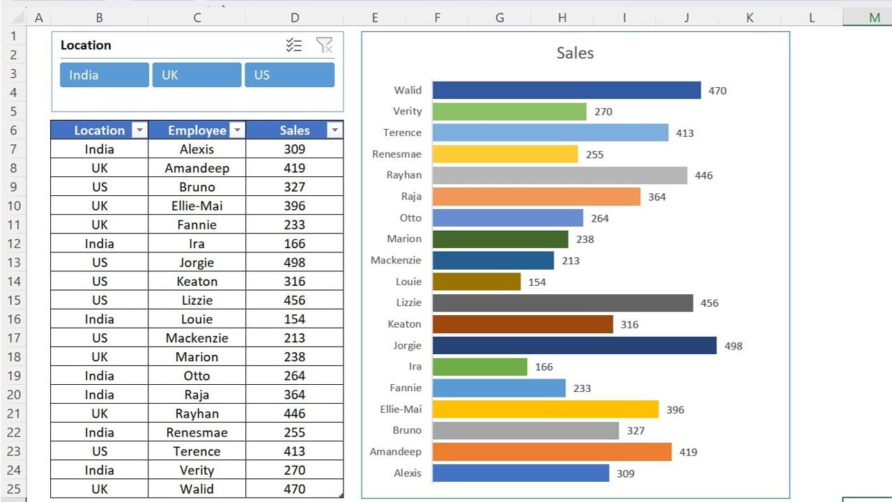
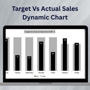
The Quick Dynamic Sales by Employees Chart with Slicer in Excel is a powerful and user-friendly tool designed to help you track and visualize sales data by employees. This dynamic chart allows you to compare the sales performance of different team members in real-time. The inclusion of a slicer feature makes it even easier to filter and analyze the data based on different criteria such as time periods, regions, or product categories.
Whether you’re managing a small team or a large sales force, this Excel tool helps you quickly identify top performers, monitor individual progress, and assess overall team productivity. With the slicer functionality, you can filter data on the fly, making it easier to get the insights you need without manually adjusting the data set.
Key Features of the Quick Dynamic Sales by Employees Chart with Slicer in Excel
📌 Interactive Sales Chart
The chart dynamically updates as you change the slicer criteria. Whether you want to view sales by month, product, or employee, the chart adjusts in real-time to provide a visual representation of your sales data.
🛠 Slicer for Real-Time Data Filtering
The slicer allows you to filter sales data based on various parameters such as date ranges, products, or individual employees. This enables you to focus on specific data subsets, improving analysis and decision-making.
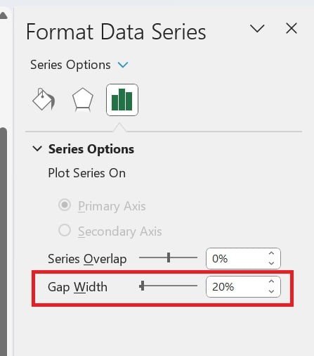
💡 Customizable Data and Labels
You can customize the chart to display specific data points such as sales targets, actual sales, or any other key performance indicator (KPI) that is relevant to your analysis. Easily change labels and data points to match your unique needs.
🔢 Real-Time Sales Performance Tracking
Monitor your sales team’s performance in real-time, with the chart updating automatically as new data is entered. This allows you to keep track of your team’s progress without needing to manually adjust the chart.
🚀 Multiple Use Cases
This tool is ideal for tracking sales performance across various departments, regions, or products. Use it to compare individual performance, assess overall team productivity, or visualize trends over time.
📊 Dynamic Data Visualization
The dynamic chart makes it easier to visualize sales data, helping you identify trends, outliers, and areas that require attention. Whether for internal reports or client presentations, this tool helps you present your data in a more impactful way.
⚙ Easy Setup and Customization
Setting up the Quick Dynamic Sales by Employees Chart is quick and simple. With user-friendly instructions, you can have the chart customized and ready for use in just a few steps.
🚀 Why You’ll Love the Quick Dynamic Sales by Employees Chart with Slicer in Excel
✅ Interactive and Dynamic – Update the chart with just a click using the slicer for real-time insights. ✅ Customizable Data Points – Tailor the chart to display the sales data that matters most. ✅ Real-Time Performance Tracking – Monitor team and individual sales performance instantly. ✅ Multiple Data Filtering – Use the slicer to filter data by various parameters. ✅ Easy to Use – Quick setup and simple customization for users of all skill levels.
📂 What’s Inside the Quick Dynamic Sales by Employees Chart with Slicer in Excel?
- Dynamic Sales Chart: A flexible chart that dynamically adjusts to your data.
- Interactive Slicer: Filter data in real-time based on specific parameters like employee, product, or time period.
- Customizable Labels and Data: Adjust the chart to reflect the sales metrics that are most important to you.
- Clear Instructions: Easy-to-follow steps to set up and customize the chart to your needs.
🔍 How to Use the Quick Dynamic Sales by Employees Chart with Slicer in Excel
1️⃣ Download the Template – Get instant access to the Excel file upon purchase. 2️⃣ Enter Your Sales Data – Input sales figures for each employee, product, or time period. 3️⃣ Customize the Chart – Adjust labels, categories, and other elements to match your reporting needs. 4️⃣ Use the Slicer – Filter data on the fly to compare sales performance across different variables. 5️⃣ Present and Share – Use the dynamic chart in reports, meetings, or client presentations to showcase your sales data.
🎯 Who Can Benefit from the Quick Dynamic Sales by Employees Chart with Slicer in Excel? 🔹 Sales Managers
🔹 Business Owners
🔹 Marketing Teams
🔹 Financial Analysts
🔹 Project Managers
🔹 Anyone managing or tracking sales performance
Track and visualize your sales performance with the Quick Dynamic Sales by Employees Chart with Slicer in Excel. Improve analysis, enhance team performance, and make data-driven decisions with this intuitive and powerful Excel tool.
Click here to read the Detailed blog post
https://www.pk-anexcelexpert.com/quick-dynamic-sales-by-employees-chart-with-slicer-in-excel/
Visit our YouTube channel to learn step-by-step video tutorials
Watch the step-by-step video tutorial:


Reviews
There are no reviews yet.