Power generation companies operate in one of the most fast-moving and data-intensive industries. Every plant must track fuel cost, revenue, total cost, downtime, power output, and operational performance on a continuous basis. When all this information stays scattered across spreadsheets, manual logs, and different systems, leaders lose visibility. As a result, decisions get delayed, efficiency drops, and financial performance suffers. To solve these challenges, we created the Power Generation Dashboard in Power BI — a modern, visual, and interactive analytics solution designed specifically for power plants.
This powerful dashboard brings every important KPI into one integrated view. Whether you manage a thermal plant, solar power plant, hydro station, or wind farm, this Power BI dashboard gives you real-time insights with dynamic slicers, automated visuals, and interactive drill-downs. You understand trends instantly, compare performance across departments, reduce downtime, monitor fuel cost changes, and make data-driven decisions with complete clarity.
✨ Key Features of the Power Generation Dashboard in Power BI
⚡ Five Dedicated Analytical Pages
This dashboard includes five high-impact pages: Overview, Department Analysis, Plant Type Analysis, Fuel Type Analysis, and Monthly Trends. Each page displays a focused layer of insights to help you understand power generation performance from all angles.
📊 Clear KPI Cards & Dynamic Charts
The dashboard includes five key KPI cards for high-level metrics along with interactive charts such as profit comparison, downtime trends, fuel cost breakdowns, and cost-versus-revenue visuals.
🔍 Smart Filters & Slicers
Users can filter data by month, plant type, fuel type, department, or unit. With one click, every chart updates instantly, helping managers analyze information effortlessly.
🚀 Real-Time Reporting
Power BI refreshes the latest data automatically whenever your source updates. This ensures accuracy, transparency, and complete trust in the numbers.
📦 What’s Inside the Power Generation Dashboard
📁 1. Complete PBIX Dashboard File
A professionally designed Power BI file containing all charts, slicers, KPIs, and pages required to monitor energy performance.
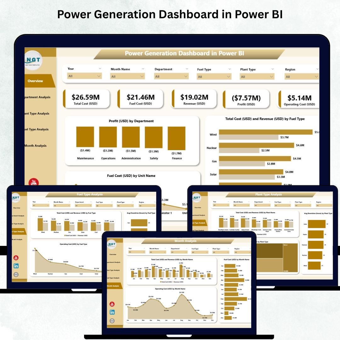
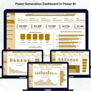
📊 2. Overview Page – Your Complete Power Performance Snapshot
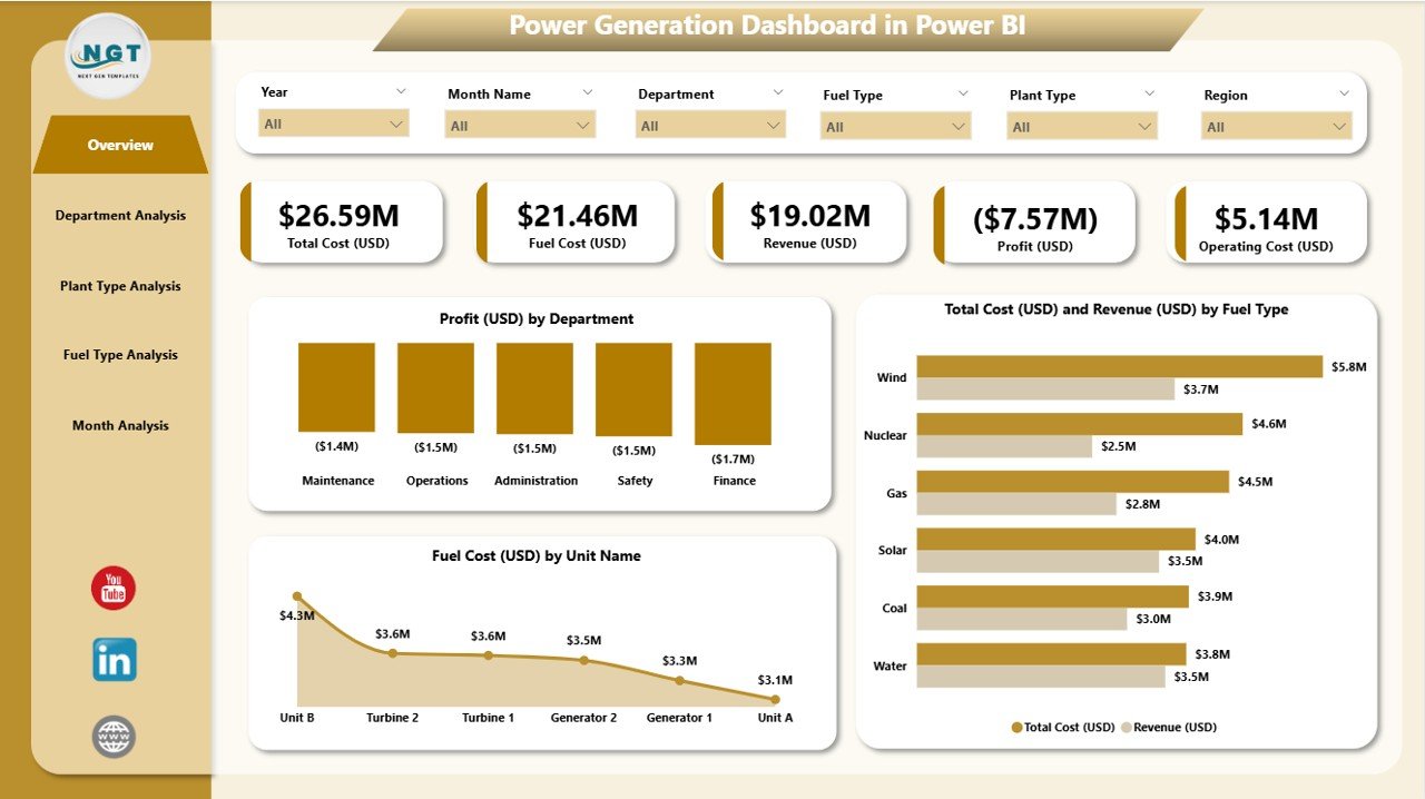
This page includes:
-
5 KPI cards
-
Slicers for Department, Plant Type, and Fuel Type
-
3 major charts:
-
Profit (USD) by Department
-
Total Cost & Revenue by Fuel Type
-
Fuel Cost by Unit Name
-
This page is perfect for daily operational monitoring. You instantly see which plants or fuel types generate high cost, and where profitability stands.
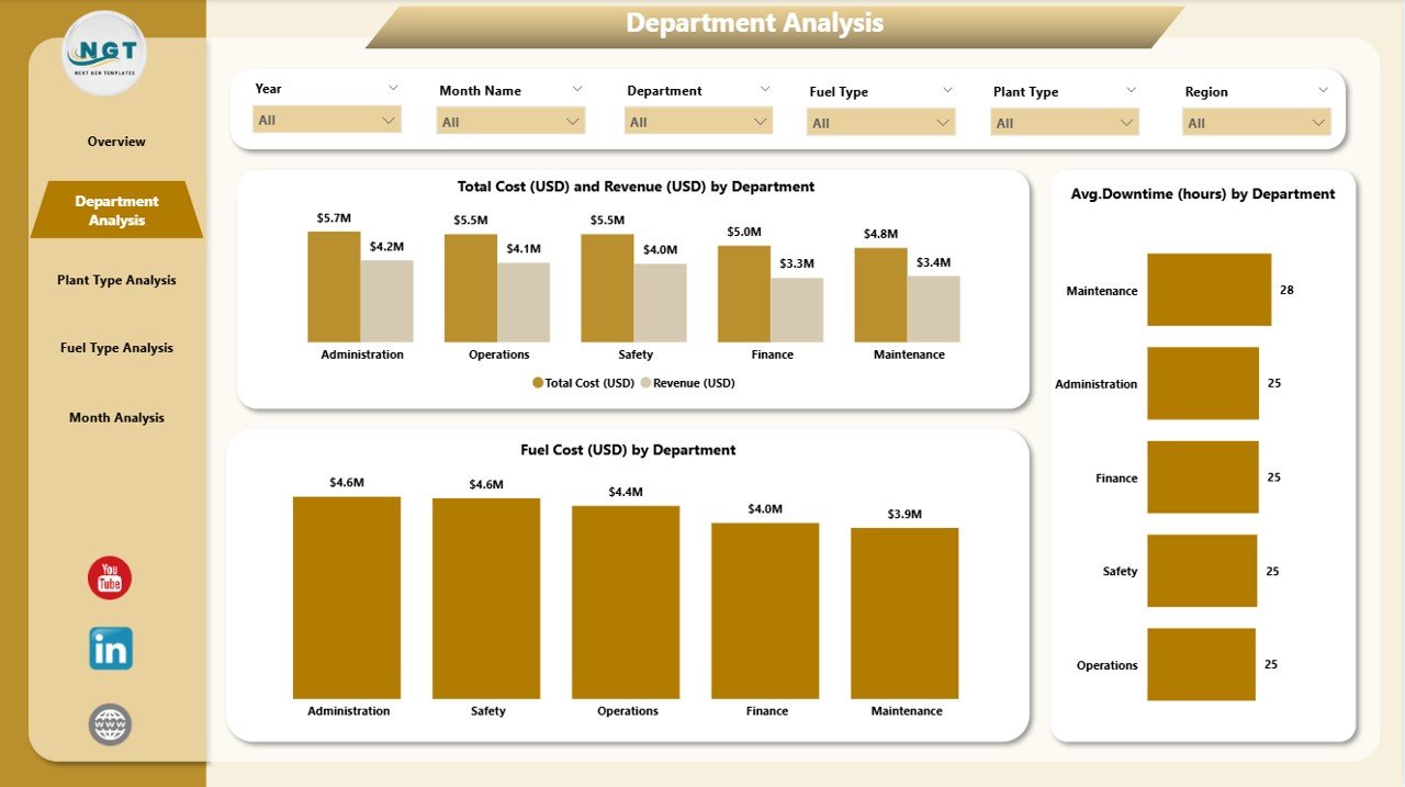
🏭 3. Department Analysis Page – Compare Performance Across Departments
This page displays:
-
Total Cost & Revenue by Department
-
Average Downtime (Hours) by Department
-
Fuel Cost by Department
These insights help leaders identify which departments perform efficiently and which need corrective action.
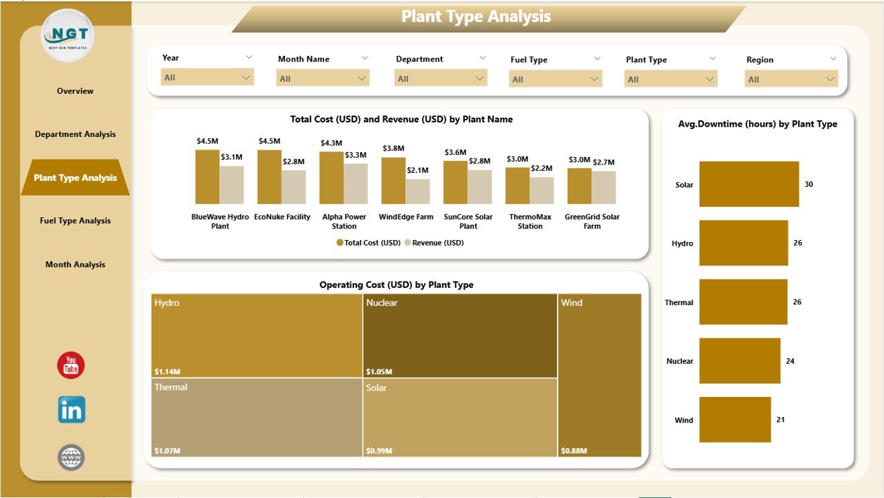
🌍 4. Plant Type Analysis Page – Evaluate Plant-Wise Performance
Visuals include:
-
Total Cost & Revenue by Plant Name
-
Average Downtime by Plant Name
-
Operating Cost by Plant Type
This helps you determine which plants generate higher profit, which face more downtime, and how operating costs compare across categories.
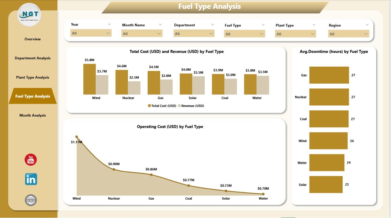
🔥 5. Fuel Type Analysis Page – Understand Performance by Fuel Source
Includes:
-
Cost & Revenue by Fuel Type
-
Downtime by Fuel Type
-
Operating Cost by Fuel Source
This page helps in fuel planning, supplier evaluation, and energy mix optimization.
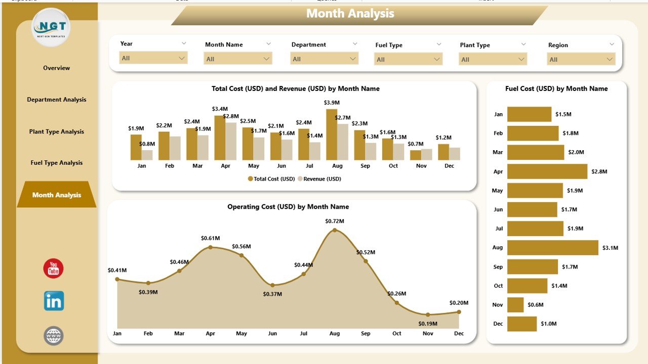
📅 6. Monthly Trends Page – Monitor Seasonal & Monthly Patterns
Charts include:
-
Cost & Revenue by Month
-
Fuel Cost by Month
-
Operating Cost by Month
Use this page to forecast upcoming performance, identify peak season behaviors, and plan maintenance schedules strategically.
🛠️ How to Use the Power Generation Dashboard
1️⃣ Update Your Data Source
Add revenue, cost, downtime, plant type, and unit-wise details into your Excel or database source.
2️⃣ Refresh Power BI
With one click, the entire dashboard updates immediately.
3️⃣ Apply Filters
Switch between fuel type, department, month, or plant category for deeper analysis.
4️⃣ Review Key KPIs
Check downtime spikes, profit movement, and fuel cost behavior.
5️⃣ Analyze Monthly Trends
Use trends to improve forecasting and long-term decision-making.
🎯 Who Can Benefit from This Dashboard
⚙️ Plant Managers
Track downtime, performance, and cost variations.
💼 Energy Analysts
Analyze plant wise, fuel wise, and unit wise profitability.
🏢 Utility Organizations
Monitor complete operational and financial performance across multiple plant types.
💹 Finance Teams
Receive clear visibility of cost, revenue, and profit trends.
🔧 Maintenance Teams
Understand downtime patterns and plan maintenance activities properly.
### Click hare to read the Detailed blog post
Visit our YouTube channel to learn step-by-step video tutorials
👉 Youtube.com/@PKAnExcelExpert


Reviews
There are no reviews yet.