The paper and pulp industry deals with huge production volumes, rising raw material costs, strict quality demands, machine efficiency challenges, and continuous pressure to improve performance. When data is scattered across multiple spreadsheets and reports, teams lose visibility. Decisions slow down. Problems go unnoticed.
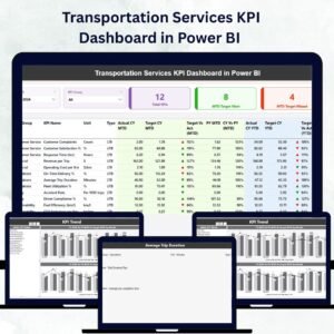
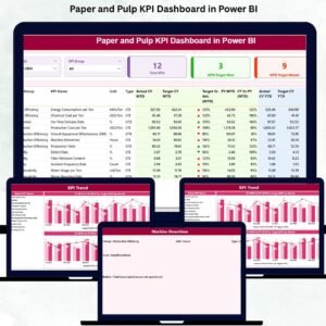
That’s why we created the Paper and Pulp KPI Dashboard in Power BI — a powerful, ready-to-use analytics dashboard that brings complete clarity into production, energy, quality, maintenance, fiber cost, and operational performance. Paper and Pulp KPI Dashboard in Power BI Designed for mill heads, production teams, quality engineers, and management, this dashboard converts raw Excel data into clean visuals and meaningful insights that drive real action.
Paper and Pulp KPI Dashboard in Power BI With just one refresh, your entire KPI tracking system becomes automated, accurate, and easy to understand — even for non-technical users. Paper and Pulp KPI Dashboard in Power BI Whether you want to monitor MTD, YTD, target achievement, trends, or last-year comparisons, this dashboard shows everything in seconds.
⭐ Key Features of the Paper and Pulp KPI Dashboard in Power BI
This dashboard comes with powerful features that help every department track performance with confidence:
✨ Real-time KPI Monitoring – Track production, energy, quality, waste, and cost KPIs in one place.
📊 Smart Slicers & Filters – View performance by month and KPI category instantly.
📈 MTD & YTD Tracking – Quickly compare targets, actuals, and previous-year numbers.
📉 Trend Analysis Charts – Identify rising energy usage, falling machine speed, or increasing defects.
📌 KPI Status Indicators – Green ▲ for improvement, red ▼ for deviation.
📁 Easy Excel Input System – Update Excel sheets, click refresh, and your dashboard updates automatically.
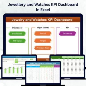
⭐ What’s Inside the Paper and Pulp KPI Dashboard?
Inside the Power BI file, you get a complete analytical system:
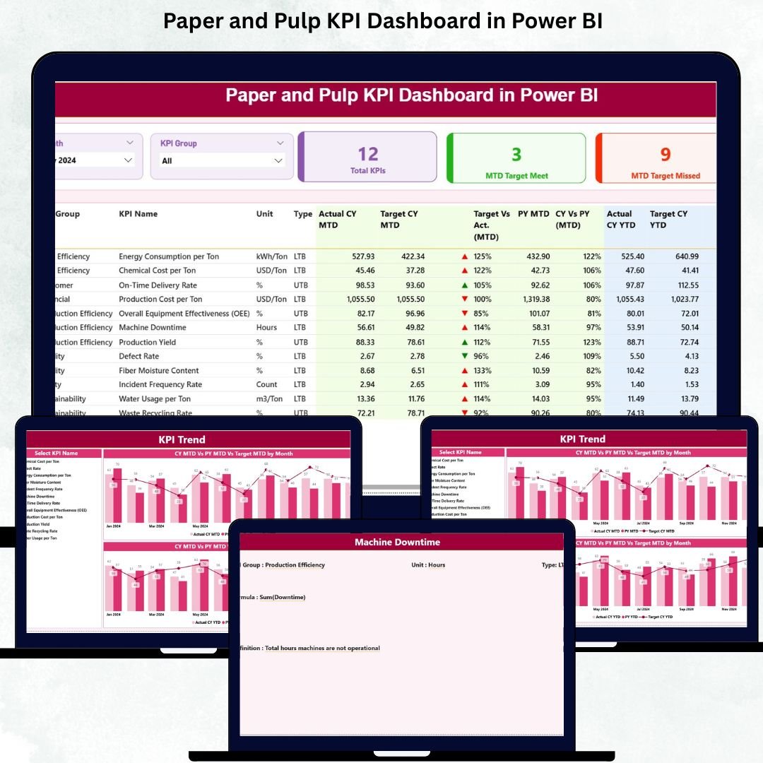
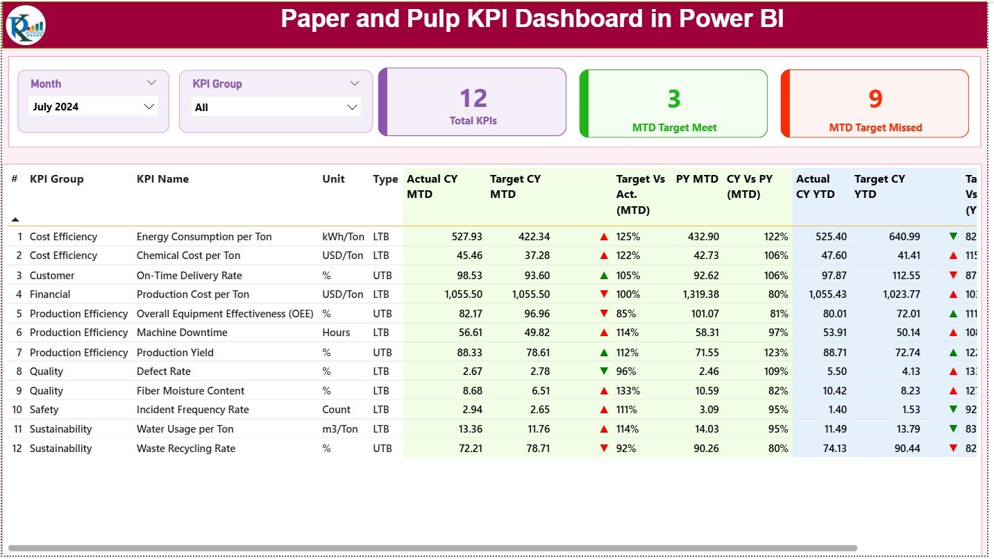
🟦 Summary Page – Your main dashboard with KPI cards, slicers, and a detailed KPI table showing:
-
KPI Group
-
Actual vs Target (MTD & YTD)
-
Previous year comparisons
-
Color-coded status indicators
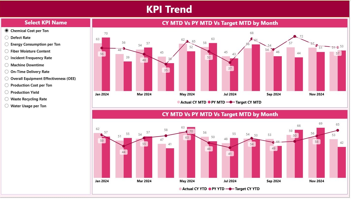
🟧 KPI Trend Page – Two combo charts showing MTD & YTD trends for any KPI you select.
This helps detect seasonality, sudden performance drops, process imbalances, or energy spikes.
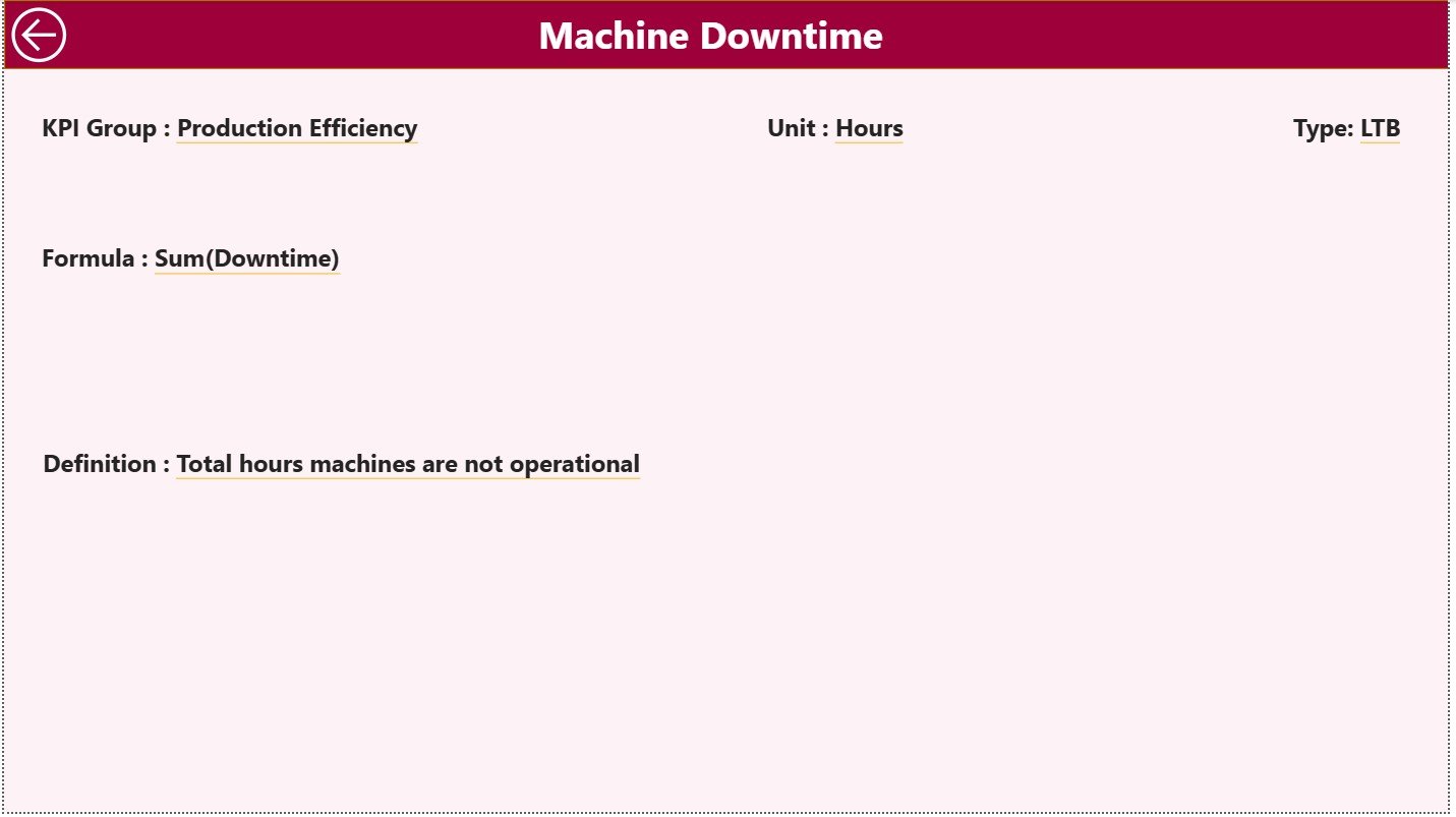
🟩 KPI Definition Drill-Through Page – A detailed view showing KPI formula, unit, type (UTB/LTB), and meaning.
Perfect for training teams and ensuring KPI clarity.
🟨 Structured Excel Data Source – Three sheets (Actual, Target, KPI Definition) designed for simple updating.
⭐ How to Use the Paper and Pulp KPI Dashboard
Using this dashboard is extremely easy—even for beginners:
1️⃣ Update Actual data in the Input Actual sheet (MTD & YTD).
2️⃣ Enter Targets into the Input Target sheet.
3️⃣ Define or edit KPIs in the KPI Definition sheet.
4️⃣ Open Power BI and click Refresh.
5️⃣ Review monthly performance using slicers.
6️⃣ Analyze trends on the KPI Trend Page.
7️⃣ Drill through to definitions for KPI clarity.
In just a few steps, your mill gets a full 360° performance view.
⭐ Who Can Benefit from This Dashboard?
This dashboard is designed for every department in a paper and pulp manufacturing company:
🧪 Production Teams – Track daily output, speed, runtime, and downtime.
📏 Quality Engineers – Monitor GSM variation, moisture, defects, and complaints.
⚙️ Maintenance Technicians – View failure patterns, downtime, and machine performance trends.
🔌 Energy Teams – Track steam, power, and water consumption.
📊 Management & Leadership – Evaluate plant-wide performance, cost drivers, and improvement opportunities.
Whether you run one machine or an entire mill, this dashboard helps every team make smarter decisions.


Reviews
There are no reviews yet.