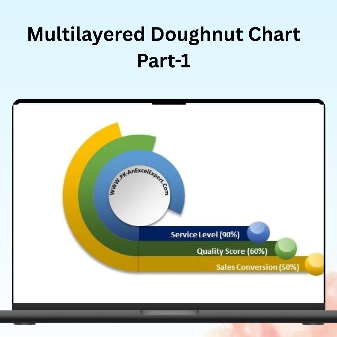
The Multilayered Doughnut Chart (Part 1) is a powerful and visually appealing Excel tool designed to help you represent multiple data points in a single, easy-to-read chart. This chart type is perfect for showing complex data relationships, such as KPIs, sales performance, or project progress, across different categories or layers. With its clean design and interactive features, the Multilayered Doughnut Chart allows you to present detailed insights in a simple and engaging way.
In this first part of the series, you’ll learn how to create and customize a multilayered doughnut chart using Excel’s built-in tools. This chart is fully customizable, allowing you to display multiple layers of data in a single chart, each representing a different aspect of your performance. Whether you’re tracking financial goals, project milestones, or any other metrics, this chart offers a clear and visually engaging way to present the data.

Key Features of the Multilayered Doughnut Chart:
📊 Multiple Data Layers
Display data across multiple layers in a single doughnut chart, allowing you to compare and contrast different metrics at once. Each layer can represent a different category or timeframe, giving you a multi-dimensional view of your data.
🔄 Dynamic Data Updates
As you input new data, the doughnut chart automatically updates to reflect the changes, giving you a real-time overview of your KPIs or project metrics.
🎨 Customizable Appearance
Easily customize the chart’s colors, labels, and sections to match your branding or presentation needs. You can also adjust the thickness of each layer, making it easy to highlight the most important data.
📈 Clear Visualization
The multilayered doughnut chart offers a clean and visually engaging way to represent your data. Each section is clearly defined, making it easy to interpret the data and spot trends or anomalies.
🛠️ Interactive & User-Friendly
With simple drag-and-drop functionality, this chart is easy to update and manipulate. Whether you are creating a report or dashboard, the multilayered doughnut chart provides a flexible and efficient way to track and present data.
Why You’ll Love the Multilayered Doughnut Chart:
✅ Versatile Data Presentation – Display multiple layers of data in a single chart, making it perfect for comparing performance across different categories or timeframes. ✅ Enhanced Visualization – Make complex data easier to interpret with visually appealing, dynamic charts. ✅ Customizable Design – Tailor the chart to your specific needs, from color adjustments to data labeling. ✅ Effortless Data Updates – The chart automatically updates as new data is entered, keeping you on top of your metrics in real-time. ✅ Ideal for Dashboards – Use this chart as part of your dashboard to provide an overview of performance indicators, sales metrics, or project progress.
What’s Inside the Multilayered Doughnut Chart:
- Multiple Data Layers – Display several data sets or categories in a single chart.
- Dynamic Data Input – Easily input new data to see the chart update in real-time.
- Customizable Color Scheme – Adjust the chart’s appearance to suit your business or project needs.
- Clear and Simple Visualization – Represent data in a visually engaging and easy-to-understand format.
- Step-by-Step Guide – Instructions for creating and customizing your multilayered doughnut chart.
How to Use the Multilayered Doughnut Chart:
1️⃣ Download the Template – Get access to your Excel file immediately after purchase. 2️⃣ Input Your Data – Enter the data you want to display in the doughnut chart. 3️⃣ Customize the Chart – Adjust colors, labels, and layers to suit your needs. 4️⃣ Visualize Your Data – Use the multilayered doughnut chart to present and compare your data in an engaging way.
Who Can Benefit from the Multilayered Doughnut Chart:
- Business Analysts
- Project Managers
- Sales Teams
- Marketing Teams
- Data Analysts
- Financial Analysts
- Entrepreneurs and Small Business Owners
Whether you need to track performance metrics, monitor project milestones, or visualize sales goals, the Multilayered Doughnut Chart is the perfect tool to help you present data clearly and effectively.
Click here to read the Detailed blog post
https://www.pk-anexcelexpert.com/multilayered-doughnut-chart-part-1/


Reviews
There are no reviews yet.