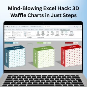
The Mind-Blowing Excel Hack: 3D Waffle Charts in Just Steps is a powerful tool designed to make your data presentations stand out. This template allows you to create stunning 3D waffle charts with ease, turning your standard data into an engaging and visually appealing representation. Whether you are presenting project progress, sales data, or any other performance metric, this tool adds a unique touch that captures attention and helps your data stand out in a crowded presentation or report.
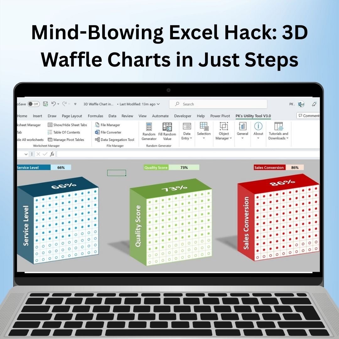
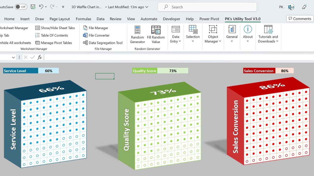
Waffle charts are an excellent way to display percentages or part-to-whole relationships. This template takes that one step further by adding a 3D effect, making your data not only more engaging but also easier to understand. With simple setup instructions and customizable data points, this template is perfect for professionals who want to elevate their presentations and wow their audience.
Key Features of the 3D Waffle Charts in Excel
📌 Stunning 3D Effect
The 3D waffle chart brings your data to life, adding depth and dimension to what would normally be a flat chart. The visual appeal helps to emphasize your data and make it more memorable for your audience.
🛠 Customizable Data and Design
You can easily customize the chart to fit your data. Whether you’re tracking sales targets, project milestones, or team performance, the 3D waffle chart can be adjusted to suit your specific needs. Change colors, labels, and data to create a chart that aligns with your goals.
💡 Track Percentages and Progress
The 3D waffle chart is ideal for tracking part-to-whole relationships, like project completion, goals, or percentage-based data. Each square in the waffle chart represents a percentage, making it easy to visualize progress at a glance.
🔢 Real-Time Data Updates
As new data is entered, the chart updates automatically. This feature ensures that your presentation or report remains accurate without the need for manual adjustments.
🚀 Multiple Data Use Cases
Use this 3D waffle chart to track any data set that involves percentages. Whether it’s sales, project completion, or goals, this tool is flexible enough for a wide variety of uses.
📊 Improved Data Presentation
The 3D design makes your charts more visually compelling, helping to keep your audience engaged while making the data easier to understand. It’s perfect for business presentations, project reviews, or reports.
⚙ Easy Setup and Customization
This template is designed to be easy to use, even for Excel beginners. With step-by-step instructions, you can set up your chart quickly and begin customizing it to match your specific data points.
🚀 Why You’ll Love the 3D Waffle Charts in Excel
✅ Visually Stunning – Make your data stand out with a 3D waffle chart that grabs attention. ✅ Track Percentages – Perfect for tracking progress, goals, or part-to-whole relationships. ✅ Customizable – Adapt the chart to fit your data and needs. ✅ Real-Time Updates – Automatically update as your data changes. ✅ Easy to Use – Simple setup and clear instructions for quick implementation.
📂 What’s Inside the 3D Waffle Charts in Excel?
- 3D Waffle Chart: A visually engaging chart that uses a 3D effect to display data.
- Customizable Design: Change the colors, data points, and labels to match your needs.
- Real-Time Data Updates: Automatically update as data changes.
- Simple Setup Instructions: Easy steps to get started with your new chart.
🔍 How to Use the 3D Waffle Charts in Excel
1️⃣ Download the Template – Instant access to the Excel file upon purchase. 2️⃣ Customize the Chart – Modify the data and labels to suit your specific project or metric. 3️⃣ Enter Your Data – Input your data into the template and watch the chart update in real-time. 4️⃣ Track Progress – Use the 3D waffle chart to visualize your progress, goals, or performance metrics. 5️⃣ Present and Share – Use the chart in presentations, reports, or meetings to make a dynamic impact.
🎯 Who Can Benefit from the 3D Waffle Charts in Excel? 🔹 Business Analysts 🔹 Project Managers 🔹 Sales Teams 🔹 Marketing Professionals 🔹 HR and Operations Teams 🔹 Anyone looking to present data in a visually compelling and engaging way
Add visual appeal and clarity to your presentations with the 3D Waffle Charts in Excel. Whether you are tracking progress, performance, or goals, this chart makes your data more engaging and easier to understand.
Click here to read the Detailed blog post
https://www.pk-anexcelexpert.com/mind-blowing-excel-hack-3d-waffle-charts-in-just-steps/
Visit our YouTube channel to learn step-by-step video tutorials
Watch the step-by-step video tutorial:


&url=https://nextgentemplates.com/product/info-graphics-with-column-chart-part-1/&media=https://nextgentemplates.com/wp-content/uploads/2025/03/Info-graphics-with-Column-chart-Part-1-1024x1024.jpg)
&url=https://nextgentemplates.com/product/spotlight-visualization-in-excel-part-1/&media=https://nextgentemplates.com/wp-content/uploads/2025/03/Spotlight-Visualization-in-Excel-Part-1-1024x1024.jpg)
&url=https://nextgentemplates.com/product/info-graphics-with-column-chart-part-2/&media=https://nextgentemplates.com/wp-content/uploads/2025/03/Info-graphics-with-Column-chart-Part-2-1024x1024.jpg)
&url=https://nextgentemplates.com/product/analog-clock-in-excel-pie-chart-doughnut-chart/&media=https://nextgentemplates.com/wp-content/uploads/2025/03/Analog-Clock-in-Excel-Pie-Chart-Doughnut-Chart-1-1.jpg)
&url=https://nextgentemplates.com/product/informative-kpi-indicator-chart-version-1/&media=https://nextgentemplates.com/wp-content/uploads/2025/03/Informative-KPI-Indicator-Chart-Version-1-1024x1024.jpg)
&url=https://nextgentemplates.com/product/informative-kpi-indicator-chart-version-2/&media=https://nextgentemplates.com/wp-content/uploads/2025/03/Informative-KPI-Indicator-Chart-Version-2-1024x1024.jpg)
&url=https://nextgentemplates.com/product/spotlight-visualization-in-excel-part-2/&media=https://nextgentemplates.com/wp-content/uploads/2025/03/Spotlight-Visualization-in-Excel-Part-2.jpg)
Reviews
There are no reviews yet.