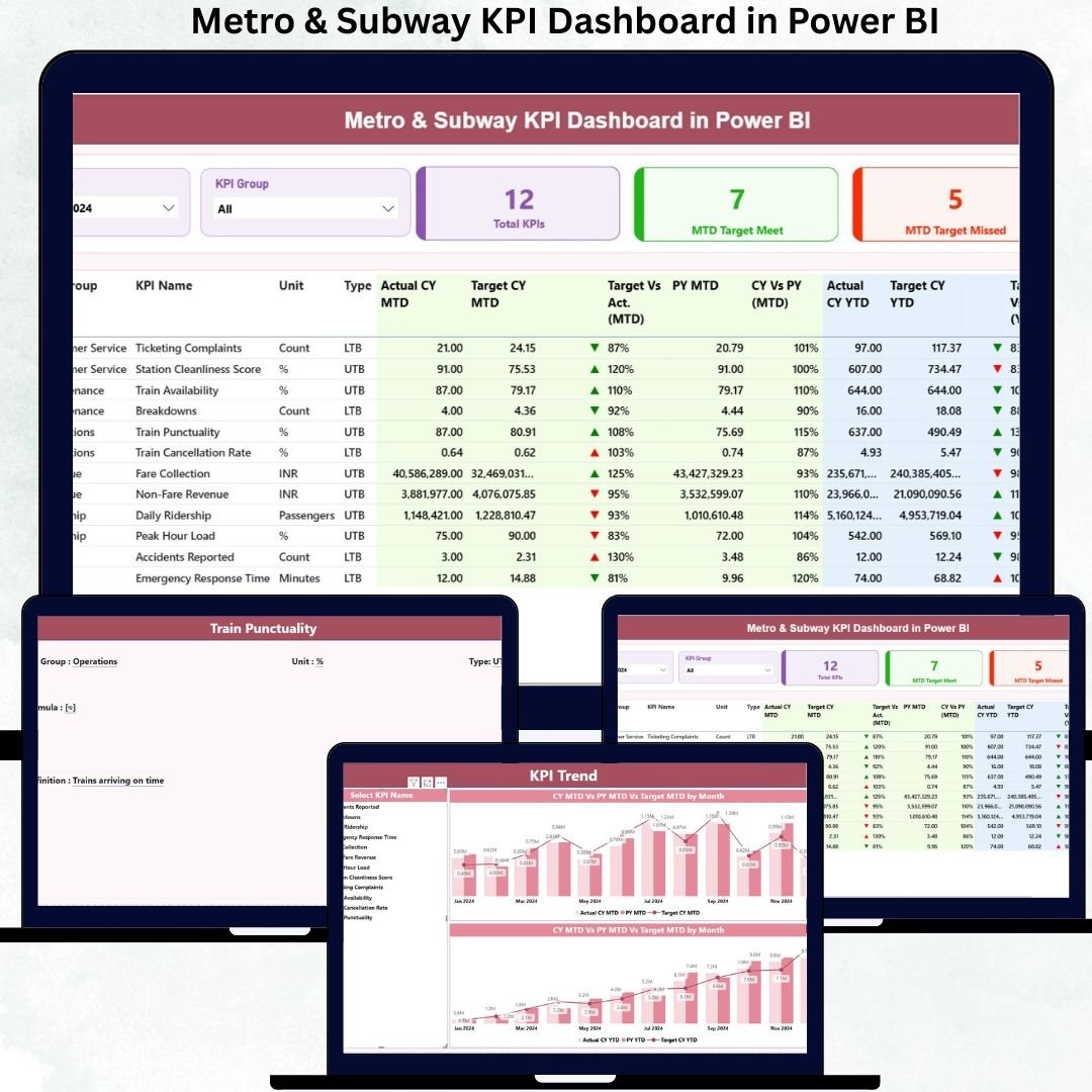
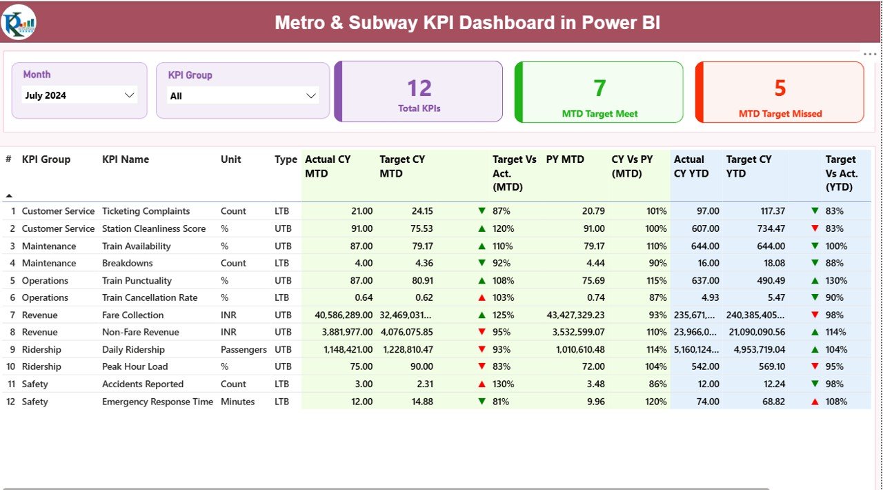
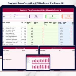
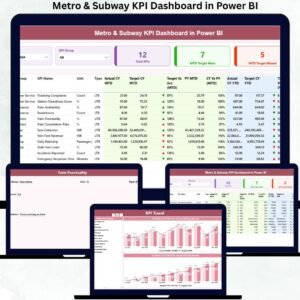
Managing a modern metro or subway system requires precision, speed, and real-time visibility. Every train, station, and route generates massive amounts of operational and safety data—but without the right reporting system, that data becomes difficult to use. That’s exactly why we created the Metro & Subway KPI Dashboard in Power BI — a powerful, ready-to-use reporting solution designed to help transit teams understand performance instantly, track KPIs effortlessly, and make faster, smarter decisions.
Whether you want to improve on-time performance, boost passenger satisfaction, or enhance safety and maintenance planning, this dashboard gives you everything you need in one clean and interactive interface. It’s built for real operations, real teams, and real decision-making.
Experience total clarity across your transit network with automated KPI cards, slicers, trend charts, drill-through details, and structured Excel inputs. If you’re looking to transform your metro performance reporting, this dashboard is your complete solution.
✨ Key Features of Metro & Subway KPI Dashboard in Power BI
This ready-made dashboard is packed with intelligent features that simplify reporting and speed up analysis. Here’s what makes it a must-have for every transit system:
🚆 Fully Automated Performance Tracking – View all operational, safety, and service KPIs in real time without manual work.
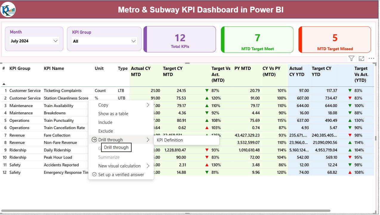
📊 Interactive Filters & Slicers – Analyze any month or KPI group instantly with just one click.
📈 Built-In MTD & YTD Comparisons – Monitor Month-to-Date and Year-to-Date progress against targets and previous years.
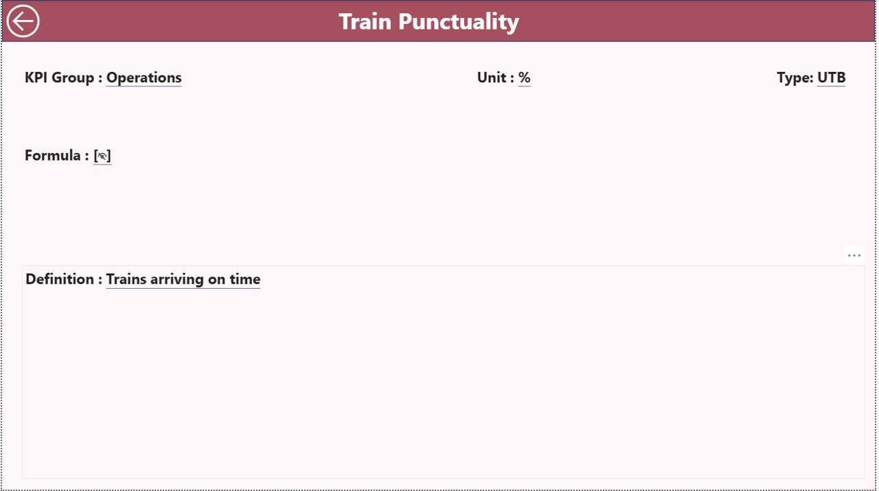
🔍 Drill-Through KPI Definitions – Jump directly into detailed KPI definitions, formulas, units, and categories.
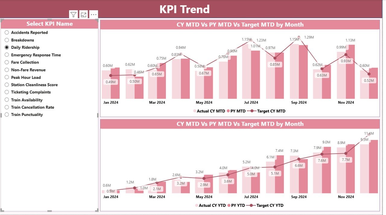
⚡ Visually Rich Charts – Combo charts make trend evaluation easy for planning, forecasting, and benchmarking.
📁 Structured Excel Data Source – Simply update the Excel sheets and Power BI refreshes everything automatically.
🛠️ Easy Customization – Add new KPIs, visuals, or categories without rebuilding the dashboard.
✔️ Ideal for Daily, Weekly, and Monthly Reviews – Perfect for transit managers, planners, and leadership teams.
📦 What’s Inside the Metro & Subway KPI Dashboard in Power BI
This digital product includes everything required to start analyzing your metro system immediately:
📄 Power BI Dashboard (.PBIX File) with 3 powerful pages:
-
Summary Page for at-a-glance monitoring
-
KPI Trend Page for monthly and yearly pattern analysis
-
KPI Definition Page for all technical details
🗂️ Excel Data File (Input Sheets):
-
Input_Actual – Enter MTD and YTD actuals
-
Input_Target – Enter monthly targets
-
KPI Definition Sheet – Manage KPI metadata, formulas, and units
📘 User-Friendly Navigation
-
Slicers for KPI groups
-
Month selection
-
Drill-through buttons
-
Status icons showing KPI performance
💡 Instant Insights
-
Target vs Actual
-
Current vs Previous Year
-
Monthly & yearly patterns
-
Department-wise clarity
This product is designed for plug-and-play use—simply replace demo data with your own operational numbers.
🧭 How to Use the Metro & Subway KPI Dashboard in Power BI
Using the dashboard is simple and intuitive, even for non-technical users.
1️⃣ Update the Excel Input Sheets
Enter actuals, targets, and KPI definitions—no special formatting required.
2️⃣ Open the Power BI File
Click Refresh, and your entire dashboard updates instantly.
3️⃣ Use Slicers to Filter Data
Select the month or KPI group you want to analyze.
4️⃣ Dive Deeper Using Drill-Through
Click on any KPI to view its formula, type (UTB/LTB), and meaning.
5️⃣ Study Trend Charts
Use the KPI Trend page to monitor long-term performance.
6️⃣ Share Reports Easily
Export to PDF or PowerPoint for presentations and management reviews.
This tool eliminates manual reporting and lets your team focus on decisions—not spreadsheets.
🎯 Who Can Benefit from This Metro & Subway KPI Dashboard in Power BI
This dashboard is perfect for anyone involved in metro or subway operations, including:
👨✈️ Operations Managers – Track punctuality, delays, and service quality.
🛠️ Maintenance Teams – Improve preventive maintenance planning with MTD/YTD insights.
🔒 Safety Departments – Analyze safety KPIs and reduce operational risks.
📅 Transit Planners – Review trends, optimize schedules, and improve resource allocation.
📈 Senior Management – Make data-driven decisions using real-time, structured insights.
🎧 Customer Experience Teams – Monitor passenger journeys and improve satisfaction.
If you manage or analyze metro operations, this dashboard will transform your workflow.
### Click here to read the Detailed blog post
Watch the step-by-step video tutorial:


Reviews
There are no reviews yet.