Managing metro and subway operations is a massive responsibility. Trains run continuously, thousands of passengers depend on timely services, and every department works under pressure. But when performance data is scattered across multiple spreadsheets, important insights get delayed. This is where the Metro & Subway KPI Dashboard in Excel becomes a powerful game-changing tool. It brings all critical KPIs into one beautifully structured, easy-to-use Excel dashboard — allowing you to monitor operations, safety, service quality, and maintenance performance instantly.
Whether you manage punctuality metrics, passenger complaints, breakdown incidents, or energy usage, this dashboard gives you a real-time, MTD, YTD, and year-over-year comparison in just one click. Designed for professionals who want clarity, speed, and accuracy, this dashboard is perfect for metro systems of all sizes.
✨ Key Features of the Metro & Subway KPI Dashboard in Excel
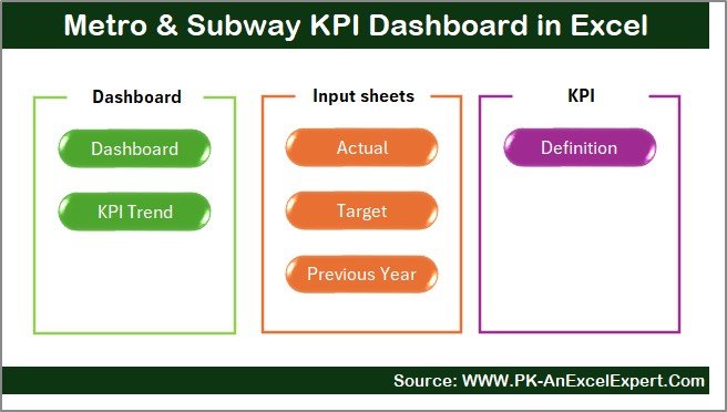
This dashboard contains 7 professionally-designed worksheets, each created to simplify your data tracking and reporting.
1️⃣ Summary Page – Your Quick Access Control Panel 🧭
The Summary Page acts as your navigation hub. With six smart buttons, you can instantly jump to any sheet without scrolling or searching. This saves time and keeps your entire workflow smooth and organized.
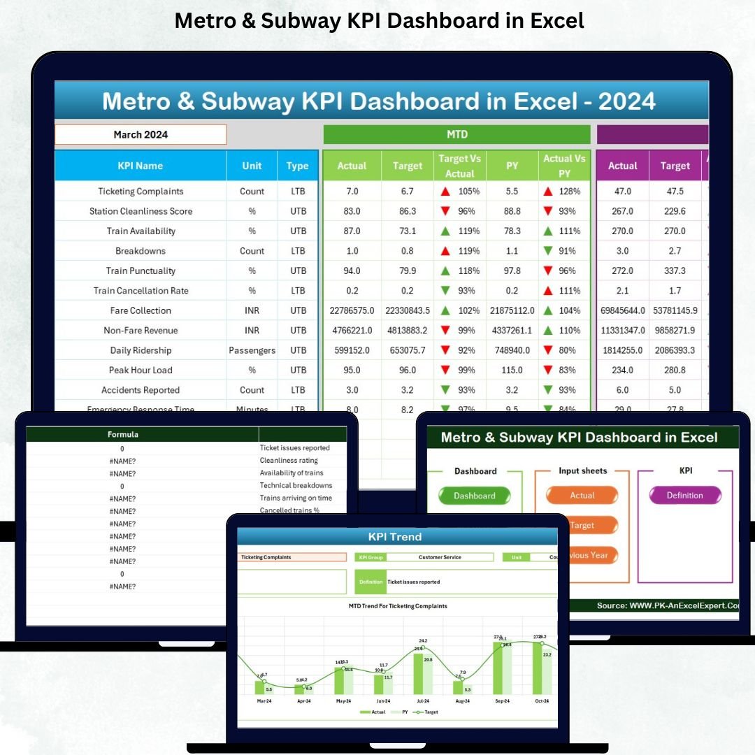
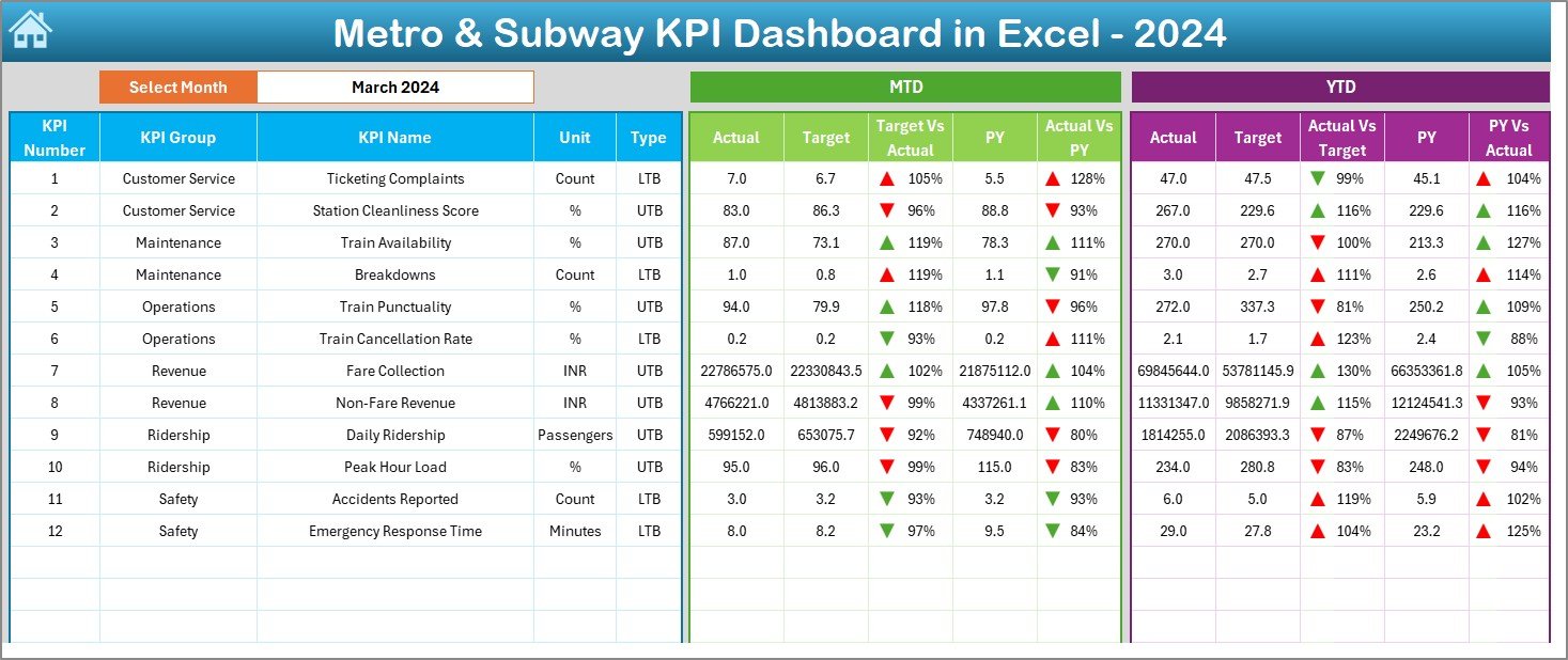
2️⃣ Dashboard Page – Complete KPI Performance View 📈
This is the heart of the template. Simply choose a month from a drop-down menu, and the entire dashboard updates instantly. It shows:
-
MTD Actual vs Target vs Last Year
-
YTD Actual vs Target vs Previous Year
-
📉 Color-coded up/down arrows
-
📊 Trend-based performance highlights
-
✔ Quick identification of gaps and improvements
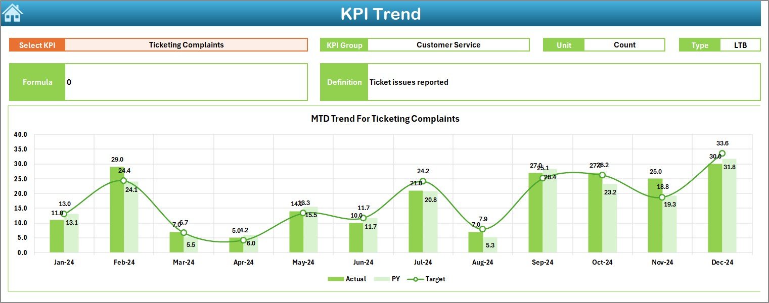
3️⃣ Trend Sheet – Deep KPI-Wise Analysis 📉📆
Select any KPI to unlock:
-
KPI group
-
Unit of measurement
-
KPI type (LTB/UTB)
-
Formula
-
Definition
-
Monthly MTD & YTD trend charts
This makes it extremely easy to detect patterns, performance drops, and seasonal changes.
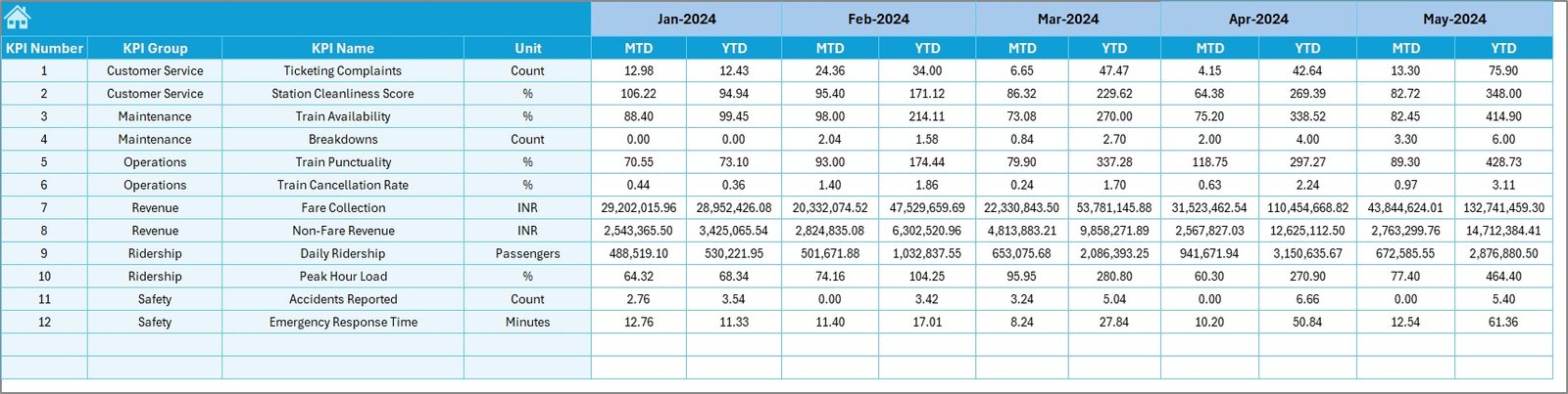
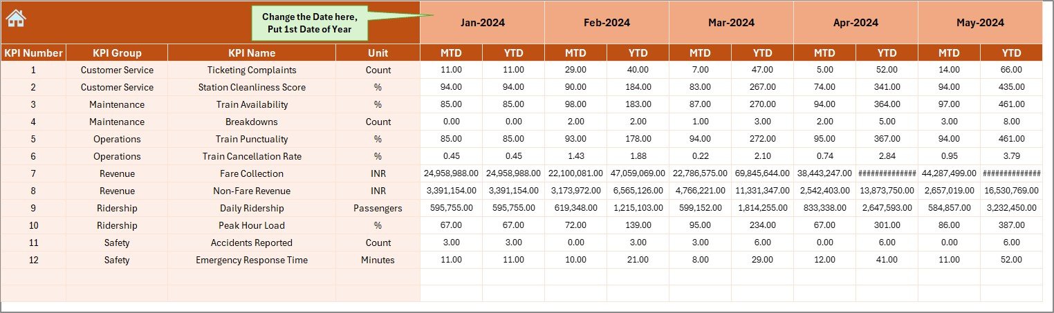
4️⃣ Actual Numbers Input Sheet – Structured Data Entry ✍️
Enter your MTD/YTD values month by month. Update once, and the entire dashboard refreshes automatically.
5️⃣ Target Sheet – Define Official KPI Targets 🎯
Store MTD & YTD targets to stay aligned with goals. Targets sync perfectly with your dashboard visuals.
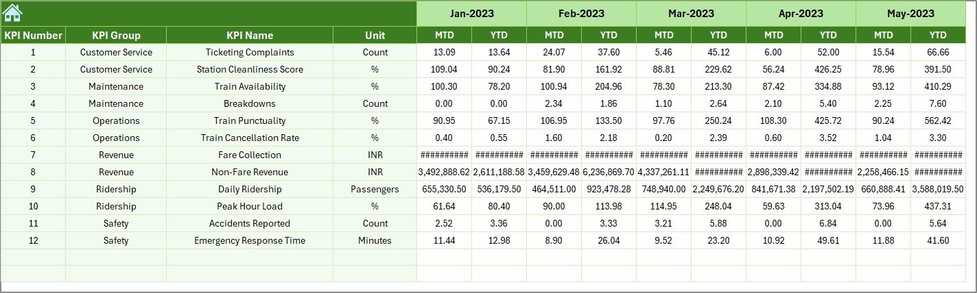
6️⃣ Previous Year Data Sheet – Accurate YOY Comparison 📅
Add last year’s performance to understand growth, stability, or decline.
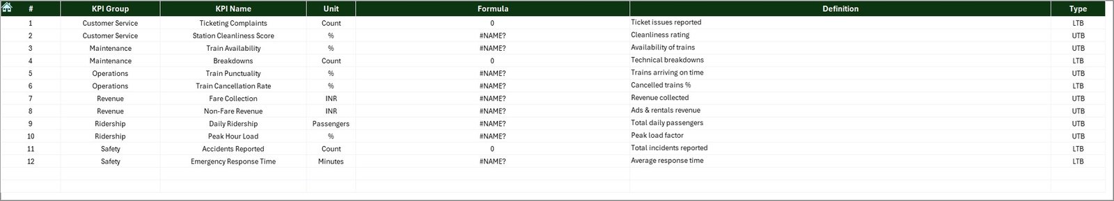
7️⃣ KPI Definition Sheet – Clear, Documented KPIs 📘
Store KPI names, groups, formulas, and definitions to maintain consistent reporting across all teams.
📦 What’s Inside the Metro & Subway KPI Dashboard in Excel
Inside this professionally designed template, you will get:
-
7 structured Excel worksheets
-
Automated dashboards & visuals
-
MTD/YTD comparison tools
-
KPI documentation table
-
Drop-down selectors
-
Color-coded performance indicators
-
Trend charts for each KPI
-
Easy navigation buttons
-
Clean, professionally formatted sheets
Everything is pre-built — just enter your numbers and start analyzing.
📝 How to Use the Metro & Subway KPI Dashboard in Excel
Using this dashboard is incredibly simple:
1️⃣ Enter KPI definitions
2️⃣ Enter previous year data
3️⃣ Set monthly MTD & YTD targets
4️⃣ Enter actual data every month
5️⃣ Select a month on the Dashboard page
6️⃣ Review performance gaps
7️⃣ Study trends for actionable insights
8️⃣ Take corrective action quickly
No coding. No technical skills. No complex tools.
Just Excel → Clean data → Instant insights.
👥 Who Can Benefit from This Metro & Subway KPI Dashboard
This dashboard is perfect for:
-
🚇 Metro & subway operations teams
-
📊 Performance and quality managers
-
🛠 Maintenance and engineering teams
-
👮 Safety & compliance managers
-
🧾 Reporting and MIS teams
-
🎯 Transport planning departments
-
💼 Consultants & data analysts
-
📈 Senior executives & decision-makers
Anyone responsible for metro operations will benefit from its clear reporting, trend visibility, and powerful analytics.
📘 Click here to read the Detailed blog post
Watch the step-by-step video tutorial:


Reviews
There are no reviews yet.