


Metro and Subway Dashboard operations in today’s high-density urban environments is extremely challenging 🚆📊. Transport authorities must monitor passenger trips, crowding levels, revenue streams, delays, and performance across multiple cities and metro lines—often in real time. However, when this data stays scattered across systems or static reports, decision-making becomes slow, reactive, and ineffective.
That is exactly where the Metro and Subway Dashboard in Power BI becomes an essential analytics solution.
This ready-to-use Power BI dashboard transforms complex metro and subway data into clear, interactive, and actionable insights. Instead of relying on manual reports or disconnected spreadsheets, decision-makers gain a centralized view of passenger movement, congestion patterns, revenue performance, and operational efficiency—all in one professional Power BI file.
Because the dashboard is built using Power BI, it offers dynamic slicers, drill-down analysis, and visually rich KPIs. As a result, transport planners, operations teams, and leadership can analyze performance at both a high level and a detailed level without technical complexity.
With five well-structured analytical pages, this dashboard helps metro and subway organizations reduce crowding, improve service reliability, optimize revenue, and support smart city initiatives.
## 🚇 Key Features of Metro and Subway Dashboard in Power BI
This dashboard is designed specifically for real-world metro and subway operations.
📊 Real-Time Passenger & Performance Insights
Track trips, crowding, revenue, and delays dynamically.
🎯 Interactive Slicers & Filters
Analyze data by metro line, city, ticket type, station, and month.
📈 Professional KPI Cards
Instant snapshot of critical transport metrics.
🏙️ City & Line-Wise Performance Analysis
Compare operational efficiency across locations.
🎟️ Ticket Type & Revenue Insights
Understand passenger behavior and pricing impact.
📅 Time-Based Trend Analysis
Identify seasonality and peak congestion periods.
🧩 Scalable Power BI Design
Easily extend for new cities, lines, or KPIs.
## 📂 What’s Inside the Metro and Subway Dashboard in Power BI
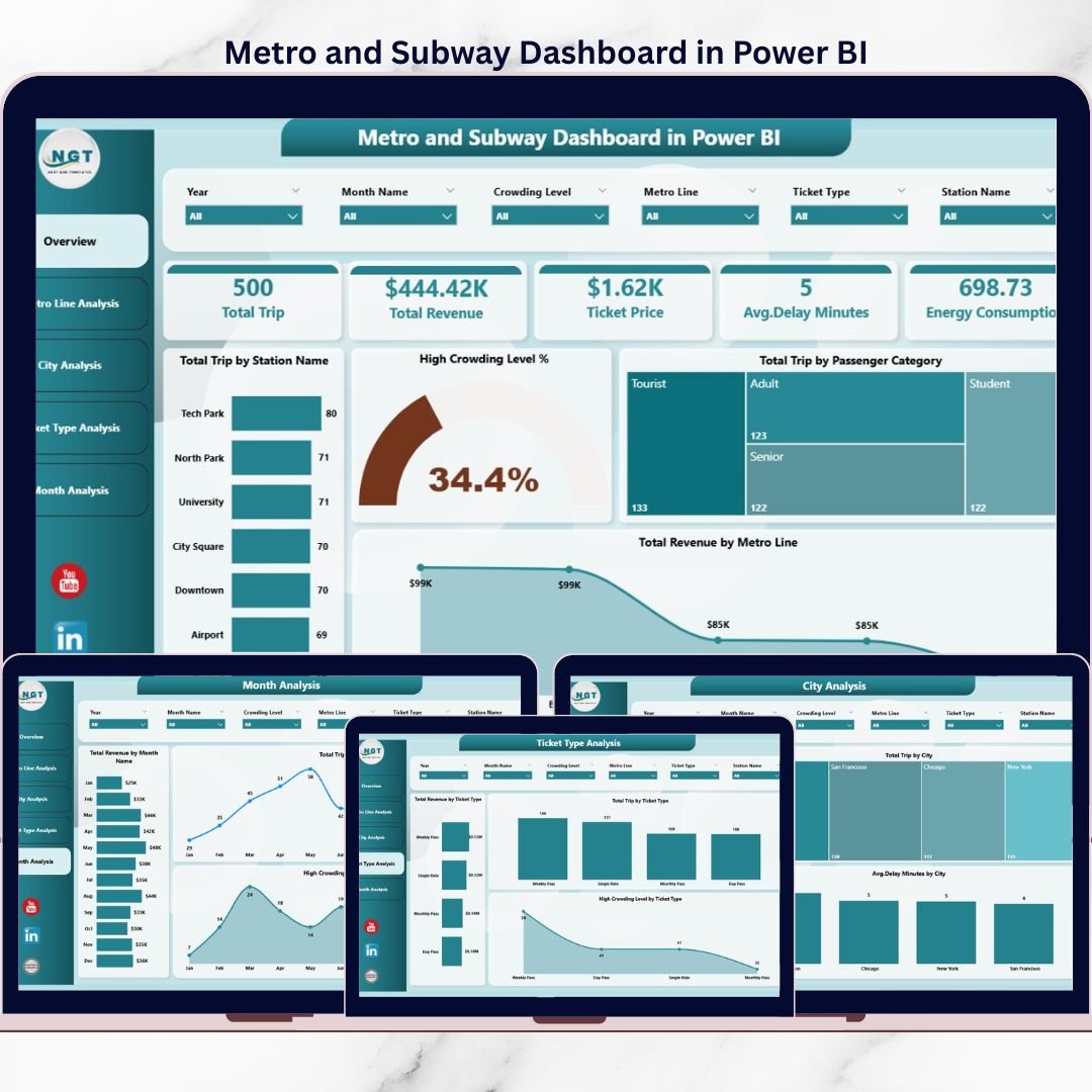
This dashboard includes 5 analytical pages, each designed to answer a specific operational question.
📊 Overview Page
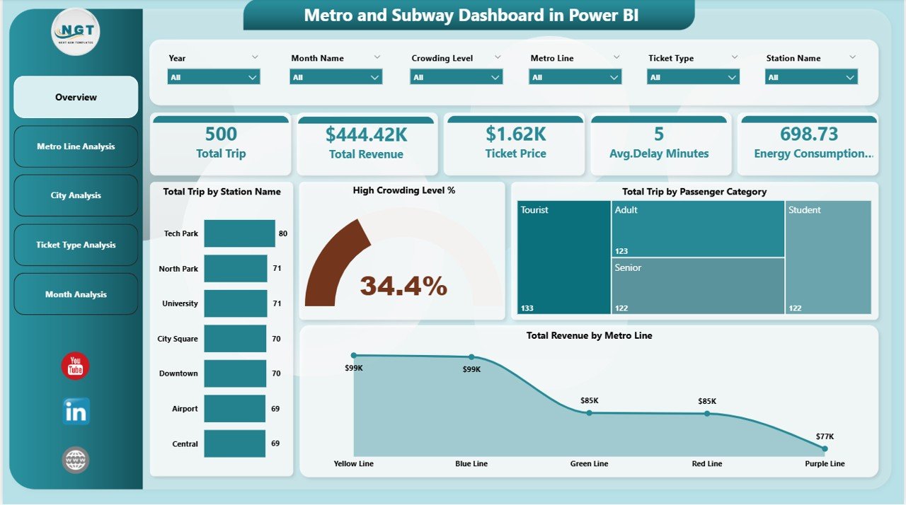
The main control panel showing:
-
Total Trips by Station Name
-
High Crowding Level %
-
Total Trips by Passenger Category
-
Total Revenue by Metro Line
This page helps leadership understand network health instantly.
🚇 Metro Line Analysis Page
Analyze line-wise performance using:
-
Total Trips by Metro Line
-
High Crowding Level % by Metro Line
-
Total Revenue by Metro Line
Ideal for capacity balancing and congestion control.
🏙️ City Analysis Page
City-level insights including:
-
Total Trips by City
-
Total Revenue by City
-
Average Delay Minutes by City
Supports infrastructure planning and city-wise optimization.
🎟️ Ticket Type Analysis Page
Ticket-level insights such as:
-
Total Trips by Ticket Type
-
Total Revenue by Ticket Type
-
High Crowding Level by Ticket Type
Helps refine pricing and ticketing strategies.
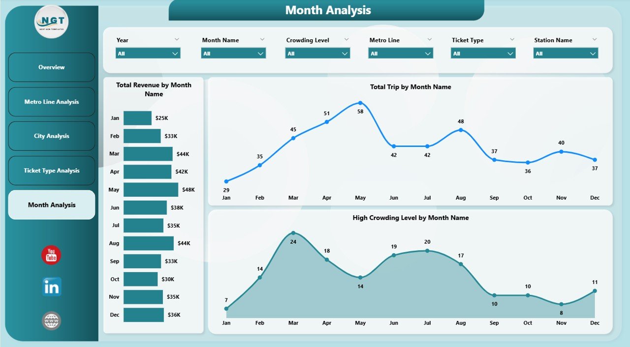
📅 Month Analysis Page
Time-based trends showing:
-
Total Trips by Month
-
Total Revenue by Month
-
High Crowding Level by Month
Supports forecasting, staffing, and seasonal planning.
## 🛠️ How to Use the Metro and Subway Dashboard in Power BI
Using the dashboard is simple and efficient:
1️⃣ Connect metro and subway data (Excel, database, or live source)
2️⃣ Refresh the Power BI dataset
3️⃣ Use slicers to filter by city, line, ticket type, or month
4️⃣ Monitor KPIs and trends instantly
5️⃣ Identify crowding, delays, or revenue gaps
6️⃣ Take data-driven operational actions
No advanced Power BI development skills required.
## 👥 Who Can Benefit from This Metro and Subway Dashboard
This dashboard is ideal for:
✔️ Metro & Subway Authorities
✔️ Transport & Urban Planning Teams
✔️ Operations & Scheduling Managers
✔️ Revenue & Finance Departments
✔️ Smart City & Policy Teams
✔️ Data & BI Analysts
Suitable for single-city networks and large multi-city metro systems.
### Click here to read the Detailed blog post
Visit our YouTube channel to learn step-by-step video tutorials
👉 https://youtube.com/@PKAnExcelExpert


Reviews
There are no reviews yet.