
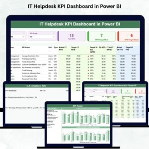
Managing an IT helpdesk is challenging—ticket volumes rise daily, user expectations increase, and teams must maintain high service quality. To achieve this, organizations need a fast and reliable way to monitor performance. The IT Helpdesk KPI Dashboard in Power BI is a powerful, ready-to-use solution designed to give complete visibility into your IT support operations. It transforms raw data into beautiful, interactive visuals that help you track tickets, ensure SLA compliance, measure response time, and analyze month-to-month trends with ease.
Whether you’re an IT manager, service desk lead, or business leader, this dashboard provides real-time insights to improve productivity, reduce delays, and deliver better user satisfaction. It connects directly with your Excel files and updates automatically whenever new data is added—no coding, no manual reports, no complications.
⭐ Key Features of IT Helpdesk KPI Dashboard in Power BI
✨ 3 Fully-Interactive Dashboard Pages – Summary, KPI Trends, and KPI Definitions for seamless analysis.
📊 Smart KPI Cards – Quickly check total KPIs, MTD target met, and MTD target missed.
📅 Powerful Filtering Options – Choose any Month or KPI Group using dynamic slicers.
📈 MTD & YTD Performance Tracking – Compare current performance with targets and previous year values.
📉 Trend Analysis Charts – Understand long-term behavior using Actual vs Target vs Previous Year visuals.
📘 Drill-Through KPI Definitions – Instantly see KPI formulas, definitions, and measurement units.
🔁 Excel-Connected Data Source – Refresh once and Power BI updates all values automatically.
⚡ Clean, Professional Design – Easy to understand for teams, managers, and leadership.
This dashboard is built to simplify decision-making for IT support teams and promote consistent, data-driven service improvement.
📦 What’s Inside the IT Helpdesk KPI Dashboard in Power BI
🟦 1. Summary Page (Main Dashboard)
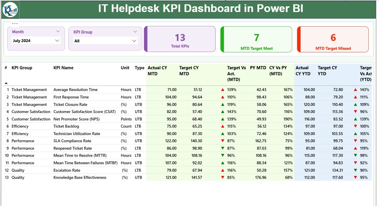
This page provides an instant overview of helpdesk performance. It includes:
-
Month & KPI Group slicers
-
Cards for Total KPIs, MTD Target Met, MTD Target Missed
-
Detailed KPI Table with:
✔ KPI Number
✔ KPI Name
✔ Unit
✔ Actual vs Target (MTD & YTD)
✔ Previous Year Comparison
✔ Conditional Icons (▲/▼)
This page helps you instantly identify performance gaps and improvement areas.
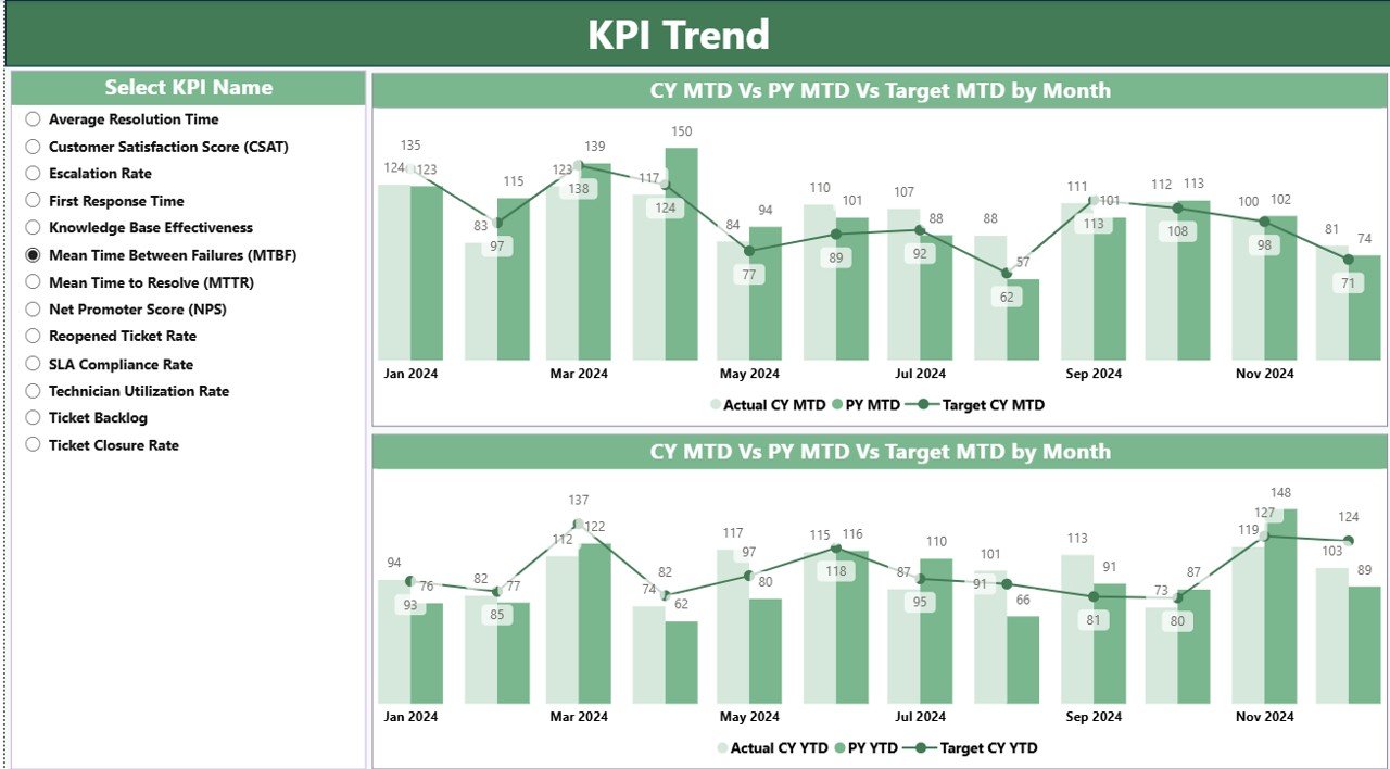
🟧 2. KPI Trend Page
Analyze how each KPI changes over time:
-
Combo Charts for MTD performance
-
Combo Charts for YTD performance
-
KPI selection slicer to filter charts
You can easily evaluate seasonal patterns, yearly improvements, and target alignment.
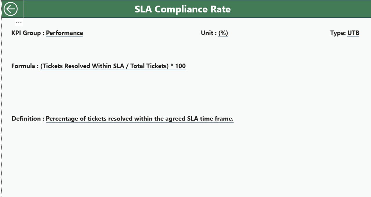
🟩 3. KPI Definition Page
A dedicated drill-through page showing:
-
KPI Number
-
KPI Group
-
KPI Name
-
Unit
-
Formula
-
KPI Definition
-
KPI Type (UTB/LTB)
This ensures clarity, consistency, and transparency across the helpdesk team.
🧠 How to Use the IT Helpdesk KPI Dashboard in Power BI
Using this dashboard is simple and beginner-friendly:
1️⃣ Open the PBIX file in Power BI Desktop
2️⃣ Connect your Excel sheets (Actual, Target, KPI Definition)
3️⃣ Refresh the report to update all visuals
4️⃣ Use slicers to filter by time period and KPI category
5️⃣ Navigate between Summary, Trend, and Definition pages
6️⃣ Drill through to see KPI formulas and definitions
7️⃣ Export charts and reports for IT meetings or presentations
It takes only a few minutes to convert your raw helpdesk numbers into high-quality insights.
👥 Who Can Benefit from This IT Helpdesk KPI Dashboard?
💼 IT Managers – Monitor KPIs and drive performance improvements
🛠 Helpdesk Teams – Understand workload, delays, and SLA gaps
📊 Service Delivery Managers – Track compliance and user satisfaction
🏢 Business Leaders – Get high-level visibility into IT support efficiency
🎓 Students & Analysts – Learn real-world KPI reporting methods
🧩 Organizations with High Ticket Volume – Improve service speed and productivity
This dashboard enables every stakeholder to make better, faster, and more informed decisions.


Reviews
There are no reviews yet.