Efficient fleet management is the foundation of every successful logistics and transportation business. The Fleet Utilization KPI Dashboard in Power BI helps you take control of your operations by visualizing performance data in real time — ensuring every vehicle, driver, and route delivers maximum value.
This ready-to-use Power BI dashboard turns complex data into actionable insights. It consolidates information from Excel or live databases and gives you a 360° view of key performance indicators (KPIs) such as vehicle utilization rate, fuel efficiency, downtime, maintenance cost, and on-time delivery.
Instead of struggling with manual spreadsheets, this interactive dashboard empowers you to make informed decisions with one glance — all through the power of dynamic visuals, slicers, and data modeling in Power BI.
⚙️ Key Features of the Fleet Utilization KPI Dashboard in Power BI
📊 Three Powerful Analytical Pages:
The dashboard includes Summary, KPI Trend, and KPI Definition pages, designed for both executive oversight and detailed analysis.
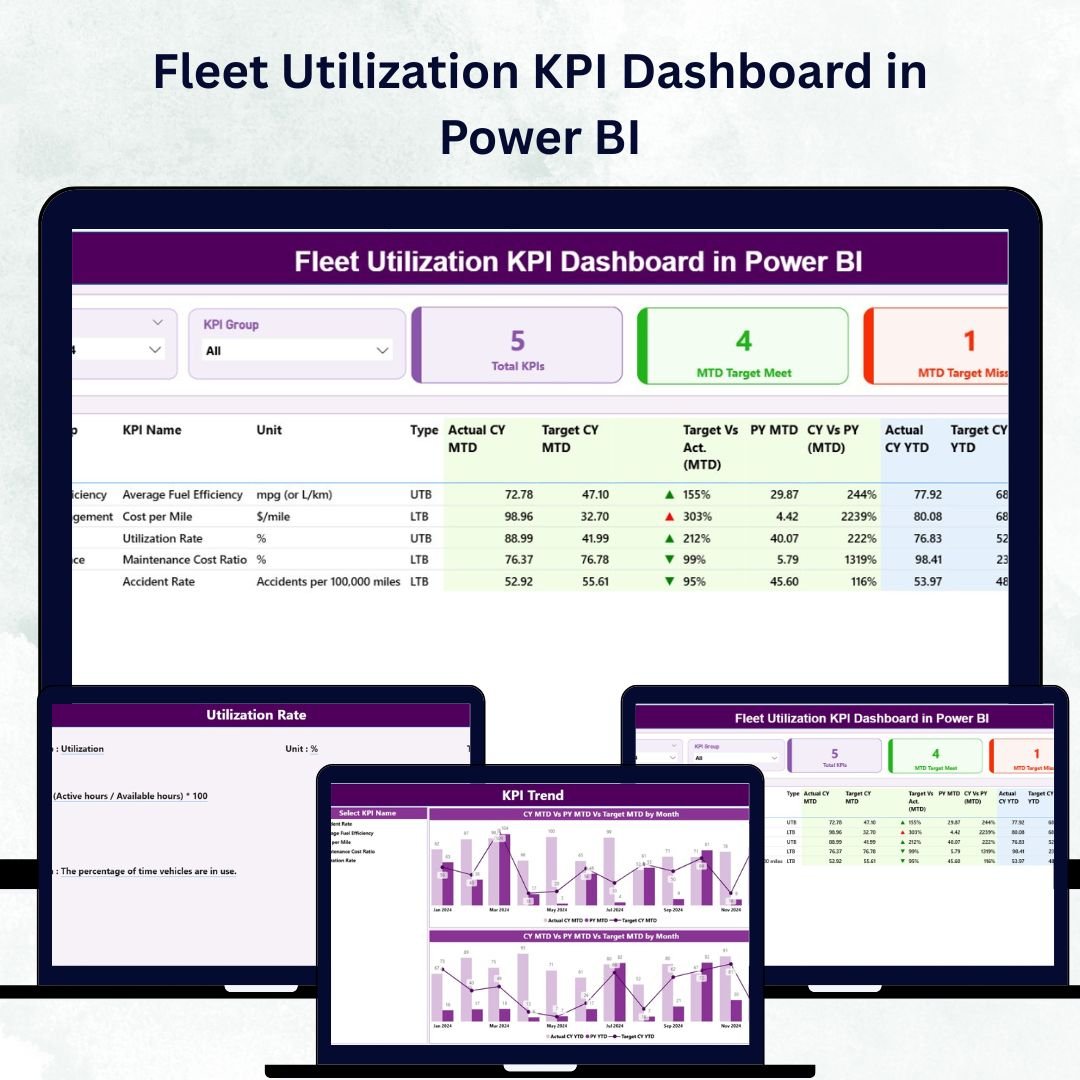
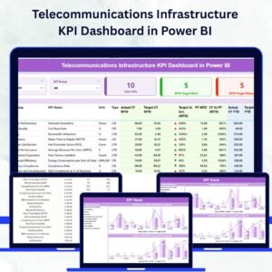
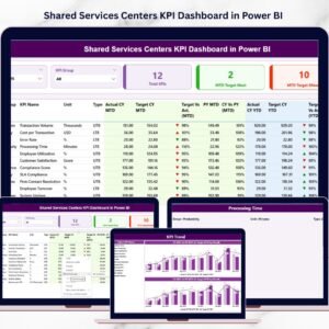
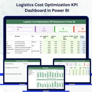
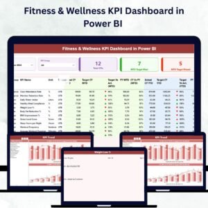
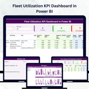
📈 Summary Page – Your Performance Command Center:
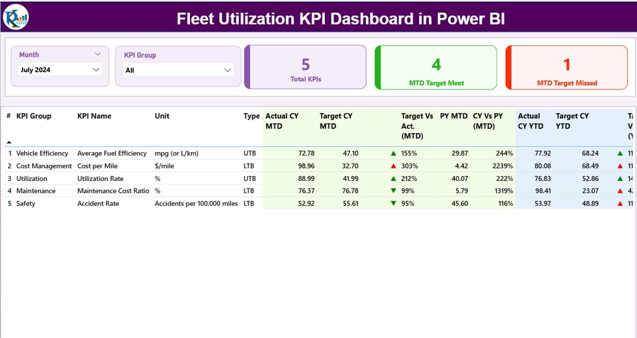
The Summary Page provides a top-level snapshot of fleet KPIs, making it ideal for quick reviews.
-
Slicers: Filter by Month or KPI Group for focused insights.
-
KPI Cards: Instantly view Total KPIs Count, MTD Target Met, and MTD Target Missed.
-
KPI Table: Detailed breakdown including:
-
KPI Number
-
KPI Group
-
KPI Name
-
Unit
-
Type (LTB/UTB)
-
Actual, Target, and Previous Year Data
-
MTD & YTD Icons for visual performance trends (▲ green = met, ▼ red = missed)
-
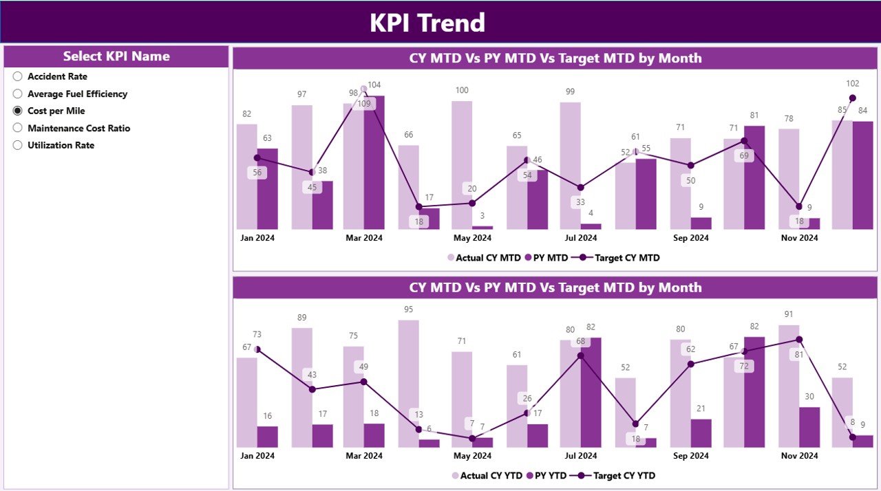
📊 KPI Trend Page – Visualize Progress Over Time:
Dive deeper into performance trends using interactive combo charts.
-
KPI Selector: Choose any KPI from the dropdown slicer.
-
Dual Charts: Compare Actual vs Target and CY vs PY for both MTD and YTD values.
-
Identify seasonal patterns, detect inefficiencies, and measure consistency month after month.
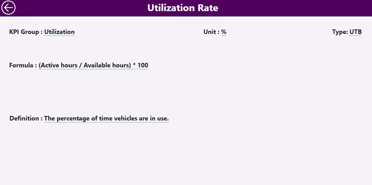
🧾 KPI Definition Page – Transparency and Clarity:
Drill through from the Summary Page to see the detailed definition of each KPI.
-
Displays Formula, Unit, Definition, and KPI Type (LTB/UTB).
-
Features a convenient Back Button to navigate back to the main dashboard.
📊 What’s Inside the Fleet Utilization KPI Dashboard in Power BI
1️⃣ Summary Page: A high-level view of all KPIs with instant insights.
2️⃣ KPI Trend Page: Interactive charts showing monthly and yearly performance trends.
3️⃣ KPI Definition Page: Detailed KPI reference for clear understanding.
4️⃣ Excel Data Source: Includes three structured sheets — Input_Actual, Input_Target, and KPI Definition — for easy data refresh and updates.
This setup ensures transparency, automation, and consistency in fleet performance reporting.
🧭 How to Use the Fleet Utilization KPI Dashboard in Power BI
✅ Step 1: Prepare the Excel source file with Actual, Target, and KPI Definition data.
✅ Step 2: Connect Power BI to your Excel workbook.
✅ Step 3: Refresh the data to view updated KPIs automatically.
✅ Step 4: Use Month and KPI Group slicers for focused analysis.
✅ Step 5: Drill through KPIs to explore definitions and formulas.
✅ Step 6: Publish the dashboard to Power BI Service for team-wide collaboration.
Within minutes, you can transform manual fleet tracking into an automated, visual, and real-time monitoring system.
👥 Who Can Benefit from This Dashboard
🚛 Fleet Managers: Monitor utilization rates and minimize vehicle downtime.
🏢 Logistics Companies: Optimize route planning and delivery performance.
🛠️ Maintenance Teams: Track service schedules and repair efficiency.
📈 Operations Executives: Compare monthly KPIs and identify performance gaps.
💰 Finance Teams: Control maintenance and operational costs effectively.
🧠 Data Analysts: Derive actionable insights from real-time metrics.
🌟 Advantages of the Fleet Utilization KPI Dashboard in Power BI
✅ Centralized Monitoring: Access all KPIs in one intuitive dashboard.
✅ Data Accuracy: Automated updates eliminate manual reporting errors.
✅ Actionable Visuals: Conditional formatting instantly shows where performance lags.
✅ Easy Customization: Modify KPIs, color themes, or filters effortlessly.
✅ Scalable Design: Works for small fleets or large enterprise operations.
✅ Time Savings: Cut down hours of manual report compilation.
✅ Collaboration Ready: Share securely with teams using Power BI Service.
🔗 Click here to read the Detailed Blog Post
🎥 Visit our YouTube channel for step-by-step tutorials
🔗 YouTube.com/@PKAnExcelExpert


Reviews
There are no reviews yet.