Modern transportation businesses are rapidly shifting toward Fleet-as-a-Service (FaaS) models. Instead of owning and managing vehicles independently, organizations now rely on flexible fleet services to improve operational efficiency and reduce costs. However, managing fleet operations requires continuous monitoring of multiple performance indicators such as trip costs, fuel expenses, service packages, contract performance, and driver ratings.
Without proper analytics tools, fleet managers often struggle to monitor operational efficiency, identify cost drivers, or evaluate service performance. This is where the Fleet-as-a-Service Dashboard in Power BI becomes a powerful solution.
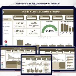
The Fleet-as-a-Service Dashboard in Power BI is a ready-to-use interactive analytics dashboard designed to help businesses monitor and optimize fleet operations. With dynamic visualizations, KPI cards, and advanced analytics, this dashboard allows organizations to track transportation costs, revenue performance, service package profitability, and driver satisfaction in one centralized platform.
Because the dashboard is built using Microsoft Power BI, users can easily analyze large datasets, filter insights by region or service category, and identify operational trends instantly. As a result, companies can make smarter decisions that improve efficiency and profitability.
Key Feature of Fleet-as-a-Service Dashboard in Power BI 🚚📊
This dashboard includes five powerful analytical pages that provide complete visibility into fleet operations.
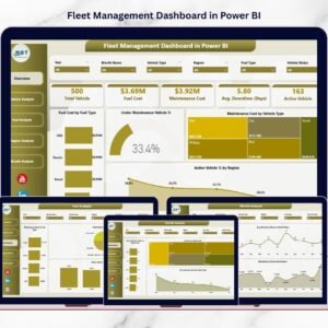
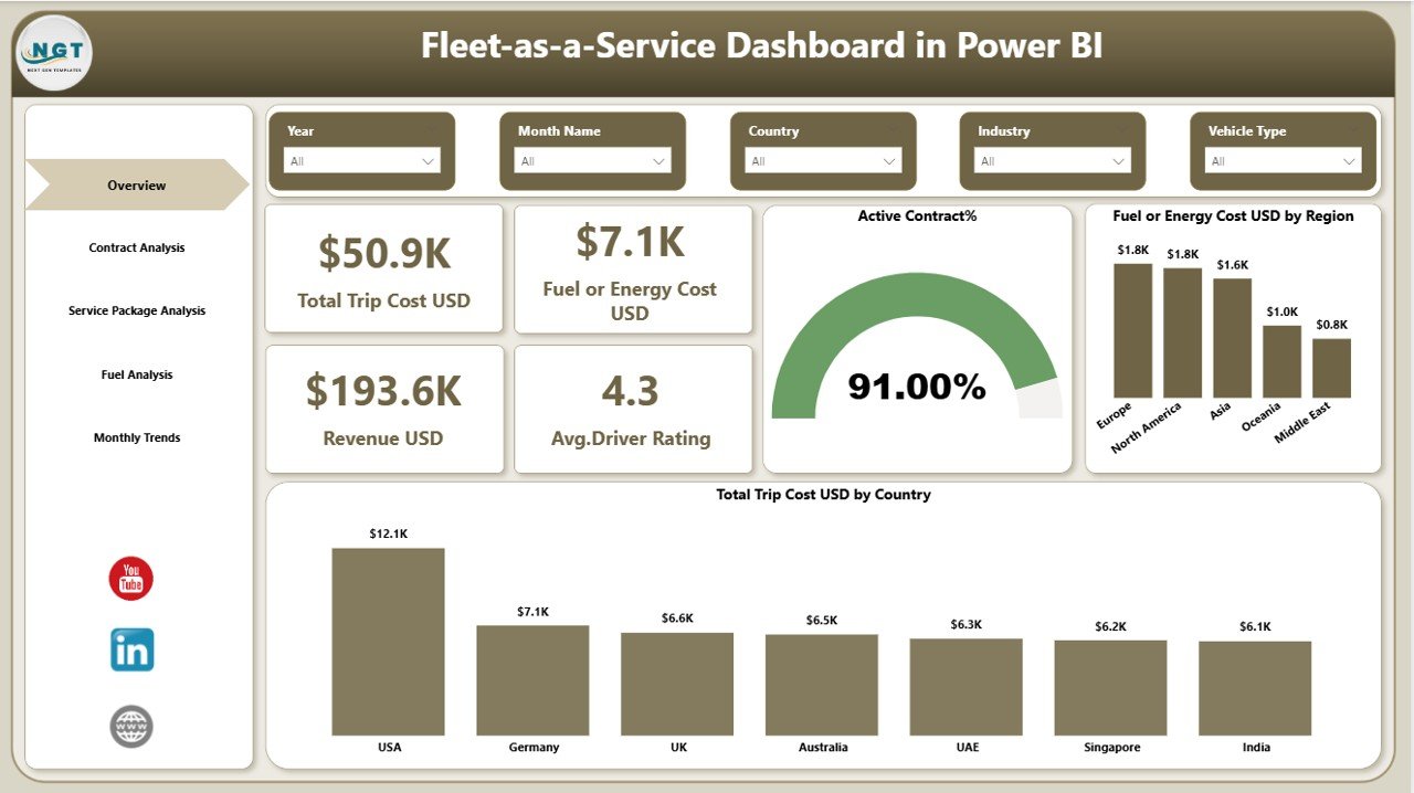
📊 Overview Dashboard Page
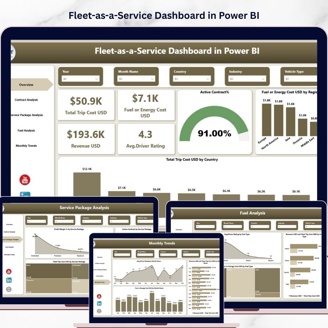
The overview page acts as the command center of the dashboard. It displays four important KPI cards including Total Trip Cost (USD), Fuel or Energy Cost (USD), Revenue (USD), and Average Driver Rating. Additionally, it contains visual charts showing Active Contract Percentage, Fuel Cost by Region, and Total Trip Cost by Country to quickly evaluate fleet performance.
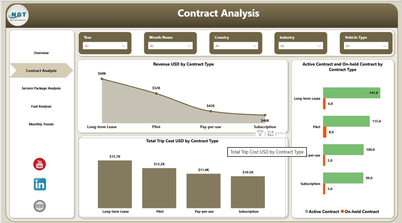
📄 Contract Analysis Page
This page focuses on contract performance across different fleet services. Charts such as Revenue by Contract Type, Active vs On-Hold Contracts, and Total Trip Cost by Contract Type help managers analyze contract profitability and operational efficiency.
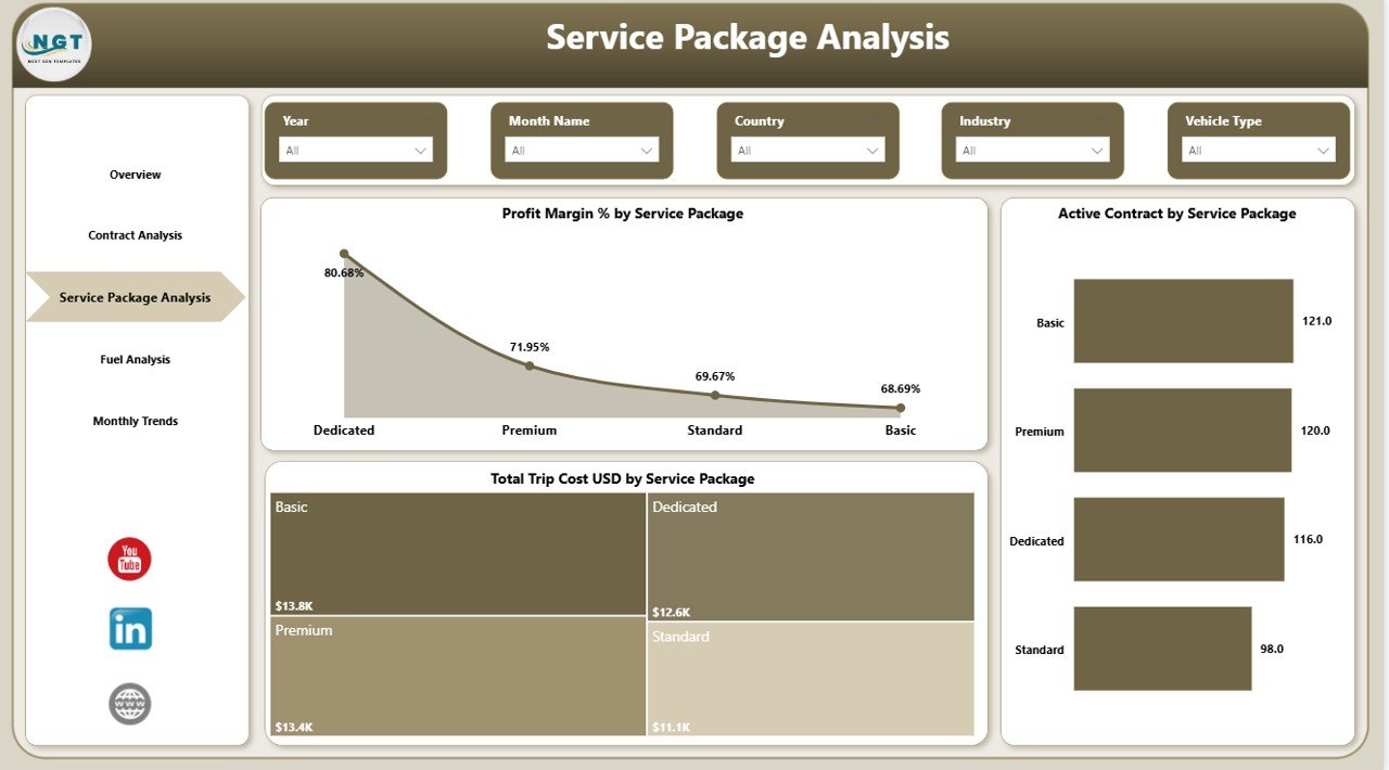
📦 Service Package Analysis Page
Fleet service providers often offer different service packages. This section includes charts such as Profit Margin % by Service Package, Active Contracts by Package, and Total Trip Cost by Service Package to help organizations identify the most profitable offerings.
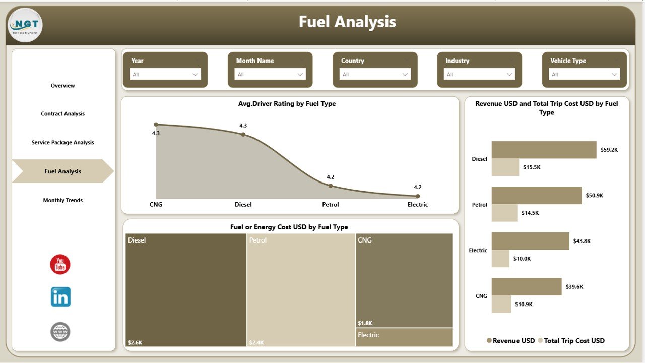
⛽ Fuel Analysis Page
Fuel and energy costs are major operational expenses. This page provides insights using charts like Average Driver Rating by Fuel Type, Revenue vs Trip Cost by Fuel Type, and Fuel Cost by Fuel Type to evaluate vehicle performance across diesel, petrol, hybrid, and electric fleets.
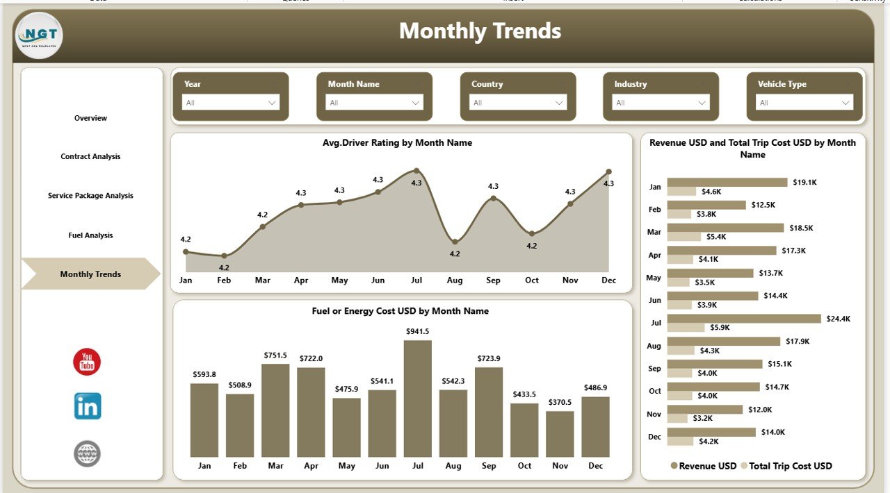
📅 Month Analysis Page
This page helps managers analyze monthly trends through visualizations such as Average Driver Rating by Month, Revenue vs Trip Cost by Month, and Fuel Cost by Month. These insights allow businesses to track seasonal demand patterns and operational performance.
What’s Inside the Fleet-as-a-Service Dashboard in Power BI 📁
When you download this product, you will receive a fully functional Power BI dashboard template designed for fleet analytics.
📊 Ready-to-use Power BI Dashboard File
📈 Interactive KPI cards and charts
📂 Structured data model for fleet analytics
🔎 Advanced filtering and slicer functionality
📉 Cost and revenue analysis reports
📊 Monthly trend and operational insights
This dashboard is designed to help organizations quickly implement advanced fleet analytics without building complex reports from scratch.
How to Use the Fleet-as-a-Service Dashboard in Power BI ⚙️
Using this dashboard is simple and requires minimal setup.
1️⃣ Import your fleet data into the Power BI dataset.
2️⃣ Refresh the dashboard to update analytics and visualizations.
3️⃣ Use filters and slicers to analyze performance by region, contract type, or service package.
4️⃣ Monitor key KPIs such as trip costs, revenue, and driver ratings.
5️⃣ Use insights to improve operational efficiency and reduce costs.
Because the dashboard uses intuitive Power BI visualizations, even non-technical users can easily analyze fleet performance.
Who Can Benefit from This Fleet-as-a-Service Dashboard 🚛
This dashboard is ideal for organizations that manage transportation services or vehicle fleets.
🚚 Logistics Companies – Monitor transportation costs, delivery performance, and operational efficiency.
🚗 Ride-Sharing Platforms – Track driver ratings, trip revenue, and fleet performance.
🏢 Corporate Fleet Operators – Manage employee transportation fleets and operational expenses.
📦 Mobility-as-a-Service Providers – Optimize subscription-based transportation services.
🚛 Fleet Management Companies – Analyze vehicle utilization, fuel efficiency, and service profitability.
By implementing this dashboard, organizations gain real-time operational visibility, cost optimization insights, and better decision-making capabilities.
Click here to read the Detailed blog post
Watch the step-by-step video tutorial: