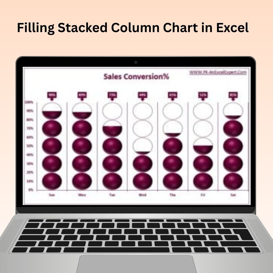
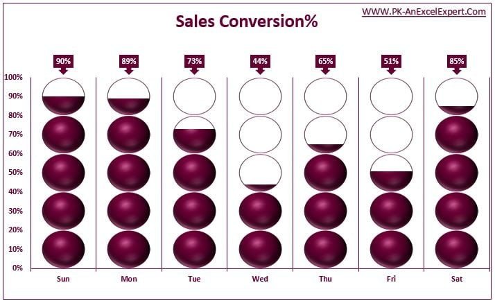
The Filling Stacked Column Chart in Excel is an innovative tool designed to help you create visually appealing and informative stacked column charts with filled areas, enhancing data presentation and making it easier to track and compare multiple categories. This Excel tool takes traditional stacked column charts a step further by filling each column segment with a color, making your data more intuitive and visually engaging.
Whether you’re working with sales data, project progress, or any other metrics, the filled stacked column chart makes it easier for your audience to identify trends, compare categories, and gain insights. This tool is perfect for anyone who needs to present complex data in a way that is visually striking and easy to understand.
Key Features of the Filling Stacked Column Chart in Excel:
📊 Enhanced Stacked Column Design
Fill each column segment with color to provide a clear visual representation of multiple data categories. This makes it easier to compare and track various metrics in one glance.
🎨 Customizable Color Scheme
Choose your preferred colors for each segment of the stacked column chart, making it easy to tailor the design to your branding or presentation style.
🔄 Dynamic Data Updates
The chart automatically updates as you modify or add new data, ensuring your visuals always reflect the most current insights.
📈 Data Segmentation
Break down your data into segments and display it in a visually clear way. Track multiple categories over time or compare different data sets with ease.
📅 Ideal for Reports and Dashboards
Perfect for creating insightful reports or adding to business dashboards, the chart provides a colorful and visually compelling way to communicate data.
Why You’ll Love the Filling Stacked Column Chart in Excel:
✅ Improved Data Visualization – Make complex data more visually appealing and easy to understand by filling stacked column charts with colors. ✅ Customizable for Your Needs – Choose your own colors, adjust chart design, and tailor the visualization to fit your specific reporting or presentation needs. ✅ Real-Time Updates – The chart automatically updates when new data is entered, ensuring you’re always presenting the most accurate information. ✅ Perfect for Presentations and Reports – Use this tool to add engaging visuals to your business reports or dashboards, making your data stand out. ✅ Easy to Use – Set up the chart with minimal effort, and even non-technical users can create professional and visually compelling charts.
What’s Inside the Filling Stacked Column Chart in Excel:
- Filling Stacked Column Chart – A chart that automatically fills each segment of the stacked column with color for easier data visualization.
- Customizable Color Scheme – Tailor the chart’s colors to match your brand or presentation style.
- Real-Time Data Updates – The chart updates dynamically as you enter new data, ensuring your visuals are always current.
- Simple Setup – Easy to implement into existing Excel reports or dashboards with no advanced Excel knowledge required.
How to Use the Filling Stacked Column Chart in Excel:
1️⃣ Download the Template – Access the Excel file immediately after purchase. 2️⃣ Input Your Data – Add the relevant data into the Excel sheet for your stacked column chart. 3️⃣ Customize the Chart – Adjust the colors, sizes, and other settings to match your presentation style. 4️⃣ Track and Compare – Watch the chart dynamically adjust and fill as you update the data, giving you a visual representation of your metrics. 5️⃣ Present Your Insights – Use the filled stacked column chart in reports, presentations, or dashboards to convey key data trends effectively.
Who Can Benefit from the Filling Stacked Column Chart in Excel:
- Data Analysts
- Project Managers
- Sales Teams
- Marketing Teams
- Business Analysts
- Anyone who needs to present and compare multiple categories or data sets visually
The Filling Stacked Column Chart in Excel is a great tool for businesses or individuals looking to enhance their data presentation and reporting with visually compelling and easy-to-understand charts. By filling each column segment with color, you can highlight data trends and comparisons in a more engaging way.
Click here to read the Detailed blog post
https://www.pk-anexcelexpert.com/filling-stacked-column-chart-in-excel/


Reviews
There are no reviews yet.