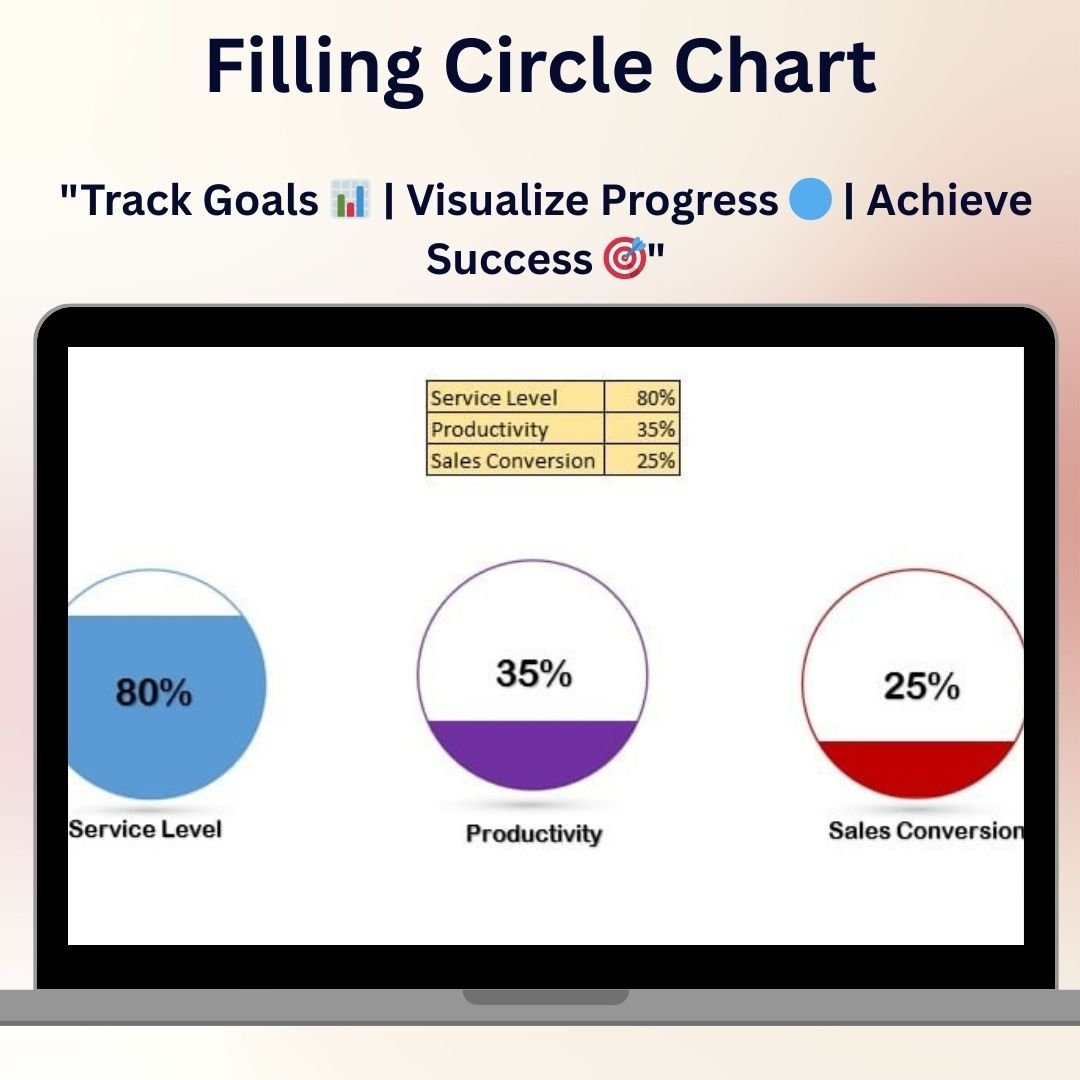
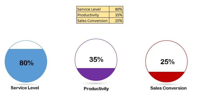
The Filling Circle Chart is an innovative and visually appealing Excel template designed to help you display your data in a dynamic and engaging way. This unique chart uses a circular format to represent data values in a visually striking manner, making it easier for you to communicate key metrics, performance indicators, and progress toward goals.
The Filling Circle Chart is perfect for visualizing KPIs, project completion status, sales performance, customer satisfaction, and more. The chart can be fully customized to suit your needs, allowing you to modify colors, size, and data points. Whether you’re tracking project progress or showcasing key business metrics, this chart offers a clear and eye-catching way to communicate your data.
Key Features of the Filling Circle Chart in Excel
🔵 Visualize Data with Circular Charts
Represent your data in a circular format that fills based on the percentage or value of the data. This makes it easier to compare performance against goals and visually track progress.
📊 Customizable & Interactive
The chart is fully customizable, allowing you to adjust colors, labels, and data ranges to meet your needs. It’s perfect for presentations, reports, and dashboards.
📈 Track Progress & KPIs
Use the Filling Circle Chart to track project completion, sales goals, performance metrics, or any other data that benefits from a circular, progress-style chart.
🎨 Adjustable Design
Modify the chart’s design to match your branding or presentation style. Choose different colors, shapes, and styles to fit your specific needs.
🖥️ Simple & Easy to Use
No advanced Excel skills are required to use the Filling Circle Chart. Simply input your data, and the chart will automatically update to reflect the values.
Why You’ll Love the Filling Circle Chart in Excel
✅ Track Progress Visually
The Filling Circle Chart makes it easy to visually track progress against targets or goals. Watch the circle gradually fill as you achieve milestones, providing an immediate visual indicator of success.
✅ Create Stunning Visual Presentations
This eye-catching chart enhances your presentations and reports by displaying data in a clear and engaging circular format.
✅ Simple to Use & Customize
Easily input your data and customize the chart to suit your needs. Adjust the colors, sizes, and labels to create a chart that matches your style.
✅ Enhance Data Communication
Use the Filling Circle Chart to simplify complex data, making it easier for your audience to understand performance trends, project status, and goal completion at a glance.
✅ Perfect for KPIs & Business Metrics
Ideal for displaying KPIs, project completion, sales figures, and any other performance metrics. It’s a versatile tool that helps make data easy to digest and understand.
What’s Inside the Filling Circle Chart Template in Excel?
- Dynamic Circular Chart: A customizable chart that fills based on data values, visually representing progress.
- Customizable Labels & Data Points: Edit the labels and input values to display the specific data you want to track.
- Real-Time Updates: Automatically update the chart as you enter new data.
- Fully Customizable Design: Modify colors, sizes, and styles to match your branding or presentation needs.
- Simple Interface: No advanced Excel skills required to use and customize the chart.
How to Use the Filling Circle Chart in Excel
1️⃣ Download the Template: Get instant access to the Filling Circle Chart Excel template.
2️⃣ Input Your Data: Enter the values or percentages you want to track into the chart.
3️⃣ Customize Your Design: Adjust the chart’s colors, labels, and other design elements to match your needs.
4️⃣ Track & Visualize Progress: Use the chart to track progress toward goals, project completion, or KPIs.
Who Can Benefit from the Filling Circle Chart in Excel?
🔹 Business Owners & Entrepreneurs
🔹 Sales Managers & Marketing Teams
🔹 Project Managers & Team Leaders
🔹 Analysts & Data Professionals
🔹 Anyone Looking to Visualize Performance Data in a Clear, Engaging Way
Track progress and visualize key metrics with the Filling Circle Chart in Excel. This dynamic and customizable chart makes it easy to communicate performance data, track goals, and make data-driven decisions.
Click here to read the Detailed blog post
Visit our YouTube channel to learn step-by-step video tutorials
Youtube.com/@PKAnExcelExpert


Reviews
There are no reviews yet.