Data science and analytics teams drive modern decision-making. They build models, analyze trends, improve processes, and unlock business value from data. However, when team performance is tracked through scattered Excel sheets or manual status reports, clarity is lost, delays increase, and impact becomes hard to measure.
That is exactly why the Data Science and Analytics KPI Dashboard in Excel is a must-have performance management solution 🚀.
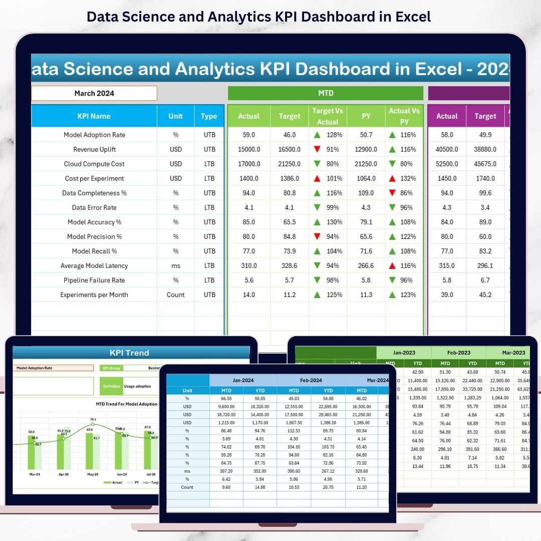
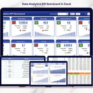
This ready-to-use Excel dashboard converts complex analytics performance data into clear KPIs, instant comparisons, and actionable trends, helping teams stay aligned with business goals and deliver measurable results.
Designed for analytics managers, data science leaders, PMOs, and business stakeholders, this dashboard enables you to track MTD and YTD performance, compare targets vs actuals, analyze trends, and maintain KPI governance—all inside Excel, without any advanced tools.
Key Features of Data Science and Analytics KPI Dashboard in Excel
📊 Centralized Analytics KPI Tracking
Monitor delivery, quality, efficiency, and impact KPIs in one structured dashboard.
📅 Dynamic Month Selection
Select any month from a drop-down and instantly refresh all MTD and YTD metrics.
🎯 Target vs Actual Performance Analysis
Quickly identify KPIs that meet expectations and those that need corrective action.
📈 MTD & YTD Performance Monitoring
Track short-term execution and long-term analytics maturity together.
🔁 Current Year vs Previous Year Comparison
Measure improvement, stagnation, or decline using YoY analysis.
📉 KPI-Wise Trend Analysis
Analyze performance patterns using dedicated MTD and YTD trend charts.
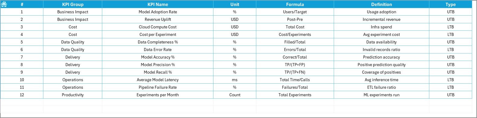
📘 Strong KPI Governance
Maintain clarity with built-in KPI groups, units, formulas, and definitions.
⚡ 100% Excel-Based & Business-Friendly
No BI tools required—easy to use, easy to update, and easy to scale.
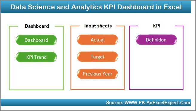
What’s Inside the Data Science and Analytics KPI Dashboard in Excel
🏠 Home Sheet
A clean index page with six navigation buttons for one-click access to all worksheets.
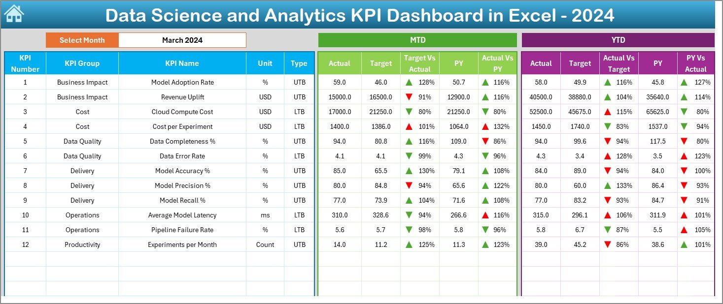
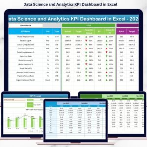
📊 Dashboard Sheet
The main performance overview showing MTD and YTD actuals, targets, previous year values, achievement percentages, and visual ▲ / ▼ indicators.
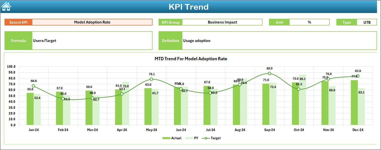
📈 KPI Trend Sheet
Select any KPI and instantly view its MTD and YTD trends along with detailed KPI information.
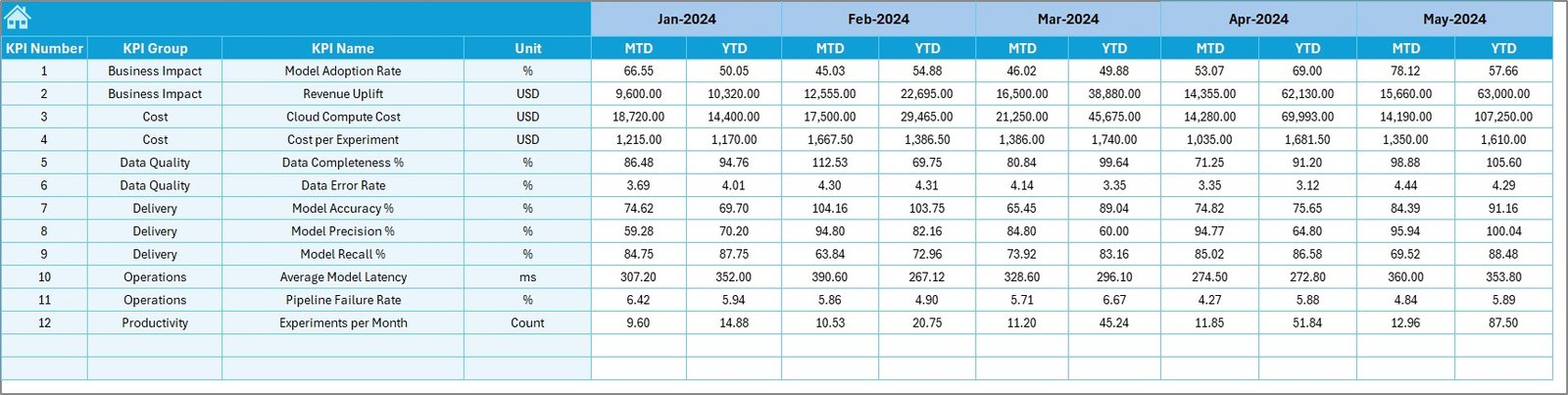
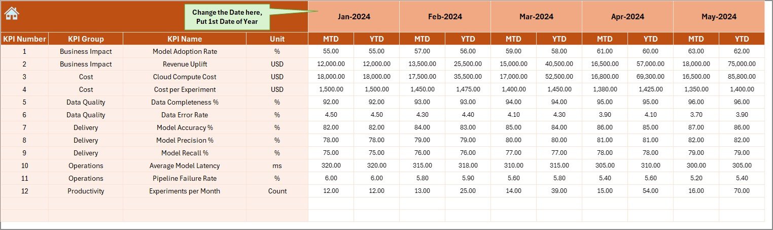
📥 Actual Numbers Input Sheet
Enter real MTD and YTD performance values in a structured and controlled format.
🎯 Target Sheet
Define monthly and yearly targets aligned with analytics and business objectives.
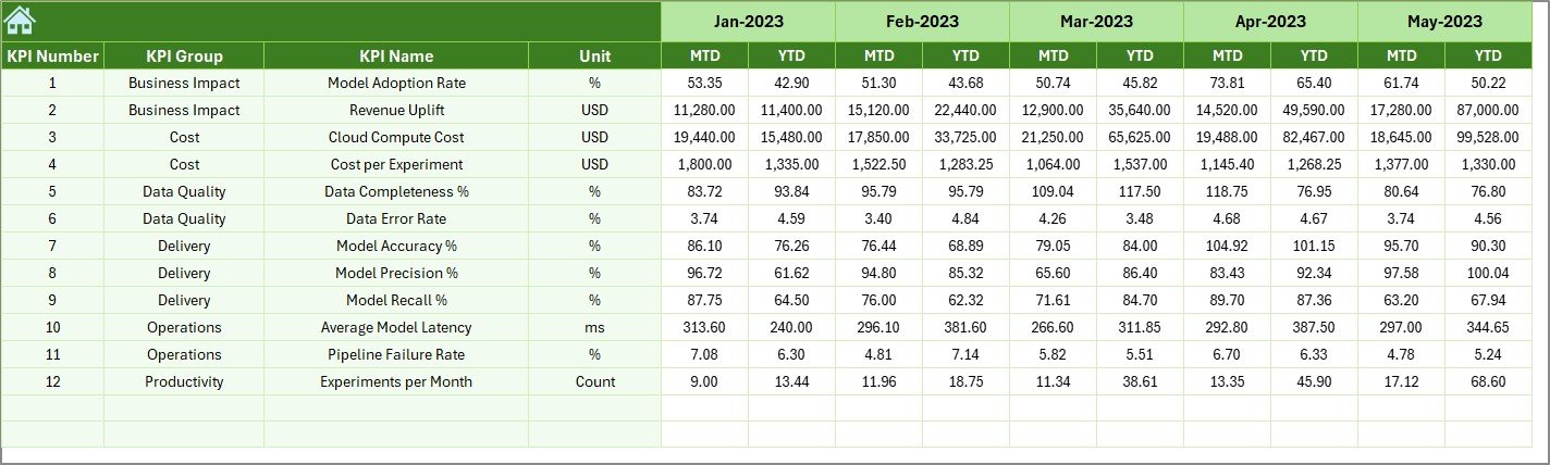
📅 Previous Year Number Sheet
Store historical KPI data to support meaningful year-over-year comparison.
📘 KPI Definition Sheet
Maintain KPI name, group, unit, formula, and definition to ensure consistency.
How to Use the Data Science and Analytics KPI Dashboard in Excel
📝 Step 1: Enter Actual Performance Data
Update MTD and YTD values in the Actual Numbers Input Sheet.
📅 Step 2: Select Month
Choose the month from cell D3 to view updated MTD and YTD results instantly.
📊 Step 3: Review Dashboard KPIs
Use arrows, percentages, and comparisons to identify strong and weak KPIs.
📈 Step 4: Analyze KPI Trends
Study trend charts to understand performance direction over time.
🎯 Step 5: Take Action
Improve delivery speed, quality, and business impact using data-driven insights.
👥 Who Can Benefit from This Data Science and Analytics KPI Dashboard in Excel
🧠 Data Science Managers – Track delivery, quality, and impact clearly
📊 Analytics Leaders – Align analytics performance with business goals
🏢 Business Stakeholders – Gain visibility without technical complexity
📈 PMOs & Strategy Teams – Monitor execution and accountability
🔍 Enterprise Analytics Teams – Standardize KPI reporting across functions
🔍 Click here to read the Detailed blog post
📺 Visit our YouTube channel to learn step-by-step video tutorials
👉 Youtube.com/@PKAnExcelExpert

Reviews
There are no reviews yet.