The courier and logistics industry runs on speed, accuracy, and efficiency. Every delayed delivery, missed target, or rising cost directly impacts customer satisfaction and profitability. However, many courier businesses still rely on static Excel reports that slow down decision-making and hide critical performance issues.
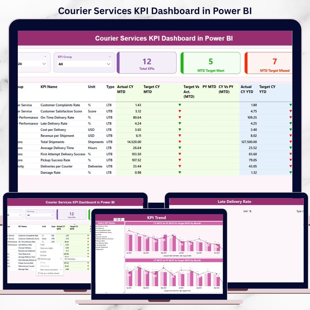
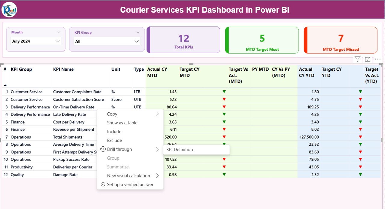
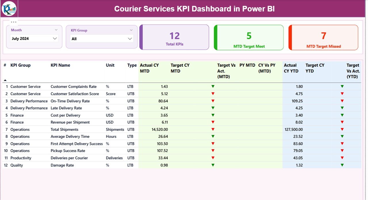
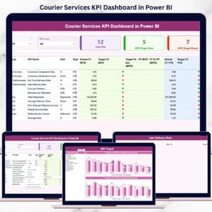
That is exactly where the Courier Services KPI Dashboard in Power BI becomes a game-changer. This ready-to-use Power BI dashboard transforms raw courier data into interactive visuals, performance indicators, and actionable insights. It allows courier companies to monitor MTD, YTD, targets, and previous-year performance in one centralized and easy-to-use dashboard.
Instead of manually tracking numbers, managers get instant clarity on delivery efficiency, service quality, and operational performance — all in real time.
🔑 Key Features of Courier Services KPI Dashboard in Power BI
🚀 Interactive KPI Monitoring
Track courier KPIs dynamically with slicers for Month and KPI Group.
📊 MTD & YTD Performance Tracking
Monitor both short-term execution and long-term performance trends simultaneously.
🎯 Target vs Actual Comparison
Instantly identify whether KPIs are meeting targets using visual indicators.
📈 Current Year vs Previous Year Analysis
Understand performance improvements or declines through year-over-year comparisons.
🚦 Conditional Formatting Indicators
Green ▲ and Red ▼ icons highlight KPI performance instantly.
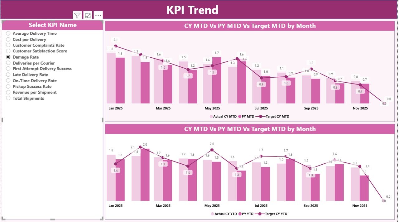
📉 Trend Analysis with Visual Charts
Analyze KPI movement over time using interactive combo charts.
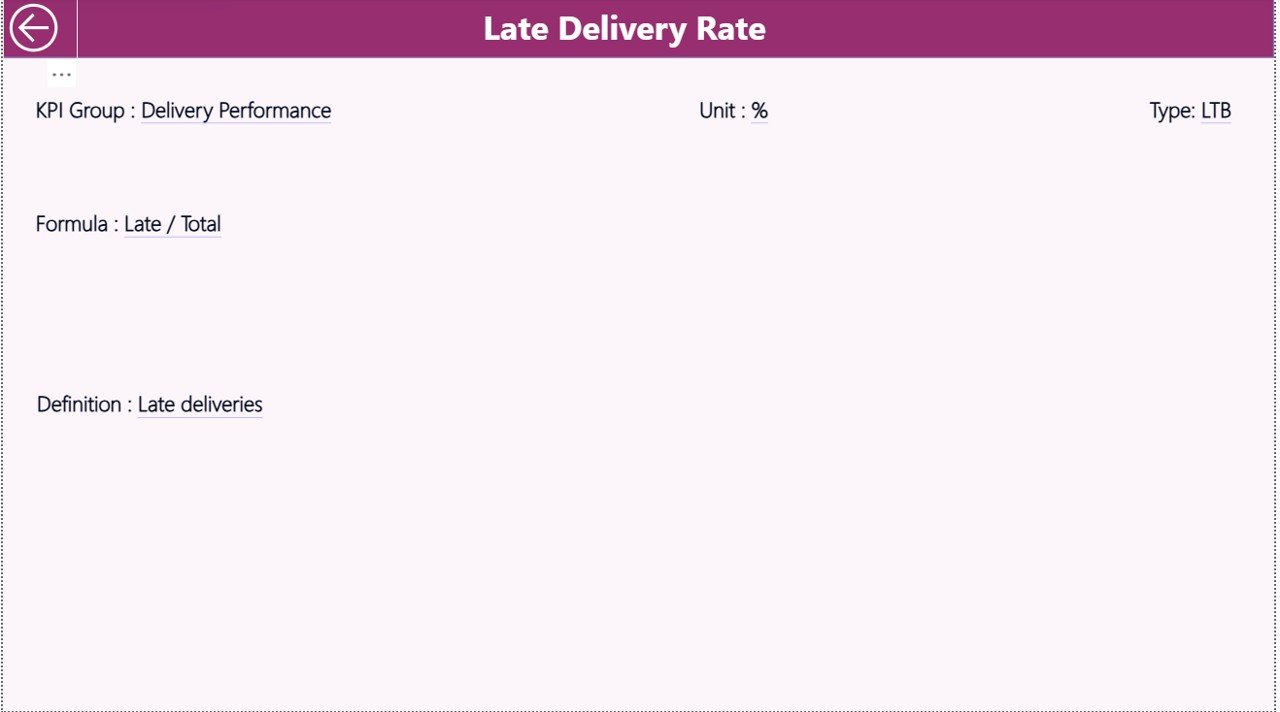
🧠 KPI Definition Drill-Through Page
View KPI formulas, definitions, units, and KPI types for complete clarity.
🔄 Excel-Driven & Easy to Maintain
Update data in Excel and refresh Power BI — no complex setup required.
📂 What’s Inside the Courier Services KPI Dashboard in Power BI
This digital product includes a professionally designed Power BI Desktop (.pbix) file with:
📄 Summary Page
• Month and KPI Group slicers
• KPI cards showing Total KPIs, MTD Target Met, and MTD Target Missed
• Detailed KPI table with MTD & YTD Actual, Target, PY, and variance indicators
📄 KPI Trend Page
• KPI selector slicer
• MTD Actual vs Target vs Previous Year chart
• YTD Actual vs Target vs Previous Year chart
📄 KPI Definition Page (Drill-Through)
• KPI Formula
• KPI Definition
• Unit of Measurement
• KPI Type (UTB / LTB)
📊 Excel Data Structure
• Input_Actual sheet
• Input_Target sheet
• KPI Definition sheet
This structure ensures scalability, transparency, and easy customization.
🛠️ How to Use the Courier Services KPI Dashboard in Power BI
1️⃣ Enter actual performance data in the Input_Actual Excel sheet
2️⃣ Add target values in the Input_Target Excel sheet
3️⃣ Define KPIs clearly in the KPI Definition sheet
4️⃣ Open the Power BI file and refresh data
5️⃣ Use slicers to analyze KPIs by Month and KPI Group
6️⃣ Track trends, spot issues, and take action instantly
No advanced Power BI skills are required — the dashboard is designed for both technical and non-technical users.
👥 Who Can Benefit from This Courier Services KPI Dashboard in Power BI
🚚 Courier & Logistics Company Owners
📦 Operations Managers
🧭 Logistics & Delivery Managers
📊 Business Analysts
🏢 Regional & Area Heads
📈 Performance Management Teams
Whether you manage a small courier operation or a large logistics network, this dashboard gives you full visibility into performance.
Click here to read the Detailed Blog Post
Watch the step-by-step video tutorial:
Visit our YouTube channel to learn step-by-step video tutorials


Reviews
There are no reviews yet.