


🔑 Key Features of Border Security Tech Dashboard in Power BI
Border Security Tech Dashboard in Power BI is a professionally designed, ready-to-use analytics template that empowers border security agencies, defense organizations, and government technology teams to monitor and evaluate border protection operations with precision. This Power BI dashboard transforms complex threat detection, equipment maintenance, and operational data into clear, interactive visualizations that drive smarter decisions and faster response times. Whether you are tracking severity levels, analyzing sector performance, or optimizing shift-based operations, this template gives you everything you need at a glance.
🚀 5 Interactive Dashboard Pages – Navigate through a comprehensive Overview, Threat Analysis, Sector Performance, Technology Insights, and Operational Efficiency views for full operational visibility
📊 Dynamic KPI Cards – Instantly monitor key metrics including Total Records, Total Operating Cost, Avg. Response Time, and Resolved Count on the overview page
🔍 Advanced Slicers & Filters – Filter by severity level, threat category, border sector, technology type, shift, and month for customized analysis
📈 Rich Data Visualizations – Professionally crafted charts display Total Records by Severity Level, Resolved Count%, Operating Cost by Month, Detection Accuracy by Method, and much more
🎨 Clean Professional Design – Modern layout with intuitive navigation that makes data exploration effortless for analysts, commanders, and stakeholders
⚡ Fully Editable & Customizable – Modify KPIs, charts, colors, and data connections to match your unique border security requirements
📂 Sample Data Included – Comes preloaded with realistic sample data so you can explore every feature immediately after download
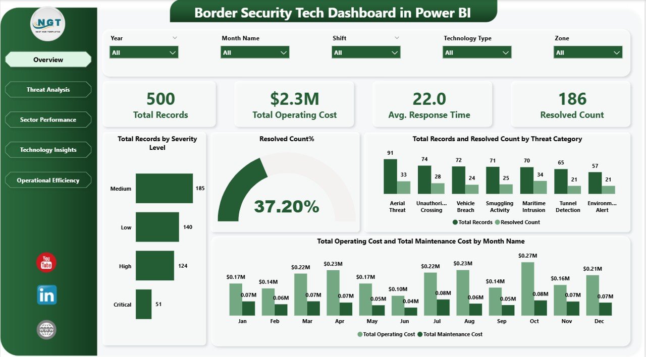
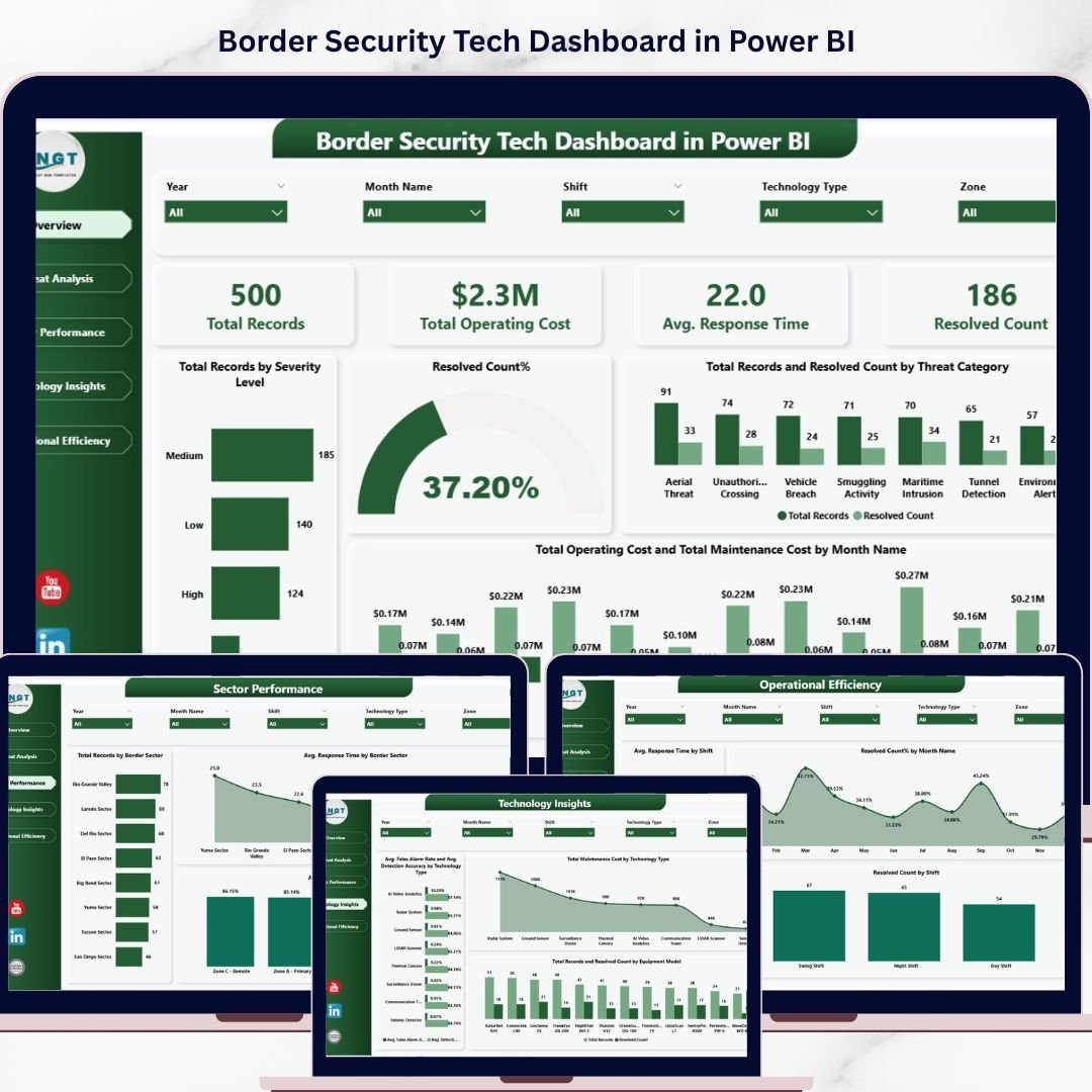
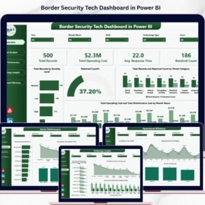
Overview Page – Border Security Tech Dashboard in Power BI
📦 What’s Inside the Border Security Tech Dashboard in Power BI
This Power BI dashboard template delivers five purpose-built pages that cover every critical aspect of border security technology management:
📌 Overview Page – Your command center showing high-level KPI cards for Total Records, Total Operating Cost, Avg. Response Time, and Resolved Count. Visual charts display Total Records by Severity Level, Resolved Count%, Total Records and Resolved Count by Threat Category, and Total Operating Cost and Total Maintenance Cost by Month Name with interactive slicers for quick filtering.
📌 Threat Analysis Page – Deep dive into border threats with charts showing Total Operating Cost by Severity Level, Avg. Detection Accuracy by Detection Method, and Total Records and Resolved Count by Escalation Level. Identify patterns, cost drivers, and detection effectiveness across all threat categories.
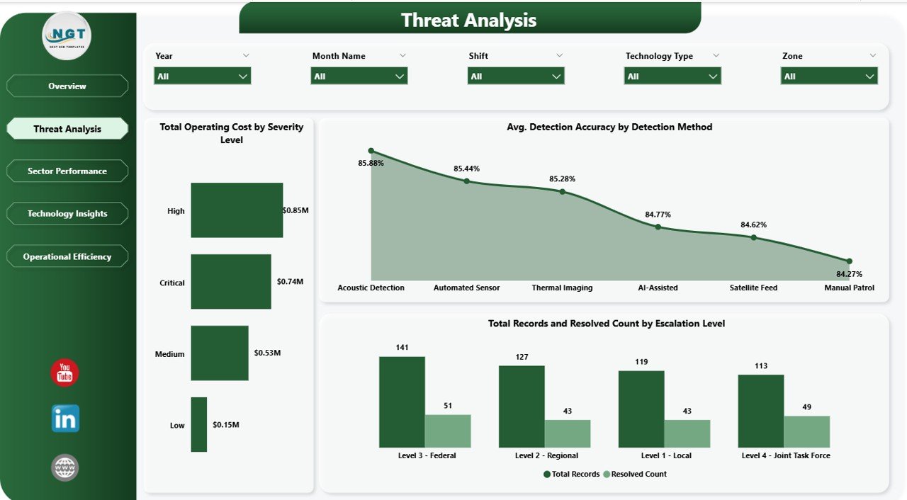
Threat Analysis Page
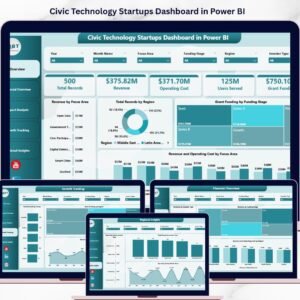
📌 Sector Performance Page – Analyze border sector effectiveness with visualizations for Total Records by Border Sector, Avg. Response Time by Border Sector, and Avg. Detection Accuracy by Zone. Ensure every sector meets operational benchmarks and identify underperforming zones. Explore more technology dashboards like the Civic Technology Startups Dashboard in Power BI for additional insights.
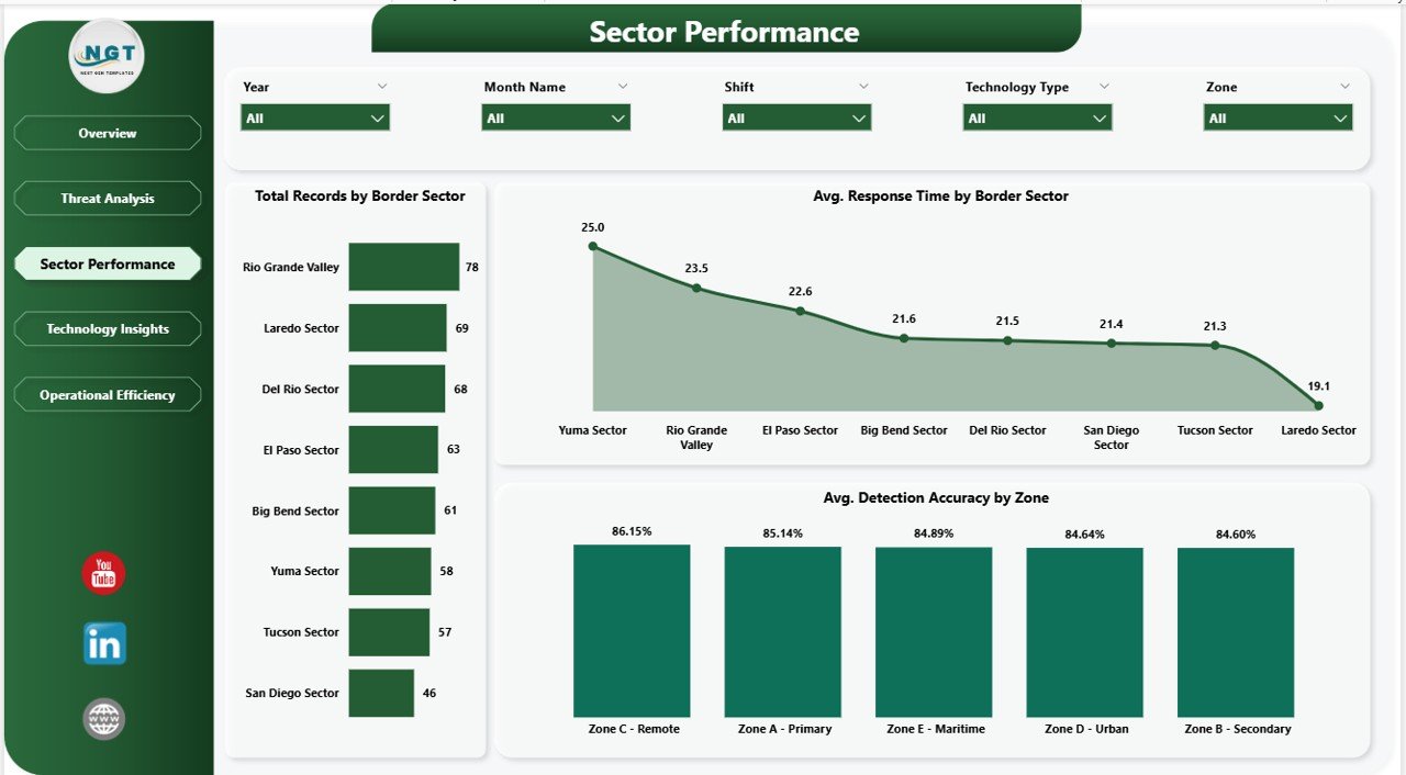
Sector Performance Page
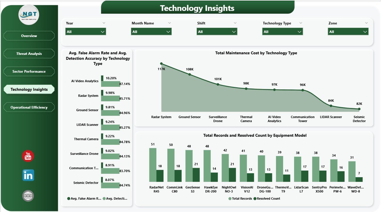
📌 Technology Insights Page – Track all security technology assets with visualizations for Avg. False Alarm Rate and Avg. Detection Accuracy by Technology Type, Total Maintenance Cost by Technology Type, and Total Records and Resolved Count by Equipment Model. Evaluate technology ROI and maintenance burden across your equipment portfolio. For a similar security-focused template, check out the Incident Response and Downtime Analysis Dashboard in Google Sheets.

Technology Insights Page
📌 Operational Efficiency Page – Optimize shift-based operations with charts for Avg. Response Time by Shift, Resolved Count% by Month Name, and Resolved Count by Shift. Ensure optimal staffing, track resolution trends over time, and maximize operational readiness. Also explore the Border Security Tech Dashboard in Excel for an alternative spreadsheet-based approach.
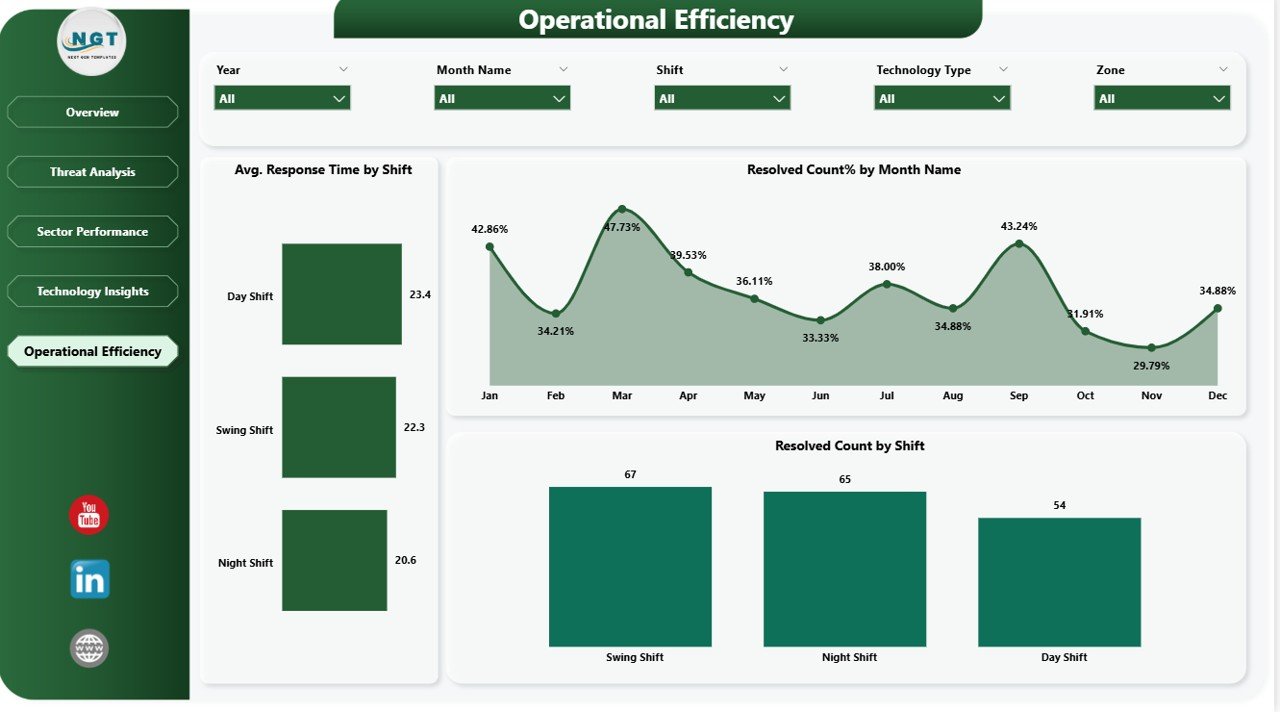
Operational Efficiency Page
⚙️ How to Use the Border Security Tech Dashboard in Power BI
1️⃣ Download the .pbix file and open it in Microsoft Power BI Desktop
2️⃣ Explore the sample data across all five dashboard pages to understand the layout and functionality
3️⃣ Replace the sample data with your own border security data by updating the data source connections
4️⃣ Customize KPIs, chart colors, filters, and visuals to match your organizational requirements
5️⃣ Publish to Power BI Service for team-wide access and real-time collaboration
6️⃣ Use slicers and filters to drill down into specific severity levels, threat categories, border sectors, and technology types
👥 Who Can Benefit from This Border Security Tech Dashboard in Power BI
🎯 Border Security Agencies – Monitor threat records, response times, and resolution rates across all border sectors in real time
🎯 Government Defense Departments – Track operating costs, maintenance expenses, and technology performance across equipment portfolios
🎯 Homeland Security Analysts – Analyze severity levels, escalation patterns, and detection accuracy by method and zone
🎯 Technology Operations Managers – Evaluate false alarm rates, detection accuracy, and maintenance costs by technology type and equipment model
🎯 Security Consultants & Contractors – Present professional border security analytics reports to government clients
🎯 Shift Supervisors & Operations Leads – Optimize shift scheduling using response time and resolution data by shift
🎯 Data Analysts & BI Professionals – Use as a ready-made template for security-focused data visualization projects
Click here to read the Detailed Blog Post about Border Security Tech Dashboard in Power BI
Watch the step-by-step video tutorial:


Reviews
There are no reviews yet.