


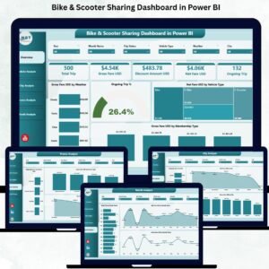
Urban mobility is evolving faster than ever, and shared mobility services—especially bikes and scooters—have become an essential part of city transportation. As riders take thousands of trips daily, operators must track weather impact, trip duration, membership behavior, city-level performance, revenue trends, and promotional results. Doing this manually becomes nearly impossible. That’s why the Bike & Scooter Sharing Dashboard in Power BI is a must-have tool for every mobility operator.
This powerful dashboard transforms your raw trip, fare, and user data into clean, interactive visuals. With smart slicers, live charts, trend analysis, and real-time KPIs, this dashboard gives you complete clarity over your bike and scooter sharing business. Whether you are a startup, a city mobility operator, or a large-scale fleet provider, this dashboard helps you make fast, data-driven, and profitable decisions.
Built directly in Power BI and fully connected to Excel data sources, the dashboard updates automatically when you refresh your data. You can track gross fare, net fare, ongoing trip percentages, city performance, weather impact, and promotional outcomes—all in one clean interface. This makes operations smoother, planning easier, and business decisions smarter.
🚴♂️ Key Features of the Bike & Scooter Sharing Dashboard in Power BI
This dashboard contains five powerful analysis pages, each offering deep insights into a different part of your mobility operations.
⭐ 1. Overview Page – Your Complete Mobility Snapshot

The Overview Page gives you an instant view of your top KPIs and performance indicators.
🔹 What You’ll See:
-
✔ Four key KPI cards
-
✔ Live insights into trip behavior
-
✔ Important charts showing real-time patterns
🔹 Charts on the Overview Page:
-
Gross Fare (USD) by Weather – Understand how weather influences demand.
-
Ongoing Trip (%) – Track how many trips are active at any moment.
-
Net Fare (USD) by Vehicle Type – Compare financial performance of bikes vs. scooters.
-
Gross Fare (USD) by Membership Type – Analyze revenue from casual vs. subscribed riders.
This page gives you the big picture instantly.
⭐ 2. Vehicle Analysis Page – Understand Vehicle-Level Performance
Different vehicles behave differently across weather conditions and usage patterns. This page helps you optimize your fleet.
🔹 Charts Included:
-
Trip Duration (Minutes) by Weather
-
Ongoing Trip (%) by Vehicle Type
-
Gross Fare (USD) by Vehicle Type
These insights help you decide fleet allocation, purchasing decisions, and city-level deployment for maximum performance.
⭐ 3. City Analysis Page – Compare City-Wise Performance
Every city has unique rider behavior. Some cities show higher demand, while others show better profitability.
🔹 Charts on This Page:
-
Ongoing Trip (%) by City
-
Net Fare (USD) by City
-
Gross Fare (USD) by City
This detailed view helps mobility operators plan expansions, optimize fleet distribution, and improve promotional targeting.
⭐ 4. Promo Analysis Page – Measure Promotion Success
Promotional campaigns drive user engagement, but they also affect revenue. This page helps you measure their true impact.
🔹 Charts Included:
-
Ongoing Trip (%) by Promo Type
-
Net Fare (USD) by Promo Type
-
Gross Fare (USD) by Promo Type
This analysis helps you decide which promotions to continue, adjust, or discontinue based on ROI.
⭐ 5. Monthly Trends Page – Identify Seasonality and Growth Patterns
Shared mobility demand changes across seasons, weather, and events. This page helps you understand long-term trends.
🔹 Charts Included:
-
Total Trip by Month
-
Net Fare (USD) by Month
-
Gross Fare (USD) by Month
These insights help you plan budgets, prepare for high-demand months, and run targeted campaigns.
📦 What’s Inside the Bike & Scooter Sharing Dashboard
You get a complete Power BI reporting system that includes:
-
5 analysis pages
-
Clean dashboard navigation
-
Dynamic slicers and filters
-
Interactive, real-time charts
-
Excel-based data input
-
Automatic refresh
-
Fully customizable visuals
This dashboard delivers everything needed for accurate shared mobility analytics.
🧩 How to Use the Dashboard Effectively
-
Enter your trip and fare data in Excel
-
Refresh Power BI
-
Use slicers for deep filtering
-
Monitor weather, city, and promo impact
-
Compare bike vs product performance
-
Analyze trends monthly
-
Make data-driven operational decisions
It’s simple, visual, and perfect for everyday use.
👤 Who Can Benefit from This Dashboard
This dashboard is ideal for:
-
🚴♂️ Shared Mobility Operators
-
🛴 Electric Scooter Companies
-
🏙 City Planners & Urban Mobility Teams
-
📊 Operations Managers
-
💼 Mobility Startups
-
💰 Finance & Pricing Teams
-
📢 Marketing & Promotions Teams
Anyone who depends on shared mobility analytics will benefit immediately.
### Click hare to read the Detailed blog post
Visit our YouTube channel to learn step-by-step video tutorials
👉 Youtube.com/@PKAnExcelExpert


Reviews
There are no reviews yet.