Airline Catering Dashboard is a critical part of the aviation industry. Every day, airlines serve thousands of meals to passengers across multiple routes, aircraft types, and airports. Because of this complex operation, catering teams must manage food preparation, delivery timing, service quality, and operational costs efficiently.
However, many airline catering companies still rely on scattered spreadsheets and manual reports. As a result, managers struggle to monitor performance, track costs, and evaluate service quality across airlines and airports.
That is where the Airline Catering Dashboard in Power BI becomes a powerful analytics solution.
This ready-to-use Power BI dashboard transforms raw catering data into interactive visual insights. Instead of reviewing multiple spreadsheets, managers can monitor catering performance, analyze meal costs, track service ratings, and evaluate revenue trends from a single centralized dashboard.
Because Power BI provides dynamic charts, filters, and KPI indicators, catering teams can analyze operational performance quickly and make faster data-driven decisions.
If you want better operational visibility and improved airline catering management, this dashboard offers an effective solution.
✈️ Key Feature of Airline Catering Dashboard in Power BI
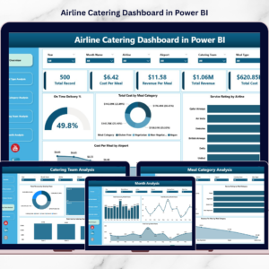
This structured Power BI dashboard includes five analytical pages designed to monitor catering operations from multiple perspectives.
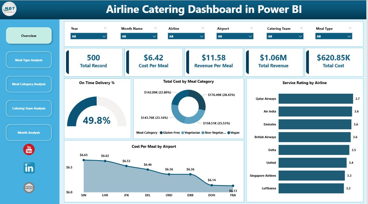
📊 Overview Dashboard Page – A centralized control panel displaying key catering KPIs.
🎯 Interactive Slicers & Filters – Analyze catering performance by airline, airport, meal category, or time period.
⏱ On-Time Delivery Monitoring – Track how efficiently meals are delivered to aircraft.
💰 Cost Analysis by Meal Category – Monitor catering expenses across different meal categories.
⭐ Service Rating Monitoring – Evaluate satisfaction levels across airline partnerships.
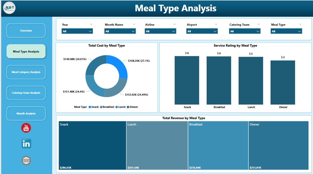
📦 Meal Type Performance Analysis – Analyze cost, service quality, and revenue by meal type.
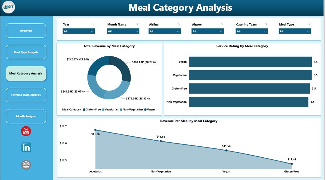
🍽 Meal Category Insights – Understand which food categories perform best operationally.
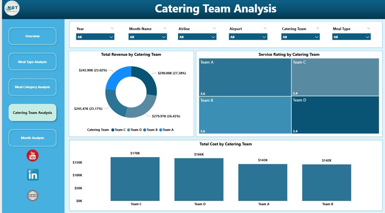
👨🍳 Catering Team Performance Tracking – Compare cost efficiency and service quality across teams.
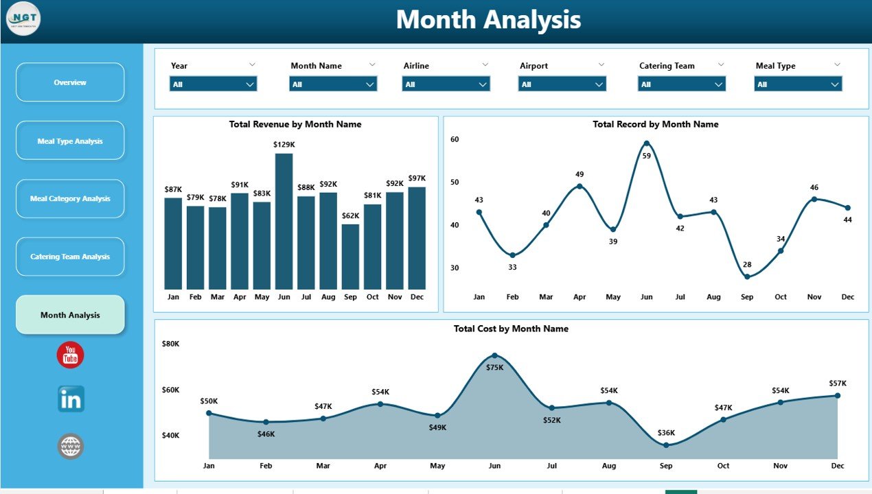
📅 Monthly Trend Analysis – Identify seasonal patterns in catering demand, cost, and revenue.
Because the dashboard updates dynamically, users can instantly analyze airline catering performance and operational trends.
📦 What’s Inside the Airline Catering Dashboard in Power BI
The dashboard is built using Power BI for visualization and structured catering data as the source.
Inside the dashboard you get:
✅ Overview Page – High-level summary of catering operations
✅ Meal Type Analysis Page – Meal type performance insights
✅ Meal Category Analysis Page – Category-level cost and revenue analysis
✅ Catering Team Analysis Page – Team performance monitoring
✅ Month Analysis Page – Time-based performance trends
✅ Interactive KPI Cards – Key catering performance metrics
✅ Dynamic Filters & Slicers – Flexible data exploration
The dashboard typically analyzes data fields such as:
Airline Name
Airport
Meal Type
Meal Category
Catering Team
On-Time Delivery %
Service Rating
Total Cost
Total Revenue
Month
Because Power BI supports multiple data sources, organizations can integrate the dashboard with:
Excel files
Operational databases
ERP systems
Cloud data platforms
This flexibility allows the dashboard to scale as airline operations grow.
⚙️ How to Use the Airline Catering Dashboard in Power BI
Using this dashboard is straightforward.
1️⃣ Import catering data into Power BI from Excel or other operational systems.
2️⃣ Ensure the dataset includes airline, airport, meal type, cost, revenue, and service rating data.
3️⃣ Refresh the dashboard to update visuals.
4️⃣ Use slicers to filter data by airline, airport, meal category, or month.
5️⃣ Analyze operational trends and KPI insights.
Within seconds, decision-makers gain a complete overview of airline catering operations.
Even users with basic Power BI knowledge can easily operate the dashboard.
👥 Who Can Benefit from This Airline Catering Dashboard in Power BI
This dashboard is designed for professionals involved in airline food service operations.
It is particularly useful for:
✈️ Airline Operations Managers
🍽 Catering Service Providers
📊 Business Analysts
💰 Finance Teams
⭐ Quality Control Teams
📈 Airline Management Teams
Because the dashboard combines operational, financial, and service metrics, multiple departments can use it simultaneously.
💡 Why This Dashboard Improves Airline Catering Operations
✔ Centralized monitoring of catering operations
✔ Faster identification of operational issues
✔ Improved cost control across meal categories and airports
✔ Better service quality monitoring
✔ Clear comparison between catering teams and airlines
✔ Data-driven decision-making
✔ Improved demand planning using monthly trends
✔ Scalable analytics platform using Power BI
Instead of relying on manual reports, airline catering companies gain real-time operational insights through visual analytics.
This dashboard converts catering data into actionable intelligence that helps organizations improve efficiency and profitability.
### Click here to read the Detailed blog post
Visit our YouTube channel to learn step-by-step video tutorials
Youtube.com/@PKAnExcelExpert