🔑 Key Features of Agriculture and Farm Dashboard in Excel
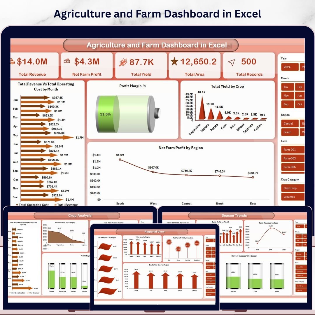
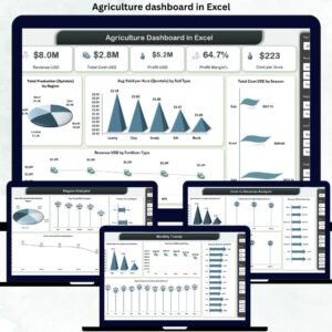
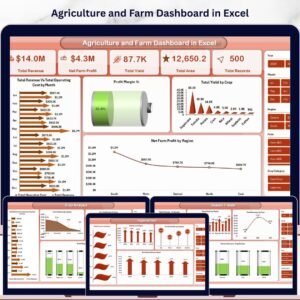
The Agriculture and Farm Dashboard in Excel is a comprehensive, interactive reporting tool built for farmers, agronomists, and agricultural business owners who want to track farm revenue, crop yield, operating costs, and profit margins — all in one place. This dashboard includes 5 interactive analysis pages, a dedicated data sheet, and a support sheet with pivot tables that power the entire dashboard dynamically. It tracks 5 critical KPIs including Total Revenue, Net Farm Profit, Total Area, Total Yield, and Total Records. Whether you manage a small family farm or a large-scale agricultural operation, this template helps you make data-driven decisions quickly.
📌 Built entirely in Microsoft Excel — no macros, no VBA, no additional software needed. Simply replace the sample data with your own, click Refresh All in the Data tab, and your entire dashboard updates automatically.
📌 Includes interactive slicers on every page so you can filter by region, crop, season, irrigation type, and more — giving you a customized view in seconds.
📌 Designed with clean, professional visuals and easy-to-read charts that make complex agricultural data simple to understand.
If you are looking for more agriculture and farming templates, explore our full collection of Excel Dashboard Templates at NextGenTemplates.
📦 What’s Inside the Agriculture and Farm Dashboard in Excel
This dashboard contains 7 sheet tabs that cover every aspect of your farming operations:
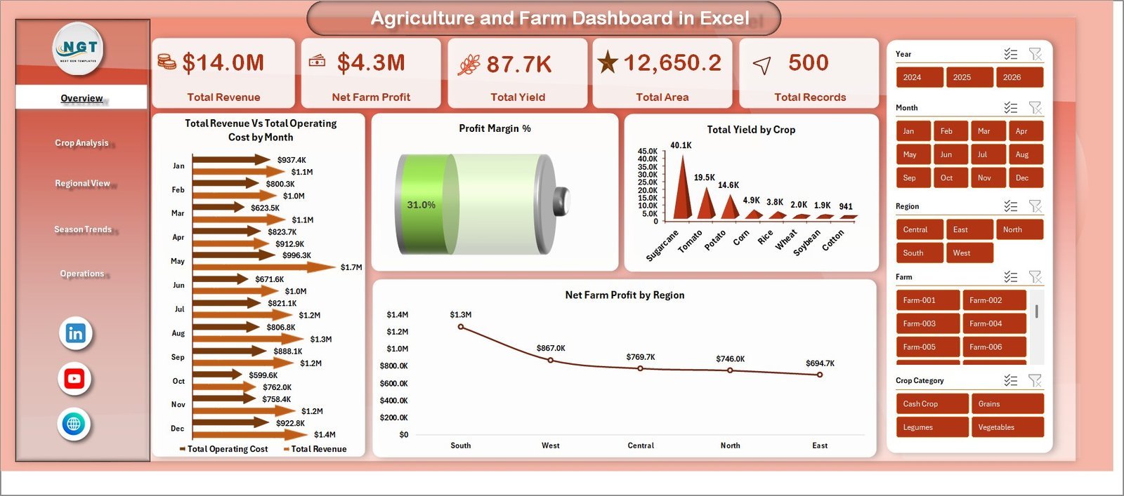
📊 Overview Page – Your central command center displaying Total Revenue, Net Farm Profit, Total Area, Total Yield, and Total Records as KPI cards. Charts include Total Revenue vs Total Operating Cost by Region, Profit Margin %, Total Yield by Crop, and Net Farm Profit by Region. Interactive slicers let you filter the entire dashboard instantly.
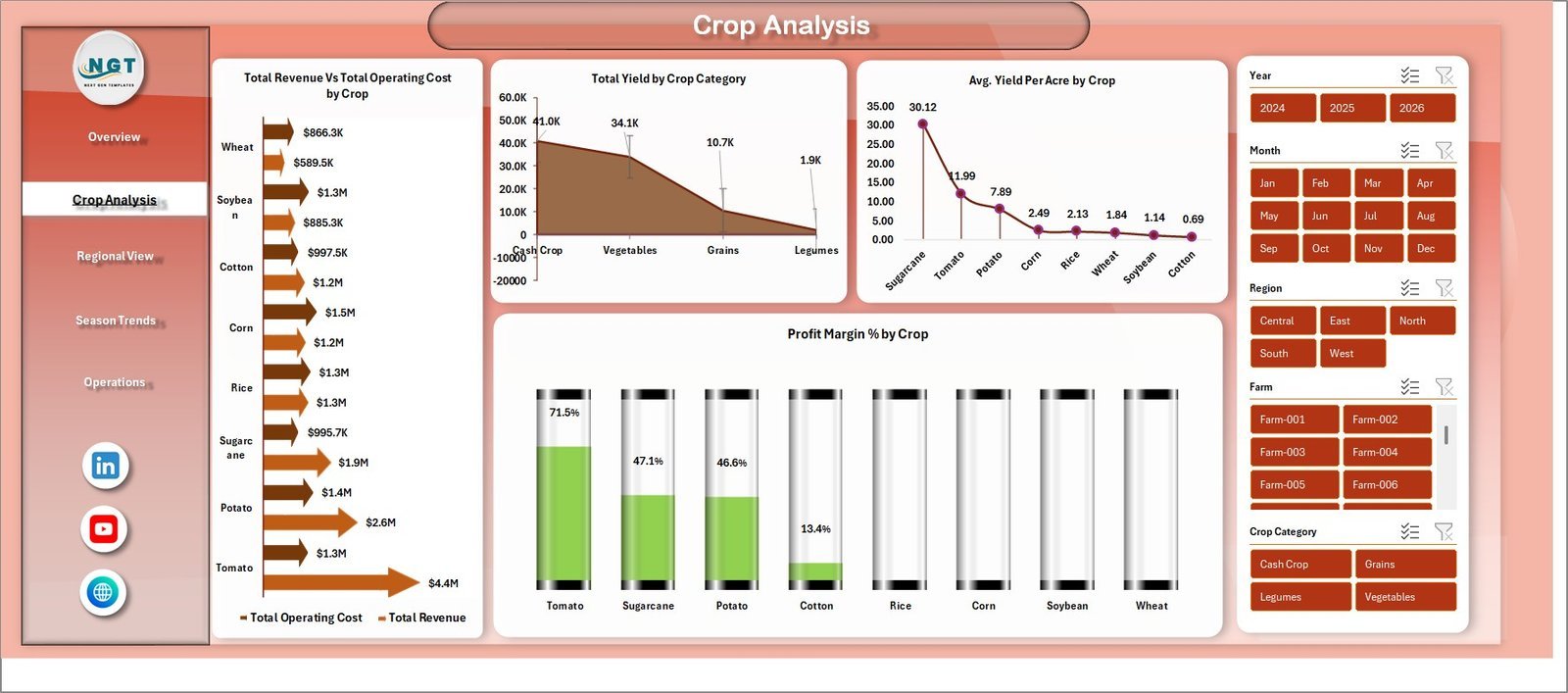
📊 Crop Analysis – Deep-dive into crop-level performance with charts showing Total Revenue vs Total Operating Cost by Crop, Total Yield by Crop Category, Avg Yield Per Acre by Crop, and Profit Margin % by Crop. Identify your most profitable crops at a glance.
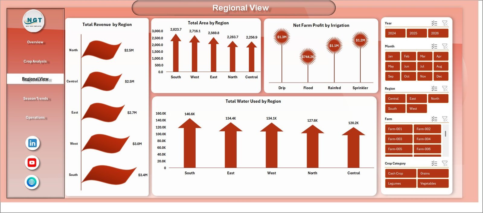
📊 Regional View – Analyze geographic performance with Total Revenue by Region, Total Area by Region, Net Farm Profit by Irrigation, and Total Water Used by Region. Understand which regions deliver the best returns.
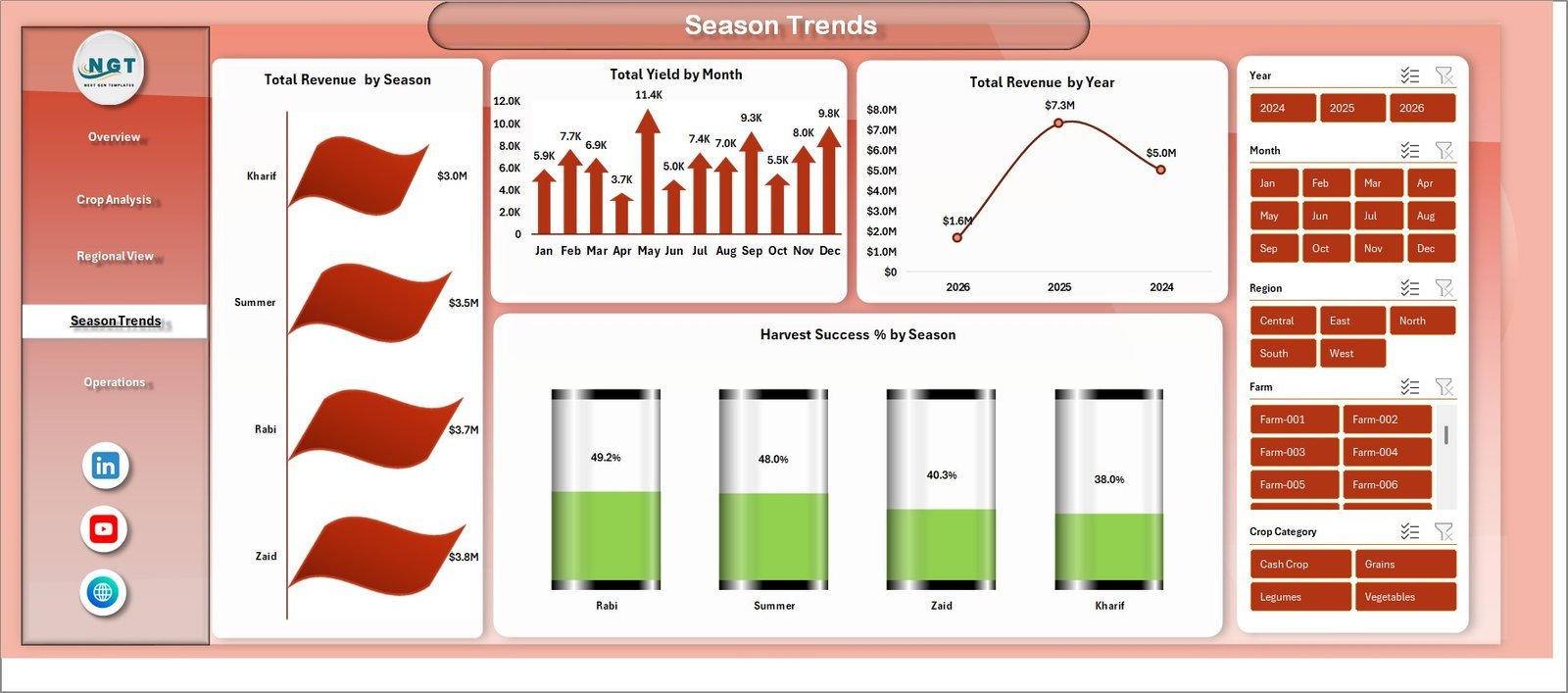
📊 Season Trends – Track seasonal patterns with Total Revenue by Season, Total Yield by Month, Total Revenue by Year, and Harvest Success % by Season. Plan your planting and harvesting cycles based on real data.
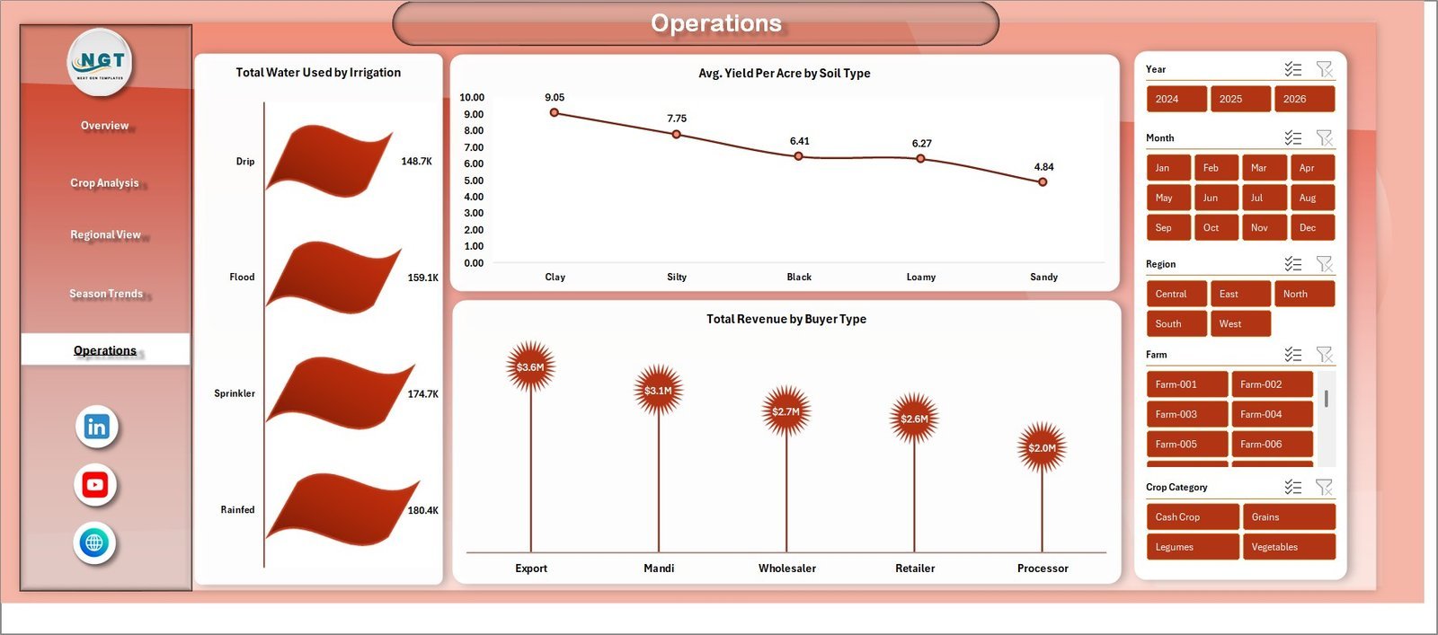
📊 Operations – Monitor operational efficiency with Total Water Used by Irrigation, Avg Yield Per Acre by Soil Type, and Total Revenue by Buyer Type. Optimize your resource allocation for maximum yield.
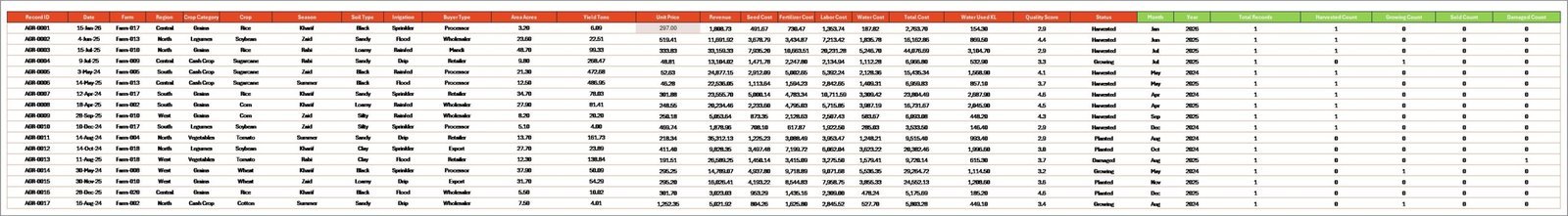
📊 Data Sheet – This is where you enter your raw farming data. Simply replace the sample records with your actual data in the same format, and the entire dashboard refreshes automatically.
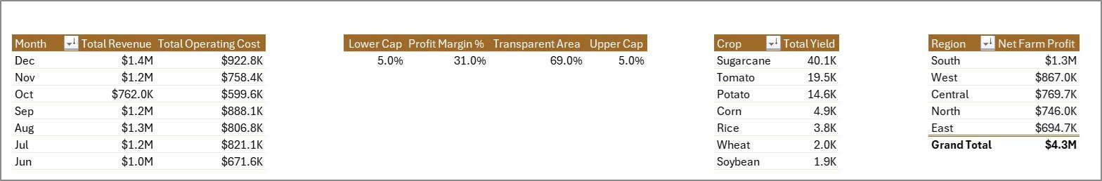
📊 Support Sheet – Contains all pivot tables that power the dashboard. After updating data, go to the Data tab in Excel and click Refresh All. All pivots and charts update instantly. You can keep this sheet hidden.
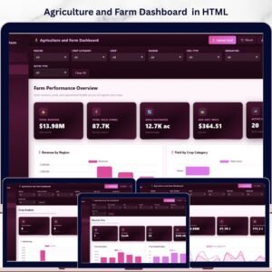
Looking for a similar dashboard in other platforms? Check out the Agriculture and Farm Dashboard in HTML or the Farm Production Dashboard in Google Sheets.
⚙️ How to Use the Agriculture and Farm Dashboard in Excel
Getting started is simple:
1️⃣ Download and open the Excel file on your computer using Microsoft Excel.
2️⃣ Go to the Data Sheet tab and replace the sample data with your own farming records — keep the same column format.
3️⃣ Navigate to the Data tab in the Excel ribbon and click Refresh All to update all pivot tables.
4️⃣ All 5 dashboard pages will automatically refresh with your data — charts, KPI cards, and slicers update instantly.
5️⃣ Use the slicers on each page to filter by Region, Crop, Season, Irrigation Type, and other dimensions.
6️⃣ The Support Sheet can be hidden — it contains the pivot tables that drive the dashboard.
👥 Who Can Benefit from This Agriculture and Farm Dashboard in Excel
🌾 Farmers and Farm Owners – Track revenue, costs, and profitability across crops and seasons.
🌾 Agronomists and Agricultural Consultants – Analyze crop yield, soil type performance, and regional trends for clients.
🌾 Agricultural Businesses and Cooperatives – Monitor multi-farm operations with centralized data.
🌾 Agricultural Students and Researchers – Use real-world data structures for academic projects and research.
🌾 Government and NGO Agricultural Programs – Track program outcomes, regional performance, and resource allocation.
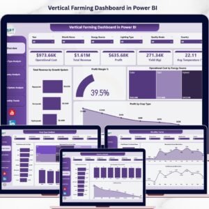
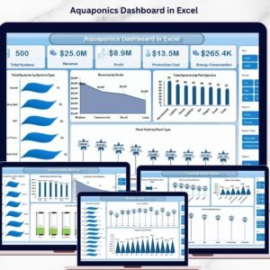
Also explore the Vertical Farming Dashboard in Power BI and the Aquaculture Dashboard in Excel for related agricultural analytics.
❓ Frequently Asked Questions
What KPIs does the Agriculture and Farm Dashboard in Excel track?
The Agriculture and Farm Dashboard in Excel tracks 5 key performance indicators: Total Revenue, Net Farm Profit, Total Area, Total Yield, and Total Records. Additionally, it provides Profit Margin %, Harvest Success %, and Avg Yield Per Acre across multiple analysis pages.
Do I need advanced Excel skills to use this dashboard?
No. Simply replace the sample data in the Data Sheet with your own farming records and click Refresh All in the Data tab. All charts, KPI cards, and pivot tables update automatically. No macros or VBA knowledge is required.
Can I customize the crops, regions, and seasons in this dashboard?
Yes. The dashboard is fully data-driven. When you update the Data Sheet with your own crop names, regions, seasons, and other fields, the dashboard adapts automatically to reflect your unique farm data.
What is the best Excel dashboard template for agriculture and farming?
The Agriculture and Farm Dashboard in Excel by NextGenTemplates is one of the best options available. It includes 5 interactive pages covering overview, crop analysis, regional view, season trends, and operations — plus a data sheet and support sheet for easy customization.
How do I track farm revenue and crop yield in Excel?
You can use the Agriculture and Farm Dashboard in Excel to track farm revenue and crop yield. Enter your farming data into the Data Sheet, and the dashboard automatically generates charts showing revenue by region, yield by crop, profit margins, and seasonal trends.
Is this template compatible with Google Sheets?
This template is designed for Microsoft Excel and uses pivot tables and slicers which work best in Excel. For Google Sheets, check out our Farm Production Dashboard in Google Sheets.
🔗 Explore Related Templates
🔹 Agriculture and Farm Dashboard in HTML – Same agricultural analytics in a browser-based HTML format.
🔹 Vertical Farming Dashboard in Power BI – Advanced vertical farming analytics with Power BI visuals.
🔹 Aquaculture Dashboard in Excel – Track aquaculture production, revenue, and sustainability in Excel.


Reviews
There are no reviews yet.