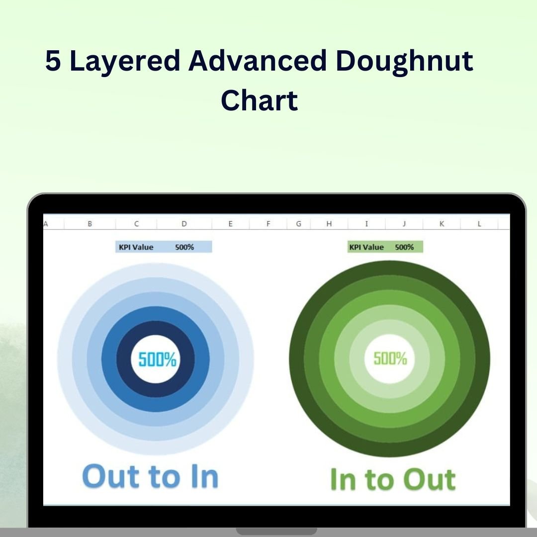
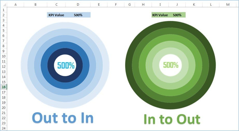
The 5 Layered Advanced Doughnut Chart in Excel is a sophisticated yet easy-to-use tool designed to give your data a visually striking and highly informative presentation. Unlike traditional pie charts or doughnut charts, this 5-layered chart allows you to display multiple data series in a single, dynamic visualization. It’s perfect for comparing various categories, tracking KPIs, or presenting data with multiple layers of information, all within a single, engaging chart.
This advanced chart is fully customizable, so you can tailor each layer, color, and data point to suit your needs. Whether you’re presenting financial data, sales performance, or any other multi-dimensional data, this chart provides a modern and effective way to communicate your insights clearly and creatively.
Key Features of the 5-Layered Advanced Doughnut Chart in Excel
📌 Multi-Layered Data Representation
Unlike standard charts, this doughnut chart has five distinct layers that allow you to display up to five different data series. This makes it easy to compare multiple categories or track different metrics within a single chart.
🛠 Customizable Layers and Colors
Each layer of the doughnut chart can be customized with different colors and labels to make your data visually appealing and easy to interpret. You can assign specific colors to each data series to help users quickly differentiate between categories.
💡 Dynamic Data Visualization
As you update the data in Excel, the chart automatically adjusts to reflect the changes. This real-time functionality allows for seamless updates and ensures that your chart is always displaying the most up-to-date information.
🔢 Clear and Easy-to-Read Design
The 5-layered chart is designed to be clear and easily interpretable. With each layer representing a different data set, you can immediately identify trends, patterns, and key insights without having to analyze multiple separate charts.
🚀 Multiple Use Cases
This versatile chart can be used for various purposes, including performance tracking, sales comparisons, KPI monitoring, project progress, or any scenario where multiple data sets need to be compared in a single chart.
📊 Interactive Features
The doughnut chart is designed to be interactive, allowing users to hover over each layer to view specific data values. This interactivity adds an extra layer of insight, making it perfect for presentations or detailed reports.
⚙ Simple Setup and Customization
Despite its advanced design, setting up the 5-layered doughnut chart is easy. You can follow simple steps to input your data and customize each layer to reflect your exact needs, whether you’re using it for internal analysis or presenting it to stakeholders.
🚀 Why You’ll Love the 5-Layered Advanced Doughnut Chart
✅ Multi-Layered Data Representation – Compare multiple data sets in a single chart with five distinct layers. ✅ Customizable Design – Adjust colors, labels, and data points to match your needs. ✅ Real-Time Data Updates – The chart automatically adjusts as you update your data. ✅ Visually Clear and Interactive – Easily interpret trends and insights with interactive features. ✅ Versatile and Dynamic – Perfect for sales, performance, and project tracking.
📂 What’s Inside the 5-Layered Advanced Doughnut Chart in Excel?
- 5-Layered Chart: A sophisticated chart that displays multiple data series in one dynamic visualization.
- Customizable Layers: Tailor each layer’s color, labels, and data points.
- Interactive Data Labels: Hover over layers to see detailed data values.
- Real-Time Updates: The chart adjusts automatically as new data is entered.
- Simple Setup Instructions: Easy-to-follow setup and customization steps.
🔍 How to Use the 5-Layered Advanced Doughnut Chart in Excel
1️⃣ Download the Template – Instant access to the Excel file upon purchase. 2️⃣ Enter Your Data – Input your data for each layer of the doughnut chart. 3️⃣ Customize the Chart – Modify the colors, labels, and layout to suit your needs. 4️⃣ Analyze and Present – Use the chart to compare multiple data series or track KPIs. 5️⃣ Present and Share – Use the interactive chart in presentations, reports, or dashboards to showcase your insights.
🎯 Who Can Benefit from the 5-Layered Advanced Doughnut Chart in Excel? 🔹 Business Analysts
🔹 Project Managers
🔹 Marketing Teams
🔹 Sales Managers
🔹 Data Analysts
🔹 Anyone looking to display multiple data sets clearly and effectively
Take your data presentations to the next level with the 5-Layered Advanced Doughnut Chart in Excel. This powerful chart allows you to compare multiple data sets in a single, visually stunning visualization that updates in real time.
Click here to read the Detailed blog post
https://www.pk-anexcelexpert.com/5-layered-advanced-doughnut-chart/


Reviews
There are no reviews yet.