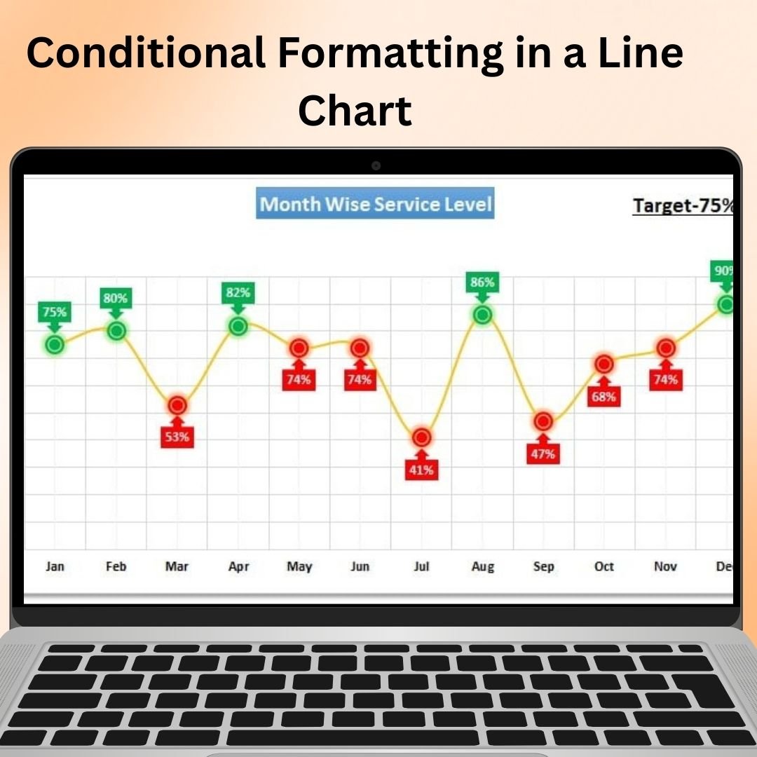
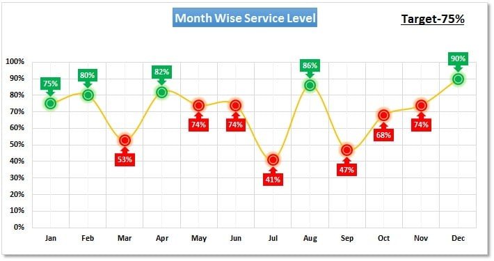
The Conditional Formatting in a Line Chart tool in Excel is an innovative way to add dynamic, visual flair to your line charts by applying conditional formatting rules. This tool enhances your traditional line chart with color coding, highlighting, and other visual cues, allowing you to emphasize key data points or trends automatically. Whether you’re tracking sales, project progress, or other performance metrics, this feature helps to bring out important changes or milestones, making your data more insightful and actionable.
With the Conditional Formatting in a Line Chart, you can set rules that change the color of lines or data points based on specific conditions, such as performance thresholds, trend changes, or value ranges. This allows you to easily identify trends, peaks, and dips in your data, providing an instant, visual overview of key data points without manually adjusting your chart.
Key Features of Conditional Formatting in a Line Chart
📌 Dynamic Conditional Formatting
Apply conditional formatting to different segments of your line chart based on predefined rules. This allows for dynamic updates and ensures your chart visually reflects data changes instantly.
🛠 Customizable Formatting Rules
Set your own conditions to change the color of the line or data points when specific values are met. For instance, you can change the line color when sales exceed a target, when data falls below a certain threshold, or when a particular event occurs in your dataset.
💡 Visual Cues for Better Insights
The color changes, markers, and highlights created through conditional formatting provide clear visual cues that make it easier to interpret the data at a glance. Instantly spot trends, spikes, dips, and outliers without needing to manually analyze the data.
🔢 Real-Time Data Updates
As your data changes, the conditional formatting automatically updates in real-time, ensuring your chart always reflects the most current information. This dynamic feature is ideal for monitoring ongoing performance or tracking live data.
🚀 Perfect for Trend Analysis
This tool is ideal for tracking trends, comparing performance over time, and identifying critical points where action is needed. Whether you’re monitoring financial metrics, project progress, or other business KPIs, conditional formatting makes it easier to assess progress and take timely action.
📊 Enhanced Visual Appeal
The application of conditional formatting improves the visual appeal of your charts, making them more engaging and easier to interpret. You can use color gradients, line thickness variations, and other formatting options to customize the chart’s appearance according to your preferences.
⚙ User-Friendly Setup
Despite its powerful functionality, the Conditional Formatting in a Line Chart feature is easy to use. Even if you’re new to Excel, you can quickly apply conditional formatting rules to your charts with simple, step-by-step instructions.
🚀 Why You’ll Love Conditional Formatting in a Line Chart
✅ Dynamic Updates – Automatically change colors and formatting based on data updates. ✅ Customizable Rules – Set your own thresholds for when formatting should apply. ✅ Clear Visual Insights – Quickly spot trends, milestones, and deviations in your data. ✅ Perfect for Reports – Enhance the clarity and impact of your business dashboards and performance reports. ✅ Simple Setup – No advanced Excel skills required – follow simple instructions for setup.
📂 What’s Inside Conditional Formatting in a Line Chart?
- Customizable Formatting Rules: Set conditions to change line colors based on specific values or trends.
- Real-Time Updates: Automatically updates the chart as data changes.
- Enhanced Visuals: Use color coding, gradients, and highlights to make key data points stand out.
- Step-by-Step Setup Guide: Easy-to-follow instructions to help you apply the tool.
🔍 How to Use Conditional Formatting in a Line Chart
1️⃣ Download the Template – Instant access to the Excel file upon purchase. 2️⃣ Input Your Data – Enter your time-series data into the line chart. 3️⃣ Set Conditional Rules – Define your custom conditions for formatting the line or data points. 4️⃣ Track Progress – Watch the chart automatically adjust as data updates. 5️⃣ Present and Share – Use the formatted chart in reports, presentations, or dashboards to communicate insights.
🎯 Who Can Benefit from Conditional Formatting in a Line Chart? 🔹 Business Analysts
🔹 Project Managers
🔹 Sales Teams
🔹 Financial Analysts
🔹 Marketing Managers
🔹 Anyone who needs to visualize and track performance trends in a clear, engaging way
The Conditional Formatting in a Line Chart tool allows you to quickly visualize performance metrics, identify trends, and track important milestones with ease. With real-time updates and dynamic visual cues, it’s the perfect tool for improving data presentations and making data-driven decisions.
Click here to read the Detailed blog post
https://www.pk-anexcelexpert.com/conditional-formatting-in-a-line-chart/
Visit our YouTube channel to learn step-by-step video tutorials
Watch the step-by-step video tutorial:
Watch the step-by-step video tutorial:


Reviews
There are no reviews yet.