Powerful Employee Satisfaction Dashboards That Will Transform Your HR Strategy
Published by NextGenTemplates.com | Category: HR & People Analytics | Tools: Excel, Power BI, Google Sheets

Happy employees build thriving companies. Yet most HR teams still rely on cluttered spreadsheets, disconnected survey tools, or basic bar charts to measure how their people actually feel. The result? Critical signals get buried, attrition sneaks up unnoticed, and leadership is left making culture decisions based on gut feel rather than real data.
That changes today. At NextGenTemplates.com, we have built three dedicated, ready-to-use Employee Satisfaction Dashboards—one each for Microsoft Excel, Power BI, and Google Sheets. Whether your team lives inside spreadsheets, craves enterprise-level analytics, or needs a cloud-first collaboration tool, there is a perfect fit waiting for you.
In this post, we break down all three dashboards, highlight what makes each one unique, and help you choose the right one for your organization.
Why Every HR Team Needs a Dedicated Satisfaction Dashboard
Employee satisfaction is not just a “nice to have”—it is a core business metric. Studies consistently show that disengaged employees cost organizations significantly in lost productivity, absenteeism, and costly turnover. The earlier you spot a dip in satisfaction, the faster you can act.
A well-designed dashboard transforms raw survey responses into clear, visual patterns. You can instantly see which departments are struggling, which roles feel undervalued, and how satisfaction trends have shifted over months. That is the kind of intelligence that drives smarter HR decisions—and that is exactly what our three dashboards deliver.
1. Employee Satisfaction Dashboard in Excel
The Employee Satisfaction Dashboard in Excel is the ideal solution for HR professionals who already rely on Microsoft Excel and want a powerful, self-contained analytics tool—without paying for extra software.
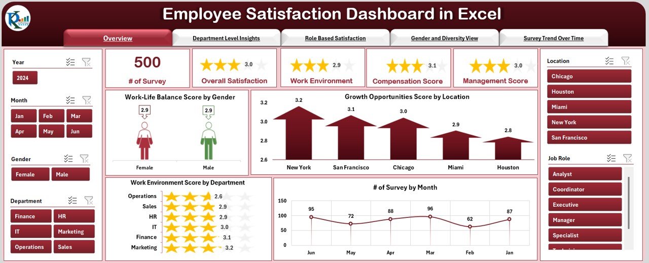
What’s Inside
The template is structured across 5 analytical pages and 2 support tabs, all connected through a clean top navigation panel so you can switch views with a single click.
- Overview Page: KPI cards for Total Surveys, Average Satisfaction Score, Highest/Lowest Department Score, and MTD Trend. Visual charts covering Work-Life Balance by Gender, Growth Opportunities by Location, Work Environment by Department, and Surveys by Month.
- Department-Level Insights: Compare satisfaction, participation, and growth scores across every team to quickly spot top and under-performing departments.
- Role-Based Satisfaction: Understand how scores vary from entry-level staff all the way to leadership—essential for targeted career development.
- Gender & Diversity Analysis: Track satisfaction equity across gender lines and design more inclusive HR strategies.
- Survey Trend Over Time: Identify seasonal dips and measure the long-term impact of HR initiatives.
Powerful Slicer Filters
Filter every chart simultaneously by Department, Role, Gender, Location, Month, and Year using Excel’s built-in slicers. All visuals are pivot-powered and auto-update the moment you apply a filter or enter new data. Zero coding required.
👉 Get the Excel Employee Satisfaction Dashboard →
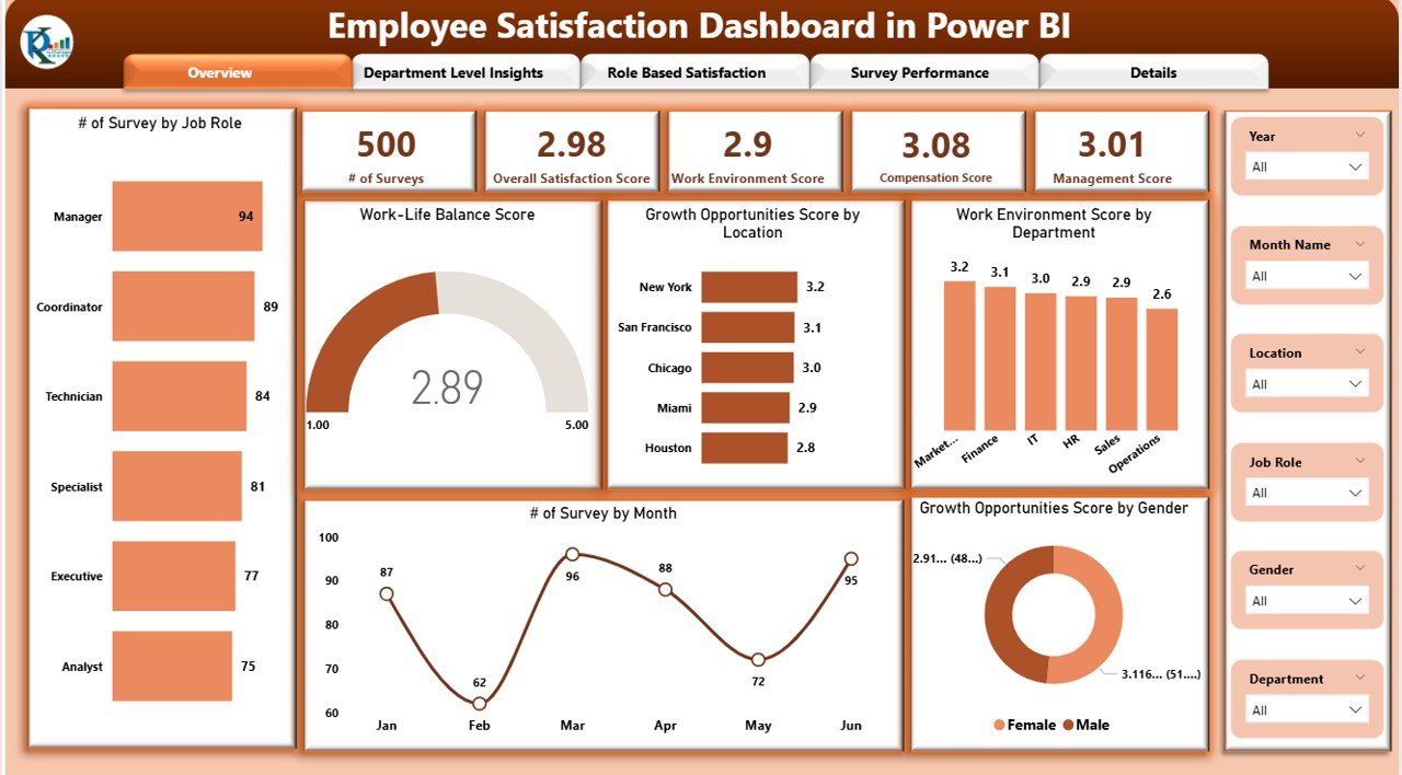
2. Employee Satisfaction Dashboard in Power BI
For organizations that need enterprise-grade analytics and deep drill-down capabilities, the Employee Satisfaction Dashboard in Power BI is the right choice. It takes all the core satisfaction metrics and supercharges them with Power BI’s dynamic, interactive visuals.
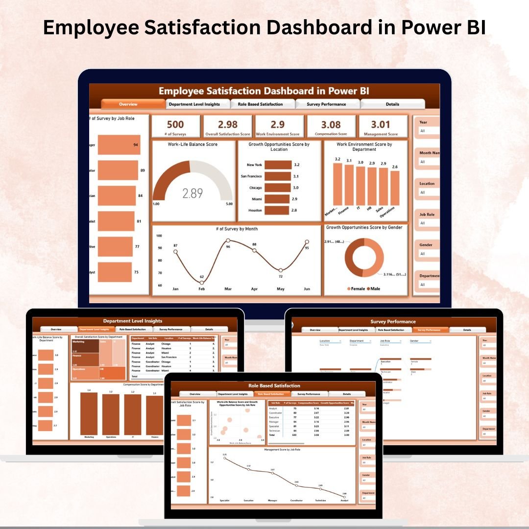
What’s Inside
The Power BI dashboard is organized across 4 fully interactive pages:
- Overview Page: KPI cards for number of Surveys, Overall Satisfaction Score, Work Environment Score, Compensation Score, and Management Score—plus charts for Work-Life Balance, Growth Opportunities by Location and Gender, and Surveys by Month.
- Department-Level Insights: Compare Work-Life Balance, Overall Satisfaction, and Compensation Score across every department with drill-down clarity.
- Role-Based Satisfaction: Analyze Overall Satisfaction, Work-Life Balance vs Growth Opportunities, and Management Score by Job Role—ideal for targeted HR interventions.
- Survey Performance: Includes a Decomposition Tree for drilling into results by department, role, and location, plus trend charts and individual performance tables.
What Makes This Dashboard Stand Out
The Power BI version goes beyond static charts. The Decomposition Tree visual lets users interactively break down satisfaction scores across multiple dimensions in seconds—something Excel and Google Sheets simply cannot replicate at the same depth. It is built for business leaders and analysts who need to uncover root causes, not just report on outcomes.
👉 Get the Power BI Employee Satisfaction Dashboard →
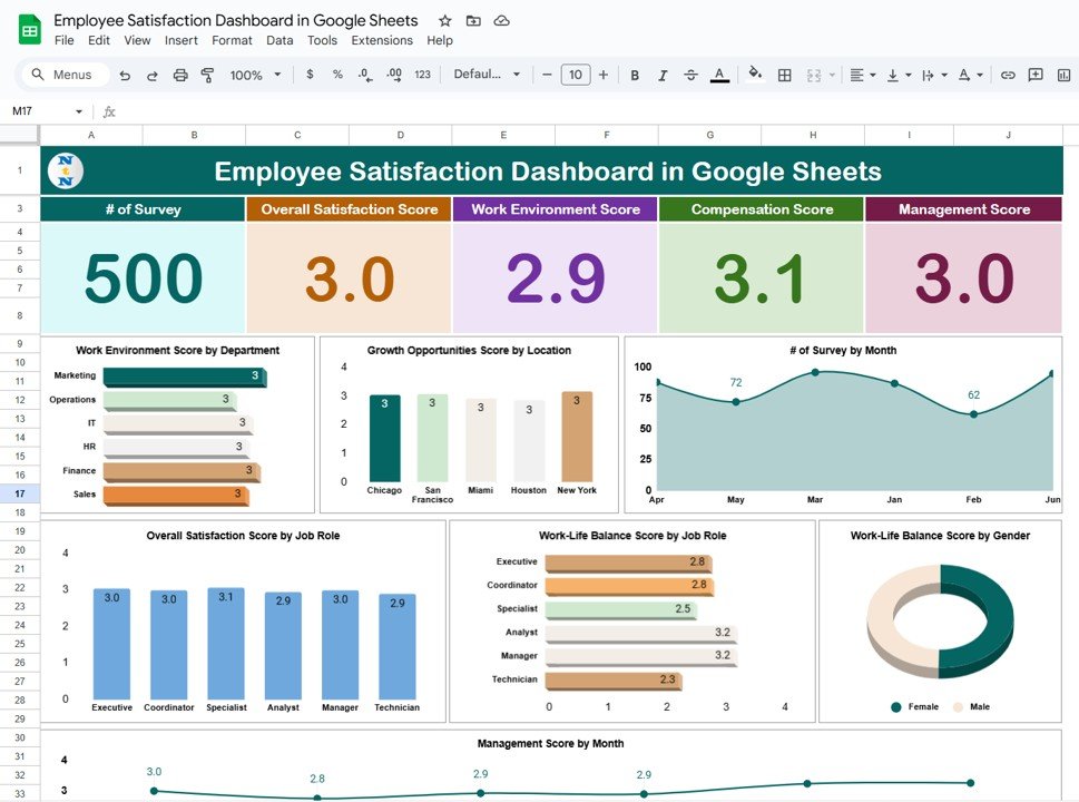
3. Employee Satisfaction Dashboard in Google Sheets
If your team works remotely, collaborates across time zones, or simply prefers a browser-based solution with zero software installation, the Employee Satisfaction Dashboard in Google Sheets is exactly what you need.
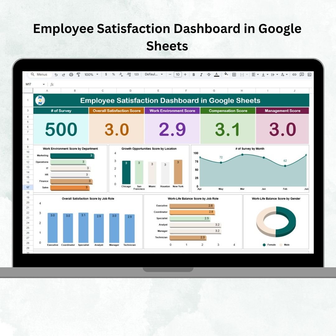
What’s Inside
The Google Sheets version is cleanly organized into 2 core tabs:
- Dashboard Tab (Main Overview): KPI cards for number of Surveys, Overall Satisfaction, Work Environment, Compensation, and Management Effectiveness. Visual charts for Work Environment by Department, Growth Opportunities by Location, Surveys by Month, Satisfaction by Job Role, Work-Life Balance by Role & Gender, and Management Score by Month.
- Data Sheet (Survey Input): Enter scores for Satisfaction, Work Environment, Compensation, Management, Work-Life Balance, and Growth Opportunities—segmented by Department, Job Role, Location, and Gender. The dashboard refreshes automatically with every new entry.
Cloud-First Collaboration
Because it lives in Google Sheets, this dashboard can be shared with your entire HR team or leadership instantly—no file attachments, no version conflicts. Everyone views the same live data, making it perfect for distributed teams and organizations that want total transparency in their employee engagement reporting.
👉 Get the Google Sheets Employee Satisfaction Dashboard →
Quick Comparison: Which Dashboard Is Right for You?
| Feature | Excel | Power BI | Google Sheets |
|---|---|---|---|
| Number of Analytical Pages | 5 Pages + 2 Support Tabs | 4 Interactive Pages | Dashboard + Data Sheet |
| Interactive Filters/Slicers | ✅ Yes (Excel Slicers) | ✅ Yes (Power BI Filters) | ✅ Yes (Chart Segmentation) |
| Decomposition Tree | ❌ No | ✅ Yes | ❌ No |
| Cloud/Collaboration | Limited (SharePoint) | Power BI Service | ✅ Built-in (Google Drive) |
| Real-Time Updates | ✅ Pivot-Powered | ✅ Dynamic Visuals | ✅ Formula-Driven |
| Software Required | Microsoft Excel | Power BI Desktop/Service | Google Account (Free) |
| Coding Required | ❌ None | ❌ None | ❌ None |
| Best For | Excel-first HR teams | Enterprise & Analytics teams | Remote & collaborative teams |
5 Things All 3 Dashboards Have in Common
Regardless of which version you choose, every dashboard delivers these powerful capabilities:
- Department & Role Segmentation: Instantly compare satisfaction across teams, roles, and locations to identify gaps and strengths.
- Gender & Diversity Tracking: Monitor equity in satisfaction scores and growth opportunities across gender lines.
- Survey Trend Analysis: Track how satisfaction changes month over month to measure the impact of HR initiatives.
- Zero Coding Required: All three templates are designed for HR professionals, not developers. Simply enter your data and the dashboard does the rest.
- Fully Customizable: Add new KPIs, adjust filters, or modify the layout to fit your organization’s unique needs.
Who Should Use These Dashboards?
These templates are built for anyone responsible for measuring and improving employee engagement, including HR Managers running pulse or annual surveys, Department Heads who want data-backed insights into team morale, People & Culture teams designing inclusion strategies, Business Leaders shaping company-wide retention policies, and HR Analysts or consultants building actionable reporting frameworks.
Whether you are a growing startup or a large enterprise, these dashboards scale with your needs and give you a structured, visual way to act on employee feedback.
Start Measuring What Matters Most — Your People
Employee satisfaction is not a once-a-year checkbox exercise. It is an ongoing conversation between your organization and its workforce. The right dashboard makes that conversation data-driven, consistent, and actionable.
No matter which platform you prefer, NextGenTemplates has you covered with a professional, ready-to-use solution. Pick the one that fits your workflow and start turning survey data into real workplace change today.
- 📊 Employee Satisfaction Dashboard in Excel — Best for Excel-first HR teams
- 📈 Employee Satisfaction Dashboard in Power BI — Best for enterprise analytics & drilldowns
- ☁️ Employee Satisfaction Dashboard in Google Sheets — Best for cloud collaboration & remote teams
👉 Visit NextGenTemplates.com to explore our full library of HR, analytics, and productivity templates—crafted for professionals who want results without the complexity.
🎥 Visit our YouTube channel to watch the demo:
youtube.com/@NextGenTemplates