Marine and port operations run 24/7 and involve countless activities—from managing vessel arrivals and fuel usage to handling cargo performance and monitoring port charges. When these critical metrics stay scattered across spreadsheets, logs, and manual documentation, teams lose time and visibility. Decision-making slows, operational risks increase, and leaders struggle to understand real-time performance. To solve these challenges, we created the Marine & Ports Dashboard in Power BI — a powerful, interactive, and ready-to-use reporting solution designed for port authorities, marine logistics teams, and cargo managers.
This dashboard centralizes every marine KPI into one visual platform. You can monitor total cost, revenue, fuel consumption, vessel performance, department-wise results, port charges, satisfaction scores, and monthly trends instantly. Since it runs on Power BI, you get automated refreshes, drill-through capabilities, dynamic slicers, and stunning visuals—allowing technical and non-technical users to analyze marine operations with ease.
✨ Key Features of the Marine & Ports Dashboard in Power BI
⚓ Five Powerful Analytical Pages
The dashboard includes separate pages for Overview, Department Analysis, Operation Analysis, Vessel Analysis, and Monthly Trends—each designed to highlight a different layer of marine and port performance.
🔍 Interactive Slicers & Filters
Users can switch between regions, operation types, vessel types, cargo types, months, and departments instantly. The dashboard dynamically updates all visuals with a single click.
💰 Cost & Revenue Visualization
Track fuel cost, port charges, total cost, revenue trends, and profit margin across categories. These insights help reduce operational expenses and increase efficiency.
📈 Clean and Insightful Power BI Visuals
Combo charts, bar charts, slicers, KPI cards, and breakdown visuals help teams understand complex marine data quickly—without needing deep technical expertise.
📦 What’s Inside the Marine & Ports Dashboard in Power BI
📁 1. Power BI PBIX File
A fully designed dashboard with five pages, professional visuals, drill-through interactions, and optimized layouts.
📊 2. Dashboard Pages
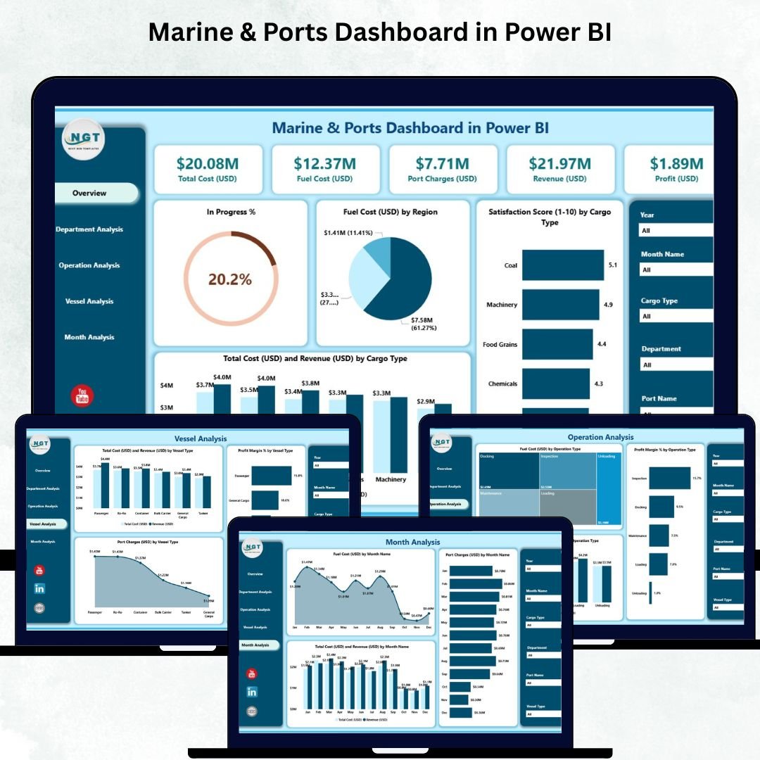
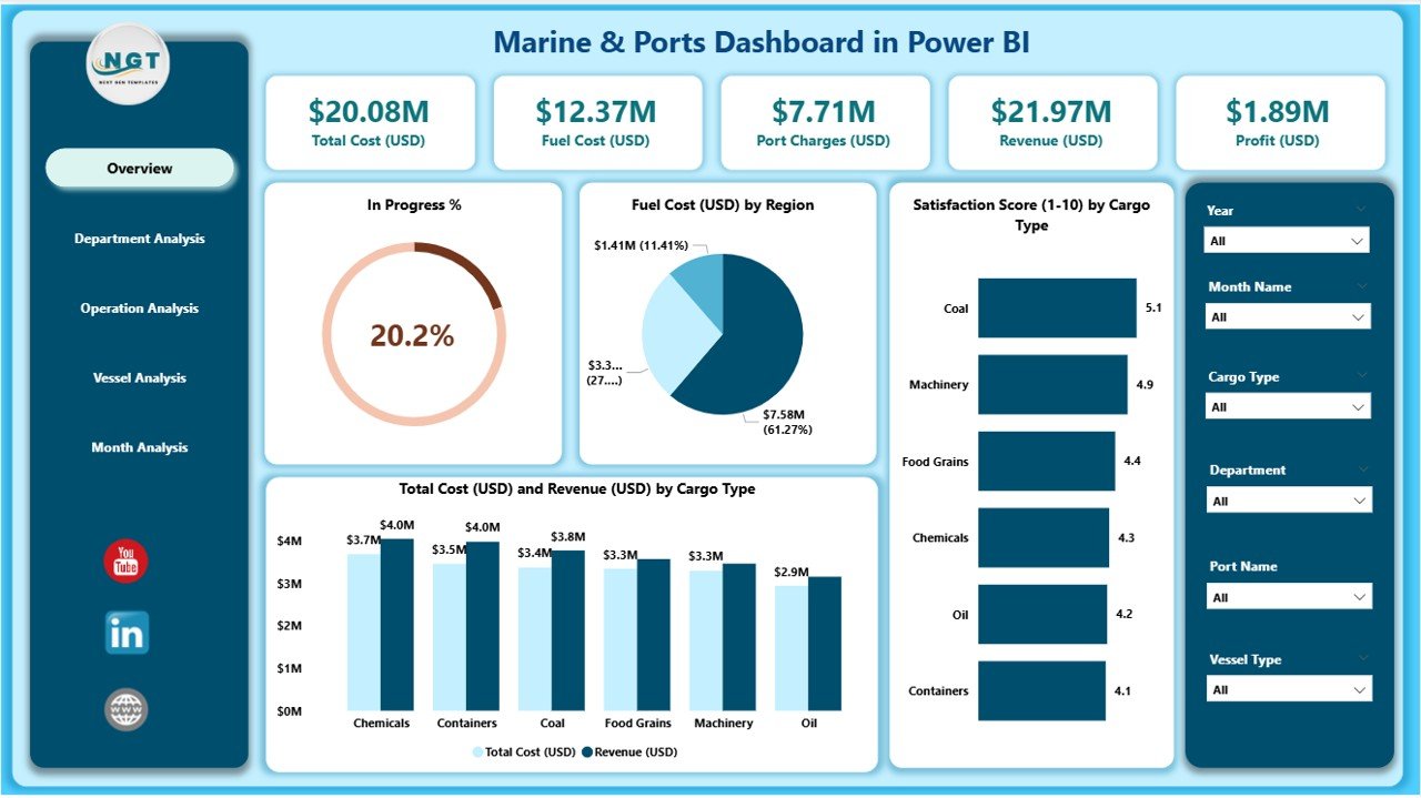
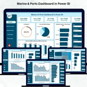
🟦 Overview Page – Your 360° Marine Operations Snapshot
This page includes:
-
5 KPI cards for fuel cost, port charges, total cost, revenue, and satisfaction
-
4 charts including:
-
In Progress %
-
Fuel Cost (USD) by Region
-
Satisfaction Score by Cargo Type
-
Total Cost vs Revenue by Cargo Type
-
It instantly shows which regions consume more fuel, which cargo types deliver high satisfaction, and how revenue compares with cost.
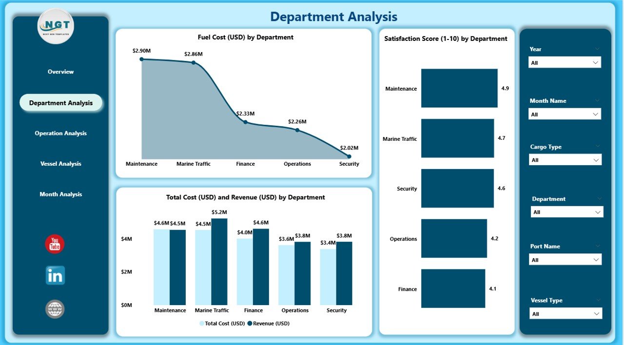
🟧 Department Analysis Page – Compare Department-Level Performance
This page highlights:
-
Fuel Cost by Department
-
Satisfaction Score by Department
-
Total Cost vs Revenue by Department
Managers can identify departments that overspend, underperform, or contribute significantly to revenue.
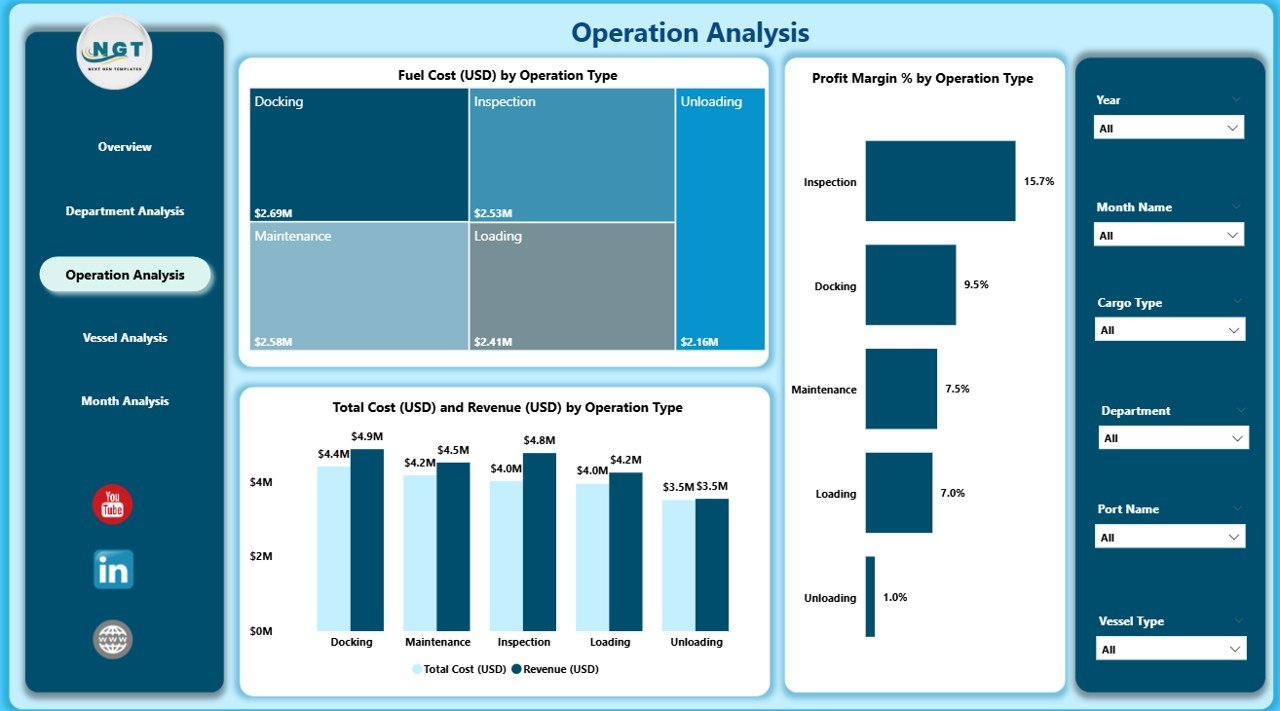
🟩 Operation Analysis Page – Analyze Marine Operational Efficiency
Includes:
-
Fuel Cost by Operation Type
-
Profit Margin % by Operation Type
-
Total Cost vs Revenue by Operation Type
This helps teams optimize processes such as loading, unloading, handling, transport, and safety checks.
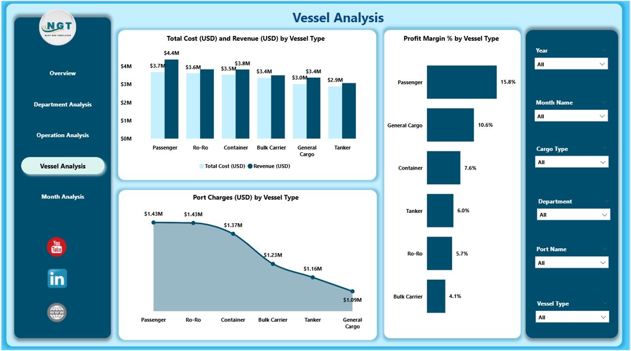
🟪 Vessel Analysis Page – Track Vessel Performance & Profitability
Visuals include:
-
Profit Margin % by Vessel Type
-
Total Cost & Revenue by Vessel Type
-
Port Charges by Vessel Type
You can compare vessel categories to improve scheduling, budgeting, and docking strategies.
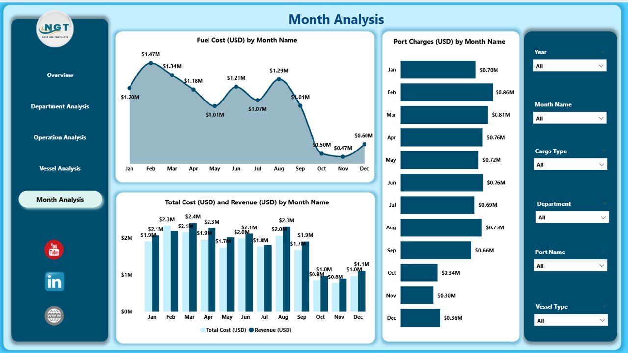
🟨 Monthly Trends Page – Understand Seasonal & Monthly Performance
Includes:
-
Fuel Cost by Month
-
Total Cost vs Revenue by Month
-
Port Charges by Month
These trends help teams plan fuel budgets, analyze performance patterns, and forecast upcoming months.
🛠️ How to Use the Marine & Ports Dashboard
1️⃣ Update your Excel or database source
Add data for vessels, cargo, departments, regions, cost, revenue, and port charges.
2️⃣ Refresh your Power BI model
All visuals update instantly.
3️⃣ Apply slicers and filters
Switch between months, cargo types, vessel types, regions, and departments.
4️⃣ Review KPI cards & charts
Identify cost spikes, revenue dips, and operational inefficiencies.
5️⃣ Drill through into detailed pages
Analyze each category closely for smarter decision-making.
🎯 Who Can Benefit from This Dashboard
🚢 Port Authority Teams
Track vessel scheduling, port charges, and operational performance.
🛳️ Marine Operations Managers
Analyze fuel usage, operation type performance, and cargo efficiency.
⚓ Vessel Operators
Review cost, revenue, and profitability by vessel type.
📦 Cargo Supervisors
Monitor satisfaction scores and cargo-wise financial performance.
💼 Finance Teams
Track revenue, cost, port charges, and profit margin % across categories.
🏭 Logistics & Safety Teams
Ensure safe and efficient marine and port operations.
### Click hare to read the Detailed blog post
Visit our YouTube channel to learn step-by-step video tutorials
👉 Youtube.com/@PKAnExcelExpert


Reviews
There are no reviews yet.